react-circular-slider
A highly customizable circular slider with no dependencies. See some live demos here!
install
npm install @fseehawer/react-circular-slider
example
;; const App = { return <CircularSlider onChange= { console; } /> }; ;Use min and max props to define the range of numbers. Use prependToValue/appendToValue if you want to prepend/append e.g. "$" or "°" to the value. Or simply use the data prop and pass any number or string sequence as an array to be spread in 360°. See some live demos here!
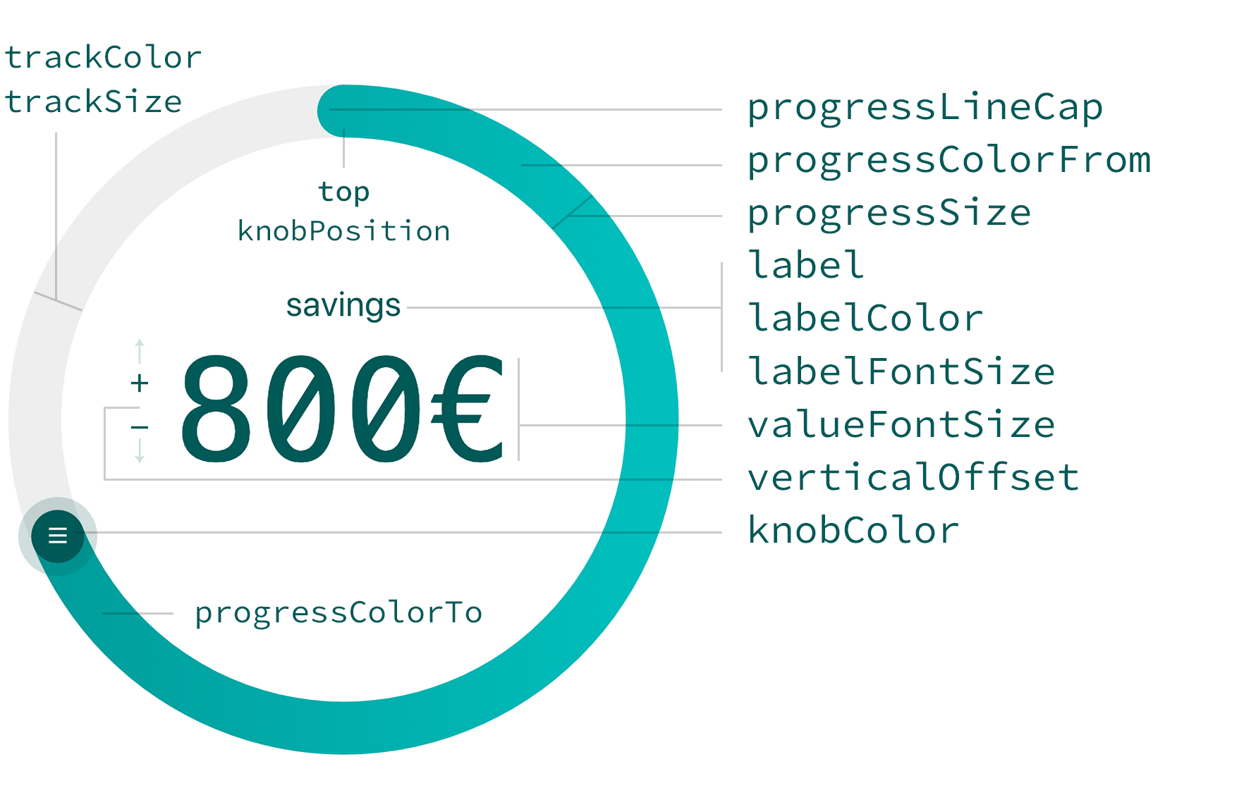
;; const App = { return <CircularSlider label="savings" labelColor="#005a58" knobColor="#005a58" progressColorFrom="#00bfbd" progressColorTo="#009c9a" progressSize=24 trackColor="#eeeeee" trackSize=24 data="1€""2€" //... dataIndex=10 onChange= { console; } /> }; ;Props
| prop | type | default | Affects |
|---|---|---|---|
| width | number | 280 | width of the slider |
| direction | number | 1 | clockwise (1) or anticlockwise (-1) |
| min | number | 0 | smallest value |
| max | number | 360 | largest value |
| data | array | [] | array of data to be spread in 360° |
| dataIndex | number | 0 | initially place knob at a certain value in the array |
| knobColor | string | #4e63ea | knob color |
| knobSize | number | 32 | knob size |
| hideKnob | boolean | false | hide knob |
| knobDraggable | boolean | true | knob not draggable |
| knobPosition | string | top | knob's 0 position to be top, right, bottom or left |
| label | string | ANGLE | label |
| labelColor | string | #272b77 | label and value color |
| labelBottom | boolean | false | label position at bottom |
| labelFontSize | string | 1rem | label font-size |
| valueFontSize | string | 4rem | label value font-size |
| appendToValue | string | '' | append character to value |
| prependToValue | string | '' | prepend character to value |
| renderLabelValue | jsx | null | add custom jsx code for the labels and styles |
| verticalOffset | string | 2rem | vertical offset of the label and value |
| hideLabelValue | boolean | false | hide label and value |
| progressColorFrom | string | #80C3F3 | progress track gradient start color |
| progressColorTo | string | #4990E2 | progress track gradient end color |
| progressSize | number | 8 | progress track size |
| progressLineCap | string | round | progress track cap to be round or flat |
| trackColor | string | #DDDEFB | background track color |
| trackSize | number | 8 | background track size |
| onChange | func | value => {} | returns label value |