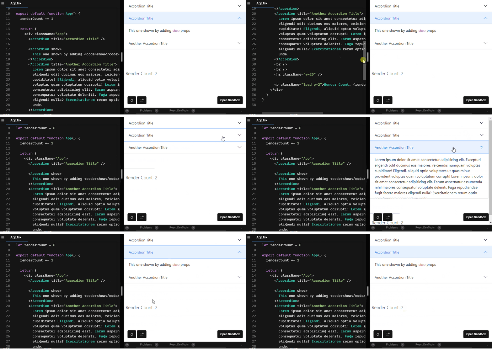
React Bootstrap Accordion
A simple react component for adding a nice vertically collapsing accordions based on bootstrap 5 Accordion.
Install
npm
npm i react-bootstrap-accordionYarn
yarn add react-bootstrap-accordionUsage
import React from 'react'
import { Accordion } from 'react-bootstrap-accordion'

const MyComponent = () => {
  return (
    <div className='App'>
      <Accordion /* Props */ />
    </div>
  )
}
Props
| Prop | Type | Options | Description | Default |
|---|---|---|---|---|
title |
String | Optional | Accordion Title | Accordion Title |
show |
Boolean | Optional | Make accordion shown by default | false |
children |
ReactNode | Optional | Accordion body | Lorem text |
Style
The Component is based on Bootstrap 5 HTML structure and CSS classes so it will work out of the box if Bootstrap 5 css stylesheet is already included in you project. If you don't have/want to include Bootstrap, you still can use a standalone css stylesheet which was extracted form bootstrap 5 stylesheet. Just add it:
import 'react-bootstrap-accordion/dist/index.css'Demo
License
MIT © awran5


