react-beacon
React Beacon - Onboarding Tooltips using Slack-like Beacons
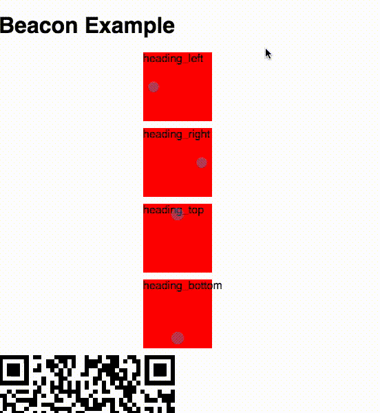
Screenshots
Example
Props
position: top, right, bottom or left for tooltip to appear. Default to rightpersistent: see below
Usage
Just place the Beacon tag inside the target element with the tooltip text as its content:
<div id="some-element-that-I-want-to-explain-to-the-user">
  <Beacon>
    This is the tooltip text
  </Beacon>
</div>
Persistence
If the persistent attribute is specified, the component will automatically remember whether the beacon has been
clicked on. If it has already been clicked, it will not be displayed again since generally the user will only want
to see an onboarding tooltip once.
The state of each beacon is stored using a unique ID. If you just set persistent to true, a SHA-1 hash will
be calculated from the beacon content and used as the key. This means that all beacons will have a unique key as
long as they also have unique content. You can override this key by specifying some other truthy value for
the persistent attribute.
IndexedDB is used for storing the beacon state, so if some of your target browsers don't support IndexedDB, you should use a shim.
Tooltip Overlay
If desired, the tooltip target can be highlighted by fading the background and enlarging the target when
the beacon is clicked (see screenshot). To activate this functionality, add the class tour-overlay to
your application root element (i.e. the element that should be faded).
Development
npm install
npm start
License
react-beacon is released under the MIT license.