
react-bars
React Component to draw simple "skill bar" - style bar-graphs
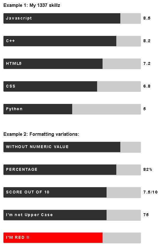
This component was developed after needing to graphically display skill levels for various technologies on my resume.
I thought this may be useful to other devs out there, so I turned it into a reusable component for React
Of course, It doesn't need to be used just for "skill bars" - it could fulfil many simple bar graph requirements.
There are two components, in a simple Heirarchy:
-
Bars draws an entire Bar graph consisting of a number of Bar components corresponding to each item in an array of iput data
-
Bar draws a single Bar component
Each Bar inherits properties from the parent Bars component, but properties can be overridden for each individual Bar component as required.
(for example, in the screenshot and sample code below, the 'HTML' bar is colored red)
Please refer to the API documentation for details:
API documentation: ./api.md
sample usage
import React, { Component } from 'react';
import ReactDOM from 'react-dom';
import Bars from 'react-bars';

import './App.css';

class App extends Component {
  constructor(props) {
    super(props);
    this.state = {
      testData: [
        {label:'Javascript', value:85},
        {label:'C++', value: 82},
        {label:'React', value:80},
        {label:'Node.js', value:75},
        {label:'HTML5', value:72, barColor:'red'},
        {label:'CSS', value:68},
        {label:'JQuery', value:65},
        {label:'Bootstrap', value:60},
        {label:'Python', value:50},
        {label:'Angular.js', value:45},
      ]
    };
  }

  render() {
    return (
      <div className="demo">
        <Bars data={this.state.testData} makeUppercase={true}/>
      </div>
    );
  }
}

ReactDOM.render(
  <App />,
  document.getElementById('root')
);
styling
the styling for the Bars is defined in an internal stylesheet called bar.css
You can override the classes defined in bar.css to meet your own needs:
.bar-label {
    color: white;
    font: 15px 'opensans-bold', sans-serif;
    letter-spacing: 2px;
    font-weight: bold;
    position: relative;
    top: 10px;
    left: 10px;
}

.bar-suffix {
  display: inline-block;
    color: black;
    font: 15px 'opensans-bold', sans-serif;
    letter-spacing: 2px;
    font-weight: bold;
    position: relative;
    top: 10px;
    left: 10px;
}

.bar-contain {
    width: 90%;
    padding: 0;
    display: inline-block;
    border-radius: 3px;
}

.bar-expand {
    display: inline-block;
    border-radius: 3px 0 0 3px;
}
the classes are used as follows:
bar-label : the labels inside the bars
bar-suffix: the numerical value AND suffix following each bar
bar-contain: the surrounding container for each bar
bar-expand: the value part of the bar
build commands:
dev: npm run dev - runs demo host app to facilitate development
dist: npm run build - runs minified build
lint: npm run lint - runs ESLint
generate API documentation: npm run generate-docs
testing: npm test
to-do:
-
optional display of numerical value -
event callbacks (click, hover etc)
-
change orientation (vertical ? etc)
-
document / define styling -
hover colors etc
Acknowledgements / credits:
This project was inspired by the following works:
- ceevee template (released under the Creative Commons Attribution 3.0 License) by Styleshout