react-admin-date-inputs
<DateInput>, <TimeInput> and <DateTimeInput> components for React-Admin.
Installation
npm install react-admin-date-inputs --save
Usage
You have to include an icon font to display the icons on the picker. This is mentioned on the bottom of the material-ui-pickers installation page.
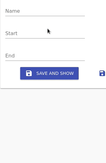
// on index.htmlimport React from 'react';import Edit TextInput TabbedForm FormTab from 'react-admin'import DateInput TimeInput DateTimeInput from 'react-admin-date-inputs'; const NewsEdit = props <Edit = > <TabbedForm> <FormTab> <LongTextInput ="title" = /> <DateInput ="startDate" ="Start date" = /> <TimeInput ="startTime" ="Start time" = /> <DateTimeInput ="endDate" ="End time" = /> </FormTab> </TabbedForm> </Edit>; Options prop
The options prop is passed down to the pickers. Documentation for these options can be found in the material-ui-pickers documentation for the component you're trying to use.
providerOptions prop
If you want to use a date parser utils library other than date-fns or you want a locale other than english, you can pass the providerOptions prop:
import DateFnsUtils from '@date-io/date-fns';import MomentUtils from 'material-ui-pickers/utils/moment-utils';import frLocale from "date-fns/locale/fr"; ...<DateInput ="date" ="Date using moment" = /><DateInput ="date" ="Date in French!" = />NOTE: When specifying a locale you must also specify the utils, even if it's the default DateFnsUtils.
Development
You can build sources:
npm run build
License
This library is licensed under the MIT Licence.