rc-slider
Slider UI component for React


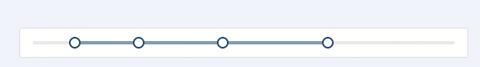
Screenshots


Features
- Supports IE9, IE9+, Chrome, Firefox & Safari
Install
npm install --save rc-slider
Usage
;;;// We can just import Slider or Range to reduce bundle size// import Slider from 'rc-slider/lib/Slider';// import Range from 'rc-slider/lib/Range';; ReactDOM;API
Common API
The following APIs are shared by Slider and Range.
| Name | Type | Default | Description |
|---|---|---|---|
| className | string | '' |
Additional CSS class for the root DOM node |
| min | number | 0 |
The minimum value of the slider |
| max | number | 100 |
The maximum value of the slider |
| marks | {number: string} or{number: { style, label }} |
{} |
Marks on the slider. The key determines the position, and the value determines what will show. If you want to set the style of a specific mark point, the value should be an object which contains style and label properties. |
| createHandleMark | Function | NOOP | Will show marks on every handle position that are created by createHandleMark. The function takes two arguments: The value of the handle and the index of it. |
| step | number or null |
1 |
Value to be added or subtracted on each step the slider makes. Must be greater than zero, and max - min should be evenly divisible by the step value. When marks is not an empty object, step can be set to null, to make marks as steps. |
| vertical | boolean | false |
If vertical is true, the slider will be vertical. |
| handle | (props) => React.ReactNode | A handle generator which could be used to customized handle. | |
| included | boolean | true |
If the value is true, it means a continuous value interval, otherwise, it is a independent value. |
| disabled | boolean | false |
If true, handles can't be moved. |
| dots | boolean | false |
When the step value is greater than 1, you can set the dots to true if you want to render the slider with dots. |
| onBeforeChange | Function | NOOP | onBeforeChange will be triggered when ontouchstart or onmousedown is triggered. |
| onChange | Function | NOOP | onChange will be triggered while the value of Slider changing. |
| onAfterChange | Function | NOOP | onAfterChange will be triggered when ontouchend or onmouseup is triggered. |
Slider
| Name | Type | Default | Description |
|---|---|---|---|
| defaultValue | number | 0 |
Set initial value of slider. |
| value | number | - | Set current value of slider. |
Range
| Name | Type | Default | Description |
|---|---|---|---|
| defaultValue | number[] |
[0, 0] |
Set initial positions of handles. |
| value | number[] |
Set current positions of handles. | |
| count | number | 1 |
Determine how many ranges to render, and multiple handles will be rendered (number + 1). |
| allowCross | boolean | true |
allowCross could be set as true to allow those handles to cross. |
| pushable | boolean or number | true |
pushable could be set as true to allow pushing of surrounding handles when moving an handle. When set to a number, the number will be the minimum ensured distance between handles. Example: |
Development
npm install
npm start
Example
npm start and then go to http://localhost:8005/examples/
Online examples: http://react-component.github.io/slider/
Test Case
http://localhost:8005/tests/runner.html?coverage
Coverage
http://localhost:8005/node_modules/rc-server/node_modules/node-jscover/lib/front-end/jscoverage.html?w=http://localhost:8088/tests/runner.html?coverage
License
rc-slider is released under the MIT license.