
Simple react tooltip component


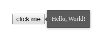
Demo
Installation
Install package with npm:
npm i rc-simple-tooltip
Install package with yarn:
yarn add rc-simple-tooltip
Basic Usage
Import Tooltip component:
import Tooltip from 'rc-simple-tooltip';Wrap your component with Tooltip:
<Tooltip trigger="hover" content="Tooltip content">
  <button>Complete action</button>
</Tooltip>
Tooltip works with any component that supports refs. For custom functional components you need to forward ref:
const Button = React.forwardRef(({children, ...props}, ref) =>
  <button {...props} ref={ref}>{children}</button>
);
<Tooltip trigger="hover" content="Tooltip content">
  <Button>Complete action</Button>
</Tooltip>
Tooltip can be used without any children:
<Tooltip top content="Tooltip content" />Additionally import styles.css to apply default styling:
import 'rc-simple-tooltip/dist/styles.css';Props
| Name | Type | Default | Description |
|---|---|---|---|
active |
Boolean |
true |
Show tooltip |
timeout |
Int |
0 |
Time delay before hiding tooltip in hover mode |
content |
Node |
null |
Tooltip content |
position |
'left'|'right'|'top'|'bottom' |
null |
Tooltip position |
trigger |
'click'|'focus'|'hover' |
null |
Tooltip activation trigger |
className |
String |
null |
className value |
styles |
Object |
null |
styles value |
Running locally
With yarn:
yarn start
With npm:
npm start