rc-dialog
react dialog component


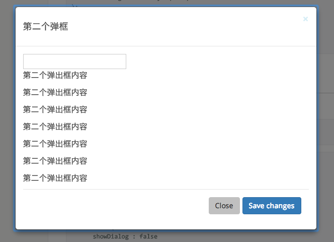
Screenshot
Install

Usage
var Dialog = ; ReactDOM document); // use dialogAPI
props
| name | type | default | description |
|---|---|---|---|
| prefixCls | String | rc-dialog | The dialog dom node's prefixCls |
| style | Object | {} | Root style for dialog element.Such as width, height, zIndex |
| visible | Boolean | false | current dialog's visible status |
| animation | String | part of dialog animation css class name | |
| maskAnimation | String | part of dialog's mask animation css class name | |
| title | String|React.Element | Title of the dialog | |
| footer | React.Element | footer of the dialog | |
| closable | Boolean | true | whether show close button and click mask to close |
| maskClosable | Boolean | true | whether click mask to close, this prop will be ignored if set closable prop to false |
| mousePosition | {x:number,y:number} | set pageX and pageY of current mouse(it will cause transform origin to be set). | |
| onClose | function() | called when click close button or mask |
Development
npm install
npm start
Example
http://localhost:8007/examples/
online example: http://react-component.github.io/dialog/examples/
Test Case
http://localhost:8007/tests/runner.html?coverage
Coverage
License
rc-dialog is released under the MIT license.