Inspiration
Please go check out the original source from kingofthestack/react-chat-window.
Installation
npm install --save rc-chat-viewimport { Launcher } from 'rc-chat-view- OR
const Launcher = require('rc-chat-view').Launcher
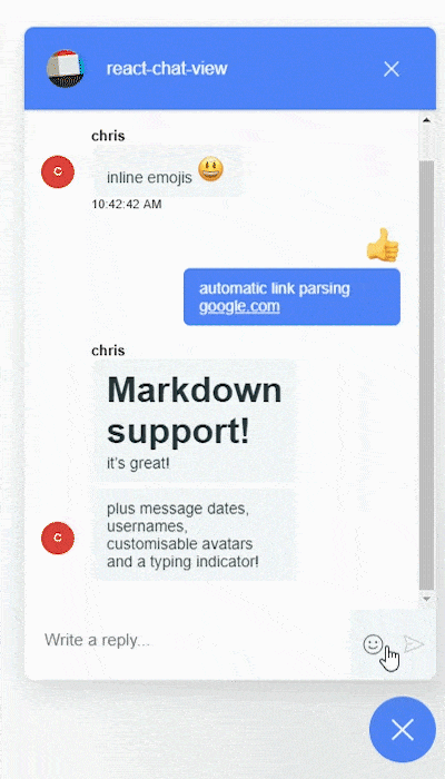
Features
- Fully customizeable (enable usernames, avatars, emojis...)
- Backend agnostic
- Free!
Table of Contents
Example
Here is an example that passes the bare minimum props to Launcher to be able to send/receive messages.
import React, { Component } from 'react';
import moment from 'moment';

import { Launcher } from '../../src';
import { MESSAGE_CONTENT_TYPE_TEXT, MESSAGE_CONTENT_TYPE_EMOJI } from '../../src/types';

class Demo extends Component {
    state = {
        messageList: [],
    };

    appendMessage = message => {
        this.setState(({ isOpen, newMessagesCount, messageList }) => ({
            messageList: [
                ...messageList,
                {
                    ...message,
                    id: `message_${messageList.length}`,
                    date: moment(),
                },
            ],
        }));
    };

    sendMessage = message => {
        this.appendMessage({
            ...message,
            senderId: 'dummy_sender_1',
            username: 'sam',
            avatar: { name: 'sam' },
        });
    };

    // mock reception from server/socket
    fakeReceiveMessage = msg => this.appendMessage(msg);

    render() {
        const { messageList } = this.state;

        return (
            <Launcher
                onMessageWasSent={this.sendMessage}
                messageList={messageList}
                userId="dummy_sender_1"
            />
        );
    }
}
Components
Launcher
The only component exported is the Launcher component. It manages the open/closed state ONLY if isOpen and handleClick are not provided.
| Prop | Type | Required | Default | Description |
|---|---|---|---|---|
| userId | String | yes | The current user's id. Used to determine whether a message was sent or received. | |
| isOpen | Boolean | Set this prop to manually control the open/closed state of the launcher. Do not define it, or set it to null to manage state automatically |
||
| handleClick | function | Set this prop to receive a callback when the user clicks one of the open/close buttons. If provided, will be called instead of setting state internally. | ||
| headerConfig | Object | {} | Props for the header of the chat widget. See the types definitions for more information. |
|
| messageList | Array | [] | The array of messages to display. See the types definitions for more information. |
|
| onMessageWasSent | function | yes | Called when the user submits text or an emoji. Called with a single parameter with keys text and text/emoji
|
|
| newMessagesCount | Number | 0 | The counter to display on the launcher button. Will not be displayed if 0. | |
| showEmoji | Boolean | true | Enables the emoji picker. Does not affect the emoji parsing. | |
| showUsername | Boolean | true | Enables the display of usernames. | |
| showAvatar | Boolean | true | Enables the display of avatars. | |
| avatarTopPosition | Boolean | false | Place the avatars at the top or bottom, along the side of received messages. | |
| showDate | Boolean | true | Enables the display of message dates. | |
| minDateDiff | Number | 60 * 5 | The minimum amount of time between messages to automatically display the date of second message. | |
| isTyping | Boolean | false | Show/Hide the typing indicator. |
Type definitions
HeaderConfig
| Prop | Type | Required | Default | Description |
|---|---|---|---|---|
| imageUrl | String | The source to the image to display in the chat header. | ||
| headerName | String | The text to display in the chat header. | ||
| onHeaderNameClick | function | Callback invoked when the header name is clicked. |
Message
| Prop | Type | Required | Default | Description |
|---|---|---|---|---|
| id | String | yes | The id of the message. Used as a React key. | |
| senderId | String | yes | The id of the sender. Compared against userId passed to Launcher to determine if the message was sent or received. |
|
| username | String | The username of the sender to display above his message. Does not control whether the username will be displayed. | ||
| avatar | Object | {} | The props to pass to the react-avatar component. Does not control whether the avatar will be displayed. |
|
| type | String | yes | Set either text or emoji. Used to determine what type of message to display. |
|
| text | String | if type === 'text' | The text of the message. Can contain any Markdown except HTML. | |
| emoji | Object/String | if type === 'emoji' | The id of the emoji, or the emoji object, as per emoji-mart
|
|
| date | momentString/momentObj | The date to display under the message. Does not control whether the date will be displayed. Must be a moment String or Object. |
Avatar
These are the props passed to react-avatar
| Prop | Type | Required | Default | Description |
|---|---|---|---|---|
| String | ||||
| md5Email | String | |||
| facebookId | String | |||
| twitterHandle | String | |||
| instagramId | String | |||
| googleId | String | |||
| skypeId | String | |||
| name | String | |||
| maxInitials | String | |||
| value | String | |||
| color | String | |||
| fgColor | String | |||
| src | String |
Description
Why not fork?
The idea behind this project is to learn how to develop and publish a React component.
As such, this project uses Webpack instead of NWB. I also want to modify and extend most of the component. Here are the planned features:
- [x] Use Emoji Mart for a better looking picker and emojis (instead of native emojis)
- [x] Display the messages with Markdown (automatic inline emojis and links)
- [x] Display username with messages
- [x] Display unique user avatar with messages
- [x] Display message sent dates
- [x] Display a typing indicator
- [ ] Create a new screen for conversation selection. Selecting a conversation will then switch to the current message list.
Contributing
Scripts
-
npm run start: start development server with hot loading
Style
Install Prettier to format the code according to the .prettierrc configuration.