
Popup-Prompt


Show popup and prompt windows to your users.

Table of Contents
- Table of Contents
- PowerShell Needed
- Installation
- Abilities
- Functionality
- Versions (Legacy and Coming)
- Usage
- Real Examples
- More Coming Soon!
- Bugs?
- On Another Platform (other than Windows)?
- Maintainers
- License (MIT)
PowerShell Needed
Please make sure that you have PowerShell 5.1 (or above) installed on your device, so that the popups and prompts show up without any disruption.
On Windows devices, it should come pre-installed. However, on MacOS and Linux, you may need to download it at this website.
Important Note: Make sure your computer is supported for PowerShell at this website.
Installation
To install, simply type the following command in your terminal/command prompt (making sure you have Node.js installed).
$ npm install popup-prompt
Then, when it is successfully installed, and the node_modules folder shows up, type the following in your JavaScript file.
const popup = require("popup-prompt");And that's it!
Abilities
This amazing npm module, popup-prompt, is very powerful! It can make popups so that you can show a better UI to your user!
The main capabilities that popup-prompt can do includes showing pre-made popups, and also making your own complex popups easily in just a few lines!
So, to use this extraordinary module, run npm install popup-prompt to use it now!
Reminder: You also need PowerShell 5.1 (or above) installed on your device.
Functionality
Below is a table of all of the constants and methods available in the popup-prompt package.
| Name & Parameters | Type | Description |
|---|---|---|
VERSION |
Constant | Show the current version of the package. |
AVAILABLE_VALUES |
Constant | Show the values that can be passed into the methods. |
showMessageBox(title, message[, type][, picture][, defaultOption]) |
Method | Show a message popup window. |
showPrompt(title, message[, defaultValue]) |
Method | Show a prompt popup window, in which a user can enter text in. |
showCredentials(title, message[, username][, targetName]) |
Method | Show a credential popup window. |
Popup() |
Class | Make a fully customizable popup window. |
Versions (Legacy and Coming)
To see the full history of changes, see the CHANGELOG.md file.
Legacy Version
Version 1.1.5 included...
- Added
componentListBoxmethod to thePopupclass. This is used to allow the user to select an available option. - Added new
showCredentialsfunction. This asks the user for their username and password of any account (which you can specifiy). Note: The username and password will be returned, so you will have to validate it. - Fixed a few minor bugs and code format.
- Resolved the issue where icons and images would not show up correctly (#5).
Coming Version
Note: The items below may change at any time.
Version 1.2.0 is set to include...
- Added a new methods in the
Popupclass calledcomponentCalendar. This displays a calendar for the user to select a date from. - Fixed a few bugs.
Usage
There are currently three methods, two constants, and one class available. They will be shown below.
Constant: VERSION
This constant simply shows the current version of the package.
Warning: This may be out-of-date at times. Please make a new Issue for this.
To log it (with the popup variable) to the console, simple run the following code. It should show the current version as a string.
console.log(popup.VERSION);
Constant: AVAILABLE_VALUES
AVAILABLE_VALUES shows the available values for the methods, since PowerShell has limited values for specific parameters.
If you get stuck on what values are available, you can simply console.log it, and see an object with each method.
You may be a bit stuck on what AVAILABLE_VALUES prints out, so let's do it now!
In JavaScript:
console.log(popup.AVAILABLE_VALUES);Which then outputs...
{
    showMessageBox: {
        title: [],
        message: [],
        type: [ "OK", "OKCancel", "YesNo", "YesNoCancel" ],
        picture: [
            "Asterisk",    "Error",
            "Exclamation", "Hand",
            "Information", "None",
            "Question",    "Stop",
            "Warning"
        ],
        defaultOption: [ "Cancel", "No", "None", "OK", "Yes" ]
    },
    showPrompt: { title: [], message: [], defaultValue: [] },
	showCredentials: {
		title: [],
		message: [],
		username: [],
		targetName: [],
	},
}
Note: This object does not show any methods of classes (e.g. Popup).
Just a quick side note on this output: when the value of a parameter (e.g. showPrompt.title) is an empty array ([]), then it means that there are no default parameters; they can be anything!
Method: showMessageBox
showMessageBox(title, message[, type][, picture][, defaultOption])
This method shows a customizable message box. It can have a title, message, button/buttons and an image.
Note: When you run this method, you will notice a PowerShell file appear in your current working directory. This is essential for the popup to display. Also, when a user clicks on a button, a text file will appear with the button clicked. This is for the PowerShell file to communicate with NodeJS.
This method returns a Promise, which contains the button on which the user clicked on. The value can be either of the below.
- OK
- Cancel
- Yes
- No
- None
Let's see a quick example of how to use it, and then, we will look at the functionality more deeply.
popup
	.showMessageBox(
		"Confirm Deleting File",
		"Are you sure you want to delete the file? This action is irreversible.",
		"YesNoCancel",
		"Warning",
		"No"
	)
	.then((btn) => {
		console.log(btn);
	})
	.catch((err) => {
		console.log(err);
	});
So, when you run this code, you should see a PowerShell file appear in your working directory. Soon after that, a message should appear, similar to this one.
Note: Depending on your OS platform and version, your popup may look slightly different. However, the functionality should be the same. Also, the window icon is the PowerShell logo.
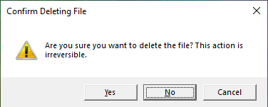
Then, logged to the console will be whatever the user chose (in this case, the choosen one is No).
No
Now, let's break it down.
The first parameter of showMessageBox is the title. The title is, as it may suggest, a string of the name of the popup/window. This appears when the user sees the top of the popup, and also when they see the taskbar (Windows) and see the name.
The second parameter is the description, where you can write a sentence or two, telling the user what the popup is for.
After that, the optional parameters come in. The third parameter are the buttons that display on the bottom. They, however, can only be of the following values. Passing anything other than this will cause an error.
- OK
- OKCancel
- YesNo*
- YesNoCancel
* When this value is set, the X (close) button is disabled.
The fourth optional parameter is the icon to display. This is a set list of icons, and must only be of the following values.
- Asterisk
- Error
- Exclamation
- Hand
- Information
- None*
- Question
- Stop
- Warning
* When None is set, there is no icon.
The last parameter is optional, and it is the default value for the button. So, if the user clicks Enter when the popup comes, and the default value is set, then it will automatically go with it. It must be one of the following.
- OK
- Cancel
- Yes
- No
- None
And that's it! This method can be very helpful for displaying information, warning, and error messages to your users, instead of just logging it to the console!
Method: showPrompt
showPrompt(title, message[, defaultValue])
The method creates a customizable prompt popup. This includes the title, the message, and the default value for the text field.
Note: When you run this method, you will notice a PowerShell file appear in your current working directory. This is essential for the prompt to display. Also, when the user enters their text, a text file will appear with the text entered. This is for the PowerShell file to communicate with NodeJS.
This method returns a Promise, which contains the string that the user entered. Note: If the user presses the Cancel button, or presses the X (close) button, then the returned value will be a zero-length string.
Below is an example of how to use the method.
popup
	.showPrompt("New File", "Type the new file name below.", "text.txt")
	.then((fileName) => {
		console.log(fileName);
	})
	.catch((err) => {
		console.log(err);
	});
When you run the code, like showMessageBox, a PowerShell file will appear in your current working directory, and then, a prompt message similar to this one (depending on your OS, the prompt may look different) will show up.
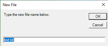
Once the user clicks Enter, the OK button, the Cancel button, or the Close button, a text file will appear in your current working directory, and then, in the terminal/command prompt, the text that the user entered will show up. In this example, we will pretend that the user entered text.txt.
text.txt
Now, let's go over what happens.
The first parameter, like showMessageBox, is the title. This is a string that should appear at the top on the popup window, and also on the taskbar (Windows) when they hover over the window.
After that, the second parameter is the message. This can be a sentence or two, telling the user what the prompt is for.
Finally, the last parameter is optional, and that is the default value. This is the value that should appear by default in the text field. This will be highlighted (like in the picture), so that if the user wants to go with it, they can just press Enter.
You may notice that unlike showMessageBox, not one of showPrompt's parameters has some set values.
And that's how easy it is to display a prompt to your user to get some data from them!
Method: showCredentials
showCredentials(title, message[, username][, targetName])
The method creates a credential popup, which asks the user for their credentials. This includes the title, the message, and a default username and/or target name.
Note: When you run this method, you will notice a PowerShell file appear in your current working directory. This is essential for the credential to display. Also, when the user enters their text, a text file will appear with the text entered. This is for the PowerShell file to communicate with NodeJS.
This method returns a Promise, which contains an object with credential and error information. Note: If the user presses the Cancel button, presses the X (close) button, or an error occured, then the returned value will have username and password be null.
Below is an example of how to use the method.
popup
	.showCredentials(
		"Popup Prompt Login",
		"Please enter your credentials to login to Popup Prompt.",
		"",
		"popup-prompt"
	)
	.then((cred) => {
		console.log(cred);
	})
	.catch((err) => {
		console.log(err);
	});
When you run the code, a PowerShell file will appear in your current working directory, and then, a credential popup, similar to the one below (depending on your OS) will show up.
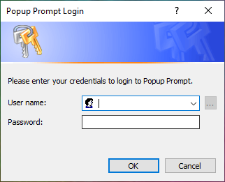
Once the user clicks the OK button, the Cancel button, or the Close button, a text file will appear in your current working directory, and then, in the terminal/command prompt, an object will appear. The data may varie, depending on how the user reacted.
{ username: 'popup-prompt\\popup', password: 'password', error: null }
Now, let's go over what happens.
The first parameter is the title to display on the top of the popup.
The second parameter is the message to display to the user, telling them what the credential prompt is for.
The third parameter is the default username to show in the username field.
The fourth parameter is the name that will show behind the username. This shows the target of the user.
And that's how easy it is to display a credential popup to your user!
Class: Popup
Popup()
This class creates a new Popup instance, which is a fully customizable popup.
Important Note: Popup is still in BETA. If there is a bug (or you would like a new feature), please make a new Issue!
Note: When you add components and run the popup, you will notice a PowerShell file appear in your current working directory. This is essential for the popup to display. Also, when the user enters text/clicks a button, then a text file may appear. This is essential for Powershell to communicate with NodeJS.
It is so easy to create a popup!
const info = new popup.Popup();Note: In this example, we are creating a server reboot information dialog, so that is why the name is info.
Then, you can create the window for all the data. This will include the icon as well.
info.createWindow("Server Reboot", [275, 175], true, "./favicon.ico");Note: The icon is a server-like image.
After that, we can add some components. In this example, we will only add a label and a button.
info.componentLabel(
	"information",
	"The server rebooted at 2:14 PM on 16/10/2021.",
	[10, 20],
	[280, 20]
);
info.componentButton("button", "OK", [85, 75], [75, 25], "OK", true);
Then, finally, we can render the window, and display the popup.
info.renderWindow(true);
info.openPopup((data, err) => {
	if (err) {
		console.log(err);
	} else {
		console.log(data);
	}
});
The total code is below.
const info = new popup.Popup();

info.createWindow("Server Reboot", [275, 175], true, "./favicon.ico");

info.componentLabel(
	"information",
	"The server rebooted at 2:14 PM on 16/10/2021.",
	[10, 20],
	[280, 20]
);
info.componentButton("button", "OK", [85, 75], [75, 25], "OK", true);

info.renderWindow(true);
info.openPopup((data, err) => {
	if (err) {
		console.log(err);
	} else {
		console.log(data);
	}
});
This will open the popup below (depending on your OS).
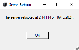
When the user clicks on the button, then, output to the terminal/command prompt is the button the user clicked on (in this case, OK).
OK
There is an even easier way to type the code, which gives us the same result. We can do this by method chaining.
const info = new popup.Popup(); // We are not chaining from here, but you can if you want.

info.createWindow("Server Reboot", [275, 175], true, "./favicon.ico")
	.componentLabel(
		"information",
		"The server rebooted at 2:14 PM on 16/10/2021.",
		[10, 20],
		[280, 20]
	)
	.componentButton("button", "OK", [85, 75], [75, 25], "OK", true)
	.renderWindow(true)
	.openPopup((data, err) => {
		if (err) {
			console.log(err);
		} else {
			console.log(data);
		}
	});
This will give us the same result.
Now, let's see the methods in Popup in more detail.
createWindow
createWindow(title, size[, resizable][, iconPath][, startPos][, name])
This method creates a window, which is where all of the popup components go.
Note: This method does not open the popup/window. To do this, run openPopup.
This method needs a title, which is the main title of the popup.
The next parameter is the size, which is an array of two numbers. These numbers determine the size of the window. So, [300, 200] means that the width is 300, and the height is 200.
After that come the optional parameters. The first optional parameter is for specifing if the window should be resizable.
The next parameter specifies the icon path for the icon on the popup window. This must be an .ico picture extension. If the icon is empty, then the default is a picture will red, blue, and yellow blocks.
The tipical sizes for an icon are 16 × 16, 32 × 32, and 48 × 48 pixels. For great icons, see this website!
After that is the start position. This is the position of the window. This defaults to CenterScreen and can be of the following values.
- CenterParent
- CenterScreen
- Manual*
- WindowsDefaultBounds
- WindowsDefaultLocation
* When Manual is set, there can be some issues.
Finally, the last parameter is the name of the window. It is not recommended to change this value, since if you do change it, then you will have to pass it in almost every other method. Therefore, it is easier to leave it alone (the default value is window).
componentLabel
componentLabel(name, text, location, size[, windowName])
This method creates a component label in the popup.
Note: This method does not open the popup/window. To do this, run openPopup.
First, this method requires a name, which is like a variable for the label. If you pass in a value that already exists, there can be errors.
The next parameter is the text, which is basically the text to display on the label.
The third parameter is the location. This is an array of two numbers. These numbers determine the location from the top-left corner of the popup text, from the top-left of the popup window. For example, if the numbers are [10, 20], then 10 is the width, and 20 is the height.
The fourth parameter is the size. This is an array of two numbers. These numbers determine the size of the text. For example, if the numbers are [300, 20], then 300 is the width, and 20 is the height.
The final parameter is the name of the window. It is not recommended to change this value, since if you do change it, then you will have to pass it in almost every other method. Therefore, it is easier to leave it alone (the default value is window).
componentButton
componentButton(name, text, location, size, result[, listen][, windowName])
Create a component button in the popup.
Note: This method does not open the popup/window. To do this, run openPopup.
This parameter requires a name as the first parameter, which is the variable for the button. Beware that if you pass a value that exists, there could be errors.
The next parameter is the text to display on the button.
The third parameter is the location. This is an array of two numbers. These numbers determine the location from the top-left corner of the popup text, from the top-left of the popup window. For example, if the numbers are [10, 20], then 10 is the width, and 20 is the height.
The fourth parameter is the size. This is an array of two numbers. These numbers determine the size of the button. For example, if the numbers are [75, 20], then 300 is the width, and 20 is the height.
The fifth parameter is the result, which is the result of the button (if listen is true). This is what is returned if listen is true.
The sixth optional parameter is a listener. This will wait for a click event, and when it occurs, it will return the result value.
The last parameter is the name of the window. It is not recommended to change this value, since if you do change it, then you will have to pass it in almost every other method. Therefore, it is easier to leave it alone (the default value is window).
componentTextBox
componentTextBox(name, location, size[, listen][, windowName])
Create a text box field in which the user can enter text in.
Note: This method does not open the popup/window. To do this, run openPopup.
For the first parameter, like any other component, the text box requires a name, which is its variable name. Beware that if you pass a value that exists, there could be errors.
The second parameter is the location. This is an array of two numbers. These numbers determine the location from the top-left corner of the popup text, from the top-left of the popup window. For example, if the numbers are [10, 20], then 10 is the width, and 20 is the height.
The third parameter is the size. This is an array of two numbers. These numbers determine the size of the text box. For example, if the numbers are [250, 20], then 250 is the width, and 20 is the height.
After that come the optional parameters. The fourth one is a listener. This will wait for a KeyUp event, and when it occurs, it will return the text. Note: This method does not return the text after each KeyUp event. Also, beware that there could be null readings at times.
The last parameter is the name of the window. It is not recommended to change this value, since if you do change it, then you will have to pass it in almost every other method. Therefore, it is easier to leave it alone (the default value is window).
componentImage
componentImage(name, path, location[, windowName])
Create an image to display.
Note: This method does not open the popup/window. To do this, run openPopup.
For the first parameter, like any other component, the image requires a name, which is its variable name. Beware that if you pass a value that exists, there could be errors.
The second parameter is the relative path of the image to display. This supports raster picture file types, so you can use file extensions such as .png and .jpg.
The third parameter is the location. This is an array of two numbers. These numbers determine the location from the top-left corner of the popup text, from the top-left of the popup window. For example, if the numbers are [10, 10], then 10 is the width, and 10 is the height.
The last parameter is the name of the window. It is not recommended to change this value, since if you do change it, then you will have to pass it in almost every other method. Therefore, it is easier to leave it alone (the default value is window).
componentListBox
componentListBox(name, items, location, size, height[, listen][, windowName])
Create a list box, which is a list of items for the user to select from.
Note: This method does not open the popup/window. To do this, run openPopup.
The first parameter is the name, which is the list's variable name. Beware that if you pass a value that exists, there could be errors.
The second parameter is the array of strings, which are the items to display.
The third parameter is the location. This is an array of two numbers. These numbers determine the location from the top-left corner of the popup text, from the top-left of the popup window. For example, if the numbers are [10, 10], then 10 is the width, and 10 is the height.
The fourth parameter is the size. This is an array of two numbers. These numbers determine the size of the list box.
The fifth parameter is the height. This is the displayed height.
The sixth parameter specifies if the end result should be the selected value. Default value is false.
The seventh parameter is the name of the window. It is not recommended to change this value, since if you do change it, then you will have to pass it in almost every other method. Therefore, it is easier to leave it alone (the default value is window).
renderWindow
renderWindow([topmost][, name])
This method creates the code for the window to be properly rendered.
Note: This method does not open the popup/window. To do this, run openPopup.
All of the parameters of this method are optional. Therefore, it is okay to not pass in anything.
The first parameter is if the window should be the topmost. This means that even if the window is out of focus, the popup will still stay on the top (unless the user clicks the minimize button).
The second and last parameter is the name of the window. It is not recommended to change this value, since if you do change it, then you will have to pass it in almost every other method. Therefore, it is easier to leave it alone (the default value is window).
openPopup
openPopup(callback)
This method opens the popup on the users computer.
There is only one required parameter, and that is the callback. It is usually called as below.
popup.openPopup((data, err) => {
	if (err) {
		console.log(err);
	} else {
		// Do whatever you want with the data returned.
		console.log(data);
	}
});
Now, let's look at it in detail.
The first parameter that the callback passes is the data. This is the data from a button or text box (if listen is set to true). If there are no listeners, then the data will be a zero-length string. Otherwise, it will be the button clicked, or the text in the text box entered, depending on what has been listened.
The second parameter that the callback passes is the error. This is a string telling the user that an error occured.
In v1.1.0, descriptive errors were introduced.
Once both of the parameters are there, then, in the callback body, you should add an if/else statement, and check if there is an error. The reason is because if there is an error, it will have a value, otherwise, it will have a value of null. The same applies for the data. In the else clause, you can do whatever you wish with the data.
Real Examples
You may be wondering what popup-prompt can be used for in real life. Well, for testing purposes, we have created a few real-life examples for you to try!
File Setup Wizard
This is a simple program which uses all of the methods issued in v1.1.0. It also uses showMessageBox with the Popup class!
See the code below, and then see the result!
const fs = require("fs");
const files = new popup.Popup();
files
.createWindow("File Setup Wizard", [500, 255], false, "./favicon.ico")
.componentImage("pic", "./File-Setup.png", [0, 0])
.componentLabel("title", "Welcome to the File Setup Wizard!", [125, 25], [200, 20])
.componentLabel(
"info",
"To make a new file, type in the file contents, and we will make it!",
[125, 75],
[325, 20]
)
.componentTextBox("content", [125, 100], [325, 20], true)
.componentButton("submit", "Create", [125, 150], [75, 25], "OK")
.renderWindow(true)
.openPopup((data, err) => {
if (err) {
console.log(err);
popup.showMessageBox(
`File Setup Wizard - Error Creating File`,
`An error occured while creating the file. ERR_PROGRAM_ERROR`,
"OK",
"Error"
);
} else if (data) {
try {
fs.writeFileSync("text.txt", data);
} catch (err) {
console.log(err);
popup.showMessageBox(
`File Setup Wizard - Error Creating File`,
`An error occured while creating the file. ERR_CREATION_ERROR`,
"OK",
"Error"
);
}
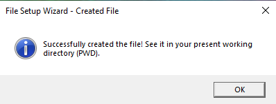
popup.showMessageBox(
`File Setup Wizard - Created File`,
`Successfully created the file! See it in your present working directory (PWD).`,
"OK",
"Information"
);
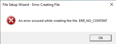
} else {
popup.showMessageBox(
`File Setup Wizard - Error Creating File`,
`An error occured while creating the file. ERR_NO_CONTENT`,
"OK",
"Error"
);
}
});Now, after a bunch of code, let's see the result!
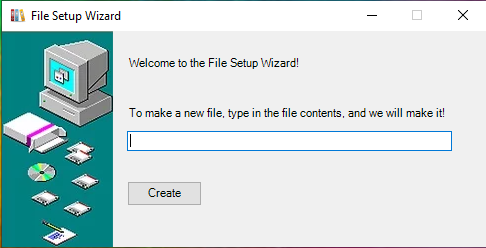
If we pass in file contents, we should see a success message, and a new file in the PWD (present working directory).
If we don't pass in any file contents (or another error occured), we should see an error message.
So, even though it's a bit of code, the end result is amazing!
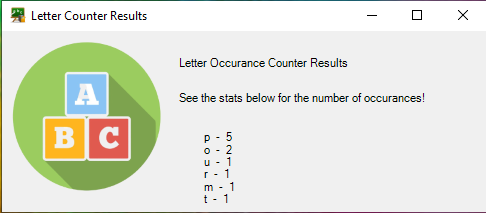
Letter Counter
This quick demo shows how a text box is used to get input from a user, count the number of letters, and display another box with the results.
new popup.Popup()
	.createWindow("Letter Counter", [500, 220], false, "./favicon.ico")
	.componentImage("pic", "./Letters.png", [10, 10])
	.componentLabel("title", "Letter Occurance Counter", [175, 25], [200, 20])
	.componentLabel(
		"info",
		"This counter will automatically count the number of letters in the sentence you pass!",
		[175, 60],
		[300, 30]
	)
	.componentTextBox("content", [175, 100], [300, 20], true)
	.componentButton("submit", "Count!", [175, 135], [75, 25], "OK")
	.renderWindow(true)
	.openPopup((data, err) => {
		if (err) {
			console.log(err);
		} else {
			const letters = [...data];
			const occurances = {};

			letters.forEach((letter) => {
				letter = letter
					.replace(/[!"#$%&'()*+,-.\\/:;<=>?@[\]^_`{|}~]/g, "")
					.trim()
					.toLowerCase();

				occurances[letter] ? (occurances[letter] += 1) : (occurances[letter] = 1);
			});

			Object.keys(occurances).forEach((key) => {
				if (key === "") {
					delete occurances[key];
				}
			});

			let formatted = "";
			for (const key in occurances) {
				formatted += `${key}  -  ${occurances[key]}\n`;
			}

			new popup.Popup()
				.createWindow("Letter Counter Results", [500, 220], true, "./favicon.ico")
				.componentImage("pic", "./Letters.png", [10, 10])
				.componentLabel("title", "Letter Occurance Counter Results", [175, 25], [200, 20])
				.componentLabel(
					"info",
					"See the stats below for the number of occurances!",
					[175, 60],
					[300, 30]
				)
				.componentLabel("stats", formatted, [200, 100], [300, 100])
				.renderWindow(true)
				.openPopup((data, err) => {
					if (err) {
						console.log(err);
					}
				});
		}
	});
That's a lot of code! But, it still works...
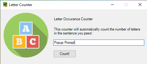
If we pass in Popup Prompt, it will show the number of characters (excluding symbols and spaces) below.
And that's how simple it is to make a should-be-complex-program with popup-prompt!
More Coming Soon!
Even though we are thinking hard for ideas, we would love it if you would make a new Issue for a feature request!
Bugs?
We know that no one likes bugs in their code, so if you find a bug, please make a new Issue, and describe the bug.
On Another Platform (other than Windows)?
If you are on another OS (other than Windows), it would be highly appreciated if you could send screenshots of how your popups/prompts look like. Also, if there are any bugs on other operating systems, then maybe you can help as a contributer!
Maintainers
arnavthorat78 - Master Arnav Thorat (Author)
License (MIT)
MIT License

Copyright (c) 2021 arnavthorat78

Permission is hereby granted, free of charge, to any person obtaining a copy
of this software and associated documentation files (the "Software"), to deal
in the Software without restriction, including without limitation the rights
to use, copy, modify, merge, publish, distribute, sublicense, and/or sell
copies of the Software, and to permit persons to whom the Software is
furnished to do so, subject to the following conditions:

The above copyright notice and this permission notice shall be included in all
copies or substantial portions of the Software.

THE SOFTWARE IS PROVIDED "AS IS", WITHOUT WARRANTY OF ANY KIND, EXPRESS OR
IMPLIED, INCLUDING BUT NOT LIMITED TO THE WARRANTIES OF MERCHANTABILITY,
FITNESS FOR A PARTICULAR PURPOSE AND NONINFRINGEMENT. IN NO EVENT SHALL THE
AUTHORS OR COPYRIGHT HOLDERS BE LIABLE FOR ANY CLAIM, DAMAGES OR OTHER
LIABILITY, WHETHER IN AN ACTION OF CONTRACT, TORT OR OTHERWISE, ARISING FROM,
OUT OF OR IN CONNECTION WITH THE SOFTWARE OR THE USE OR OTHER DEALINGS IN THE
SOFTWARE.