ph-calendar
calendar component for phoenix-ui
Install
$ npm install ph-calendar --save Usage
{ superprops context thisstate = values: 2017 1 24 2017 2 10 disabled:2017 2 14 2017 2 17// start end 包括 weekStart: 1 monthCount: 5 range: true monthStart: 'top' //['top', 'center', 'bottom'] //weekLabel: ['Sun', 'Mon', 'Tue', 'Wed', 'Thu', 'Fri', 'Sat'], events: date: 2017 1 10 name: '家立减' date: 2017 1 22 name: '团购' date: 2017 2 10 name: '劳动节' date: 2017 2 15 name: '哈哈哈' } { console } { const values disabled weekStart events weekLabel range monthCount = thisstate return <div className="rcs-demo"> <PhCalendar values=values dateChose=thischooseCallback disabled=disabled events=events monthCount=monthCount weekStart=weekStart weekLabel=weekLabel range=range monthStart=monthStart/> </div> }Options
支持的属性配置:
values: 日期对象数组,设置日历的选中日期,默认为空数组。 eg: 时间范围:[new Date(2017, 1, 24), new Date(2017, 2, 10)]disabled:日期对象数组,设置禁用的日期,默认为空数组。 如果设置的值恰好为 2 个,则表示禁用的是一段日期。传如一个或者三个以上,则表示为单个日期禁用dateChose:日期选择回调函数,默认为空函数。单个日期模式下,选中一个日期则处罚;日期范围模式下,选中两个日期才触发range:布尔值,设置日历选择日期的模式,默认为true。true表示范围选择,false表示单选monthCount:正整数,设置单页日历的个数,默认为 6。最小值为 3,最大值为 12weekStart:非负整数,设置一周的开始时间,默认为 1。取值范围是new Date().getDay()值的集合,即为 0、 1、 2、 3、 4、 5、 6,分别表示周日、周一、周二、周三、周四、周五、周六weekLabel:字符串数组,设置周的显示格式,默认为 ['日', '一', '二', '三', '四', '五', '六']format:字符串,设置日期的显示格式,默认为yyyy-MM-ddevents:对象数组,设置日历事件显示,默认为空数组。对象的格式为{'date': [Date Object], 'name': [String Object]},eg:[{'date': new Date(2016, 4, 1), 'name': '劳动节'}]monthStart:字符串,设置日历的默认显示方式,默认为top。可选值为['top', 'center', 'bottom'],top表示日历按照选中日期递增方式显示,top表示日历按照选中日期两端延伸方式显示,bottom表示日历按照选中日期递减方式显示,
Example
效果图如下:
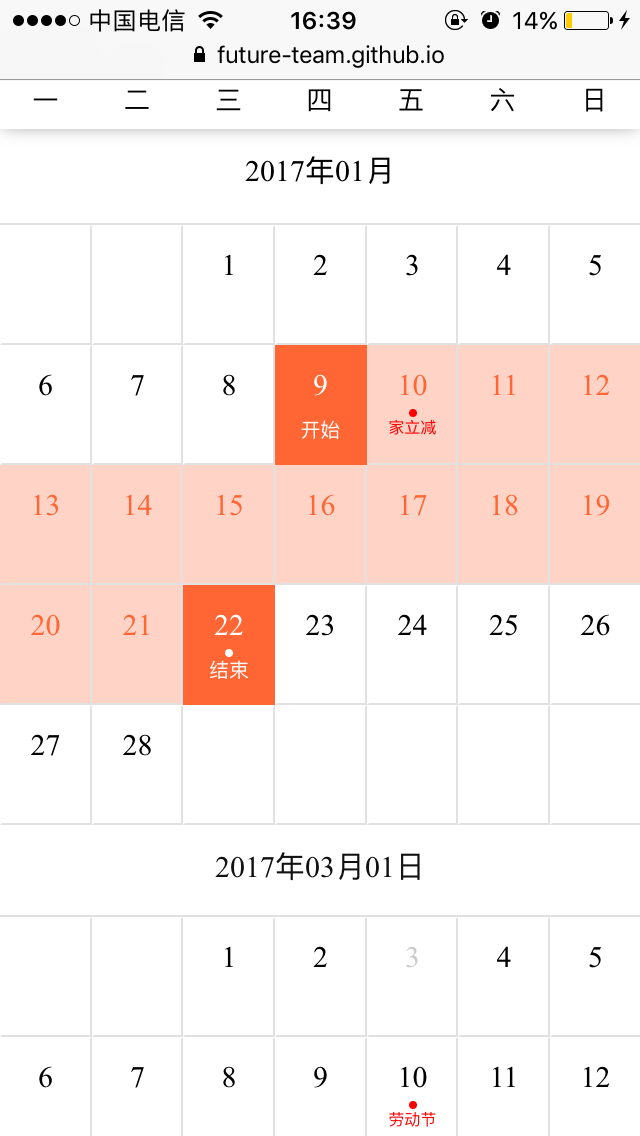
在线效果请看 ph-calendar
详细请参见examples 目录下 demo,更改对应参数查看效果,具体步骤参见下面 Command
Command
# clone 代码仓库 $ git clone https://github.com/future-team/ph-calendar.git && cd ph-calendar# 安装依赖 $ npm install # 查看demo $ npm run demo Repair
- 0.1.0 第一版本发布