An Introduction to Portable Component Oriented Styles (PCOS) with Sass
Portable Component Oriented Styles (PCOS) is a methodology to structure Sass stylesheets for large-scale projects. The primary goals of PCOS are keeping your stylesheets vital and maintainable during the complete lifetime of an application as well as creating components that are truly reusable across different projects by abstraction layers without messing around with variables.
Important to say that PCOS is not re-inventing the wheel at all, it combines concepts from ITCSS (Inverted Triangle CSS) by Harry Roberts, Naming conventions from the BEM methodology (Block-Element-Modifier) and Atomic Design introduced by Brad Frost.
Terminology
Component
A component is a unit representing an encapsulated part of the User Interface independent from its hierarchy or dependencies.
Utility Class
Example of a utility class is .text-right / .clearfix / .font-large. They are composable with a single, very specific job. Also known as helper class
Selector Convention
In this part, we briefly touch the recommended naming conventions and selector types.
TL;DR;
- All selectors are hyphenated-lower-case
- Components and utilities are prefixed by
crespectivelyu- Mostly following BEM but prefixed and possibly namespaced
- Modifiers may be nested while elements must not be nested for readability
c-button/c-button--inverted/c-button__icon/c-button__icon--rotatedrespectively with a namespacec-nsp-button.
Prefixes
A selector starts with its type prefix and optionally project or dependency namespace separated with one hyphen (-).
Type prefixes are:
cindicates this is a component.uindicates that this is a utility class.
As typical in CSS, all selectors are written in hyphenated lower-case.
Why prefixes?
In some circumstances, a prefix like c looks obsolete since almost everything is a component. At a particular time, especially when you need to integrate external fragments, the prefix/namespace distinguish clearly where your element belongs to and who is responsible for.
When namespaces?
Namespaces make all your components portable to another project without thinking of naming-collisions. If you consider using this component across projects, we highly recommend you to use prefixes separate.
BEM
A button-component we call c-button or c-xyz-button while xyz represents the namespace of the project. Or we can guess what a u-text-right does.
Attached to this root class name, we can optionally add a modifier that follows the BEM rules with a double-hyphen separation like - c-button--inverted.
An example of a component with a nested modifier:
.c-button If the component holds a child that is idiomatically related to the parent component - an element according to BEM - we separate it with a double-underscore like c-button__icon. Elements must not be nested for the reason of readability.
An element may have a modifier attached.
.c-button .c-button__icon For clarity, you should not go deeper than one level of elements. Avoid .c-button__icon__legend. In most cases, you come to this point, think of creating a new component for the icon in this example to keep the principle of separation of concerns intact.
Everything is a Component.
TL;DR;
- Everything is a component, not like Atomic Design which knows separation of atoms, molecules, templates, and pages
- That way it's easy to share components across projects and community-driven packages
Compared to Atomic Design (http://bradfrost.com/blog/post/atomic-web-design/), PCOS does not distinguish between levels like atoms, molecules, organisms, templates, and pages. Instead, everything is a component even if there are other components nested.
Why no level separation as Atomic Design uses? When we practiced Atomic Design extensively in the past, there were always discussions about their belongings and when it was reasonable to strictly separate atoms from molecules and when organisms start becoming templates. As a conclusion without any downsides yet switching to the "everything is a component"-mindset we gained a lot of traction.
You might be able to deal with the separation within your team. But what happens if you want to use shared components from the community.
Explicit Variables Assignment
TL;DR;
- We think you should take the time to read this chapter to understand it
One of the most significant bottlenecks or even killer of components sharing across projects is improper usage of variables. To make it impossible or very hard or very dirty to exchange and maintain components across projects is the very common implicit variables binding or a little bit better, explicit importing of variables within a component definition.
In many cases, a project holds its project variables and the created components are using them. Let's illustrate that situation below.
For the sake of simplicity we use a narrow set of variables to illustrate. We know real projects face a more complicated situation. We tackle this situation later.
A simple variables.scss file containing some color variables.
// variables.scss ;;;;Our classical button component looks like this:
// c-button.scss .c-button The bundled styles.scss then includes both of them.
;;In the template, we use those buttons:
A boring button A shiny button We all can imagine the output above. It's not a problem so far since the project is tiny and we think in such a small case PCOS is an overkill. But now, let's integrate a shiny CSS framework holding their variables we have to override, things become harder to maintain.
// styles.scss ;;;;;The snippet above illustrates when the dilemma starts. And our c-button component has access to all of the variables from the framework as well. We face a complex implicit variables binding situation.
And to make it short - loading the variables in the components does not solve the problem. It just improves it a bit.
Separation of definition and implementation of a component in PCOS
When we continue trying to work around with the variables import, we will always fail in a certain way, because the problem lays in how the variables get accessed and bound in the component.
In the button example above we see, that independent of how we import it. The component expects to have access to $color-brand, $color-light and $color-accent. We can define those variables with !default. However, this prevents you from seeing an error, not from the cause of the issue.
Instead, we separate the implementation (usage/binding) from the definition of the component. For that reason, we create a mixin of that component with all variables the component needs.
Let's refactor the famous c-button.scss.
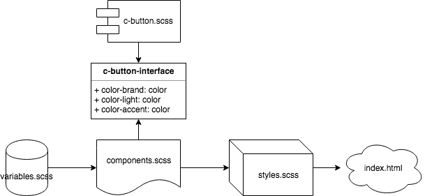
// c-button.scss And we can create another file called components.scss where we implement our components:
; // importing the variables here is not a bad thing, it's not affecting the definition of the component ; The styles.scss only need to import the components.scss.
Let's illustrate what we have created so far:
So far we did not create a real game changer since we can only create one button component and the next would override this one. What if we want to namespace our button?
Let's accept a $selector parameter and set a default to c-button.
// c-button.scss Now we can not just create a winter and summer edition of our button we furthermore have a component we can substitute with any another button component that accepts the same interface and returns the same elements and modifiers.
Comments
With PCOS we encourage you to create machine and human readable comments on top of each component.
Since comments in CSS can look pretty fancy and chaotic, we recommend writing DocBlock-Comments similar to JSDoc (http://usejsdoc.org/) or PHP DocBlock (http://docs.phpdoc.org/guides/docblocks.html).
When we decorate the c-button.scss component:
/** * Button component * * @type component * * @param {string} [$component-selector=.c-button] - selector of the component * @param {color} $color-brand - background color * @param {color} $color-light - text color * @param {color} $color-accent - background color for highlight * * @modifier highlight - a highlighted version of the button */ At the time of writing the implementation of such comments looks like nonsense. But imagine the tooling improve and we could link it with a template file that is automatically populated by examples in its block comment and automatically create a component library. Or let's declare an interface like @implements and we get warnings and type hints automatically.
Objects
As we can see in the button component, the colors definition still looks very much driven by the implementation and the variables we have defined there.
PCOS has Objects in place to fix them. We could describe them as buckets that hold variables in a structured way.
Let's create a color-scheme.object.scss:
/** * color-scheme * * @type object * * @param {color} $primary * @param {color} $secondary * @param {color} $accent * @param {color} $shadow * @param {color} $shadow-primary * @param {color} $shadow-secondary * @param {color} $shadow-accent * @param {color} $text * @param {color} $text-on-primary * @param {color} $text-on-secondary * @param {color} $text-on-accent * * @returns {map} */Ok! This one was big. Let's convert the colors we have in our variables.scss:
// variables.scss ; ;;;; // important, use the named parameters to leave out optional parameters ;Improve out c-button.scss to accept a color-scheme-object instead of separate color variables:
// Import color-scheme object for the reference in the comment ; /** * Button component * * @type component * * @param {string} [$component-selector=.c-button] - selector of the component * @param {color-scheme} $color-scheme * * @modifier highlight - a highlighted version of the button */ Now we have to rewrite our components.scss:
// components.scss ;; From now on we can use our objects to follow the DRY principle.
Interfaces
Interfaces are the critical factor to ensure integrity and substitution as known from the SOLID principles.
Please note that the current state of PCOS implementing interfaces is nothing else than a comment defining accepted parameters and sets its output. It's like a contract and documentation.
Let's create two interfaces, one for the button component and another one for the color scheme object.
; /** * Button interface * * @name button-interface * * @type interface * * @param {string} $component-selector * @param {color-scheme-interface} $color-scheme * * @modifier highlight - a highlighted version of the button *//** * color-scheme interface * * @name color-scheme-interface * * @type interface * * @prop {color} primary * @prop {color} primary * @prop {color} secondary * @prop {color} accent * @prop {color} shadow * @prop {color} shadow-primary * @prop {color} shadow-secondary * @prop {color} text * @prop {color} text-on-primary * @prop {color} text-on-secondary * @prop {color} text-on-accent * * @returns {map.<props>} */Now we can reference those interfaces to the color scheme object and button component.
;; /** * Button component * * @type component * * @implements button-interface * * @param {string} [$component-selector=.c-button] - selector of the component * @param {color-scheme-interface} $color-scheme * * @modifier highlight - a highlighted version of the button */ And adding the @implements annotation to color-scheme.object.scss:
; /** * color-scheme * * @type object * * @implements color-scheme-interface * * @param {color} $primary * @param {color} $secondary * @param {color} $accent * @param {color} $shadow * @param {color} $shadow-primary * @param {color} $shadow-secondary * @param {color} $shadow-accent * @param {color} $text * @param {color} $text-on-primary * @param {color} $text-on-secondary * @param {color} $text-on-accent * * @returns {map} */Now you can substitute the color-scheme-object or the button component with any other implementation that accepts the same interface.
Conclusion
Thanks for reading the introduction about PCOS - Portable Components Oriented Styles with Sass.
We are entirely at the beginning of the journey. Nevertheless, I think PCOS will bring up more and more professionalism and improves the collaboration within teams and within the community of component creators.
There are downsides at the moment working with PCOS:
- Tooling is not yet ready at all
- Publicly available examples in the wild are rare
- The PCOS is at an incomplete draft state
Hope you enjoyed. Happy to hear your questions and thoughts about PCOS.