TABLE OF CONTENT
- 01 INTRODUCTION
- 02 GETTING STARTED
- 03 NAMING CONVENTION - BEM
- 04 TECHNOLOGIES
- 05 GRID SYSTEM
- 06 FLEXBOX
- 07 FORMS
- 08 TYPOGRAPHY
- 09 BUTTONS
- 10 ALERTS
- 11 LOGOS
- 12 ICONS
- 13 LISTS
- 14 HELPER CLASSES
- 15 BROWSER SUPPORT
- 16 BEST PRACTICES IN CSS
01 INTRODUCTION
Parasail is a minimalistic CSS framework from Parasail Health using SASS and Flexbox. It's main feature is a Flexbox based grid system which lets you create responsive layouts easily.
02 GETTING STARTED
INSTALL WITH NPM
Install Parasail using npm:
$ npm install parasail
USAGE
You can include the file parasail.min.css in your header:
Or you can import the parasail.scss file in your own scss file if you want to use our variables:
CREATE YOUR OWN THEME
We included a file called _variables.scss in the scss folder which by default loads our Parasail styles. By editing this file you can create your own theme in just a few minutes.
03 NAMING CONVENTION - BEM
BEM stands for Block, Element, Modifier, it is a naming convention for classes in HTML and CSS which assists you to write modular CSS. The goal of BEM is, to help developers better understand the relationship between HTML and CSS by quickly giving them an idea of which element depends on another.
BEM is successful not because it gives you a lot of options but because it limits what you are allowed to do. The problem it's trying to avoid is getting your rules to match the elements you want, without them accidentally matching the elements you don’t want to affect.
Block is a top-level abstraction of a new component.
BlockElement depends upon the block.
Element Modifier changes the style of the block.
ModifierIf you want to read more about BEM, check out the Get BEM introduction.
04 TECHNOLOGIES
SASS
Sass is the most popular CSS pre-processor on the market today. It is a lightweight tool that lets us write fast, reusable CSS by offering key features such as nested selectors, mixins, conditional statements, and variable declarations.
FLEXBOX
Flexbox is a new layout technique that was introduced in CSS3. One of the most difficult concepts for new CSS users to grasp is how to properly align, scale, and position elements across different screen sizes. With Flexbox, we can address this problem with 1-2 lines of code.
05 GRID SYSTEM
GRID
The grid system is based on Flexbox, .grid defines a flex container by setting display to flex. It enables a flex context for all its direct children, which are called flex items.
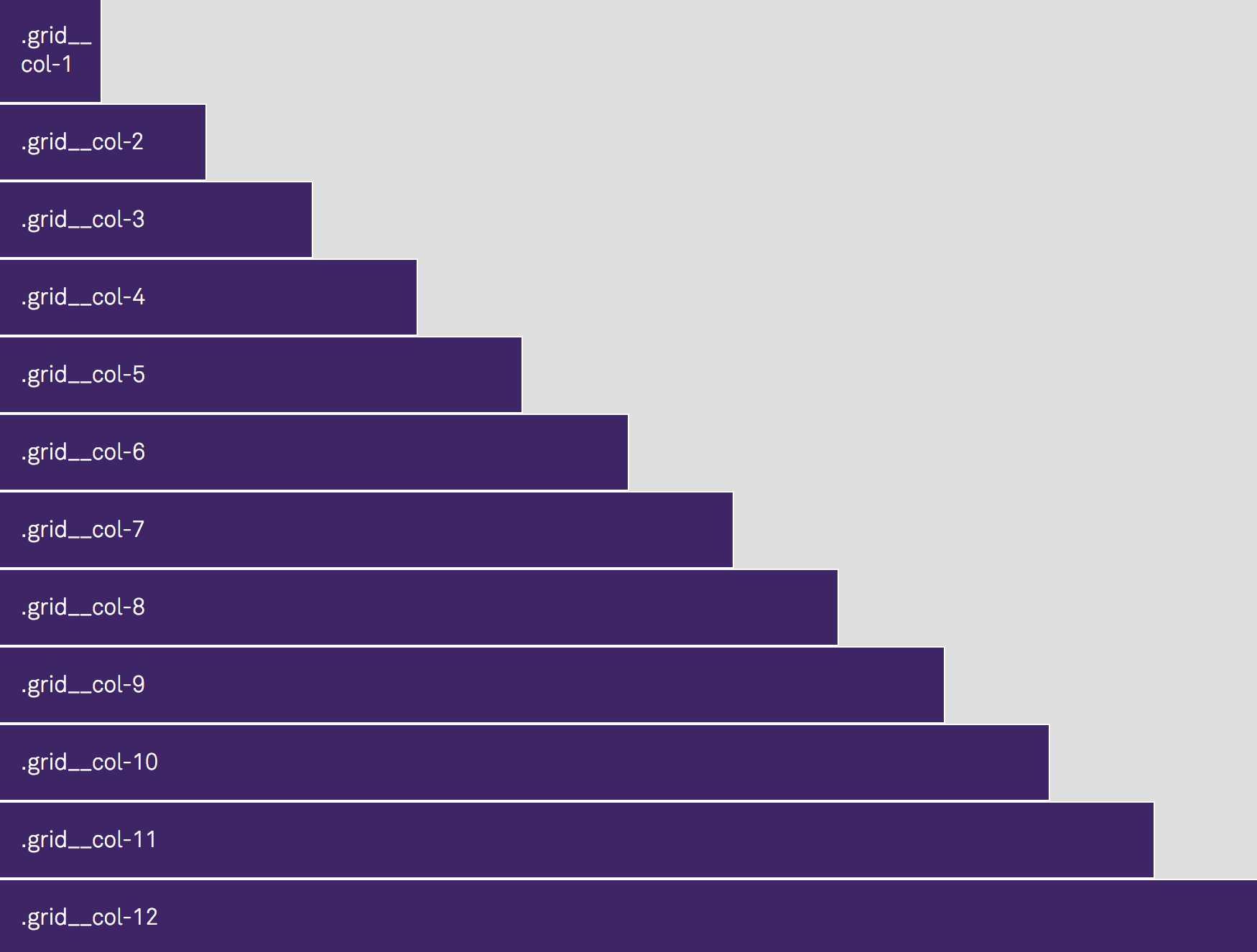
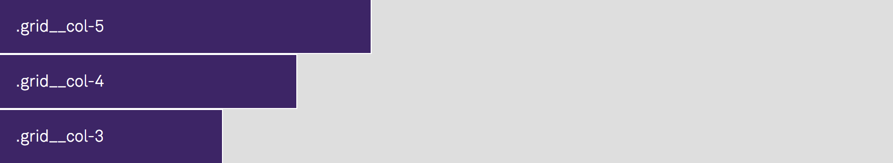
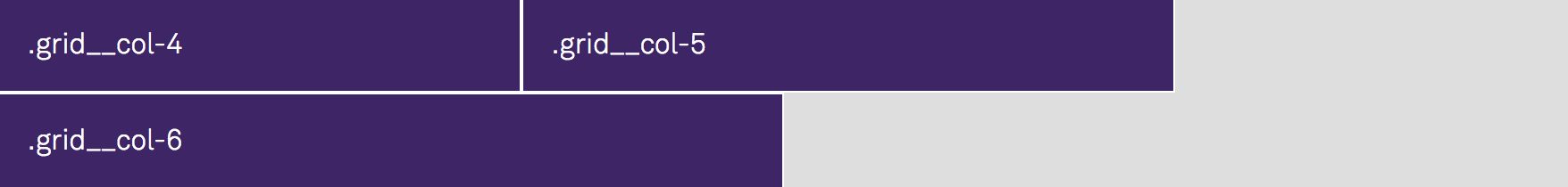
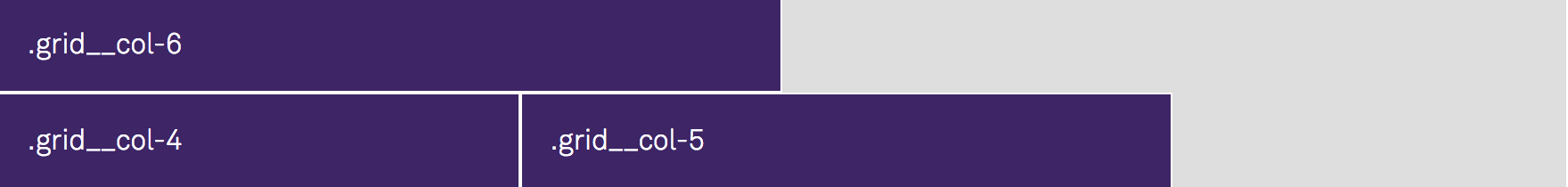
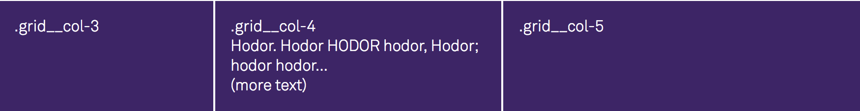
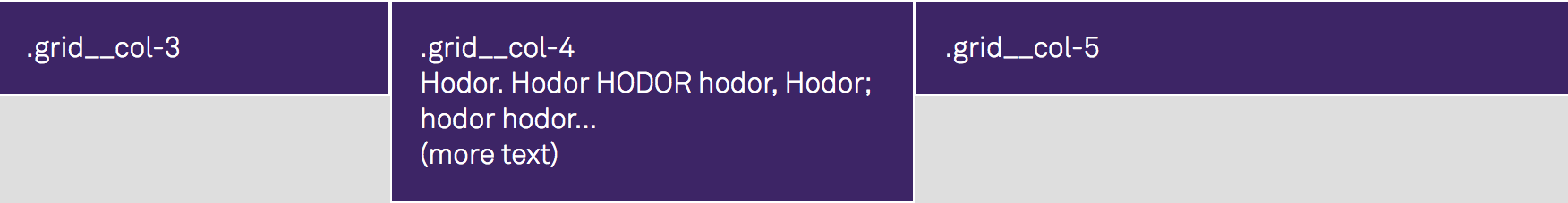
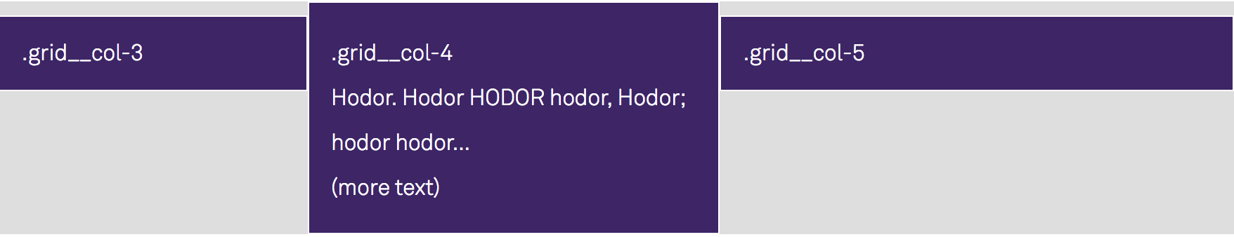
GRID COLUMNS
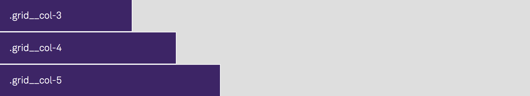
.grid_col-x
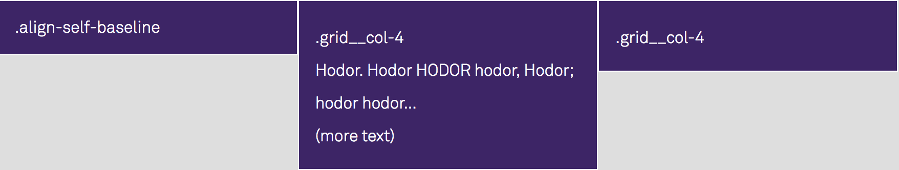
Different column sizes can be defined by using .grid__col-1 to .grid__col-12, with .grid__col-1 being the smallest column size and .grid__col-12 taking up 100% of its parent container.
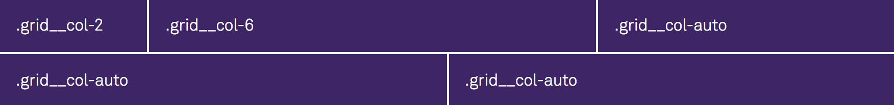
.grid_col-auto
.grid__col-auto creates a column that will take up however much space is left in the row. If the row has multiple .grid__col-auto columns, the space gets divided up evenly between the columns.
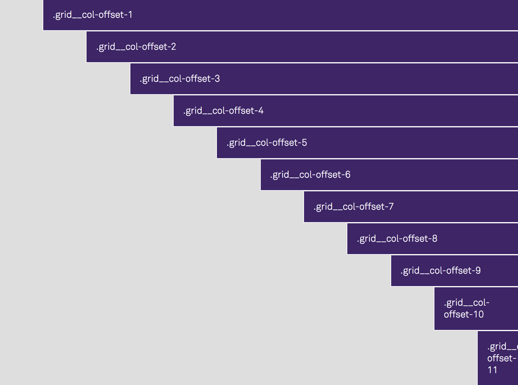
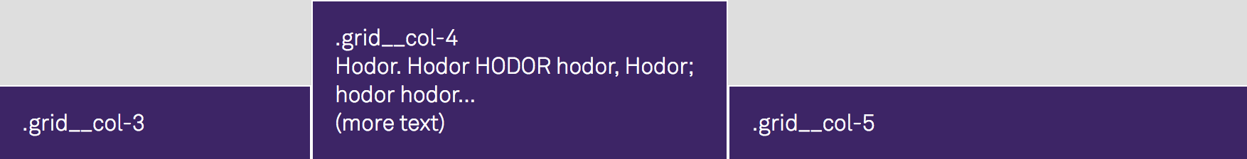
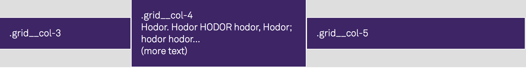
GRID COLUMN OFFSET
.grid_col-offset-x
Offset a column by adding an offset class: .grid_col-offset-x.
RESPONSIVE LAYOUTS
The grid system lets you create responsive layouts easily by giving you the option to define different column widths for each viewport. The viewports are determined by 4 different breakpoints:
Large: Viewport ≥ 1200px
- Column classes:
.grid__col-lg-1to.grid__col-lg-12 - Column Offset classes:
.grid__col-offset-lg-1to.grid__col-offset-lg-12
Medium: Viewport ≥ 992px
- Column classes:
.grid__col-md-1to.grid__col-md-12 - Column Offset classes:
.grid__col-offset-md-1to.grid__col-offset-md-12
Small: Viewport ≥ 768px
- Column classes:
.grid__col-sm-1to.grid__col-sm-12 - Column Offset classes:
.grid__col-offset-sm-1to.grid__col-offset-sm-12
Extra Small: Viewport ≤ 767px
- Column classes:
.grid__col-xs-1to.grid__col-xs-12 - Column Offset classes:
.grid__col-offset-xs-1to.grid__col-offset-xs-12
Using elements with the class .grid__col-lg-x defines column widths for the large viewport (min-width: 1200px) and .grid__col-offset-lg-x will offset those columns. .grid-col-md-x and .grid-col-offset-md-x will affect viewports with a min-width of 992px. Elements with the class .grid__col-sm-x or .grid__col-offset-sm-x will affect the small viewport (min-width: 768px) and .grid__col-xs-x defines columns width for the extra small viewport (max-width: 767px) which can be offset with .grid__col-xs-x.
06 FLEXBOX
FLEX DIRECTION
Flex Direction defines the direction in which the flex items are placed in the flex container. It is influenced by the text direction property.
.direction-row
This is the default value, the direction will be the same as the text direction.

.direction-row-reverse
Setting the flex direction to row-reverse will switch the text direction to the opposite.

.direction-column
Direction-column behaves the same way as direction-row but it influences the vertical direction, so top to bottom.
.direction-column-reverse
Direction-column-reverse behaves the same way as row-reverse but it influences the vertical direction, so top to bottom.
FLEX WRAP
Flex-wrap defines whether the flex items are forced in a single line or can be flowed into multiple lines if there isn't enough room for them on one flex line.
.nowrap
Default value, the flex items will not wrap.

.wrap
The flex items will wrap if necessary.
.wrap-reverse
The flex items will wrap if necessary but in reverse order.
JUSTIFY CONTENT
Justify-content defines how flex items are aligned along the main-axis (that means by default horizontally, left to right). It helps distribute extra space between the items when they don't use all available space on the main-axis.
.justify-start
Default value, the items are positioned at the beginning of the container.

.justify-end
The items are positioned at the end of the container.

.justify-center
Justify-center will position the items at the center of the container.

.justify-space-between
Items are evenly spread horizontally, the first item is at the beginning of the container, the last item on the end of the container. The space gets distributed between the items.

.justify-space-around
The items are positioned with equal space before, between and after them.

ALIGN ITEMS
This part is one of the best features of Flexbox because before Flexbox it was very painful to properly center elements vertically.
Align-items defines how flex items are aligned along the cross-axis (which is by default vertically, top to bottom) when they don't take up all of the available space in the container. It is the justify-content version for the cross-axis.
.align-stretch
Default value, it stretches the height of the flex item to fit the container (still respects min-width/max-width).
.align-start
Flex items are positioned at the top of the container.
.align-end
Flex items are positioned at the bottom of the container.
.align-center
Flex items are positioned at the vertical center of the container (centered in the cross-axis).
.align-baseline
Flex items are positioned at the baseline of the container.
ALIGN SELF
Align Self accepts the same 5 values as align items, with the difference that you apply it to individual flex items in order to overwrite align items.
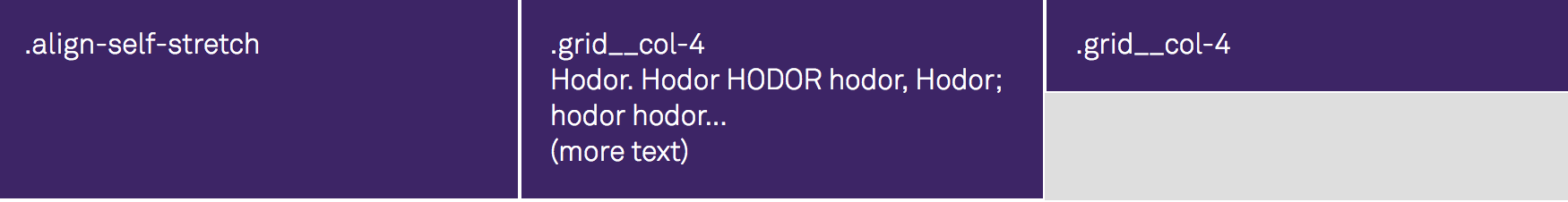
.align-self-stretch
Default value, it stretches the height of the flex item to fit the container (still respects min-width/max-width).
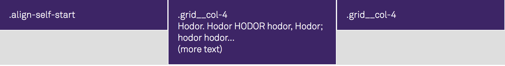
.align-self-start
Flex item gets positioned at the top of the container.
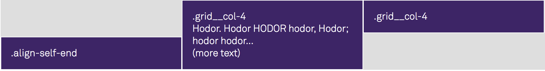
.align-self-end
Flex item gets positioned at the bottom of the container.
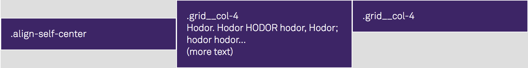
.align-self-center
Flex item gets positioned at the vertical center of the container (centered in the cross-axis).
.align-self-baseline
Flex item gets positioned at the baseline of the container.
07 FORMS
We added basic styles for form elements, all values for form variables can be changed in the file _variables.scss.
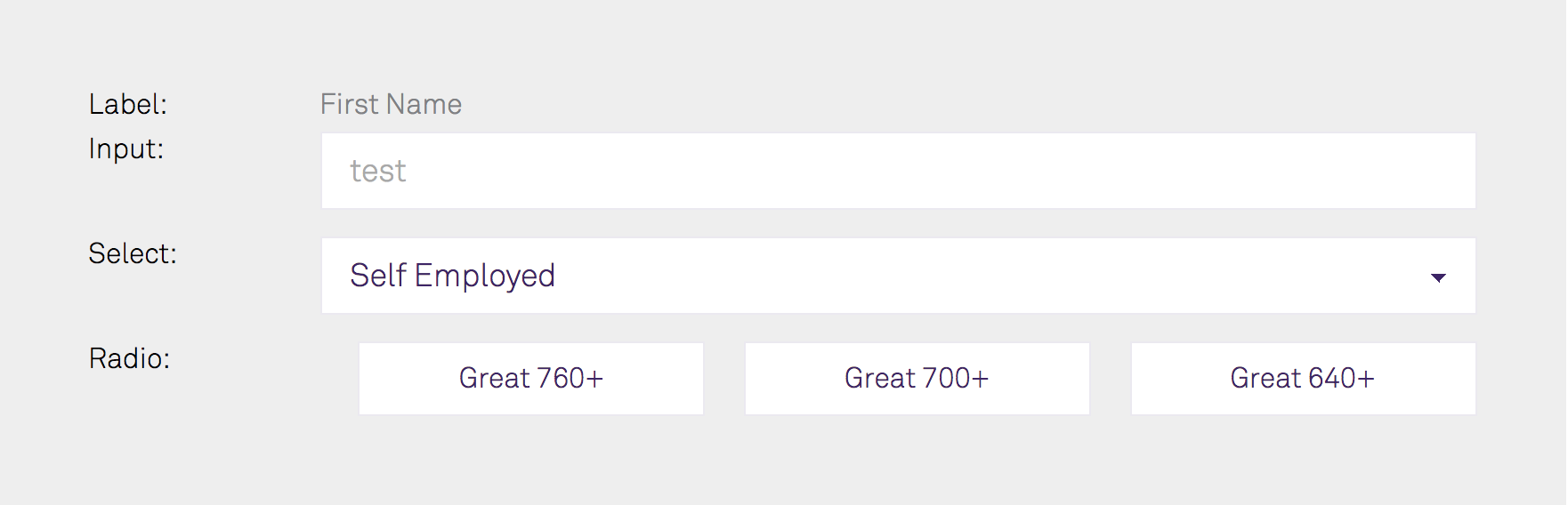
LABEL
.form__label gives you the option to change the font-size as well as the color.
INPUT + SELECT
.form__input lets you change the font-size, text, placeholder, background and border color.
RADIO BUTTONS
Input fields with type="radio" don't allow you to set a placeholder. To add a placeholder to a radio button, you need to add a label and make the label the actual placeholder. In order to still make it look like a button, wrap the label as well as the input in a div with the class="form__radio-btn".
Great 760+ EXAMPLE
08 TYPOGRAPHY
.text--left
Aligns the text on the left.

.text--center
Aligns the text in the center.

.text--right
Aligns the text on the right.

.text--uppercase
Transforms all characters to uppercase.

.text--lowercase
Transforms all characters to lowercase.

.text--capitalize
Transforms the first character of each word to uppercase.

09 BUTTONS
The theme currently includes 4 different button styles, you can update the colors as well as the font-size in the _variables.scss file.
.btn--default

.btn--primary

.btn--secondary

.btn--error

EXAMPLE
Default10 ALERTS
Use one of these 4 alert classes if you need to display a notification message to the user.
.alert--success

.alert--info

.alert--warning

.alert--error

EXAMPLE
This is a success message11 LOGOS
By default the theme is loading the Parasail logo and gives you the option to use it in 3 different sizes. Simply go into the _variables.scss file and change the $logo variable to load your own logo. If you want to change the width and height ratio, you can do this by changing the values in the _logos.scss file.
.logo
.logo--md
.logo--xs
12 ICONS
These are some icons we currently use, you can update the colors as well as the font-sizes in the _variables.scss file.
.icon__arrow
.icon__close
.icon__question-mark
13 LISTS
.ordered-list
The list items are marked with numbers.
- Ordered List Item 1
- Ordered List Item 2
- Ordered List Item 3
.unordered-list
The list items are marked with bullets.
- Unordered List Item 1
- Unordered List Item 2
- Unordered List Item 3
14 HELPER CLASSES
ALIGNMENT
.align--left
Aligns block elements to the left.

.align--center
Centeres block elements.

.align--right
Aligns block elements to the right.

15 BROWSER SUPPORT
The Parasail framework uses Flexbox, the included grid system, for example, is based entirely on Flexbox. Flexbox is supported by all major browsers, as well as IE10 and higher, with the exception of Opera mini.
Every project targets a different audience. Therefore, browser support is something that needs to be decided on an individual basis. Parasail focuses on providing a lightweight CSS framework that can be used for any project, for the simple reason that we do not wish to decide between which browsers to support.
For supporting older browsers for your project, we recommend using Autoprefixer. Autoprefixer is an amazing tool that lets you specify which browser version you want to support, and automatically prefixes your CSS with the correct vendor prefixes.
If you are looking to support IE9 and lower, you will need to add a polyfill such as Flexibility.
16 BEST PRACTICES IN CSS
FORMATTING
- Don't nest further than 3 levels deep
- Use 2 spaces for indentation
- When using multiple selectors in a rule declaration, give each selector it's own line
- Put a space before the opening brace { in rule declarations
- In properties, put a space after, but not before, the : character.
- Put closing braces } of rule declarations on a new line
IDS
- Avoid using IDs unless that element is suppose to be a Javascript identifier.
- They are not reusable and introduce unnecessarily specificity to your rule declaration.
COMMENTS
- Put comment on its own line
- Avoid using end-of-line comments
- Write comments for code that isn't self-documenting (for example Browser hacks)
- When writing comments in SASS, keep in mind that comments using the double slash (
// Double slash comment) will not be compiled to regular CSS while comments using the slash + asterix (/* Comment using slash + asterix */) will be compiled.
EXAMPLE
.grid,
.grid__col-auto {
    // display: inline-block added for IE support
    display: inline-block;
}
LICENSE
Licensed under the MIT License.