openui5-flatpickr
openui5-flatpickr is a SAPUI5 Custom Control that wraps flatpickr Date Picker
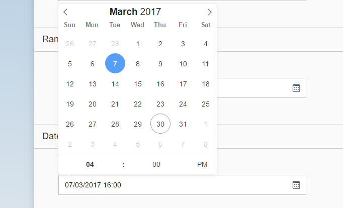
Demo
You can checkout a demo with different configurations here: https://stermi.github.io/openui5-flatpickr/test/demo/
Usage
Configure manifest.json
Add the library to sap.ui5 dependencies list and configure the resourceRoots to point where you uploaded the custom library.
"sap.ui5": Add the custom control inside an XML View
First of all add the namespace
xmlns:df="it.designfuture.flatpickr"And than you can simply add it a simple Input (FlatDatePicker extends InputBase)
Parameters
| Name | Type | Default | Description |
|---|---|---|---|
| altFormat | string | "F j, Y" | Exactly the same as date format, but for the altInput field |
| altInput | boolean | false | Show the user a readable date (as per altFormat), but return something totally different to the server |
| altInputClass | string | "" | This class will be added to the input element created by the altInput option. Note that altInput already inherits classes from the original input |
| allowInput | boolean | false | Allows the user to enter a date directly input the input field. By default, direct entry is disabled |
| clickOpens | boolean | false | Whether clicking on the input should open the picker. You could disable this if you wish to open the calendar manually with.open() |
| dateFormat | string | "Y-m-d" | A string of characters which are used to define how the date will be displayed in the input box. The supported characters are defined in the table below. |
| dateValue | object | null | Set the initial selected date. Same as preloading a date string into an input's value attribute, but can also handle a Date object |
| hourValue | int | 12 | Initial value of the hour element |
| minuteValue | int | 0 | Initial value of the minute element |
| disabledDates | object[] | [] | Arrays of dates object to be disabled |
| disableMobile | boolean | false | Set disableMobile to true to always use the non-native picker. By default, Flatpickr utilizes native datetime widgets unless certain options (e.g. disable) are used |
| enabledDates | object[] | [] | Arrays of dates object to be enabled |
| enableTime | boolean | false | Enables time picker |
| enableSeconds | boolean | false | Enables seconds in the time picker |
| hourIncrement | int | 1 | Adjusts the step for the hour input (incl. scrolling) |
| inline | boolean | false | Displays the calendar inline |
| maxDate | object | null | The maximum date that a user can pick to (inclusive). |
| minDate | object | null | The minimum date that a user can start picking from (inclusive) |
| minuteIncrement | int | 5 | Adjusts the step for the minute input (incl. scrolling) |
| mode | string | "single" | "single", "multiple", or "range" |
| noCalendar | boolean | false | Hides the day selection in calendar. Use it along with enableTime to create a time picker |
| shorthandCurrentMonth | boolean | false | Show the month using the shorthand version (ie, Sep instead of September) |
| static | boolean | false | Position the calendar inside the wrapper and next to the input element. (Leave false unless you know what you're doing.) |
| time_24hr | boolean | false | Displays time picker in 24 hour mode without AM/PM selection when enabled |
| weekNumbers | boolean | false | Enables display of week numbers in calendar |
Events
| Name | Description |
|---|---|
| onChange | onChange gets triggered when the user selects a date, or changes the time on a selected date |
| onOpen | onOpen gets triggered when the calendar is opened |
| onClose | onClose gets triggered when the calendar is closed |
| onMonthChange | onMonthChange gets triggered when the month is changed, either by the user or programmatically |
| onYearChange | onYearChange gets triggered when the year is changed, either by the user or programmatically |
| onReady | onReady gets triggered once the calendar is in a ready state |
| onValueUpdate | onValueUpdate gets triggered when the input value is updated with a new date string |
| onDayCreate | Take full control of every date cell with the onDayCreate() hook |
Methods
| Name | Description |
|---|---|
| clearDatePicker | Resets the selected dates (if any) and clears the input |
| openDatePicker | Shows/opens the calendar |
| closeDatePicker | Closes the calendar |
| destroyDatePicker | Destroys the Flatpickr instance, cleans up - removes event listeners, restores inputs, etc |
| formatDate | Return a formatted date |
| jumpToDate | Sets the calendar view to the year and month ofdate, which can be a date string, a Date, or nothing. If date is undefined, the view is set to the latest selected date, the minDate, or today’s date |
| parseDate | Parses a date string or a timestamp, and returns a Date |
| redrawDatePicker | Redraws the calendar. Shouldn’t be necessary in most cases |
| setDate | Sets the current selected date(s) todate, which can be a date string, a Date, or an Array of the Dates. Optionally, pass true as the second argument to force any onChange events to fire |
| toggleDatePicker | Shows/opens the calendar if its closed, hides/closes it otherwise |
| getSelectedDates | Return an array with selected dates |
Build
If you would like to extend and customize the controllr, you can easily do that but re-building the code with just a simple Grunt command:
npm install
grunt build
You just need to take note of two things:
- compatVersion: you should type here your project SAPUI5 version. Old projects (1.28.x) will generate a library-preload.json, new version will instead create a library-prelaod.js
- openui5_theme: add addictional files for each theme you are supporting in your application
Credits
Emanuele Ricci
- Email: stermi@gmail.com
- Twitter: @StErMi
License
This project is licensed under the Apache 2.0 License - see the LICENSE.md file for details