###install
npm install oni.accordion
###how to use
<ms-accordion ms-widget='{data: @data}'></ms-accordion>
<ms-accordion ms-widget="{data: @data, mode: 'nav'}"></ms-accordion>
<ms-accordion ms-widget="{data: @data, isVertical: false}"></ms-accordion>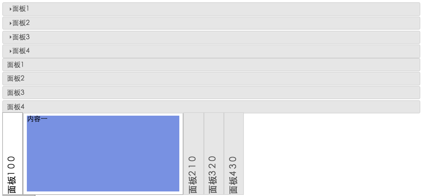
| prop | default | type | description |
|---|---|---|---|
| isVertical | true | boolean | the arrangement of the panels |
| width | 100% | number or percent | the width of the headerAndContentHeight |
| headerWidth | 30 | number | the width of the header when component are stretched horizontally |
| contentWidth | 400 | number | the width of the panel when component are stretched horizontally |
| headerAndContentHeight | 200 | number | the height of the headerAndContentHeight when component are stretched horizontally |
| accordionClass | "" | string | the className of the component root element |
| currentTriggerClass | "oni-state-active" | string | the extra className of the header to highlight when component are stretched |
| data | [] | Array<Object> |
data source, that each item has title and content |
| mode | 'caret' | 'caret' or 'nav' | in caret mode, head have a mall triangle icon that make panel collapsible; in nav mode, no any icon |
| multiple | false | boolean | is support to open multiple panels at the same time |
| triggerType | 'click' | 'click' or 'mouseenter' | use which event to fold the panel |
| event | opportunity |description | |------|--------------|----|----------| |onBeforeSwitch| when the user clicks on the header or the mouse hover the header | use to decide whether to continue the switch panel | |onSwitch| when onBeforeSwitch no invoke preventDefault method | use to do sth after switching panel |