defines an array of data items for the dropdown to use
selectorId
string
definea the name of the current selector - a GUID will be populated as selectorId if it is not manually defined
selectedItems
object array
returns a list of selected items (if it is a single item selection dropdown, it will have maximum 1 item in the returned array)
selectedText
string
returns the current selected text; or the default placeholder text if no item selected
placeHolder
string
defines the default placeholder for the dropdown
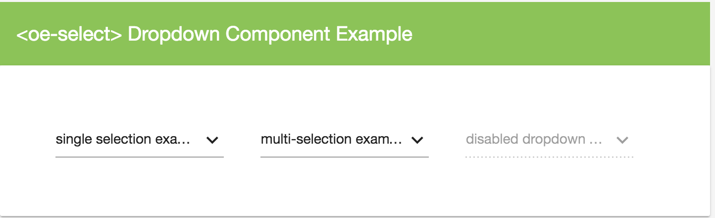
disabled
bool
defines whether the current dropdown is disabled
textBinding
string
defines a property name from the object in item array, the value of the property from the object will be injected as the item options' display text
valueBinding
string
defines a property name from the object in item array, the value of the property from the object will be injected as the item options' display value
stateBinding
string
defines a property name from the object in item array, the value of the property from the object will be injected as the item options' display isSelected
allowMultiple
bool
define whether the dropdown allows selecting multiple items
events
Events
parameters
return value
description
onItemSelected($event)
$event
void
define a custom event using the (onItemSelected) property binding in to execute your own function when an item is selected, the $event contains the selected item data
onItemDeselected($event)
$event
void
define a custom event using the (onItemSelected) property binding in to execute your own function when an item is deselected, the $event contains the deselected item data
<oe-selectplaceHolder="love my own work" [items]="[{a:'abc',b:1,c:true},{a:'bcd',b:2},{a:'cde',b:3}]"
NOTE: -- remember to define the "onItemDeselected($event)" and "onItemSelected($event)" function in your component if you specified them in the property bindings
methods
Methods
parameters
return value
description
show()
-
void
triggers the dropdown list to be shown
close()
-
void
triggers the dropdown list to be closed (if is shown)
option items of the dropdown, equivalent to
NOTE: if all your data is loaded dynamically using the data items variable in , then you don't need to worry about using the which allows you to specify option items without a data load
properties
Property
value type
description
item
object
defines an object which can be automatically loaded same way like other objects in the array, using the config options defined in
text
string
define the text displayed for the dropdown item; if no item object is defined, this text value will be automatically assigned onto an item object automatically for the component
value
string, any
defines the value to be assigned to the dropdown item; if no item object is defined, this value will be automatically assigned onto an item object for the component
isSelected
bool
define whether the item should be marked as selected

 ### Dependencies