
ngx-tooltip
Simple tooltip control for your angular2 applications using bootstrap3. Does not depend of jquery. If you want to use it without bootstrap - simply create proper css classes. Please star a project if you liked it, or create an issue if you have problems with it.
Installation
-
Install npm module:
npm install ngx-tooltip --save -
If you are using system.js you may want to add this into
mapandpackageconfig:
Usage
Example of simple usage:
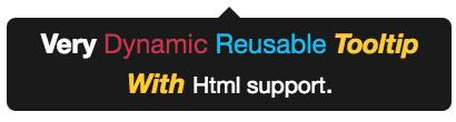
element on which this tooltip is applied.Example of usage with dynamic html content:
Very Dynamic Reusable Tooltip With Html support. element on which this tooltip is applied.<span tooltip>:tooltip="string"The message to be shown in the tooltip.[tooltipDisabled]="true|false"Indicates if tooltip should be disabled. If tooltip is disabled then it will not be shown. Default is false[tooltipAnimation]="true|false"Indicates if all tooltip should be shown with animation or not. Default is true.tooltipPlacement="top|bottom|left|right"Indicates where the tooltip should be placed. Default is "bottom".
<tooltip-content>:[animation]="true|false"Indicates if all tooltip should be shown with animation or not. Default is true.placement="top|bottom|left|right"Indicates where the tooltip should be placed. Default is "bottom".
Sample
;; @ @ Take a look on samples in ./sample for more examples of usages.