NgxMatMSAutocomplete
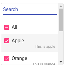
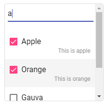
Ngx Mat MultiSelect Autocomplete is a simple multiselect dropdown with master toggle and autocomplete filter, designed with angular material. NPMJS: ngx-mat-msautocomplete
What is it good for?
The library allows you to:
- Create a multiselect component with an array of objects (list) as input
- 2 way data binding with the input list. New key 'selection : boolean' will be added to each object of the input list
- Autocomplete search filter to find matching options in list, filtering in display text and if present, info text
- Master toggle to select all or clear all selection
Dependencies
- "@angular/common": "^8.2.14",
- "@angular/core": "^8.2.14",
- "@angular/material": "^8.2.3",
- "@angular/cdk": "^8.2.3"
Installation
-
Add Angular material to your project:
$ ng add @angular/material
-
Add Angular cdk to your project:
$ ng add @angular/cdk
-
Install NgxMatMSAutocomplete
$ npm i ngx-mat-msautocomplete --save
-
Include ngx-mat-msautocomplete in your app.module.ts
...
import { NgxMatMSAutocompleteModule } from 'ngx-mat-msautocomplete';

@NgModule({
  declarations: [...],
  imports: [
    ...,
    NgxMatMSAutocompleteModule
  ],
  ...
})
-
Add the selector in your component.html file:
<mat-ms-auto [(dropdownList)]="dropdownList" display-key="display"></mat-ms-auto>
Example
-
Dropdown options - Input array of objects in TS file
fruitsList = [
  {
    info: 'This is apple',
    name: 'Apple'
  }, {
    info: 'This is orange',
    name: 'Orange'
  }, {
    info: 'This is lemon',
    name: 'Lemon'
  }, {
    info: 'This is gauva',
    name: 'Gauva'
  }, {
    info: 'This is banana',
    name: 'Banana'
  }, {
    info: 'This is kiwi',
    name: 'Kiwi'
  }
];
-
Ngx Mat MultiSelect Autocomplete component in HTML file
<mat-ms-auto [(dropdownList)]="fruitsList" display-key="name"></mat-ms-auto>
dropdownList - Required display-key - Required -
Call method on change / selection:
<mat-ms-auto [(dropdownList)]="fruitsList" display-key="name" (selectionChanged)="onChange()"></mat-ms-auto>
-
Default selection: To select an option by default, add a key => 'selection: true' to the required option in the input array of objects: Example:
fruitsList = [
  {
    info: 'This is apple',
    name: 'Apple',
    selection: true
  }, {
    info: 'This is orange',
    name: 'Orange',
    selection: false
  },
  ...
];
Other Options (Optional)
<mat-ms-auto
name="mat-ms-auto"
placeholder="Types of fruits"
[(dropdownList)]="fruitsList"
display-key="name"
info-key="info"
(selectionChanged)="onChange()"
[masterToggle]="true"
[alignInfoRight]="true"
icon="arrow_drop_down"
hint="List of fruits"
disabled
required></mat-ms-auto>| Attribute | Attribute type | Default value | Description |
|---|---|---|---|
| placeholder | string | null | Placeholder for the input field |
| disabled | boolean | false | Should the input field be disabled |
| required | boolean | false | Is the form field required |
| masterToggle | boolean | true | Display 'All' checkbox to trigger master selection toggle |
| info-key | string | null | Display info values for each dropdown option. Value should be a key in the input array of objects |
| alignInfoRight | boolean | false | Align info display to right (true) or left (false) for each dropdown option |
| icon | string | "arrow_drop_down" | Icon suffix: Material icon keys |
| hint | string | null | Description / hint |


