
NgpImagePicker
Angular library for the selection, edition and compression of images in png, jpeg and webp formats This library was generated with Angular CLI version 15, and support the latest version of angular. Previous versions of this library relied entirely on angular material components. Today it is made with html and css without any extra components. Recently new functionality has been added. More image editing capabilities, initial compression indexing is now available for the first time an more
Description
In many projects it is of interest to upload images for a backend, and sometimes we have to consult other programs for the compression of images and the change of format to improve the performance of the page. With NgpImagePicker this is possible in real time with for each image that you want to upload.
Installation
npm i ngp-image-picker --saveUsages
You must import the module NgpImagePicker where you will use it and use the component
***
import { NgpImagePickerModule } from 'ngp-image-picker';
@NgModule({
  ***
  imports: [
    NgpImagePickerModule,
  ],
****
})
In your component:
<ngp-image-picker [_config]="imagePickerConf" ($imageChanged)="onImageChange($event)"></ngp-image-picker>In .ts file
export class ExampleComponent {
  imagePickerConf: ImagePickerConf = {
    borderRadius: '4px',
    language: 'en',
    width: '320px',
    height: '240px',
  };
}
Here is an example with different configurations
export class ExampleComponent {
  config1: ImagePickerConf = {
    borderRadius: '16px',
    language: 'en',
  };
  config2: ImagePickerConf = {
    borderRadius: '50%',
    language: 'es',
    width: '200px',
    height: '200px',
  };
  config3: ImagePickerConf = {
    borderRadius: '4px',
    language: 'en',
  };
  initialImage = 'https:example-server.com/public/main.png';
}<h2>Basic ussage</h2>
<ngp-image-picker [_config]="config1"></ngp-image-picker>
<br />
<h2>Custom comfig</h2>
<ngp-image-picker [_config]="config2"></ngp-image-picker>
<br />
<h2>Initial Image</h2>
<ngp-image-picker [_imageSrc]="initialImage" ($imageChanged)="onImageChanged($event)" [_config]="config3"> </ngp-image-picker>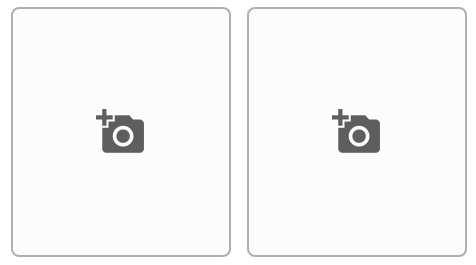
More about the component
The NgpImagePicker component has a setting to change the width, length, the aspectRatio, and objectFit properti of the loaded image. In addition to the language ( en | es | fr | de ). It also has an initial compression ratio option that by default is null.
It is important to note that the quality factor for image compression is only for formats such as: jpeg and webp.
The interface looks like this:
export interface ImagePickerConf {
  width?: string;
  height?: string;
  borderRadius?: string;
  aspectRatio?: number | null;
  objectFit?: 'cover' | 'contain' | 'fill' | 'revert' | 'scale-down';
  compressInitial?: number; // Range from [1-100]
  language?: string;
  hideDeleteBtn?: boolean;
  hideDownloadBtn?: boolean;
  hideEditBtn?: boolean;
  hideAddBtn?: boolean;
}| name | type | description | default |
|---|---|---|---|
| width | string | Set the specific width of the div that contain the image uploaded | null |
| height | string | Set the specific height of the div that contain the image uploaded | null |
| borderRadius | string | Set the property for the holder of the image and the image | null |
| aspectRatio | string | This apply a specifict aspect ratio to the div, use this with only setting a width and you can archive the ratio that you want it | null |
| objectFit | string | Default is 'cover', but if 'contain' is used the content will be scaled to maintain its aspect ratio while fitting inside the element's content box. | 'cover' |
| compressInitial | number | Quality factor applied to images with format: "webp, jpeg" | null |
| language | string | set the translations object | 'en' |
| hideDeleteBtn | boolean | hide the botton | false |
| hideDownloadBtn | boolean | hide the botton | false |
| hideEditBtn | boolean | hide the botton | false |
| hideAddBtn | boolean | hide the botton | false |
A basic configuration object with compression applied would be:
export class ExampleComponent {
  config1: ImagePickerConf = {
    language: 'en',
    compressInitial: 90
  };
The above example means that once an image is loaded from the file system, a compression quality is applied to it with a value of 0.9, and the resulting image will be reformatted as a jpeg.
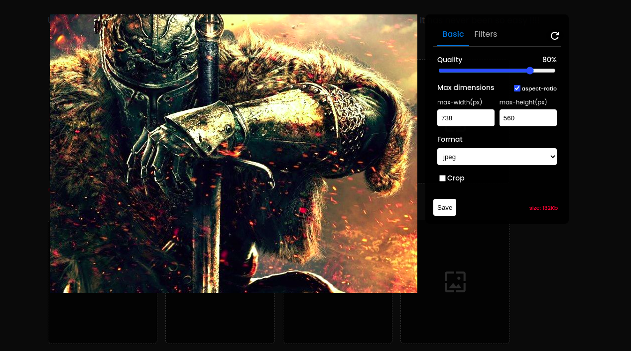
Editing panel
Once you have selected an image, 4 buttons are enabled below the image:
- load a new image.
- Open the editing panel.
- Download the image.
- Delete the image.
In the edit panel, you can change the quality ratio to compress the file size (in kb). Also changing width and height in px keeping aspect ratio or not, is selectable. You can change the image format as you wish, the options are 'png', 'webp','jpeg'. The 'Png' format is not affected by changing the quality ratio. Another capability is that you can crop the image by simply dragging and dropping the cropping component. And by clicking on the crop button.
I just added a new tab for applying filters. Now you can not only crop, compress and reformat your image, but you have new features like:
- Contrast level
- Brigthness level
- Gray
- Sepia
- Saturation
- Blur


Control section


Croping images
