
ng2-accordion
Simple accordion control for your angular2 applications using bootstrap3. Does not depend of jquery. If you don't want to use it without bootstrap - simply create proper css classes. Please star a project if you liked it, or create an issue if you have problems with it.
Installation
-
Install npm module:
npm install ng2-accordion --save -
If you are using system.js you may want to add this into
mapandpackageconfig:
Usage
Import AccordionModule in your app and start using component:
<accordion showArrows="true" closeOthers="false" expandAll="true"> <accordion-group heading="Accordion heading"> <accordion-heading> Or <b>custom</b> <accordion-toggle>heading with clickable zone</accordion-toggle> </accordion-heading> Accordion group contents </accordion-group> ...</accordion>-
<accordion>:Contains accordion groups.
[showArrows]="true|false"Indicates if arrows should be shown or not. Default is false[closeOthers]="true|false"Indicates if other opened groups should be automatically closed when you open a new group. Default is true[expandAll]="true|false"Indicates if all panels should be expanded by default. Default is false. If expandAll is set to true, then the closeOthers option has no effect, since all panels are opened.
-
<accordion-group>:Used inside
<accordion>and represents a single collapsible panel.heading="Group heading"Simple text group heading[disabled]="true|false"Indicates if this group is disabled or not (expandable or not)(onOpen)="doSomethingOnOpen()"Calls function when this accordion-group is opened(onClose)="doSomethingOnClose()"Calls function when this accordion-group is closed(onToggle)="doSomethingOnToggle(isOpened)"Calls function when this accordion-group is toggled<accordion-heading>Content zone where you can put custom headings
-
<accordion-toggle>:Used inside
<accordion-group>to provide a custom clickable zone for the accordion heading. This is usable when you have clickable controls in your header (for example checkbox) and you don't want accordion to be opened/closed on click of this controls.
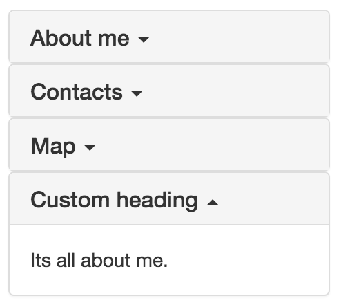
Sample
;; @ @ Take a look on samples in ./sample for more examples of usages.
Release notes
0.0.13
- added "disabled" option to accordion group
0.0.12
- angular last version support
- fixed issue when accordion is used in ngFor
- added onOpen, onClose, onToggle event emitters to accordion group
0.0.9
- angular rc.6 support
0.0.8
- angular rc.5 support
0.0.7
- angular rc.2 support. Use older versions if you still using rc1.