
ng-wizard
ng-wizard is a stepper / wizard component that you can use in your Angular applications. You can access the sample demo project by clicking here.
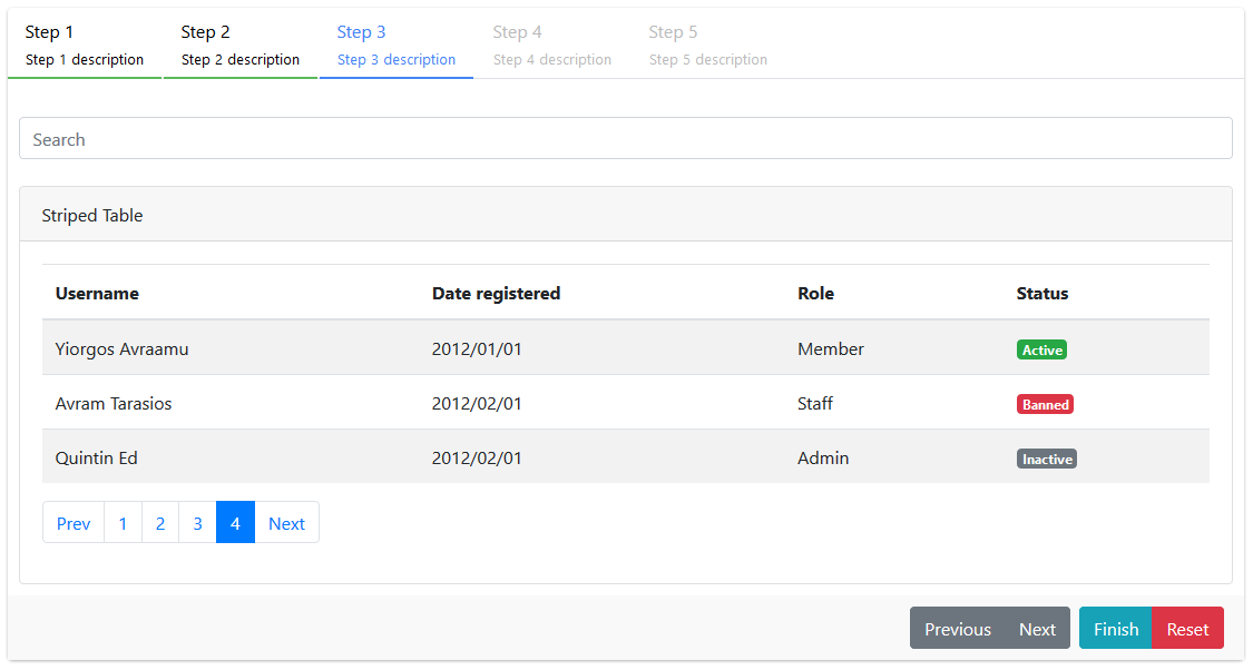
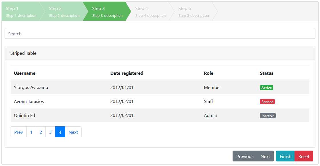
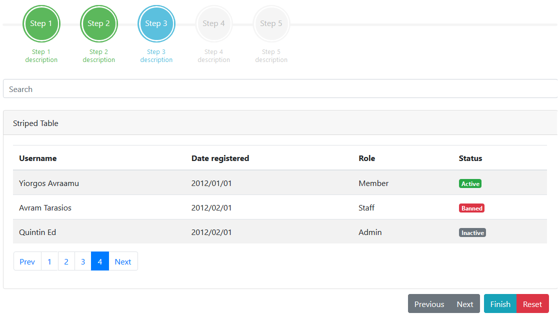
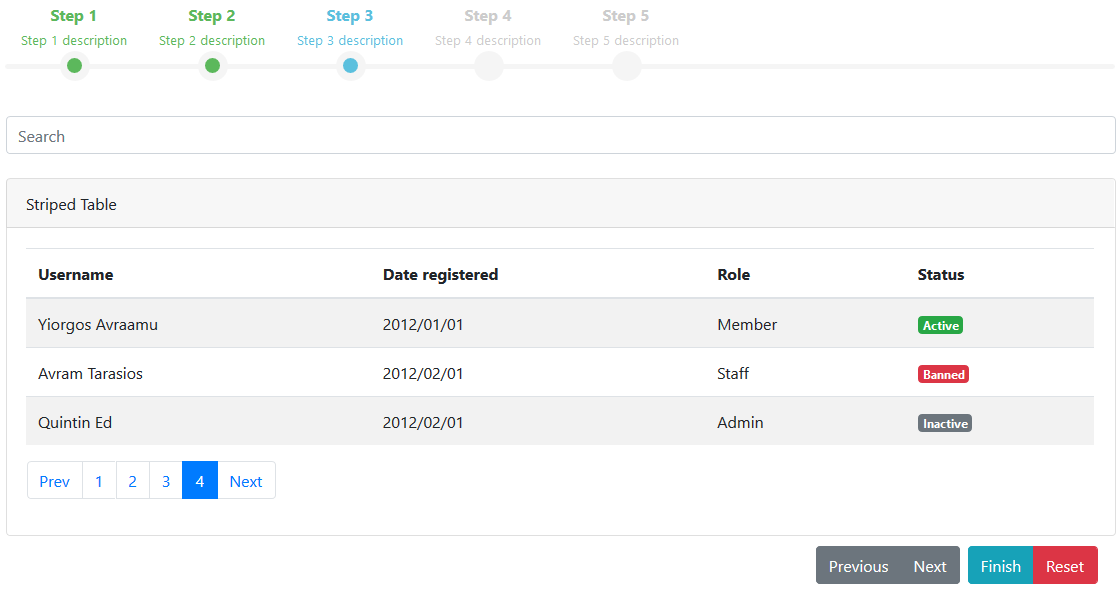
Screenshots
Dependencies
Getting started
Install ng-wizard through npm:
$ npm install --save ng-wizard
Include bootstrap CSS file (skip if already imported):
;Include ng-wizard CSS files:
/* Mandatory */; /* Optional *//* If a theme other than default is used, the css file for that theme is required. */;;;Import the ng-wizard module into your apps module:
; ; ; Add an ng-wizard component to the html template of your component:
Step 1 content Step 2 content Step 3 content Step 4 content Step 5 content Step 6 content Step 7 content [config] is an optional parameter for ng-wizard component.
If you want to override ng-wizard default configuration defined in apps module for a specific component, define [config] parameter in your ***.component.ts file.
;;; Configuration
NgWizardStep parameters:
Input parameters:
| Name | Type | Default Value | Description |
|---|---|---|---|
| title | string |
Step title | |
| description | string |
Step description | |
| state | STEP_STATE |
STEP_STATE.normal |
Step State (normal, disabled, error, hidden) |
| component | Component |
A component can be defined for step content. | |
| canExit | boolean | ((args: StepValidationArgs) => boolean) | ((args: StepValidationArgs) => Observable<boolean>) |
Validation for transition from step | |
| canEnter | boolean | ((args: StepValidationArgs) => boolean) | ((args: StepValidationArgs) => Observable<boolean>) |
Validation for transition to step |
Output parameters:
| Name | Type | Default Value | Description |
|---|---|---|---|
| index | number |
Step Index | |
| status | STEP_STATUS |
Step Status (untouched, done, active) | |
| initialStatus | STEP_STATUS |
Initial Step Status (untouched, done, active) | |
| initialState | STEP_STATE |
Step State (normal, disabled, error, hidden) | |
| componentRef | ComponentRef |
If the component input parameter is given, it is used to access the instance of this component. |
NgWizardConfig properties:
| Name | Type | Default Value | Description |
|---|---|---|---|
| selected | number |
0 |
Initial selected step |
| keyNavigation | boolean |
true |
Enable/Disable keyboard navigation (left and right keys are used if enabled) |
| cycleSteps | boolean |
false |
Allows to cycle the navigation of steps |
| lang | { next: string, previous: string } |
{ next: 'Next', previous: 'Previous' } |
Language variables for buttons |
| toolbarSettings | ToolbarSettings |
{ toolbarPosition: TOOLBAR_POSITION.bottom, toolbarButtonPosition: TOOLBAR_BUTTON_POSITION.end, showNextButton: true, showPreviousButton: true, toolbarExtraButtons: [] } |
Toolbar settings |
| anchorSettings | AnchorSettings |
{ anchorClickable: true, enableAllAnchors: false, markDoneStep: true, markAllPreviousStepsAsDone: true, removeDoneStepOnNavigateBack: false, enableAnchorOnDoneStep: true } |
Anchor settings |
| theme | THEME |
THEME.default |
Wizard theme (default, arrows, circles, dots) |
ToolbarSettings properties:
| Name | Type | Default Value | Description |
|---|---|---|---|
| toolbarPosition | TOOLBAR_POSITION |
TOOLBAR_POSITION.bottom |
Toolbar position (none, top, bottom, both) |
| toolbarButtonPosition | TOOLBAR_BUTTON_POSITION |
TOOLBAR_BUTTON_POSITION.end |
Toolbar button position (start, end) |
| showNextButton | boolean |
true |
show/hide Next button |
| showPreviousButton | boolean |
true |
show/hide Previous button |
| toolbarExtraButtons | ToolbarButton[] |
[] |
Extra buttons to show on toolbar, array of input/buttons elements |
AnchorSettings properties:
| Name | Type | Default Value | Description |
|---|---|---|---|
| anchorClickable | boolean |
true |
Enable/Disable anchor navigation |
| enableAllAnchors | boolean |
false |
Activates all anchors clickable all times |
| markDoneStep | boolean |
true |
Add done css |
| markAllPreviousStepsAsDone | boolean |
true |
When a step selected, all previous steps are marked done |
| removeDoneStepOnNavigateBack | boolean |
false |
While navigate back done step after active step will be cleared |
| enableAnchorOnDoneStep | boolean[] |
true |
Enable/Disable the done steps navigation |
Thanks
This component was created by rewriting the jQuery Smart Wizard 4 in Angular. Thanks to TechLaboratory for .Css files.