
ng-input-file


This library provides a component input-file that wraps a legacy input[type=file] element styled with Material components, enables user to choose file from local device (supports drag-and-drop) or Google drive (needs extra setup below). This library assumes your application is already using @angular/material and one of the themes:
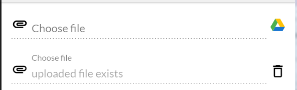
<!-- legacy input --> <!-- using a component -->input-file component emits (files) output whenever user chooses or removes a file. By default, the component accepts image/*, video/* and you can override it by providing optional input like [accept]="'image/*'".
To support drag-and-drop, you'd need to pass in an element that will serve as a dropbox to the component:
To enable Google drive, you'd need to import GoogleDriveService and initialize it with your developer information like below:
; const GOOGLE_CONFIG: GoogleApiConfig = developerKey: 'your-developer-key' appId: 'your-app-id' clientId: 'your-client-id' { thisgoogleDrive; }A Stackblitz demo is available to show the usage.
// to install
npm install ng-input-file --save
yarn add ng-input-file

// in app.module.ts
import { NgInputFileModule } from 'ng-input-file';
@NgModule({
  imports: [
    NgInputFileModule,

// in template
<input-file (files)="fileChanged($event)" #input1></input-file>

// in component
import { NgInputFileComponent } from 'ng-input-file';

@ViewChild('input1')
private input1: NgInputFileComponent;

fileChanged({ files }) {
  console.log(`fileChanged ${files.length}`, files, this.input1.filename);
}