
Angular 6+ component wrapper for @Mikhus' canvas-gauges library.
Getting Started
- Install the package in your angular 6 or greater app
npm install ng-canvas-gauges
- Import the GaugesModule to your AppModule file and register it in the imports:
;;; ; @ - Add the linear-gauge or radial-gauge element to your template:
<linear-gauge width="150" height="400"></linear-gauge><radial-gauge width="400" height="400"></radial-gauge>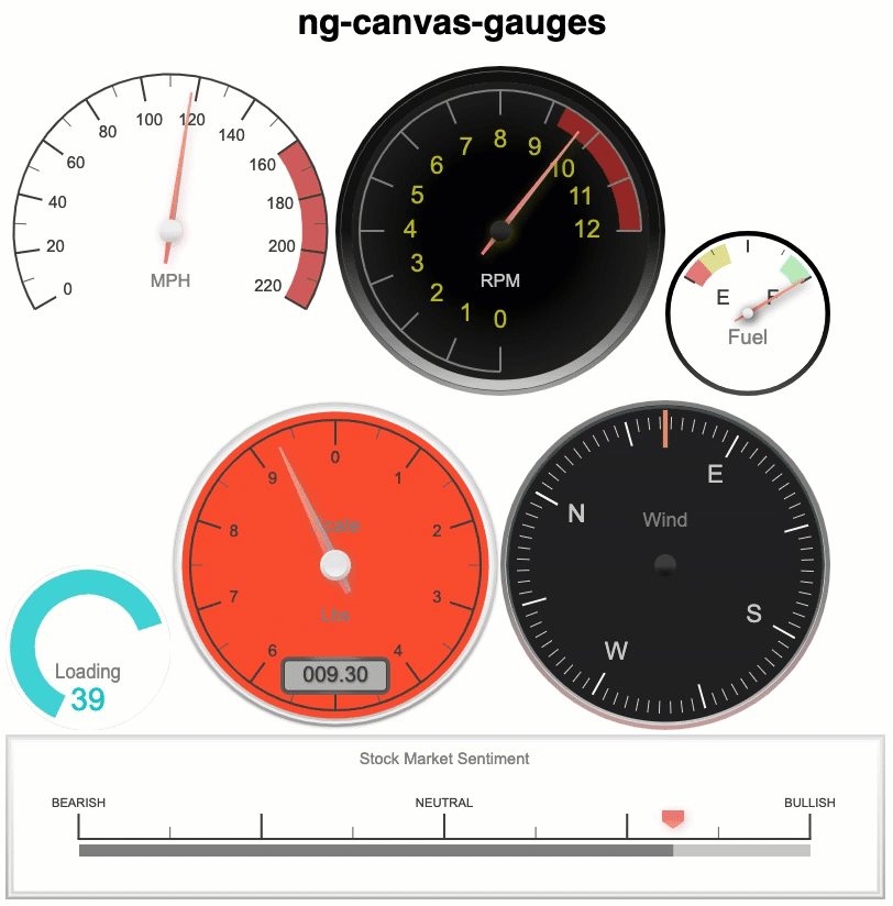
More specific examples of data binding using attributes and component properties
<linear-gauge width="150" height="400" units="°C" title="Temperature" min-value="-50" max-value="50" major-ticks="[-50,-40,-30,-20,-10,0,10,20,30,40,50]" minor-ticks="5" stroke-ticks="true" ticks-width="15" ticks-width-minor="7.5" highlights='[ {"from": -50, "to": 0, "color": "rgba(0,0, 255, .3)"}, {"from": 0, "to": 50, "color": "rgba(255, 0, 0, .3)"} ]' color-major-ticks="#ffe66a" color-minor-ticks="#ffe66a" color-title="#eee" color-units="#ccc" color-numbers="#eee" color-plate="#2465c0" color-plate-end="#327ac0" border-shadow-width="0" borders="false" border-radius="10" needle-type="arrow" needle-width="3" animation-duration="250" animation-rule="linear" animated-value="true" color-needle="#222" color-needle-end="" color-bar-progress="#327ac0" color-bar="#f5f5f5" bar-stroke="0" bar-width="8" bar-begin-circle="false" attrvalue="myValueProperty" ></linear-gauge> <radial-gauge options="myOptionsProperty" value="myValueProperty" ><radial-gauge>All canvas-gauge attributes are supported as shown above (kebab format) or programmatically (camelCase format). Learn more: https://canvas-gauges.com/documentation/user-guide/configuration
Build
This repo layout is based on an Angular 6 or greater workspace consists of the ng-canvas-gauge library project and a demo angular app project.
- Install dependencies
npm install
- Create an installable library (.tgz) for upload to the npm public repository or for local installation. Output is to ./dist/ng-canvas-gauges/ folder.
npm run build:package
Special Thanks
The upgrade of this library to angular 6+ and the demos project were developed using CodeMix.

For supporting development!