NativeScript Wear OS
NativeScript-Wear-OS is a NativeScript plugin that provides layouts and utilities specific to WearOS.


Installation
NativeScript Version 7+:
tns plugin add nativescript-wear-osNativeScript version prior to 7:
tns plugin add nativescript-wear-os@2.1.1Ambient Mode Support
Documentation: https://developer.android.com/training/wearables/apps/always-on
- Add the
WAKE_LOCKpermission to your AndroidManifest.xml
-
Copy the
ambient-activity.tsin the root of this project's demo app and use it to replace the default Android Activity loaded by NativeScript. NativeScript docs HERE about using a custom Android Activity. -
Update the AndroidManifest.xml for your application to use the correct activity. Change the
android:namevalue of theactivitynode to point to the same name used inside theambient-activity.tsfile inside the@JavaProxy()decorator at the top of the file.
- Update your webpack.config to include the custom Android Activity. Snippet below copied from the demo app.
// Add your custom Activities, Services and other Android app components here.const appComponents = '@nativescript/core/ui/frame' '@nativescript/core/ui/frame/activity' ;WearOsLayout
A base layout for Wear OS apps built with NativeScript that automatically handles calculating the inset for circle watch faces. To disable the layout from automatically adjusting the inset set disableInsetConstraint="true" on the WearOsLayout instance. The default is false and does not have to be set.
This has no effect on square watches.
| Circle Watch | Square Watch |
|---|---|
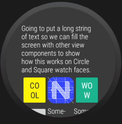 |
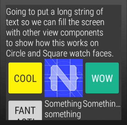 |
WearOsListView
API
useScalingScroll - If true, the items in the listview will scale during the scroll layout change event.
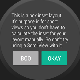
BoxInsetLayout
Dialogs
This plugin uses an Android WearOS specific library SmartWearOs.
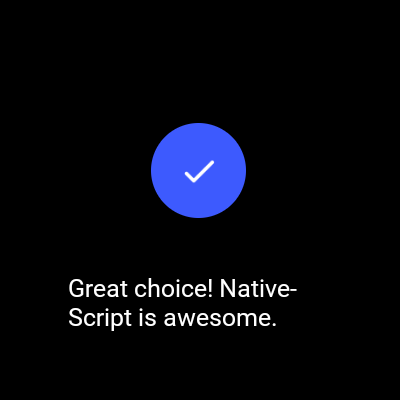
The plugin has a success dialog and failure/error dialog to present on WearOS. These mimic the behavior of the built in Confirmation Activity on WearOS. With the option of setting the time before it is dismissed/hidden from the user.
Usage
; showSuccess'Great choice! NativeScript is awesome.', 4.then;