
NativeScript CardView
A NativeScript plugin to provide an XML widget to implement the Material Design CardView component.


Do you need assistance on your project or plugin? Contact the nStudio team anytime at team@nstudio.io to get up to speed with the best practices in mobile and web app development.
Installation
tns plugin add nativescript-cardview
Be sure to run a new build after adding plugins to avoid any issues. Here is a post with some details: Plugin Not Working after adding to project.
Material Design Card Spec
CardView Android Documentation
Usage
iOS note: Setting a background-color will help if you do not see the card on the page.
NativeScript Plain
IMPORTANT: Make sure you include xmlns:Card="nativescript-cardview" on the Page element
XML
CSS
NativeScript Angular
;;registerElement'CardView',CardView; NativeScript Vue
;Vue; Attributes
- radius optional
An attribute to control the 'border-radius' of the card.
Platform specific options
Android
- elevation optional
An attribute to set the elevation of the card. This will increase the 'drop-shadow' of the card. There can be some performance impact when using a very high elevation value.
- ripple optional
Set to 'true' to show a ripple when the card is tapped. Tap event handlers in the card content will prevent the ripple.
iOS
- shadowOffsetWidth optional
An attribute to offset the x position of the shadow behind the card.
- shadowOffsetHeight optional
An attribute to offset the y position of the shadow behind the card.
- shadowColor optional
An attribute to set the color of the shadow behind the card.
- shadowOpacity optional
An attribute to set the opacity of the shadow behind the card.
- shadowRadius optional
An attribute to set the radius of the shadow (shadow spread) behind the card.
The default values are set to:
radius = 2;
shadowOffsetWidth = 0;
shadowOffsetHeight = 2;
shadowColor = new Color('#000').ios
shadowOpacity = 0.4;
shadowRadius = 1;
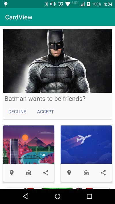
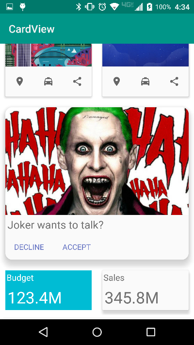
Sample Screenshots
Android
| Sample 1 | Sample 2 |
|---|---|
 |
 |
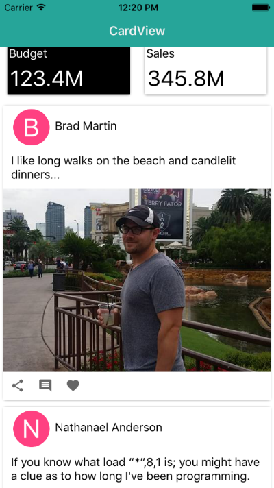
iOS
| Sample 1 | Sample 2 |
|---|---|
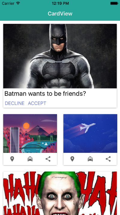 |
 |
Contributors
 |
 |
 |
 |
 |
 |
|---|---|---|---|---|---|
| bradmartin | NathanWalker | manijak | NathanaelA | EddyVerbruggen | sis0k0 |
 |
 |
 |
|---|---|---|
| vladimirnani | DickSmith | Jofferson Tiquez |