material-ui-password-field
This project provides a password field for Material-UI.
If you want to try the component yourself instead of watching a gif, head over to the storybook for a live demo!
Installation
npm i --save material-ui-password-fieldUsage
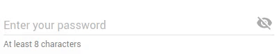
The usage of this component is pretty straightforward: Just replace your boring password TextFields with the shiny new PasswordField and you're done.
import PasswordField from 'material-ui-password-field' <PasswordField ="At least 8 characters" ="Enter your password" ="Your password is too short"/>Properties
| Name | Type | Default | Description |
|---|---|---|---|
| buttonDisabled | bool |
false |
Set this to true to disable the visibility button. |
| classes | object |
Override or extend the styles applied to the component. | |
| visible | bool |
false |
Set this to true to make the password initially visible. |
Additionally, all properties of Material UI's Text Field should be supported, except for type and multiLine. Please open an issue if something is missing or does not work as expected.
CSS
You can override all the class names thanks to the classes property. This property accepts the following keys:
| Name | Description |
|---|---|
root |
Styles applied to the root element. |
input |
Styles applied to the Input element. |
iconButton |
Styles applied to the IconButton element. |
icon |
Styles applied to the ToggleIcon element. |
Credits
Some code for the input component was adapted from Material UI's Text Field that we all know and love.
License
The files included in this repository are licensed under the MIT license.