
material-ui-flat-pagination


A pagination component for Material-UI using Button component.
Compatibility
Supported Versions
| material-ui-flat-pagination | Material-UI |
|---|---|
| >=4.0.0 | >=4.0.0 |
| >=3.0.0 | >=1.0.0 |
| 2.x | 0.x |
Installation
npm install material-ui-flat-paginationDemo
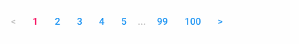
Demo
Example
import React from "react";
import ReactDOM from "react-dom";
import CssBaseline from "@material-ui/core/CssBaseline";
import { createMuiTheme, MuiThemeProvider } from "@material-ui/core/styles";
import Pagination from "material-ui-flat-pagination";

const theme = createMuiTheme();

class Example extends React.Component {
  constructor(props) {
    super(props);
    this.state = { offset: 0 };
  }

  handleClick(offset) {
    this.setState({ offset });
  }

  render() {
    return (
      <MuiThemeProvider theme={theme}>
        <CssBaseline />
        <Pagination
          limit={10}
          offset={this.state.offset}
          total={100}
          onClick={(e, offset) => this.handleClick(offset)}
        />
      </MuiThemeProvider>
    );
  }
}

ReactDOM.render(<Example />, document.getElementById("root"));
Props
| Name | Type | Default | Description |
|---|---|---|---|
limit * |
number | The number of rows per page. Allow a number greater than or equal to 1. |
|
offset * |
number | The number of rows to skip. Allow a number greater than or equal to 0. |
|
total * |
number | The total number of rows. Allow a number greater than or equal to 0. |
|
centerRipple |
bool | false | If true, the ripples of all buttons will be centered. |
classes |
object | Override or extend the styles applied to the component. See CSS API below for more details. | |
component |
union: string | func | object |
'div' | The component used for the root node. Either a string to use a DOM element or a component. |
currentPageColor |
enum: 'default' | 'inherit' | 'primary' | 'secondary' |
'secondary' | The color of the current page button. |
disabled |
bool | false | If true, all buttons will be disabled. |
disableFocusRipple |
bool | false | If true, the keyboard focus ripple of all buttons will be disabled. |
disableRipple |
bool | false | If true, the ripple effect of all buttons will be disabled. |
fullWidth |
bool | false | If true, all buttons will take up the full width of its container. |
innerButtonCount |
number | 2 | The number of displayed standard page buttons adjacent to the current button. Allow a number greater than or equal to 0. |
nextPageLabel |
node | '>' | The content of the next page button. |
onClick |
func | Callback fired when the button is clicked. Signature: function(event: object, offset: number, page: number) => voidevent: The event source of the callback. offset: The number of new offset. page: The number of new page. |
|
otherPageColor |
enum: 'default' | 'inherit' | 'primary' | 'secondary' |
'primary' | The color of the buttons of other pages excluding the current page. |
outerButtonCount |
number | 2 | The number of standard page buttons displayed at the end. Allow a number greater than or equal to 1. |
previousPageLabel |
node | '<' | The content of the previous page button. |
reduced |
bool | false | If true, the number of displayed buttons will be reduced. Equivalent to innerButtonCount=1 and outerButtonCount=1. |
renderButton |
func | Callback fired when the button is rendered. Main use case is to use anchor for pagination: ({ page, children }) => React.cloneElement(children as React.ReactElement, { href: `?page=${page}` })Signature: function({ offset: number, page: number, children: node}) => ReactElementoffset: The number of new offset. page: The number of new page. children: The page button component. |
|
size |
enum: 'small' | 'medium' | 'large' |
'medium' | The size of all buttons. |
Any other properties supplied will be spread to the root element.
CSS API
| Name | Description |
|---|---|
root |
Styles applied to the root element. |
rootCurrent |
Styles applied to the root element of the current page button. |
rootEllipsis |
Styles applied to the root element of the ellipsis page button. |
rootEnd |
Styles applied to the root element of the end page button. |
rootStandard |
Styles applied to the root element of the standard page button. |
label |
Styles applied to the span element of the page button that wraps the children. |
text |
Styles applied to the root element of the page button. |
textPrimary |
Styles applied to the root element of the page button if currentPageColor="primary" or otherPageColor="primary". |
textSecondary |
Styles applied to the root element of the page button if currentPageColor="secondary" or otherPageColor="secondary". |
colorInherit |
Styles applied to the root element of the page button if currentPageColor="inherit" or otherPageColor="inherit". |
colorInheritCurrent |
Styles applied to the root element of the current page button if currentPageColor="inherit". |
colorInheritOther |
Styles applied to the root element of the other page button if otherPageColor="inherit". |
disabled |
Styles applied to the root element of the page button if disabled={true}. |
sizeSmall |
Styles applied to the root element of the page button if size="small". |
sizeSmallCurrent |
Styles applied to the root element of the current page button if size="small". |
sizeSmallEllipsis |
Styles applied to the root element of the ellipsis page button if size="small". |
sizeSmallEnd |
Styles applied to the root element of the end page button if size="small". |
sizeSmallStandard |
Styles applied to the root element of the standard page button if size="small". |
sizeLarge |
Styles applied to the root element of the page button if size="large". |
sizeLargeCurrent |
Styles applied to the root element of the current page button if size="large". |
sizeLargeEllipsis |
Styles applied to the root element of the ellipsis page button if size="large". |
sizeLargeEnd |
Styles applied to the root element of the end page button if size="large". |
sizeLargeStandard |
Styles applied to the root element of the standard page button if size="large". |
fullWidth |
Styles applied to the root element of the page button if fullWidth={true}.
|
License
MIT, see LICENSE for details.