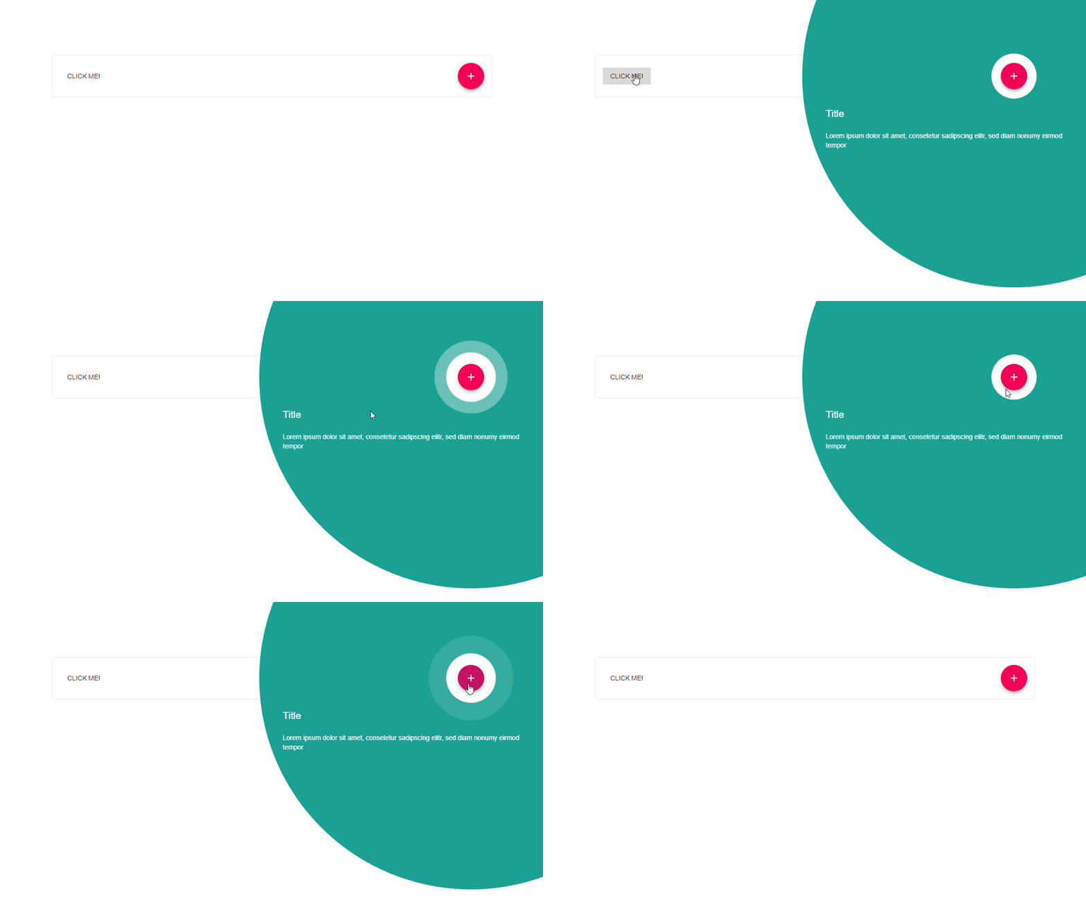
Material Feature Discovery Prompt
Provide value and encourage return visits by introducing users to new features and functionality at contextually relevant moments.

See this component in action
Installation
npm i --save material-ui-feature-discovery-promptUsage
// ... { return <div> <Button onClick= >Click me!</Button> <FeatureDiscoveryPrompt onClose= open=stateisOpen backgroundColor='rgb(0,150,136)' title="Title" description="Lorem ipsum dolor sit amet, consetetur sadipscing elitr, sed diam nonumy eirmod tempor" > <Button color='secondary' variant='fab' onClick= > <Add /> </Button> </FeatureDiscoveryPrompt> </div> }SearchBar Properties
| Name | Type | Default | Description |
|---|---|---|---|
| children* | node |
The node which will be featured. | |
| open* | bool |
Defines if the prompt is visible. | |
| onClose* | func |
Fired when the the prompt is visible and clicked. | |
| style | object |
Override the inline-styles of the root element. | |
| title | string |
Defines the title text. | |
| description | string |
Defines the description text. |
* required property
License
The files included in this repository are licensed under the MIT license.
