

light-react-validator


light-react-validator is a validator very fast, very small, and with extra flexibility!
Made with create-react-library
🎤 General idea
The validator follows the "prototypal inheritance" model for the configuration. The idea is simple: The closest to the element rules and messages have higher priority, therefore they override the farther ones. For example, built-in validators are overridden by the user's global config validators (customValidators), which are overridden by element-specific validators. Same thing with error messages. Because light-react-validator doesn't have any default error messages (yet), the element-specific error messages override the global config messages. Also, the light-react-validator re-renders only when it is necessary, hence it is very fast!
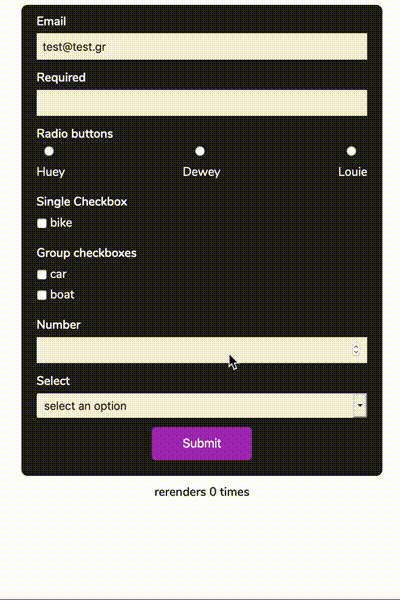
🎥 Demo
✨ Features
- Very light
- Very flexible
- Full customizable
- 0 configuration
- Built-in validators
📦 Install
npm install --save light-react-validator🚲 Basic example
🛵 Complex example
🚀 The useValidator hook
The useValidator accepts a config as described below and returns an object with the following properties:
| Property | Description | Type | Default |
|---|---|---|---|
| track | This function initialize the "watcher" for this specific input. Should be passed as on the example below | function | - |
| submitForm (optional) | This function is a hof function (high order function).The first's function argument is a function which runs on form submit after successful validation and the second's functions argument is the event | function | - |
| errors | An object with the errors if any errors exist. The errors are separated by input's name on depth 0 and with validation rule on depth 1. | object | {} |
| formValidity | The current validity status | boolean | true |
### track example:
In order to the validator watch, the input should be passed to the ref through the hook's track function. Note: Each field is required to have a unique name as a key.
### form submit example:
### errors object example:
errors:🛠 Options
global config options (optional):
The light-react-validator hook accepts custom config with the following properties:
| Variable | Description | Type | Default |
|---|---|---|---|
| customValidators | You can specify custom validators in order to override the built-in validators | object | undefined |
| validateFormOnSubmit | Validation starts on submit | boolean | false |
| errorOnInvalidDefault | If an input has default value on render, it shows the error immediately | boolean | false |
| globalMessages | Global error messages | object | undefined |
| globalOptions | Global options | object | undefined |
Note: All the above properties are optional.
custom config example
... ... The above config overrides the built-in email validator, it creates a new validator (emailWithSpecificDomain) and enables errorOnInvalidDefault, validateFormOnSubmit. Also, it sets a global error message for the required, email, emailWithSpecificDomain rules in case that an element does not have any error messages of them. Moreover, it sets minLength rule 5 which applies on all inputs with minLength rule but without input option specifically for this rule. When the validation occurs, the input will validate against 3 rules required, email, emailWithSpecificDomain. The error message and the emailWithSpecificDomain will get them from the input and the rest from the global config
Validator overrides
The light-react-validator has 3 types of validators:
- Built-in
- Global config
- Input-specific
Input specific validators overrides Global config validators and those overrides BuiltIn validators
#### Built-in Validators
- required
- minLength
- maxLength
- minCheckboxes
| Built-in | Arguments |
|---|---|
| required | value: T |
| input: string | |
| minLength | input: string, len: number |
| maxLength | input: string, len: number |
| minCheckboxes | input: any, availableOptions: any |
In order to pass additional arguments to the validator, the arguments should be declared on the options property. !Important the validator and the extra arguments should have the same name!
🛣 Roadmap
- Docs
- Examples
- More features
🤩 Contributing
You are welcome to contribute to this project, but before you do, please make sure you read the contribution guide.
🎉 Acknowledgments
The initial idea came from react-hook-form
🎈 License
MIT © thstamod