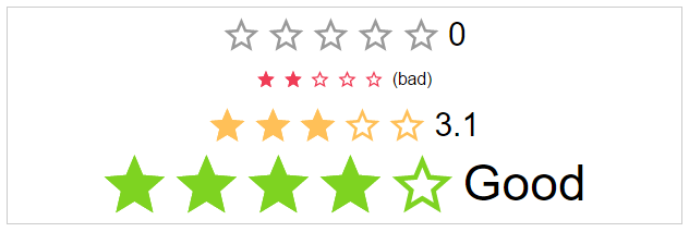
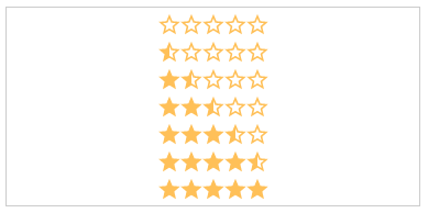
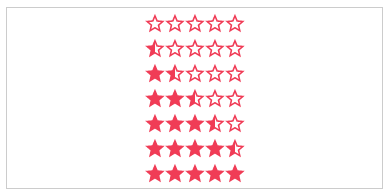
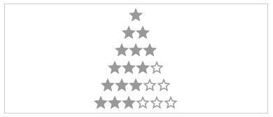
Angular Star Rating ⭐⭐⭐⭐⭐
⭐ Angular Star Rating is a Angular 2+ component made with ❤, based on css only techniques. ⭐


Angular Star Rating is a Angular 2+ component made with ❤.
It is based on best practice UX/UI methods, accessibility in mind and an eye for details.
In love with reactive forms the component is easy to control over the keybord.
It is a perfect fit for all angular projects with ⭐'s.
To keep it as flexible as possible a major part of the logic is based on css only techniques. The component simple applies the state depending css modifiers.
Browser support
| IE | Firefox | Chrome | Safari | Opera |
|---|---|---|---|---|
| >11 | >50 | >55 | >10 | >41 |
 |
 |
 |
 |
 |
Features
Fully featured this component is provided with:
- easy configurable and reasonable defaults
- all 12 css modifiers of the awesome css only star rating library
- it integrates well with reactive forms and all it's states
- focus and blur events are handled for a smooth keyboard navigation
- it's keyboard control is even better than a native input once :-)
- mouse enter and leave events are used to generate a nice on hover interaction
- importable as a angular ngModule it is a plug and play to use
Related Projects
| Css | Angular 1 | Angular | Ionic 1 |
|---|---|---|---|
 |
 |
 |
 |
| Css Star Rating | Angular1 Star Rating | Angular Star Rating | Ionic1 Star Rating |
DEMO
Installation
Get Angular Star Rating:
- clone & build this repository
- download as .zip
- via npm: by running
$ npm install angular-star-rating --savefrom your console
Consuming the library
As a precondition we consider you have your .angular-cli.json setup with an assets folder so that the ./src/assets folder is included in the bundled version.
But this is given by default if you use the angular-cli to setup your project.
Now you can import your library in your angular application by running:
$ npm install angular-star-rating --saveor
$ npm install angular-star-rating@2.0.0-rc.5 --savefor a specific version.
Create an assets folder under your ./src folder and copy the images from your ./node_modules/assets/images folder into ./src/assets/images.
In your app.module.ts import the StarRatingModule to your Angular AppModule:
;; ; // IMPORT YOUR LIBRARY; Once your library is imported, you can use the components in your Angular application:
<!-- You can now use your library component in app.component.html --> {{title}} <!-- USE COMPONENT HERE-->If something is not working check if
- the component renders the expected html
- if you use the svg version check if the
star-rating.icons.svgis present in your./src/assets/imagesand loaded
Implement the output handler
;; <!-- app.component.html-->Use it with reactive forms
As easy as it could be. Just apply the formControlName attribute to the star rating component.
//my.component.ts;; <!-- app.component.html-->Component Bindings
Modifier list
- Label modifier
- Label visible
- Label text
- Label position
- Style modifier
- Star type
- Color
- Size
- Space
- Speed
- Direction
- Disabled
- Control modifier
- Rating
- Step
- Number of stars
- Show half stars
- Read only
- Id
- getColor
- getHalfStarVisible
Label Modifier
labelVisible: string (Optional)
The visibility of the label text.
Default: true

labelText: string (Optional)
The text next to the stars.
Default: undefined
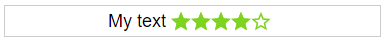
labelPosition: starRatingPosition (Optional)
The position of the label
Options: top, right, bottom, left
Default: left
Style Modifier
starType: starRatingStarTypes (Optional)
The type of start resource to use.
Options: svg, icon
Default: svg
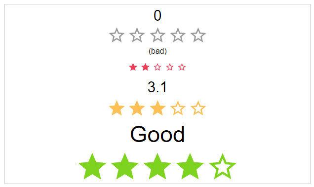
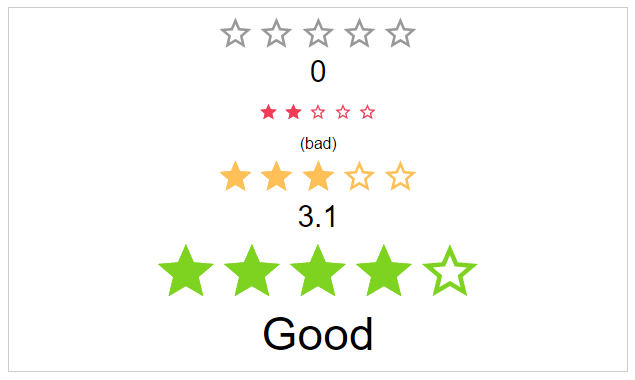
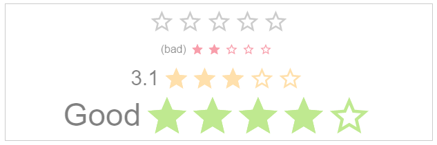
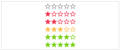
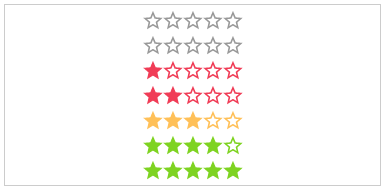
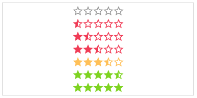
staticColor: starRatingColor (Optional)
Possible color names for the stars.
Options: default, negative, ok, positive
Default: undefined
size: starRatingSizes (Optional)
The height and width of the stars.
Options: small, medium, large
Default: medium

space: starRatingStarSpace (Optional)
If the start use the whole space or not.
Options: no, between, around
Default: no

speed: starRatingSpeed (Optional)
The duration of the animation in ms.
Options: immediately, noticeable, slow
Default: noticeable


direction: string (Optional)
The direction of the stars and label.
Options: rtl, ltr
Default: rtl

disabled: boolean (Optional)
The click callback is disabled, colors are transparent
Default: false

Control modifier
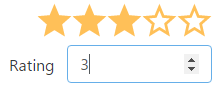
rating: number (Optional)
The actual star rating value
Default: no
step: number (Optional)
The step interval of the control
Default: 1
numOfStars: number (Optional)
The possible number of stars to choose from
Default: 5
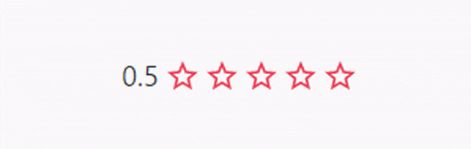
showHalfStars: boolean (Optional)
To show half stars or not
Options: true, false
Default: false
readOnly: boolean (Optional)
The click callback is disabled
Default: false
id: string (Optional)
The html id attribute of the star rating
Default: undefined
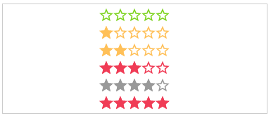
getColor: Function (Optional)
Calculation of the color by rating.
Params: rating, number,numOfStars and staticColor
Return: color name
getHalfStarVisible: Function (Optional)
Calculation for adding the "half" class or not, depending on the rating value.
Params: rating
Return: boolean
Outputs
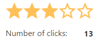
onClick: Function (Optional)
Callback function for star click event
Params: $event
onRatingChange: Function (Optional)
Callback function for rating change event
Params: $event
hoverEnabled: boolean (Optional)
An or disable hover interaction.
Default: false
Potions: true, false
onHoverRatingChange: Function (Optional)
Callback function for hoverRating change event
Params: $event
Shields and other draft


License
MIT © Michael Hladky