Leaflet.Control.Layers.Tree
A Tree Layers Control for Leaflet.
Description
This plugin extends Control.Layers allowing a tree structure for the layers layout. In Control.Layers you can only display a flat list of layers (baselayers and overlays), that is usually enough for small sets. If you have a long list of baselayers or overlays, and you want to organize them in a tree (allowing the user collapse and expand branches), this is a good option.
Installation
Using npm for browserify npm install leaflet.control.layers.tree (and require('leaflet.control.layers.tree')), or just download L.Control.Layers.Tree.js and L.Control.Layers.Tree.css and add a script and link tag for it in your html.
Compatibility
This plugin has been tested with Leaflet 1.0.3, 1.1.0, 1.2.0, 1.3.1., 1.4.0, 1.5.1, 1.6.0 and 1.7.1
This plugin supports TypeScript. See file L.Control.Layers.Tree.d.ts
Usage
- Create your layers. Do this as usual.
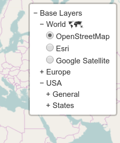
- Create your layers tree, like the one just below.
- Create the control and add to the map:
L.control.layers.tree(baseTree, overlaysTree, options).addTo(map); - Voilà!
var baseTree = {
    label: 'Base Layers',
    children: [
        {
            label: 'World 🗺',
            children: [
                { label: 'OpenStreetMap', layer: osm },
                { label: 'Esri', layer: esri },
                { label: 'Google Satellite', layer: g_s },
                /* ... */
            ]
        },
        {
            label: 'Europe',
            children: [
                { label: 'France', layer: france },
                { label: 'Germany', layer: germany },
                { label: 'Spain', layer: spain },
                /* ... */
            ]
        },
        {
            label: 'USA',
            children: [
                {
                    label: 'General',
                    children: [
                        { label: 'Nautical', layer: usa_naut },
                        { label: 'Satellite', layer: usa_sat },
                        { label: 'Topographical', layer: usa_topo },
                    ]
                },
                {
                    label: 'States',
                    children: [
                        { label: 'CA', layer: usa_ca },
                        { label: 'NY', layer: usa_ny },
                        /* ... */
                    ]
                }
            ]
        },
    ]
};
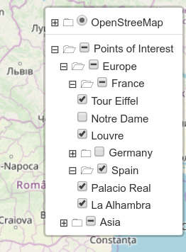
var overlaysTree = {
label: 'Points of Interest',
selectAllCheckbox: 'Un/select all',
children: [
{
label: 'Europe',
selectAllCheckbox: true,
children: [
{
label: 'France',
selectAllCheckbox: true,
children: [
{ label: 'Tour Eiffel', layer: L.marker([48.8582441, 2.2944775]) },
{ label: 'Notre Dame', layer: L.marker([48.8529540, 2.3498726]) },
{ label: 'Louvre', layer: L.marker([48.8605847, 2.3376267]) },
]
}, {
label: 'Germany',
selectAllCheckbox: true,
children: [
{ label: 'Branderburger Tor', layer: L.marker([52.5162542, 13.3776805])},
{ label: 'Kölner Dom', layer: L.marker([50.9413240, 6.9581201])},
]
}, {label: 'Spain',
selectAllCheckbox: 'De/seleccionar todo',
children: [
{ label: 'Palacio Real', layer: L.marker([40.4184145, -3.7137051])},
{ label: 'La Alhambra', layer: L.marker([37.1767829, -3.5892795])},
]
}
]
}, {
label: 'Asia',
selectAllCheckbox: true,
children: [
{
label: 'Jordan',
selectAllCheckbox: true,
children: [
{ label: 'Petra', layer: L.marker([30.3292215, 35.4432464]) },
{ label: 'Wadi Rum', layer: L.marker([29.6233486, 35.4390656]) }
]
}, {
/* ... */
}
]
}
]
}API
L.Control.Layers.Tree
The main (and only) 'class' involved in this plugin. It exteds L.Control.Layers, so most of its methods are available. addBaseLayer, addOverlay and removeLayer are non usable in L.Control.Layers.Tree.
L.control.layers.tree(baseTree, overlayTree, options)
Creates the control. The arguments are:
-
baseTree:<Object>or<Array>Tree defining the base layers (like the one above). You can also provide anArrayof nodes, if you want to start with a flat level. -
overlayTree:<Object>or<Array>Similar than baseTree, but for overlays. -
options:<Object>specific options for the tree. See that it includesL.Control.Layeroptions
constructor options
-
closedSymbol:<String>Symbol displayed on a closed node (that you can click to open). Default '+'. -
openedSymbol:<String>Symbol displayed on a opened node (that you can click to close). Default '−' (−). -
spaceSymbol:<String>Symbol between the closed or opened symbol, and the text. Default ' ' (a normal space). -
selectorBack:<Boolean>Flag to indicate if the selector (+ or −) is after the text. Default 'false'. -
namedToggle:<Boolean>Flag to replace the toggle image (box with the layers image) with the 'name' of the selected base layer. If thenamefield is not present in the tree for this layer,labelis used. See that you can show a different name when control is collapsed than the one that appears in the tree when it is expanded. Your node in the tree can be{ label: 'OSM', name: 'OpenStreetMap', layer: layer }. Default 'false'. -
collapseAll:<String>Text for an entry in control that collapses the tree (baselayers or overlays). If empty, no entry is created. Default ''. -
expandAll:<String>Text for an entry in control that expands the tree. If empty, no entry is created. Default ''. -
labelIsSelector:<String>Controls if a label or only the checkbox/radiobutton can toggle layers. If set toboth,overlayorbasethose labels can be clicked on to toggle the layer. Default 'both'.
See that those strings can be html code, with unicode, images or whatever you want.
setBaseTree(tree)
Resets the base layers tree (like in constructor, an <Object> or <Array>). Internally removes and adds all the layers, so you may be notified if you registered those events. Returns this.
setOverlayTree(tree)
Resets the overlay layers tree (like in constructor, an <Object> or <Array>). Internally removes and adds all the layers, so you may be notified if you registered those events. Returns this.
expandTree(overlays)
This method expands the tree. When overlays is true expands the overlays tree. Otherwise expands the baselayers tree. Returns this.
collapseTree(overlays)
This method collapses the tree. When overlays is true collapses the overlays tree. Otherwise collapses the baselayers tree. Returns this.
expandSelected(overlays)
This method expands only the selected item in the tree. When overlays is true affects the overlays tree. Otherwise affects the baselayers tree. Returns this.
Tricks about the tree
The layers tree is a normal Objects tree like in the example above. The valid elements are:
-
children:<Array>Array of children nodes for this node. Nothing special. -
label:<String>Text displayed in the tree for this node. It may contain HTML code. -
layer:<L.Layer>The layer itself. You can create withL.tileLayer,L.marker, or however you want. -
name:<String>Text displayed in the toggle when control is minimized. If not present,labelis used. It makes sense only whennamedToggleistrue, and with base layers. -
radioGroup:<String>Text to identify different radio button groups. It is used in thenameattribute in the radio button. It is used only in the overlays layers (ignored in the base layers), allowing you to have radio buttons instead of checkboxes. See that radio groups cannot be unselected, so create a 'fake' layer (likeL.layersGroup([])) if you want to disable it. Deafult''(that means checkbox). -
collapsed:<Boolean>Indicate whether this tree node should be collapsed initially, useful for opening large trees partially based on user input or context. Disabled by default. -
selectAllCheckbox:<Boolean>or<String>Displays a checkbox to select/unselect all overlays in the sub-tree. In case of being a<String>, that text will be the title (tooltip). When any overlay in the sub-tree is clicked, the checkbox goes intoindeterminatestate (a dash in the box). -
eventedClasses:<Array>or<Object>. [Advanced functionality to access nodes of the tree. Use carefully] Object (or array of objects) to define events on thelabel. Now you can specify a way to select all the sub-nodes in the overlay tree inspecting the tree. The object contains:-
className:<String>. Will add an event on the first element with this class name in this node. -
event:<String>(optional). Event to trigger. By default isclick. -
selectAll:<Boolean>or<Function>.trueselects all the checkboxes in the subnodes.falseunselects all. In case of using a<Function>(that should return aBooleanorundefined), it will be called with(ev, domNode, treeNode, map), where:-
ev: event triggered. -
domNode: DOM node that includes the label and all the children. -
treeNode: node of this tree affected. Be careful. Modifying it may produce undefined behaviours. -
map: map associated with the control.
-
-
You can see an example of a baselayers tree (the javascript code) above. You can provide a tree, or an array of trees.
Non leaf nodes (that is, those with children) can also have a layer. In this case you will be able to select the layer, and only the icon will collapse or expand this branch.
You can include HTML code, not only ascii chars, in the label attribute. It will be included as innerHTML. Be carefull with unicodes, because not every browser supports them all.
A leaf node without layer attribute is also posible. Only with label. This can be used to include special commands calling a javascript function, or a separator, or whatever you like. An example of separator node is
{label: '<div class="leaflet-control-layers-separator"></div>'}


