laxar-command-bar-widget 
AngularJS v1 widget that allows a user to trigger actions (such as navigation) using graphical buttons. The widget provides some default buttons for navigation.
Content
Appearance
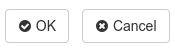
A laxar-command-bar-widget with two default buttons.
Usage
Installation
In a LaxarJS v2 installation with AngularJS v1 adapter, simply run:
npm install laxar-command-bar-widgetConfiguration Example
Use this configuration on a page to get a laxar-command-bar-widget instance with the two default buttons "ok" and "cancel".
For full configuration options refer to the widget.json.
Features
1. Display a Button Bar (areas)
R1.1 The widget MUST display a button bar in a row with three anchors (left, center, right) for the buttons.
R1.2 It MUST be possible to configure a button list for each of the anchors.
R1.3 The widget MUST display a default space between the buttons. The width of the space is defined by the theme.
R1.4 A button bar on the left anchor position MUST be align to the left border of the widget. A button bar in the center MUST be placed in the center of the widget. A button bar on the right anchor position MUST be aligned to the right border of the widget.
R1.5 If the available space is no enough, the button bars SHOULD be placed below each other. The position requirement (left, center, right) of the button bars is OPTIONAL in this case.
R1.6 The widget MUST allow a configuration of an absolute width in grid columns for a button bar. This configuration allows a better handling of special cases of partitioning of the buttons.
2. Display Configurable Buttons (buttons)
R2.1 It MUST be possible to enable or disable each button by configuration.
R2.2 Each button text MUST be configurable. The configured text MUST be interpreted as internationalized HTML content. It MUST be possible to use icons as labels.
R2.3 For each button an access key MUST be configurable to allow the control by keyboard MDN accesskey.
R2.4 For each button the position and the anchor position MUST be configurable. The buttons position MUST be determined by the configured zero-based index and by the position of the button configuration.
R2.5 The widget MUST allow the configuration of the button class (normal, primary, info, success, warning, danger, inverse, link).
R2.6 The size of a button (mini, small, default, large) MUST be configurable.
R2.7 Each button MUST have a state (disabled, hidden, omitted or normal). The state of a button MUST depend on the page state (signaled through flags). If several flags are defined for a state, the state MUST be activated when one flag is at least true.
R2.8 In relation to the page state (signaled through flags, e.g. while a action is performed) a spinner SHOULD be displayed. In this case a CSS class is-busy MUST be set to allow to complement the label with a spinner.
R2.9 Each button MUST have an unique page-wide ID.
When a button or its associated access key is pressed, the widget MUST publish a takeActionRequest event with a key anchorDomElement with the DOM ID of the button as value.
3. Display Default Buttons (previous, next, finish, ok, cancel, close, info, help, print, apply, yes, no)
R3.1 The widget MUST support default buttons. The default buttons MUST act like the other custom buttons, but have default values for the configuration such as the label.
R3.2 A default button with the same index as a custom button MUST be displayed before the custom button.
4. Layout (layout)
R4.1 In default configuration the buttons are rendered side by side (horizontally). It MUST be configurable to display the buttons below each other (vertically).
5. Support Internationalization (i18n)
R5.1 The widget MUST allow the configuration of a locale as described in the documentation to LaxarJS i18n. When displaying internationalized content, the widget MUST use the current language tag of the locale.
Integration
Patterns
The widget supports the following event patterns as specified by the LaxarJS Patterns document.
Actions
- Action:
*.action- Role: Sender
- Description: Trigger this action if a button or a access key is pressed.
Flags
- Flag:
*.omitOn|hideOn|disableOn|busyOn- Role: Receiver
- Description: Change a button (hide, disable, omit or display a busy icon)
References
The following resources are useful or necessary for the understanding of this document. The links refer to the latest version of the documentation. Refer to the bower.json for the specific version that is normative for this document.