jsheatmap
A heat map package for Node. You provide the column headings, row labels and row values, and it will return corresponding rgb colors that can be used to populate a table or other representation of your choosing.
What's a heat map?
A common use of a heat map is to visualize frequency of occurrence of one variable in correlation with another. For example: the number of traffic accidents that occur along each mile of a highway, or the number of jellybeans in several sample packages.
About the implementation
This is largely a JavaScript transliteration of Andrew Noske's C# sample code.
Release history
1.0.1 Initial release 1.1.2 Added logarithmic scaling 1.2.0 Allow extra information as pass-thru data
Usage
npm install jsheatmap
In your Node application, import the HeatMap class from the jsheatmap module
import HeatMap from 'jsheatmap'Next, construct an HeatMap instance with heading and row data.
// Days of rain in summer summer months, by year
const headings = ["June", "July", "August", "September"]  // the months
const rows = [
  ["2015", [9, 5, 6, 8]],   // the years and rainy days by month
  ["2016", [7, 5, 10, 7]],
  ["2017", [7, 4, 3, 9]],
  ["2018", [10, 5, 6, 8]],
  ["2019", [8, 9, 3, 1]],
]


const heatmap = new HeatMap(headings, rows)
const data = heatmap.getData();
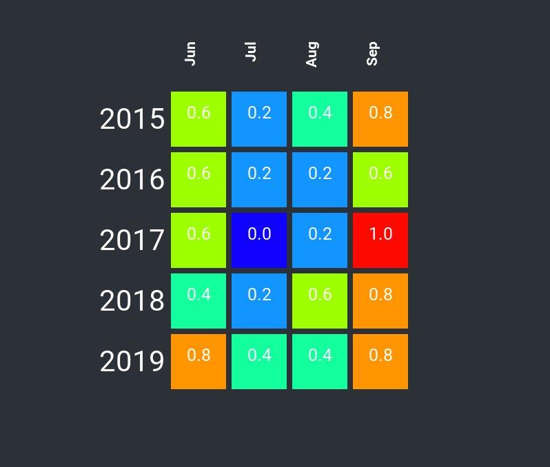
The HeatMap will scale all values of the data (all rainy day values in this case), and to fit within the range 0 to 1.0. The scaled values are then converted to rgb colors based on a color gradient, with blue at the lowest scale and red at the highest.
Data is returned in the following format:
{
  "headings": [
    "Jun",
    "Jul",
    "Aug",
    "Sep"
  ],
  "high": 10,
  "low": 1,
  "rows": [
    {
      "label": "2015",
      "cells": {
        "values": [
          7,
          5,
          6,
          8
        ],
        "colors": [
          {
            "red": 0.6249999999999998,
            "green": 1,
            "blue": 0
          },
          {
            "red": 0,
            "green": 0.588235294117647,
            "blue": 1
          },
          {
            "red": 0,
            "green": 1,
            "blue": 0.625
          },
          {
            "red": 1,
            "green": 0.588235294117647,
            "blue": 0
          }
        ],
        "scales": [
          0.6,
          0.2,
          0.4,
          0.8
        ]
      }
    },
    ...
  ]
}
options
The getData() method takes an optional options parameter.
Logarithmic Scaling
heatmap.getData({logn: true})
Oftentimes, the distribution of values is skewed toward the high end, making the heatmap look mostly greenish-blue. An example of this is a map of the winning odds of hole cards in Texas Hold'em. By applying logarithmic scaling, the range of high and low scale values is decreased, making the resulting HeatMap colors less skewed.
Extra info
As a convenience, it is possible to construct the HeatMap where each row of data has a third parameter. This is an array containing objects of the same length as the value array. These objects are then passed-thru as an array called extra in the returned cell data structure.
 // the years and rainy days by month; extra info indicating record rainfall
const rows = [
  ["2015", [9, 5, 12, 8], [{record: false}, {record: false}, {record: true}, {record: false}]],
  ["2016", [7, 5, 10, 7], [{record: false}, {record: false}, {record: false}, {record: false}]],
  ["2017", [7, 4, 3, 9], [{record: false}, {record: false}, {record: false}, {record: true}]],
  ["2018", [10, 5, 6, 8], [{record: true}, {record: false}, {record: false}, {record: false}]],
  ["2019", [8, 9, 3, 1], [{record: false}, {record: false}, {record: false}, {record: false}]],
]
The returned data structure would look like:
```json
{
  "headings": [
    "Jun",
    "Jul",
    "Aug",
    "Sep"
  ],
  "high": 12,
  "low": 1,
  "rows": [
    {
      "label": "2015",
      "cells": {
        "values": [
          7,
          5,
          6,
          8
        ],
        "colors": [
          ...
        ],
        "scales": [
          ...
        ],
        "extra": [
          {"record": false},
          {"record": false},
          {"record": true},
          {"record": false}
        ], ...
      }
    },...
  ]
}
A visualization using React
Once the HeatMap data is returned, it is possible to write some React components that visualizes the result.
In this visualization, blue indicates fewer rainy days, and red more. Inside the color boxes are the scaled values, where 0.0 is the lowest (fewest rainy days) and 1.0 is the highest (most rainy days).
