jelly-switch
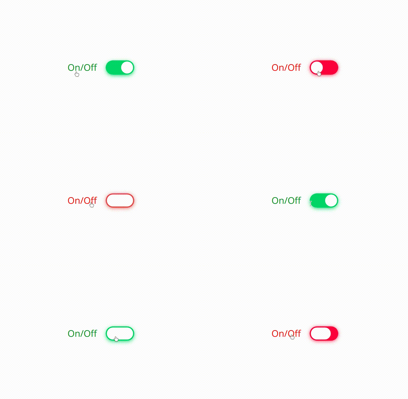
A simple, customizable and jellified switch built as web component using ES6 javascript
NOTE:
- This component is still in work in progress WIP. So there is a high chance that the API can change. So please be notified

This micro web component(~1.7kB) can be used for any framework
Try Now
Install
1. via npm
npm i jelly-switch
(or)
2.via script tag
Usage
1.Import into module script(required only for npm install):
2.Use it in your web page like any other HTML element
3. Like any other input type, label can be used to bind with the jelly-switch element using 'slot' attribute as shown below. For more information on this, refer the Slots sub section in API section
On/OffAPI
Attributes
checked
Add this attribute to set the switch to toggled / checked mode i.e., equivalent to 'checked' attribute of input type
(or)
js1checked = truedisabled
Add this attribute to disable the switch and the opacity will be decreased to half and user can not interact with the switch and cursor will be changed to 'not-allowed'
(or)
js1disabled = true;Slots
- For achieving the
labelbinding with theinputbyforattribute,slotfeature has been used in this custom element - For label to position to left of the
jelly-switch, slot attribute with the valuecontent-leftcan be used for any other native HTML Element as shown in the example below
On/Off- For label to position to right of the
jelly-switch, slot attribute with the valuecontent-rightcan be used for any other native HTML Element as shown below
On/Off| Slot name | Description | Image |
|---|---|---|
content-left |
This would render the label to left of the switch |  |
content-right |
This would render the label to right of the switch |  |
Styling
The switch component can be styled as a normal and regular HTML element in CSS. There are list of CSS properties below with the default values
| CSS variables | Default value | Description |
|---|---|---|
--off-color |
#FF4651 | background color of switch when the switch is off or its value is set to false. Can assign any color to rgba, hex values |
--on-color |
#11C75D | background color of switch when the switch is on or its value is set to true. Can assign any color to rgba, hex values |
--onHandle-color |
#FFFFFF | color of switch Handle when the switch is on or its value is set to true. Can assign any color to rgba, hex values |
--offHandle-color |
#FFFFFF | color of switch Handle when the switch is off or its value is set to false. Can assign any color to rgba, hex values |
The CSS variables can be set dynamically. For example, refer the following snippet
documentdocumentElementstyle;Events
-
toggle- The toggle event is triggered when the user toggles the switches either by
- clicking on the switch (or)
- pressing
spaceon the keyboard when the switch is focused
- The present value can be accessed from
event.detail.valueas shown in the below example
- The toggle event is triggered when the user toggles the switches either by
documentdocumentElement;or
and value can be obtained as follows
{ //The value after the user toggles the switch can be accessed from the below code console; //here e is the event object }Accessibility
- ARIA has been handled
ToDos
- Handle keyboard
spaceevent - Add box-shadow to focus
- Accessibility check
- Basic Unit testing
- Lazy property handling
- Documentation
- npm publish
- Add label 'for' support
- Minify js file
- Support safari browser
- Writing the release notes (changeLog.md file)
- Adding unit test cases
- Write contribute.md file
- handling drag event
License
MIT License (c) Akhil Sai
Made with ❤️ by Akhil


