
Isometric React (React version of IsometricSass)
Full rewrite of IsometricSass using TypeScript, React and styled-components.
Installation
To install using npm, run the following command:
npm i isometric-reactIf you wanna install using yarn, run the following command:
yarn add isometric-reactInitial setup
To begin using this package, you will have to import two wrappers that will act as a container for all of your HTML:
| Code | Preview |
|---|---|
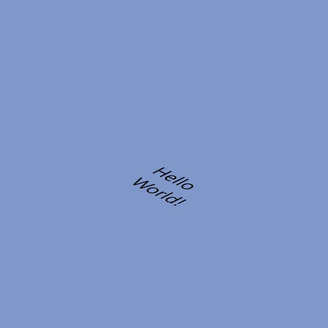
import { IsometricContainer, Isometric } from "isometric-react";

const Showcase = () => {
  return (
    <IsometricContainer>
      <Isometric>
        <p>Hello World!</p>
      </Isometric>
    </IsometricContainer>
  );
}; |
|
Begin using
Isometric React comes with couple of components that all have their specific properties.
They need to be placed inside the previously mentioned containers (replacing <p>Hello World!</p> with Isometric components).
Below you will find API for each component that exists inside this package. For more advance usage (like shadows, position changing, animations, etc.) you can find that further below under Advanced API section.
Grid Component
| Code | Preview |
|---|---|
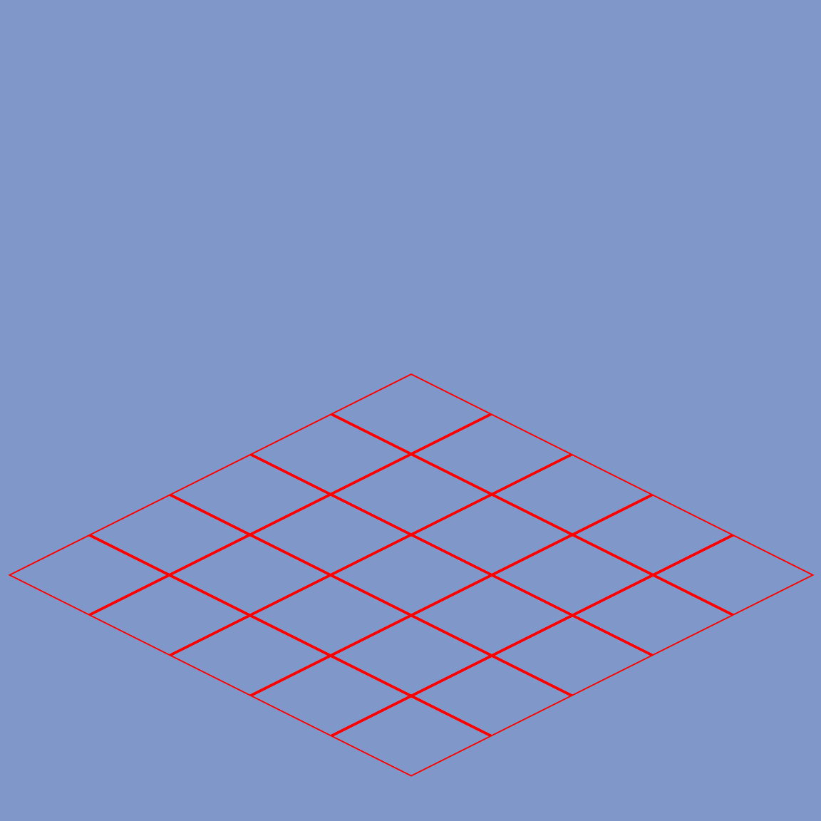
import { IsometricGrid } from "isometric-react";

const Showcase = () => {
  return (
    <IsometricContainer>
      <Isometric>

        <IsometricGrid
          size={10}
          sizeMultiplier={{
            width: 5,
            height: 5,
          }}
          color="red"
          lineweight={2}
        />

      </Isometric>
    </IsometricContainer>
  );
}; |
|
Grid API
| Property name | Description | Type | Required |
|---|---|---|---|
| size | Defines how large will grid appear to be | number |
True |
| sizeMultiplier | Defines number of rows and columns | { width: number; height: number } |
True |
| color | Defines the color of the grid. Accepts RGB, Hex or just a regular color name | string |
True |
| lineweight | Defines the thickness of the grid lines | number |
True |
| children | Takes any HTML or JSX/TSX elements and renders them | JSX.Element | JSX.Element[] |
False |
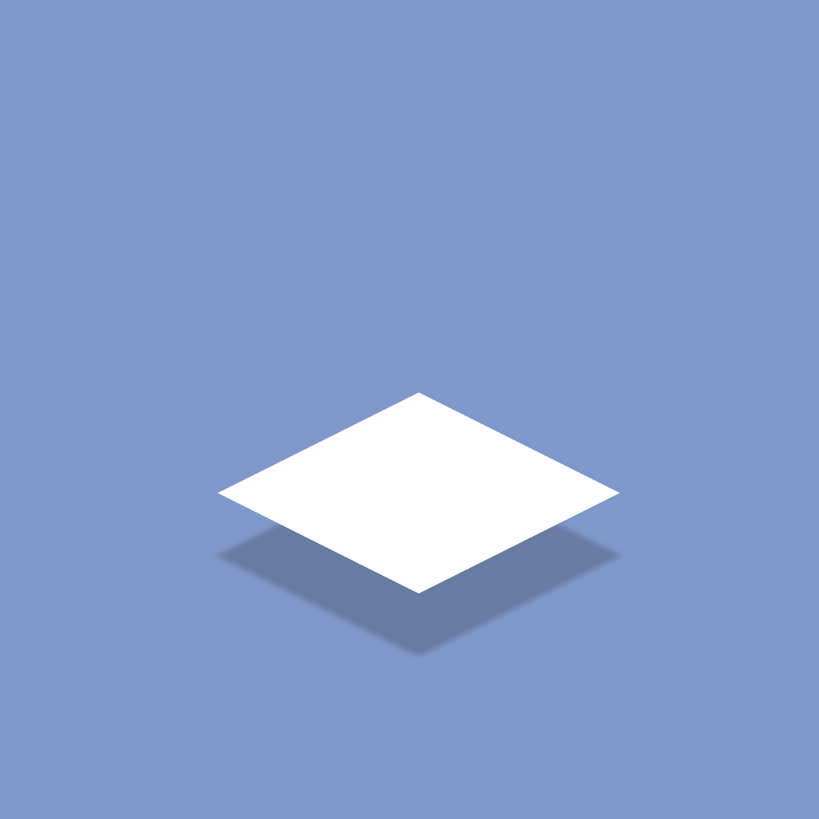
Plane Component
| Code | Preview |
|---|---|
import { IsometricPlane } from "isometric-react";

const Showcase = () => {
  return (
    <IsometricContainer>
      <Isometric>

        <IsometricPlane color="#ffffff" width={5} height={5} />

      </Isometric>
    </IsometricContainer>
  );
}; |
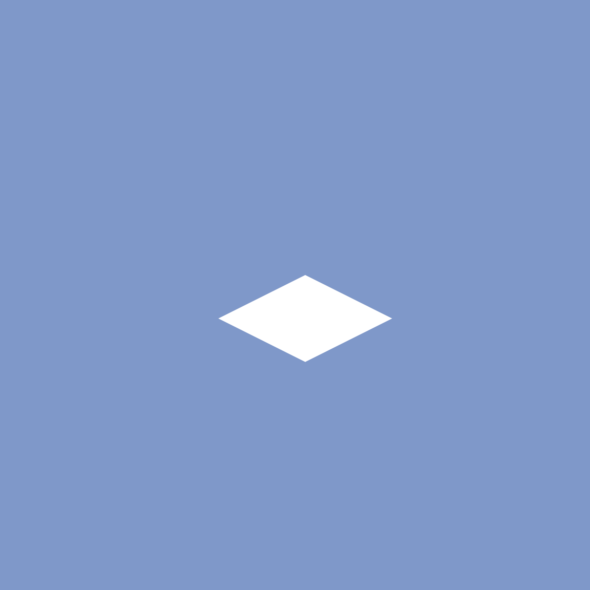
|
Plane API
| Property name | Description | Type | Required |
|---|---|---|---|
| width | Defines the width of a plane | number |
True |
| height | Defines the height of a plane | number |
True |
| color | Defines the color of the grid. Accepts RGB, Hex or just a regular color name | string |
True |
| border | Defines the border of the plane | { size: string ([number][unit]); style: 'dotted' | 'dashed' | 'solid' | 'double' | 'groove' | 'ridge' | 'inset' | 'outset' | 'none' | 'hidden'; color: string (HEX colors only) } |
False |
| edge | Defines the "shadow" plane of the current plane (works best with lower depth values) | { depth: string ([number][unit]); color: string (HEX colors only) } |
False |
| children | Takes any HTML or JSX/TSX elements and renders them | JSX.Element | JSX.Element[] |
False |
Cube component
| Code | Preview |
|---|---|
import { IsometricCube } from "isometric-react";

const Showcase = () => {
  return (
    <IsometricContainer>
      <Isometric>

        <IsometricCube
          width={5}
          height={5}
          depth={5}
          color="rgb(255, 255, 255)"
          border={{
            size: "2px",
            style: "solid",
            color: "#000000",
          }}
        >
          {[...Array(6)].map((_, sideIndex) => (
            <div key={sideIndex}>Side: {sideIndex}</div>
          ))}
        </IsometricCube>

      </Isometric>
    </IsometricContainer>
  );
}; |

|
IMPORTANT PART ABOUT CUBE COMPONENT
Cube component is the only component that REQUIRES children. It works the following way:
- Each child of IsometricCube component represents one cube side. (6 in total).
- Sides follow this pattern:
top,front left,front right,bottom,back right,back left. - One child is enough for component to work, but keep in mind the pattern from above where that child will appear if you plan on using less than 6 children (6 cube sides).
One solution would be to make all 6 sides available using empty div elements and then use/hide the sides you have in mind to use/not use.
To try out how the cube component works, you can do so here.
Cube API
| Property name | Description | Type | Required |
|---|---|---|---|
| width | Defines the width of a cube | number |
True |
| height | Defines the height of a cube | number |
True |
| depth | Defines how tall the cube will be | number |
True |
| color | Defines the color of the grid. Accepts RGB, Hex or just a regular color name | string |
True |
| children | Takes any HTML or JSX/TSX elements and renders them on one of the cubes sides following the next pattern: top, front left, front right, bottom, back right, back left. |
JSX.Element | JSX.Element[] |
True |
| border | Defines the border of the plane | { size: string ([number][unit]); style: 'dotted' | 'dashed' | 'solid' | 'double' | 'groove' | 'ridge' | 'inset' | 'outset' | 'none' | 'hidden'; color: string (HEX colors only) } |
False |
Advanced API
Shadow
Every component comes with this optional property. It creates a shadow below the item. You can try it online here.
Usage
| Code | Preview |
|---|---|
const Showcase = () => {
return (
<IsometricContainer>
<Isometric>
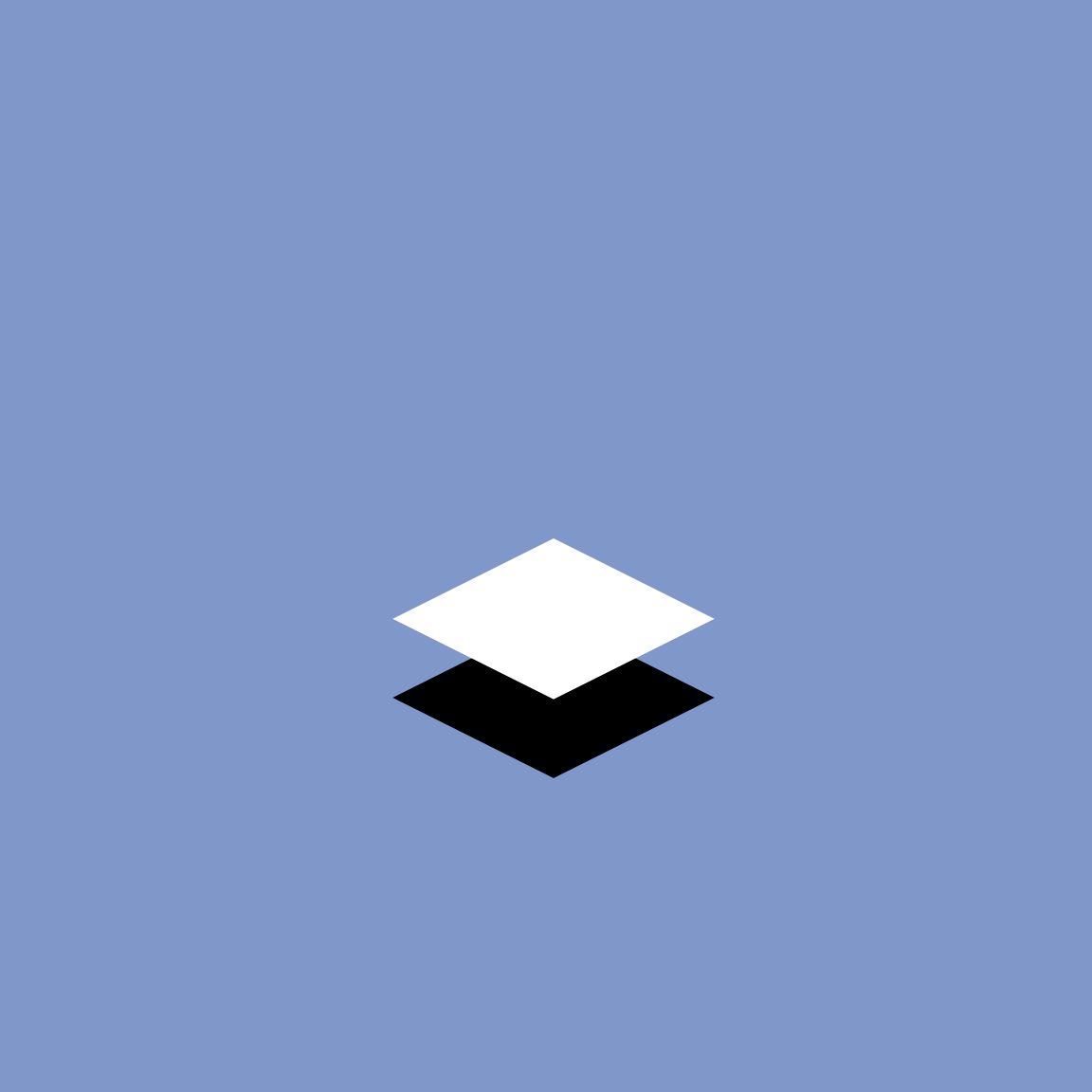
<IsometricPlane
color="#ffffff"
width={5}
height={5}
shadow={{
distance: 0.7,
spacingX: 1,
spacingY: 1,
}}
/>
</Isometric>
</IsometricContainer>
);
}; |
|
| Property name | Description | Type | Required |
|---|---|---|---|
| shadow | Defines the shadow of cube/plane/grid | { distance: number; spacingX: number; spacingY: number } |
False |
Position
Every component comes with this optional property. It offsets (moves) the item for given values. You can try it online here.
Usage
| Code | Preview |
|---|---|
const Showcase = () => {
  return (
    <IsometricContainer>
      <Isometric>
        <IsometricGrid
          size={5}
          ...
        />
        <IsometricCube
          ...
          color="rgb(255, 255, 255)"
        >
          {[...Array(6)].map((_, sideIndex) => (
            <div key={sideIndex}>
              ...
            </div>
          ))}
        </IsometricCube>
        <IsometricCube
          ...
          color="rgb(0, 255, 0)"
          position={{
            top: 10,
            left: 15,
            elevation: 0,
          }}
        >
          {[...Array(6)].map((_, sideIndex) => (
            <div key={sideIndex}>
              ...
            </div>
          ))}
        </IsometricCube>
      </Isometric>
    </IsometricContainer>
  );
}; |

|
| Property name | Description | Type | Required |
|---|---|---|---|
| position | Defines the position of cube/plane/grid | { top: number; left: number; elevation: number } |
False |
Animation
Every component comes with this optional property. It animates the component based on the given values.
Usage
You can try and see how animation works here.
animation is a property that accepts an OBJECT with following properties:
| Property name | Description | Type | Required |
|---|---|---|---|
| name | Name of the animation | string | True |
| attribute | Transform | string | True |
| from | Where to start animation from | string | True |
| to | Where to finish animation | string | True |
| delay | Delay of the animation | string | True |
| duration | Duration of the animation | string | True |
| options | Additional animation options like infinite, alternate, etc. | string | True |
Shadow Animation
Every component comes with this optional property. It animates the components shadow based on the given values.
Usage
You can try and see how shadow animation works here.
shadowAnimation is a property that accepts an OBJECT with following properties:
| Property name | Description | Type | Required |
|---|---|---|---|
| name | Name of the shadow animation | string | True |
| from | Where to start shadow animation from | number | True |
| to | Where to finish shadow animation | number | True |
| spacingX | Offset shadow on X axis | number | True |
| spacingY | Offset shadow on Y axis | number | True |
| delay | Delay of the shadow animation | string | True |
| duration | Duration of the shadow animation | string | True |
| options | Additional shadow animation options like infinite, alternate, etc. | string | True |
Rotation
Every component comes with this optional property. It rotates the component based on the given values.
Usage
You can try and see how rotation works here.
rotate is a property that accepts an OBJECT with following properties:
| Property name | Description | Type | Required |
|---|---|---|---|
| name | Name of the rotation | string | True |
| from | Where to start rotation from | string ([number]deg) | True |
| to | Where to finish rotation | string ([number]deg) | True |
| delay | Delay of the rotation | string | True |
| duration | Duration of the rotation | string | True |