
ioBroker.iqontrol


Tests:
| Linux/Mac/Windows: | Cross-Browser-Checking: |
|---|---|
 |
 |
If you like it, please consider a donation:

iQontrol adapter for ioBroker
Fast Web-App for Visualization.


© by dslraser:

© by muuulle:

© by peks-64:

Runs in any Browser. Easy to set up, although it's fully customizable and responsive.
This adapter uses Sentry libraries to automatically report exceptions and code errors to the developers. For more details and for information how to disable the error reporting see Sentry-Plugin Documentation! Sentry reporting is used starting with js-controller 3.0.
Video-Tutorial (German Language):

Add to Homescreen
You can save it as Web-App on Homescreen, and it looks and feels like a native app:

This also works on your PC with Chrome:
- Open iQontrol in Chrome
- Klick on the three-dots-menu - More tools - Create shortcut
- You will then find iQontrol in the start menu under chrome apps and can even add it to your taskbar
You need...
-
Nodejs 10 or higher
-
Web-Adapter with one instance running the same protocol (http or https) as the admin-adapter, socket.IO set to 'integrated' and 'Force Web-Sockets' disabled
- If this stands in conflict to other adapters, simply add another instance with the above settings - iQontrol will search the best fitting web-adapter-instance and use it for communication
- For connecting over iobroker.pro-Cloud both, admin- and web-adapter should be set to http (not https)
-
If you experience any problems, please have a look at the troubleshooting section at the end of this readme
Forum
Visit the Support-Thread iobroker forum. Visit the Developer-Thread iobroker forum.
Wiki
Have a look at the wiki wiki.
How to use
Don't be scared of the many options you have. Most things work right out of the box. You can, but you don't have to use all the configuration-possibilities iQontrol offers! Just start this way:
- Start creating views. You can consider views as something like a page.
- Then create devices on these views. Devices have a role, that determines the function of the device, which icons are used and so on. Depending on that role you can link several states to the device. These will give the device its functionality. If you select 'Link to other view' as role you can create links to other views. I suggest skinning Links to other views with the same Background, the linked view has. You can also try to use the Auto-create-Function to choose an existing device from the iobroker-object-tree. Auto-create tries to find out the role and to match as many states as possible.
- Afterwards you can create a toolbar, which is displayed as footer. Toolbar-Entries are links to views. The first Toolbar-Entry will be your 'Home-View' with will be loaded at start.
- To give everything a fancy style, you can upload your own images.
You can use your images as background-images for views, or for devices.
Images in the folder
/usericonscan be used as icons for devices. The free builtin demo-wallpapers are from www.pexels.com.
Use Auto-create
- You'll find a
Autocreate Views-Button inside theViews-Tab - If you have well maintained ioBroker enumerations like Rooms or Functions, you can use this function to automatically build Views with the devices listed inside this enumerations
- Keep in mind, because of the large numbers of different adapters and devices inside the ioBroker-universe, the auto-creation feature can not maintain all devices 100% correctly. You may need to rework some settings by hand to get the best results. But auto-create offers you a good starting point to build your own visualization in seconds.
URL-Parameters
- The frontend is called via
http[s]://<url or ip of iobroker>:<port of web adapter>/iqontrol/index.html-
<port of web adapter>is usually 8082
-
- To open a specified instance you can add
namespace=iqontrol.<instance-number>as URL-parameter - To open a specified view you can add
renderView=<viewID>as URL-parameter.-
<viewID>needs to be formatted likeiqontrol.<instance-number>.Views.<view-name> - Note: this is case-sensitive!
-
- To open a specified view as homepage you can add
home=<viewID>as URL-parameter. This will also change the linked view of the first toolbar entry!-
<viewID>needs to be formatted likeiqontrol.<instance-number>.Views.<view-name> - Note: this is case-sensitive!
-
- To open a specified dialog while loading the page you can add
openDialog=<deviceID>as URL-parameter-
<deviceID>needs to be formatted likeiqontrol.<instance-number>.Views.<view-name>.devices.<device-number>where<device-number>starts from 0 (so the first device on a view is device number 0) - Note: this is case-sensitive!
-
- To set or override return after time settings, use the following parameters:
-
returnAfterTimeTreshold=<time in seconds>to set the time, after which the destination view is called. Use0to disable return after time feature. -
returnAfterTimeDestiationView=<viewID>to set the view, which is called after the threshold. If not specified, the home view will be used. - These options are helpful, if you call iQontrol from a wall mounted tablet, which should automatically return to home-view after being used
-
- To load the page without toolbar you can add
noToolbar=true - To load the page without panel you can add
noPanel=true - To load the page without toolbar and panel, swiping deactivated, no loading-spinner and with transparent loading-screen you can add
isBackgroundView=true - Normally iQontrol uses the language that is set in ioBroker. You can overwrite that by adding
language=<xx>-
<xx>can bede,en,es,fr,it,nl,pl,pt,ruorzh-cn
-
- If your iQontrol instance is password protected by a passphrase (see Options - Passphrase-Protection), you can submit the passphrase by adding `passphrase='
Example:
-
https://192.168.1.1:8082/iqontrol/index.html?namespace=iqontrol.1&home=iqontrol.1.Views.Living-Room- Note upper and lower case
Fonts
- You can upload your own font files in the Images/Widgets-Tab into the folder
/userfonts - In the Options-Tab you have several places where these fonts can be chosen
- It depends on your servers MIME-Settings, if the font is presented correctly to the browser - for me best worked .ttf and .woff (tested on a raspi 4b)
- These mime-settings should work:
- .otf:
application/x-font-opentype - .ttf:
application/x-font-ttforapplication/x-font-truetype - .woff:
application/font-woff - .woff2:
application/font-woff2 - .eot:
application/vnd.ms-fontobject
- .otf:
- You can convert fonts to other formats on
fontsquirrel.comunder generator
- These mime-settings should work:
- Keep in mind - webfonts are always a little tricky and not every font with every server and every browser will work
Icons and Background-Images
- You can use the inbuilt images or the images uploaded under the images tab or any free url you like
- You can also use a variable inside the image-url. This may be useful for example for weather-forecasts. Use this pattern:
path/to/firstloaded.png|anotherpath/to/{iobrokerstate|fallback}.png- Example:
./../iqontrol.meta/userimages/demo/bottle.jpg|./../iqontrol.meta/userimages/demo/{javascript.0.myimage|whitestone}.jpg - This loads
./../iqontrol.meta/userimages/demo/bottle.jpgwhen you open the view - As soon as the state of
javascript.0.myimageis fetched from the server, the image will be replaced with./../iqontrol.meta/userimages/demo/XXX.jpgwhereXXXis the value ofjavascript.0.myimage - If
javascript.0.myimagehas no value the fallbackwhitestonewill be used (using the fallback is optional)
Progress Bars
- It is possible, to use SVG-Definitions in combination with variables instead of imagefiles to display progress-bars
- There are a vew templates integrated to chose from, but you can also create your own SVGs


- See Wiki for further information
Charts
- You can add the ''FLOT Chart-Widget'' as BACKGROUND_URL of any device, which will automatically display the main state as a chart in the background of the device-tile
- You need to ensure that the state is logged and recorded by one of the history-adapters of ioBroker

Device-Names
- Just like variables in image-urls you can use variables in device-names. The syntax is almost the same:
Text while loading|Text after loading {iobrokerstate|fallback}- Additionally, can put the iobroker state into square brackets, then the plain value without its unit will be used:
Text while loading|Text after loading {[iobrokerstate]|fallback} - Example:
Weather is loading|Weather: {javascript.0.weather|No weather data found} - This shows
Weather is loadingwhen you open the view - As soon as the state of
javascript.0.weatheris fetched from the server, the text will be replaced byWeather: XXXwhereXXXis the value ofjavascript.0.weather - If
javascript.0.weatherhas no value the fallbackNo weather data foundwill be used (using the fallback is optional)
Popup-Messages
- Every instance creates the state
iqontrol.x.Popup.Message- When passing values to this state, a popup-message (or toast) will be displayed on all currently opened iQontrol frontends
- Additionally every instance creates the state
iqontrol.x.Popup.PersistentMessage- When passing values this state, the popup-message will be saved into the PERSISTENT_MESSAGES_PENDING-Array.
- Persistent messages will not be only displayed on all currently opened iQontrol frontends, but also on all in future opened instances until they are confimed (by click or duration) or they expire.
-
PersistentExpiresdefines, when the persistent message expires as a UNIX-Timestamp (seconds from 1970-01-01 00:00:00). Values lower than 31536000 are interpreted as a duration in seconds from now (31536000 seconds = 1 year). -
PersistentUndismissibleboolean - If this is set to true, the persistent message will be kept even after it is closed. If you open a new iQontrol instance, it will be displayed again. Otherwise persistent messages are deleted after the popup closes (even by click or when the duration has elapsed). -
PersistentIdis an optional arbitrary expression that can be used to identify the message.- The id can be used to delete corresponding popup messages by sending the id to
PERSISTENT_MESSAGES_DELETE_ID. Sendingnullto this datapoint removes all pending messages. - The id can also be used to display corresponding popup messages on all currently opened iQontrol-Instances again by sending the id to
PERSISTENT_MESSAGES_SHOW_ID. Sendingnullto this datapoint shows all pending messages.
- The id can be used to delete corresponding popup messages by sending the id to
- Note: You can send a message to only one of the two data points "Message" or "PersistentMessage", not to both.
- You can use html-tags to format the message text
- There are some additional states for further customization of the displayed popup (these must be set, before the message datapoint is set):
-
Duration: This is the time in ms the message is displayed; if set to 0 the message has to be confirmed -
ClickedValueandClickedDestinationState: If the popup is clicked by user, the value fromClickedValuewill be sent toiqontrol.x.Popup.POPUP_CLICKEDand, if specified, additional to the datapoint inClickedDestinationState- If no value is specified,
truewill be used
- If no value is specified,
-
ClickKeepsOpenboolean - if true, the popup can only be closed by clicking on a button, klicking the popup itself will not close it. So make shure you add buttons to your popup-message, as described beneath. -
ButtonNames: Here you can specify a comma separated list of buttons, that will be displayed at the bottom of the popup (for example "OK,Abort")-
ButtonValuesandButtonDestinationStates: These are comma separated lists of values that will be sent toiqontrol.x.Popup.BUTTON_CLICKEDand, if specified, additional to the datapoint inButtonDestinationStates, if the user clickes the corresponding button- Instead of a datapoint you can use the commands
COMMAND:renderViewandCOMMAND:openDialogas a ButtonDestinationState, to render a view or open a dialog - The ButtonValue then specifies the view resp. dialog and needs to be in the format
iqontrol.<instance-number>.Views.<view-name>resp.iqontrol.<instance-number>.Views.<view-name>.devices.<device-number>where<device-number>starts from 0 (so the first device on a view is device number 0)
- Instead of a datapoint you can use the commands
- If you only use one value (instead of a comma separated list), this value will be used for all buttons
- If you leave
ButtonValuesempty, the name of the button will be used - If you only use one destination state (instead of a comma separated list), this state will be used for all buttons
-
ButtonCloses: This is a comma separated list of booleans (true/false) that specify, if the popup should be closed, when the corresponding button is pressed -
ButtonClears: This is a comma separated list of booleans (true/false) that specify, if the popup settings should be cleared (= set all popup-states to empty), when the corresponding button is pressed
-
-
- Alternatively you can set these values via sendTo-command with the parameters
PopupMessage,PopupDuration,PopupClickedValueand so on- Example:
sendTo("iqontrol", "send", {PopupMessage: 'This is my message', PopupDuration: 2500, PopupClickedValue: 'messageConfirmed'});
- Example:
- You can also use blockly to send messages to iQontrol


Widgets
- Every tile has a BACKGROUND_URL and a BACKGROUND_HTML datapoint
- Here you can define a link (via BACKGROUND_URL) to a website or place direct HTML-Code (via BACKGROUND_HTML), that will be displayed as background of the tile
- This gives you the possibility to place (interactive) content inside a tile (like clocks, FLOT-charts, tables, weather-forecasts and so on)
- By default, mouse events will be directed to this content (thus you can't click the tile itself anymore), but you can disable this with the option "Direct mouse events to the tile instead to the content of BACKGROUND_VIEW/URL/HTML"
- iQontrol offers a device-role "Widget" which has some predefined options set that will be mostly used when showing a website as widget. But you can achieve the same result with any other role by modifying the devices options properly.

Widget development (for experts only): (klick to open)
jQuery
- Technically the content of BACKGROUND_VIEW/URL/HTML is placed inside a HTML-Element called iframe, which is a website inside a website
- In order to use jQuery, you can transfer it from iQontrol to the iFrame with the following code:
window.$=window.jQuery=parent.jQuery.extend(function(s){return parent.jQuery(s,document)},parent.jQuery); - Example:
 <!doctype html>
 <html>
 <head>
 	<meta http-equiv="Content-Type" content="text/html; charset=UTF-8"/>
 	<meta name="widget-description" content="This is a demo widget-preset. It has no useful funcion. (C) by Sebastian Bormann"/>
 	<meta name="widget-options" content="{'noZoomOnHover': 'true', 'hideDeviceName': 'true', 'sizeInactive': 'xwideIfInactive highIfInactive', 'iconNoPointerEventsInactive': 'true', 'hideDeviceNameIfInactive': 'true', 'hideStateIfInactive': 'true', 'sizeActive': 'fullWidthIfActive fullHeightIfActive', 'bigIconActive': 'true', 'iconNoPointerEventsActive': 'true', 'hideDeviceNameIfActive': 'true', 'hideStateIfActive': 'true', 'sizeEnlarged': 'fullWidthIfEnlarged fullHeightIfEnlarged', 'bigIconEnlarged': 'true', 'iconNoPointerEventsEnlarged': 'false', 'noOverlayEnlarged': 'true', 'hideDeviceNameIfEnlarged': 'true', 'hideStateIfEnlarged': 'true', 'popupAllowPostMessage': 'true', 'backgroundURLAllowPostMessage': 'true', 'backgroundURLNoPointerEvents': 'false'}"/>
 	<title>iQontrol Widget Test</title>
 </head>
 <body>
 	<div id="testDiv">Loading...</div>
 	<script type="text/javascript">
 		console.log("JQUERY-TEST");
 		window.$=window.jQuery=parent.jQuery.extend(function(s){return parent.jQuery(s,document)},parent.jQuery);
 		$(document).ready(function(){
 			$('#testDiv').html("<h1>Hello World</h1)");
 			console.log("jQuery works!!");
 		});
 	</script>
 </body>
 </html>
postMessage-Communication
- By enabling the option "Allow postMessage-Communication for BACKGROUND_VIEW/URL/HTML" you can enable postMessage-Communication between the widget in its iframe and iQontrol itself
- To send commands to iQontrol you can use the following javascript-command:
window.parent.postMessage(message, "*");-
messageis a javascript object of the format{ command: command, stateId: stateId, value: value } - The following message-commands are supported:
-
{ command: "setWidgetState", stateId: <widgetStateId>, value: <value> }- This will set the ioBroker state
iqontrol.<instance>.Widgets.<widgetStateId>to the value<value>(<value>can be a string, number or boolean or an object like{ val: <value>, ack: true|false })
- This will set the ioBroker state
-
{ command: "getWidgetState", stateId: <widgetStateId> }- This will cause iQontrol to send the value of the ioBroker state
iqontrol.<instance>.Widgets.<widgetStateId>(see below how to receive the answer-message)
- This will cause iQontrol to send the value of the ioBroker state
-
{ command: "getWidgetStateSubscribed", stateId: <widgetStateId> }- This will cause iQontrol to send the value of the ioBroker state
iqontrol.<instance>.Widgets.<widgetStateId>now and every time its value changes (see below how to receive the answer-messages)
- This will cause iQontrol to send the value of the ioBroker state
-
{ command: "setWidgetDeviceState", stateId: <widgetDeviceState>, value: <value> }- This will set the ioBroker datapoint that is assigned to the devices STATE
<widgetDeviceState>(for example the datapoint, that is assigned to LEVEL) to the value<value>(<value>can be a string, number or boolean or an object like{ val: <value>, ack: true|false })
- This will set the ioBroker datapoint that is assigned to the devices STATE
-
{ command: "getWidgetDeviceState", stateId: <widgetDeviceState> }- This will cause iQontrol to send the value of the ioBroker datapoint, that is assigned to the devices STATE
<widgetDeviceState>(for example the datapoint, that is assigned to LEVEL; see below how to receive the answer-message)
- This will cause iQontrol to send the value of the ioBroker datapoint, that is assigned to the devices STATE
-
{ command: "getWidgetDeviceStateSubscribed", stateId: <widgetDeviceState> }- This will cause iQontrol to send the value of the ioBroker datapoint, that is assigned to the devices STATE
<widgetDeviceState>(for example the datapoint, that is assigned to LEVEL) now and every time its value changes (see below how to receive the answer-message)
- This will cause iQontrol to send the value of the ioBroker datapoint, that is assigned to the devices STATE
-
{ command: "setState", stateId: <stateId>, value: <value> }- This will set the ioBroker state
<stateId>to the value<value>(<value>can be a string, number or boolean or an object like{ val: <value>, ack: true|false })
- This will set the ioBroker state
-
{ command: "getState", stateId: <stateId> }- This will cause iQontrol to send the value of the ioBroker state
<stateId>(see below how to receive the answer-message)
- This will cause iQontrol to send the value of the ioBroker state
-
{ command: "getStateSubscribed", stateId: <stateId> }- This will cause iQontrol to send the value of the ioBroker state
<stateId>now and every time its value changes (see below how to receive the answer-messages)
- This will cause iQontrol to send the value of the ioBroker state
-
{ command: "getOptions"}- This will cause iQontrol to send the user options the user has configured as object
-
{ command: "renderView", value: <viewID> }- This will instruct iQontrol to render a view, where
<viewID>needs to be formatted likeiqontrol.<instance-number>.Views.<view-name>(case-sensitive)
- This will instruct iQontrol to render a view, where
-
{ command: "openDialog", value: <deviceID> }- This will instruct iQontrol to open a dialog, where
<deviceID>needs to be formatted likeiqontrol.<instance-number>.Views.<view-name>.devices.<device-number>where<device-number>starts from 0 (so the first device on a view is device number 0)
- This will instruct iQontrol to open a dialog, where
-
-
- To receive messages from iQontrol, you need to register an event-listener to the "message"-event with the javascript-command
window.addEventListener("message", receivePostMessage, false);- The function
receivePostMessagereceives the objectevent -
event.datacontains the message from iqontrol, which will be an object like:- event.data =
{ command: "getState", stateId: <stateId>, value: <stateObject> }- this will be the answer to agetState-command or agetStateSubscribed-command and gives you the actual<value>-object of the ioBroker state<stateId> -
<stateObject>itself is an object likeevent.data.value = { val: <value (rounded)>, unit: "<unit>", valFull: <value (not rounded, no javascript-injection prevention)>, plainText: "<clear text of val, for example taken from valuelist>", min: <minimum>, max: <maximum>, step: <step-width>, valuelist: {<object with possible values and corresponding clear text>}, targetValues: {<target value list>}, ack: <true|false>, readonly: <true|false>, custom: {<object with custom settings>}, id: <id of the iobroker datapoint>, from: "<source of state>", lc: <timestamp of last change>, ts: <timestamp of last actualization>, q: <quality of signal>, role: "<role of state>", type: "<string|number|boolean>", name: "<name of datapoint>", desc: "<description of datapoint>", Date: <Date-object (only present, if value is regognized as a valid time or period)> }
- event.data =
- The function
- To instruct iQontrol to generate a widgetState under
iqontrol.<instance>.Widgetsyou can use a meta-tag inside the head-section of the widget-website:- Syntax:
<meta name="widget-datapoint" content="WidgetName.StateName" data-type="string" data-role="text" /> - You can further configure the datapoint by using data-type (which can be set to string, number or boolean), data-role, data-name, data-min, data-max, data-def and data-unit attributes
- You can also use a URL-parameter (see below) as a variable, for example to create distinct instances of the widgets with own data points.
- The Syntax is then:
<meta name="widget-datapoint" content="WidgetName.StateName|WidgetName.{instance}.StateName" data-type="string" data-role="text" /> - If the variable
instanceis set, then the part after the|will be used as widgetState-Name and{instance}will be replaced by the value ofinstance - If the variable
instanceis not set, then the part before the|will be used aswigdetState-Name
- The Syntax is then:
- The corresponding datapoint is only then created, if the widget-website is added to a device as URL or BACKGROUND_URL
- Syntax:
- The same concept may be used for the URL/HTML-State, which is used to display a website inside the dialog of a device
- To create an icon for your widget place a .png file with the same filename as the widget into the widgets directory
- See below for an example widget-website:
Show example widget-website to be displayed as widget with postMessage-communication: (klick to open)
- You can use the following HTML code and copy it to the BACKGROUND_HTML-State of a widget (which then needs to be configured as "Constant")
- As an alternative you can upload this code as html-file into the
/userwidgetssubdirectory and reference it to BACKGROUND_URL-State (which then also needs to be configured as "Constant") - Activate the option "Allow postMessage-Communication for BACKGROUND_VIEW/URL/HTML"
- It will demonstrate how a two-way communication between the website and iQontrol is done
<!doctype html>
<html>
<head>
	<meta http-equiv="Content-Type" content="text/html; charset=UTF-8"/>
	<meta name="widget-datapoint" content="postMessageTest.test" data-type="string" data-role="text" />
	<meta name="widget-description" content="This is a test widget. To get the WidgetDeviceState-Functions working, please set a valid iobroker-datapoint for STATE. (C) by Sebastian Bormann"/>
	<meta name="widget-urlparameters" content="title/postMessageTest/Please enter a title">
	<meta name="widget-options" content="{'noZoomOnHover': 'true', 'hideDeviceName': 'true', 'sizeInactive': 'xwideIfInactive highIfInactive', 'iconNoPointerEventsInactive': 'true', 'hideDeviceNameIfInactive': 'true', 'hideStateIfInactive': 'true', 'sizeActive': 'xwideIfActive highIfActive', 'bigIconActive': 'true', 'iconNoPointerEventsActive': 'true', 'hideDeviceNameIfActive': 'true', 'hideStateIfActive': 'true', 'sizeEnlarged': 'fullWidthIfEnlarged fullHeightIfEnlarged', 'bigIconEnlarged': 'true', 'iconNoPointerEventsEnlarged': 'false', 'noOverlayEnlarged': 'true', 'hideDeviceNameIfEnlarged': 'true', 'hideStateIfEnlarged': 'true', 'popupAllowPostMessage': 'true', 'backgroundURLAllowPostMessage': 'true', 'backgroundURLNoPointerEvents': 'false'}"/>
 	<title>iQontrol postMessageTest</title>
</head>
<body>
	<br><br>
	<h3><span id="title">postMessageTest</span><h3>
	<button onclick="getWidgetState('postMessageTest.test')">getWidgetState postMessageTest.test</button><br>
	<button onclick="getWidgetStateSubscribed('postMessageTest.test')">getWidgetStateSubscribed postMessageTest.test</button><br>
	<button onclick="setWidgetState('postMessageTest.test', 'Hello world')">setWidgetState postMessageTest.test to 'Hello world'</button><br>
  	<br>
	<button onclick="getWidgetDeviceState('STATE')">getWidgetDeviceState STATE</button><br>
	<button onclick="getWidgetDeviceStateSubscribed('STATE')">getWidgetDeviceStateSubscribed STATE</button><br>
	<button onclick="setWidgetDeviceState('STATE', 'Hello world')">setWidgetDeviceState STATE to 'Hello world'</button><br>
  	<br>
	<button onclick="getState('system.adapter.admin.0.cpu')">getState system.adapter.admin.0.cpu</button><br>
	<button onclick="getStateSubscribed('system.adapter.admin.0.uptime')">getStateSubscribed system.adapter.admin.0.uptime</button><br>
	<button onclick="setState('iqontrol.0.Popup.Message', 'Hey, this is a test Message')">setState popup message</button><br>
  	<br>
	<button onclick="renderView('iqontrol.0.Views.Home')">renderView 'Home'</button><br>
	<button onclick="openDialog('iqontrol.0.Views.Home.devices.0')">openDialog 1st device on 'Home'</button><br>
	<br><hr>
	message sent: <span id="messageSent">-</span><br>
	<br><hr>
	message received: <span id="messageReceived">-</span><br>
	<br><hr>
	this means: <span id="thisMeans">-</span><br>
	<br><hr>
    <script type="text/javascript">
		var countSend = 0;
		var countReceived = 0;

		//Set title from UrlParameter
		document.getElementById('title').innerHTML = getUrlParameter('title') || "No Title set";

		//getWidgetState
		function getWidgetState(stateId){
			sendPostMessage("getWidgetState", stateId);
		}

		//getWidgetStateSubscribed (this means, everytime the state changes, an update will be received)
		function getWidgetStateSubscribed(stateId){
			sendPostMessage("getWidgetStateSubscribed", stateId);
		}

		//setWidgetState
		function setWidgetState(stateId, value){
			sendPostMessage("setWidgetState", stateId, value);
		}


		//getWidgetDeviceState
		function getWidgetDeviceState(stateId){
			sendPostMessage("getWidgetDeviceState", stateId);
		}

		//getWidgetDeviceStateSubscribed (this means, everytime the state changes, an update will be received)
		function getWidgetDeviceStateSubscribed(stateId){
			sendPostMessage("getWidgetDeviceStateSubscribed", stateId);
		}

		//setWidgetDeviceState
		function setWidgetDeviceState(stateId, value){
			sendPostMessage("setWidgetDeviceState", stateId, value);
		}


		//getState
		function getState(stateId){
			sendPostMessage("getState", stateId);
		}

		//getStateSubscribed (this means, everytime the state changes, an update will be received)
		function getStateSubscribed(stateId){
			sendPostMessage("getStateSubscribed", stateId);
		}

		//setState
		function setState(stateId, value){
			sendPostMessage("setState", stateId, value);
		}


		//renderView
		function renderView(viewId){
			sendPostMessage("renderView", null, viewId);
		}

		//openDialog
		function openDialog(deviceId){
			sendPostMessage("openDialog", null, deviceId);
		}

		// +++++ Default Functions +++++
		//getUrlParameter
		function getUrlParameter(name) {
			name = name.replace(/[\[]/, '\\[').replace(/[\]]/, '\\]');
			var regex = new RegExp('[\\?&]' + name + '=([^&#]*)');
			var results = regex.exec(location.search);
			return results === null ? null : decodeURIComponent(results[1].replace(/\+/g, ' '));
		};

		//send postMessages
		function sendPostMessage(command, stateId, value){
			countSend++;
			message = { command: command, stateId: stateId, value: value };
			document.getElementById('messageSent').innerHTML = countSend + " - " + JSON.stringify(message);
			window.parent.postMessage(message, "*");
		}

		//receive postMessages
		window.addEventListener("message", receivePostMessage, false);
		function receivePostMessage(event) { //event = {data: message data, origin: URL of origin, source: id of sending element}
			countReceived++;
			if(event.data) document.getElementById('messageReceived').innerHTML = countReceived + " - " + JSON.stringify(event.data);
			if(event.data && event.data.command) switch(event.data.command){
				case "getState":
				if(event.data.stateId && event.data.value && event.data.value.val){
					document.getElementById('thisMeans').innerHTML = "Got State " + event.data.stateId + " with value " + event.data.value.val;
				}
				break;
			}
		}
	</script>
</body>
</html>
Further configuration of widgets
- There are additional meta-tags, you can use inside the head-section of your widget-website to configure the behavior of the widget:
-
widget-description- syntax:
<meta name="widget-description" content="Please see www.mywebsite.com for further informations. (C) by me"/> - The content will be displayed when choosing the widget as URL or BACKGROUND_URL or if you auto-create a widget
- syntax:
-
widget-urlparameters- syntax:
<meta name="widget-urlparameters" content="parameter/default value/description/type;parameter2/default value2/description2/type2"/> - The user will be asked for these parameters when choosing the widget as URL or BACKGROUND_URL or auto-creates a widget
-
typeis optional and may betext(this is default),number,checkbox,color,select,multipleSelect,combobox,historyInstance,datapoint,listJsonDatapoint,icon,fontFamily,fontSize,fontStyle,fontWeight,language,section,divider,info,linkorhidden- If type is
select,multipleSelectorcomboboxthen you need to specify the possible options by adding/<selectOptions>, where<selectOptions>is a string of the format<value1>,<caption1>/<value2>,<caption2>/...(combobox is a selectbox with the possibility to enter free text) - If type is
numberthen can specify min, max and step-width by adding/<numberOptions>, where<numberOptions>is a string of the format<min>,<max>,<step> - The types
section,divider,infoandlinkhave no further function, they are just to display information to the user. Forlinkthe value should be a URL, but all slashes have to be replaced by backslashes. - Type
hiddenwill be passed to the widget, but no configuration dialog is shown
- If type is
- All these parameters will be given to the widget-website via a URL-parameter-string (like
widget.html?parameter=value¶meter2=value2) - You can use these settings inside your widget-website by requesting the URL-parameters with a function like this:
function getUrlParameter(name) { name = name.replace(/[\[]/, '\\[').replace(/[\]]/, '\\]'); var regex = new RegExp('[\\?&]' + name + '=([^&#]*)'); var results = regex.exec(location.search); return results === null ? null : decodeURIComponent(results[1].replace(/\+/g, ' ')); };- If you used type
iconfor your URL-parameter then you will get either a path relative to the iqontrol-directory or an absolute path to an image. To create a valid link to your image you can use this code:var iconOn = getUrlParameter('iconOn') || './images/icons/switch_on.png'; if(iconOn.indexOf('http') != 0) iconOn = '/iqontrol/' + iconOn;
- If you used type
- syntax:
-
widget-options- syntax:
<meta name="widget-options" content="{'noZoomOnHover': 'true', 'hideDeviceName': 'true'}"/> - See the expandable section below for the possible options that can be configured by this meta-tag
- syntax:
-
widget-replaceurl- syntax:
<meta name="widget-replaceurl" content="<url>" data-absolute="<true|false>"/> - This reconfigures the used URL/BACKGROUND_URL for this widget (this way you could define widget-presets, that are used to give special or simplified configurations to the user. But when calling the widget, iQontrol uses the given
<url>instead of the original URL. - By default, only the filename (with extension) is replaced. When setting
data-absolute=true`` then the whole URL is replaced.
- syntax:
-
Show possible options that can be configured by the meta-tag 'widget-options': (klick to open)
- Icons:
-
icon_on(Icon on):- Default: ""
-
icon_off(Icon off):- Default: ""
-
- Device Specific Options:
-
showState(Show State) - only valid for role Button and Program:- Possible values:
true|false - Default:
false
- Possible values:
-
showPowerAsState:(Show POWER as state) - only valid for role Switch, Light and Fan:- Possible values:
true|false - Default:
false
- Possible values:
-
buttonCaption(Caption for button) - only valid for role Button:- Default: ""
-
returnToOffSetValueAfter(Return to 'OFF_SET_VALUE' after [ms]) - only valid for role Button:- Possible values: number from 10 to 60000
- Default: ""
-
alwaysSendTrue(Always send 'true' (do not toggle)) - only valid for role Scene:- Possible values:
true|false - Default:
false
- Possible values:
-
closeDialogAfterExecution(Close dialog after execution) - only valid for role Button, Program and Scene:- Possible values:
true|false - Default:
false
- Possible values:
-
invertCt(Invert CT (use Kelvin instead of Mired)) - only valid for role Light:- Possible values:
true|false - Default:
false
- Possible values:
-
alternativeColorspace(Colorspace for ALTERNATIVE_COLORSPACE_VALUE") - only valid for role Light:- Possible values: ""|"RGB"|"#RGB"|"RGBW"|"#RGBW"|"RGBWWCW"|"#RGBWWCW"|"RGBCWWW"|"#RGBCWWW"|"RGB_HUEONLY"|"#RGB_HUEONLY"|"HUE_MILIGHT"|"HHSSBB_TUYA"
- Default: ""
-
linkOverlayActiveColorToHue(Use color of lamp as OVERLAY_ACTIVE_COLOR) - only valid for role Light:- Possible values:
true|false - Default:
false
- Possible values:
-
linkGlowActiveColorToHue(Use color of lamp as GLOW_ACTIVE_COLOR) - only valid for role Light:- Possible values:
true|false - Default:
false
- Possible values:
-
controlModeDisabledValue(Value of CONTROL_MODE for 'disabled') - only valid for role Thermostat, Homematic-Thermostat and Homematic IP-Thermostat:- Default: ""
-
valveStatesSectionType(Appereance of VALVE_STATES) - only valid for role Thermostat, Homematic-Thermostat and Homematic IP-Thermostat:- Possible values:
true|falsenone|none noCaption|collapsible|collapsible open - Default: "collapsible"
- Possible values:
-
stateClosedValue(Value of STATE for 'closed') - only valid for role Window and Door with Lock:- Default: ""
-
stateOpenedValue(Value of STATE for 'opened') - only valid for role Window:- Default: ""
-
stateTiltedValue(Value of STATE for 'tilted') - only valid for role Window:- Default: ""
-
lockStateLockedValue(Value of LOCK_STATE for 'locked') - only valid for role Door with Lock:- Default: ""
-
lockOpenValue(Value of LOCK_OPEN for 'open door') - only valid for role Door with Lock:- Default: ""
-
invertActuatorLevel(Invert LEVEL (0 = open)) - only valid for role Blind:- Possible values:
true|false - Default:
false
- Possible values:
-
directionOpeningValue(Value of DIRECTION for 'opening') - only valid for role Window:- Default: "1"
-
directionClosingValue(Value of DIRECTION for 'closing') - only valid for role Window:- Default: "2"
-
directionUncertainValue(Value of DIRECTION for 'uncertain') - only valid for role Window:- Default: "3"
-
favoritePositionCaption(Caption for FAVORITE_POSITION) - only valid for role Window:- Default: "Favorite Position"
-
stopCaption(Caption for STOP) - only valid for role Window:- Default: "Stop"
-
upCaption(Caption for UP) - only valid for role Window:- Default: "Down"
-
downCaption(Caption for DOWN) - only valid for role Window:- Default: "Down"
-
noConfirmationForTogglingViaIcon(Don't ask for confirmation when toggling via icon) - only valid for role Garage Door:- Default: "false"
- Possible values:
true|false
-
controlModeDisarmedValue(Value of CONTROL_MODE for 'disarmed') - only valid for role Alarm:- Default: "0"
-
showStateAndLevelSeparatelyInTile(Show STATE and LEVEL separately in tile) - only valid for role Value:- Possible values: ""|"devidedByComma"|"devidedByComma preceedCaptions"|"devidedBySemicolon"|"devidedBySemicolon preceedCaptions"|"devidedByHyphen"|"devidedByHyphen preceedCaptions"
- Default: ""
-
timeCaption(Caption for TIME) - only valid for role DateAndTime:- Default: ""
-
timeFormat(Format of TIME (as stored in the datapoint, see readme)) - only valid for role DateAndTime:- Default: "x"
-
timeDisplayFormat(Display-Format of TIME (how it should be displayed, see readme)) - only valid for role DateAndTime:- Default: "dddd, DD.MM.YYYY HH:mm:ss"
-
timeDisplayDontShowDistance(Show Distance) - only valid for role DateAndTime:- Possible values: ""|
false|true - Default: "" (this means, use custom datapoint settings)
- Possible values: ""|
-
dateAndTimeTileActiveConditions(Tile is active when all selected items are true) - only valid for role DateAndTime:- Possible values (array): "activeIfStateActive", "activeIfTimeNotZero", "activeIfTimeInFuture", "activeIfTimeInPast"
- Default: "activeIfStateActive,activeIfTimeInFuture"
-
dateAndTimeTileActiveWhenRinging(Tile is always active when RINGING is active) - only valid for role DateAndTime:- Default: true
-
dateAndTimeShowInState(Show in state) - only valid for role DateAndTime:- Possible values (array): "showStateIfInactive", "showStateIfActive", "showSubjectIfActive", "showSubjectIfInactive", "showTimeIfInactiveAndInPast", "showTimeIfInactiveAndInFuture", "showTimeIfActiveAndInPast", "showTimeIfActiveAndInFuture", "showTimeDistanceIfInactiveAndInPast", "showTimeDistanceIfInactiveAndInFuture", "showTimeDistanceIfActiveAndInPast", "showTimeDistanceIfActiveAndInFuture"
- Default: "showStateIfInactive,showSubjectIfActive,showTimeDistanceIfActiveAndInFuture"
-
coverImageReloadDelay(Delay reload of cover-image [ms]) - only valid for role Media:- Possible values: number from 0 to 5000
- Default: ""
-
coverImageNoReloadOnTitleChange:(No forced reload of cover-image on change of TITLE) - only valid for role Media:- Possible values:
true|false - Default:
false
- Possible values:
-
statePlayValue(Value of STATE for 'play') - only valid for role Media:- Default: "play"
-
statePauseValue(Value of STATE for 'pause') - only valid for role Media:- Default: "pause"
-
stateStopValue(Value of STATE for 'stop') - only valid for role Media:- Default: "stop"
-
useStateValuesForPlayPauseStop(Send these values (instead of true) when clicking on PLAY, PAUSE and STOP) - only valid for role Media:- Possible values:
true|false - Default: "false"
- Possible values:
-
hidePlayOverlay(Hide play icon) - only valid for role Media:- Possible values:
true|false - Default:
false
- Possible values:
-
hidePauseAndStopOverlay(Hide pause and stop icon) - only valid for role Media:- Possible values:
true|false - Default:
false
- Possible values:
-
repeatOffValue(Value of REPEAT for 'off') - only valid for role Media:- Default:
false
- Default:
-
repeatAllValue(Value of REPEAT for 'repeat all') - only valid for role Media:- Default:
true
- Default:
-
repeatOneValue(Value of REPEAT for 'repeat one') - only valid for role Media:- Default: "2"
-
remoteKeepSectionsOpen(Keep sections open) - only valid for role Media:- Possible values:
true|false - Default:
false
- Possible values:
-
remoteSectionsStartOpened(Start with these sections initially opened) - only valid for role Media:- Possible values: array with "REMOTE_PAD", "REMOTE_CONTROL", "REMOTE_ADDITIONAL_BUTTONS", "REMOTE_CHANNELS", "REMOTE_NUMBERS" and/or "REMOTE_COLORS"
- Default:
false
-
remoteShowDirectionsInsidePad(Show Vol and Ch +/- inside Pad) - only valid for role Media:- Possible values:
true|false - Default:
false
- Possible values:
-
remoteChannelsCaption(Caption for section 'Channels') - only valid for role Media:- Default: ""
-
remoteAdditionalButtonsCaption(Caption for section 'Additional Buttons') - only valid for role Media:- Default: ""
-
togglePowerSwitch(Toggle POWER_SWITCH instead of STATE (for example when clicking on icon)) - only valid for role Media:- Possible values:
true|false - Default:
false
- Possible values:
-
noVirtualState(Do not use a virtual datapoint for STATE (hide switch, if STATE is empty)) - only valid for role Widget:- Possible values:
true|false - Default:
false
- Possible values:
-
- General:
-
readonly(Readonly):- Possible values:
true|false - Default:
false
- Possible values:
-
renderLinkedViewInParentInstance(Open linked view in parent instance, if this view is used as a BACKGROUND_VIEW):- Possible values:
true|false - Default:
false
- Possible values:
-
renderLinkedViewInParentInstanceClosesPanel(After opening linked view in parent instance, close panel (if it is dismissible)):- Possible values:
true|false - Default:
false
- Possible values:
-
- Tile-Behaviour (general):
-
clickOnIconAction(Click on Icon Action):- Possible values: "toggle"|"openDialog"|"enlarge"|"openLinkToOtherView"|"openURLExternal"|
false - Default: "toggle"
- Possible values: "toggle"|"openDialog"|"enlarge"|"openLinkToOtherView"|"openURLExternal"|
-
clickOnTileAction(Click on Tile Action):- Possible values: "toggle"|"openDialog"|"enlarge"|"openLinkToOtherView"|"openURLExternal"|
false - Default: "openDialog"
- Possible values: "toggle"|"openDialog"|"enlarge"|"openLinkToOtherView"|"openURLExternal"|
-
clickOnIconOpensDialog(Click on icon opens dialog (instead of toggling)):- deprecated since this option is now included in clickOnIconAction
- Possible values:
true|false - Default:
false
-
clickOnTileToggles(Click on tile toggles (instead of opening dialog))):- deprecated since this option is now included in clickOnTileAction
- Possible values:
true|false - Default:
false
-
clickOnTileOpensDialog(Click on tile opens dialog):- deprecated since this option is now included in clickOnTileAction
- Possible values:
true|false - Default:
true(for most devices)
-
noZoomOnHover(Disable zoom-effect on hover):- Possible values:
true|false - Default:
false(for most devices)
- Possible values:
-
iconNoZoomOnHover(Disable zoom-effect on hover for icon):- Possible values:
true|false - Default:
false
- Possible values:
-
hideDeviceName(Hide device name):- Possible values:
true|false - Default:
true
- Possible values:
-
- Conditions for an Active Tile:
-
tileActiveStateId(State ID (empty = STATE/LEVEL will be used)):- Default: ""
-
tileActiveCondition(Condition):- Possible values: ""|"at"|"af"|"eqt"|"eqf"|"eq"|"ne"|"gt"|"ge"|"lt"|"le"
- Default: ""
-
tileActiveConditionValue(Condition value):- Default: ""
-
- Tile-Behaviour if device is inactive:
-
sizeInactive(Size of tile, if device is inactive):- Possible values: ""|"narrowIfInactive shortIfInactive"|"narrowIfInactive"|"narrowIfInactive highIfInactive"|"narrowIfInactive xhighIfInactive"|"shortIfInactive"|"shortIfInactive wideIfInactive"|"shortIfInactive xwideIfInactive"|"wideIfInactive"|"xwideIfInactive"|"highIfInactive"|"xhighIfInactive"|"wideIfInactive highIfInactive"|"xwideIfInactive highIfInactive"|"wideIfInactive xhighIfInactive"|"xwideIfInactive xhighIfInactive"|"fullWidthIfInactive aspect-1-1IfInactive"|"fullWidthIfInactive aspect-4-3IfInactive"|"fullWidthIfInactive aspect-3-2IfInactive"|"fullWidthIfInactive aspect-16-9IfInactive"|"fullWidthIfInactive aspect-21-9IfInactive"|"fullWidthIfInactive fullHeightIfInactive"|"
- Default: "xwideIfInactive highIfInactive"
-
stateHeightAdaptsContentInactive(Adapt height of STATE to its content (this overwrites the tile size, if needed), if the device is inactive):- Possible values:
true|false - Default:
false
- Possible values:
-
stateFillsDeviceInactive(Size of STATE fills the complete device (this may interfere with other content), if the device is inactive):- Possible values:
true|false - Default:
false
- Possible values:
-
stateBigFontInactive(Use big font for STATE, if the device is inactive):- Possible values:
true|false - Default:
false
- Possible values:
-
bigIconInactive(Show big icon, if device is inactive):- Possible values:
true|false - Default:
false
- Possible values:
-
iconNoPointerEventsInactive(Ignore mouse events for the icon, if device is inactive):- Possible values:
true|false - Default:
false
- Possible values:
-
transparentIfInactive(Make background transparent, if device is inactive):- Possible values:
true|false - Default:
false
- Possible values:
-
noOverlayInactive(Remove overlay of tile, if device is inactive):- Possible values:
true|false - Default:
true
- Possible values:
-
hideBackgroundURLInactive(Hide background from BACKGROUND_VIEW/URL/HTML, if device is inactive):- Possible values:
true|false - Default:
false
- Possible values:
-
hideDeviceNameIfInactive(Hide device name, if the device is inactive):- Possible values:
true|false - Default:
false
- Possible values:
-
hideInfoAIfInactive(Hide INFO_A, if the device is inactive):- Possible values:
true|false - Default:
false
- Possible values:
-
hideInfoBIfInactive(Hide INFO_B, if the device is inactive):- Possible values:
true|false - Default:
false
- Possible values:
-
hideIndicatorIfInactive(Hide Indicator Icons (ERROR, UNREACH, BATTERY), if the device is inactive):- Possible values:
true|false - Default:
false
- Possible values:
-
hideStateIfInactive(Hide state, if the device is inactive):- Possible values:
true|false - Default:
false
- Possible values:
-
hideDeviceIfInactive(Hide device, if it is inactive):- Possible values:
true|false - Default:
false* `
- Possible values:
-
- Tile-Behaviour if device is active:
-
sizeActive(Size of tile, if device is active):- Possible values: ""|"narrowIfActive shortIfActive"|"narrowIfActive"|"narrowIfActive highIfActive"|"narrowIfActive xhighIfActive"|"shortIfActive"|"shortIfActive wideIfActive"|"shortIfActive xwideIfActive"|"wideIfActive"|"xwideIfActive"|"highIfActive"|"xhighIfActive"|"wideIfActive highIfActive"|"xwideIfActive highIfActive"|"wideIfActive xhighIfActive"|"xwideIfActive xhighIfActive"|"fullWidthIfActive aspect-1-1IfActive"|"fullWidthIfActive aspect-4-3IfActive"|"fullWidthIfActive aspect-3-2IfActive"|"fullWidthIfActive aspect-16-9IfActive"|"fullWidthIfActive aspect-21-9IfActive"|"fullWidthIfActive fullHeightIfActive"|"
-
stateHeightAdaptsContentActive(Adapt height of STATE to its content (this overwrites the tile size, if needed), if the device is inactive):- Possible values:
true|false - Default:
false
- Possible values:
-
stateFillsDeviceActive(Size of STATE fills the complete device (this may interfere with other content), if the device is inactive):- Possible values:
true|false - Default:
false
- Possible values:
-
stateBigFontActive(Use big font for STATE, if the device is active):- Possible values:
true|false - Default:
false
- Possible values:
-
bigIconActive(Show big icon, if device is active):- Possible values:
true|false - Default:
false
- Possible values:
-
iconNoPointerEventsActive(Ignore mouse events for the icon, if device is active):- Possible values:
true|false - Default:
false
- Possible values:
-
transparentIfActive(Make background transparent, if device is active):- Possible values:
true|false - Default:
false
- Possible values:
-
noOverlayActive(Remove overlay of tile, if device is active):- Possible values:
true|false - Default:
true
- Possible values:
-
hideBackgroundURLActive(Hide background from BACKGROUND_VIEW/URL/HTML, if device is active):- Possible values:
true|false - Default:
false
- Possible values:
-
hideDeviceNameIfActive(Hide device name, if the device is active):- Possible values:
true|false - Default:
false
- Possible values:
-
hideInfoAIfActive(Hide INFO_A, if the device is active):- Possible values:
true|false - Default:
false
- Possible values:
-
hideInfoBIfActive(Hide INFO_B, if the device is active):- Possible values:
true|false - Default:
false
- Possible values:
-
hideIndicatorIfActive(Hide Indicator Icons (ERROR, UNREACH, BATTERY), if the device is active):- Possible values:
true|false - Default:
false
- Possible values:
-
hideStateIfActive(Hide state, if the device is active):- Possible values:
true|false - Default:
false
- Possible values:
-
hideDeviceIfActive(Hide device, if it is active):- Possible values:
true|false - Default:
false
- Possible values:
-
- Tile-Behaviour if device is enlarged:
-
sizeEnlarged(Size of tile, if device is enlarged):- Possible values: ""|"narrowIfEnlarged shortIfEnlarged"|"narrowIfEnlarged"|"narrowIfEnlarged highIfEnlarged"|"narrowIfEnlarged xhighIfEnlarged"|"shortIfEnlarged"|"shortIfEnlarged wideIfEnlarged"|"shortIfEnlarged xwideIfEnlarged"|"wideIfEnlarged"|"xwideIfEnlarged"|"highIfEnlarged"|"xhighIfEnlarged"|"wideIfEnlarged highIfEnlarged"|"xwideIfEnlarged highIfEnlarged"|"wideIfEnlarged xhighIfEnlarged"|"xwideIfEnlarged xhighIfEnlarged"|"fullWidthIfEnlarged aspect-1-1IfEnlarged"|"fullWidthIfEnlarged aspect-4-3IfEnlarged"|"fullWidthIfEnlarged aspect-3-2IfEnlarged"|"fullWidthIfEnlarged aspect-16-9IfEnlarged"|"fullWidthIfEnlarged aspect-21-9IfEnlarged"|"fullWidthIfEnlarged fullHeightIfEnlarged"|"
-
stateHeightAdaptsContentEnlarged(Adapt height of STATE to its content (this overwrites the tile size, if needed), if the device is inactive):- Possible values:
true|false - Default:
false
- Possible values:
-
stateFillsDeviceInactiveEnlarged(Size of STATE fills the complete device (this may interfere with other content), if the device is inactive):- Possible values:
true|false - Default:
false
- Possible values:
-
stateBigFontEnlarged(Use big font for STATE, if the device is enlarged):- Possible values:
true|false - Default:
false
- Possible values:
-
bigIconEnlarged(Show big icon, if device is enlarged):- Possible values:
true|false - Default:
true
- Possible values:
-
iconNoPointerEventsEnlarged(Ignore mouse events for the icon, if device is enlarged):- Possible values:
true|false - Default:
false
- Possible values:
-
transparentIfEnlarged(Make background transparent, if device is enlarged):- Possible values:
true|false - Default:
false
- Possible values:
-
noOverlayEnlarged(Remove overlay of tile, if device is enlarged):- Possible values:
true|false - Default:
false
- Possible values:
-
tileEnlargeStartEnlarged(Tile is enlarged on start):- Possible values:
true|false - Default:
false
- Possible values:
-
tileEnlargeShowButtonInactive(Show Enlarge-Button, if device is inactive):- Possible values:
true|false - Default:
true
- Possible values:
-
tileEnlargeShowButtonActive(Show Enlarge-Button, if device is active):- Possible values:
true|false - Default:
true
- Possible values:
-
tileEnlargeShowInPressureMenuInactive(Show Enlarge in Menu, if device is inactive):- Possible values:
true|false - Default:
true
- Possible values:
-
tileEnlargeShowInPressureMenuActive(Show Enlarge in Menu, if device is active)- Possible values:
true|false - Default:
true
- Possible values:
-
visibilityBackgroundURLEnlarged(Visibility of background from BACKGROUND_VIEW/URL/HTML, if device is enlarged):- Possible values: ""|"visibleIfEnlarged"|"hideIfEnlarged"
- Default: ""
-
hideDeviceNameIfEnlarged(Hide device name, if the device is enlarged):- Possible values:
true|false - Default:
false
- Possible values:
-
hideInfoAIfEnlarged(Hide INFO_A, if the device is enlarged):- Possible values:
true|false - Default:
false
- Possible values:
-
hideInfoBIfEnlarged(Hide INFO_B, if the device is enlarged):- Possible values:
true|false - Default:
false
- Possible values:
-
hideIndicatorIfEnlarged(Hide Indicator Icons (ERROR, UNREACH, BATTERY), if the device is enlarged):- Possible values:
true|false - Default:
false
- Possible values:
-
hideStateIfEnlarged(Hide state, if the device is enlarged):- Possible values:
true|false - Default:
false
- Possible values:
-
hideIconEnlarged(Hide icon, if device is enlarged):- Possible values:
true|false - Default:
false
- Possible values:
-
- Timestamp:
-
stateCaption(Caption of STATE):- Default: ""
-
levelCaption(Caption of LEVEL):- Default: ""
-
levelFavorites(Favorite values for LEVEL (semicolon separated list of numbers)):- Default: ""
-
levelFavoritesHideSlider(Hide slider for LEVEL, if Favorite values are set):- Possible values:
true|false - Default:
false
- Possible values:
-
hideStateAndLevelInDialog(Hide STATE and LEVEL in dialog):- Possible values:
true|false - Default:
false
- Possible values:
-
addTimestampToState(Add timestamp to state):- Possible values: ""|"SA"|"ST"|"STA"|"SE"|"SEA"|"SE."|"SE.A"|"Se"|"SeA"|"STE"|"STEA"|"STE."|"STE.A"|"STe"|"STeA"|"T"|"TA"|"TE"|"TEA"|"TE."|"TE.A"|"Te"|"TeA"|"E"|"EA"|"E."|"E.A"|"e"|"eA"|"N"
- Default: "N"
-
showTimestamp(Show Timestamp in dialog):- Possible values: ""|"yes"|"no"|"always"|"never"
- Default: ""
-
- INFO A/B:
-
infoARoundDigits(Round INFO_A to this number of digits):- Possible values: 0-10
- Default: "1"
-
infoBRoundDigits(Round INFO_B to this number of digits):- Possible values: 0-10
- Default: "1"
-
infoAShowName(Show Name of INFO_A):- Possible values:
true|false - Default:
false
- Possible values:
-
infoBShowName(Show Name of INFO_B):- Possible values:
true|false - Default:
false
- Possible values:
-
- BATTERY Empty Icon:
-
batteryActiveCondition(Condition):- Possible values: ""|"at"|"af"|"eqt"|"eqf"|"eq"|"ne"|"gt"|"ge"|"lt"|"le"
- Default: ""
-
batteryActiveConditionValue(Condition value):- Default: ""
-
- UNREACH Icon:
-
invertUnreach(Invert UNREACH (use connected instead of unreach)):- Possible values:
true|false - Default:
false
- Possible values:
-
hideUnreachIfInactive(Hide (resp. ignore) UNREACH, if the device is inactive):- Possible values:
true|false - Default:
false
- Possible values:
-
- ERROR Icon:
-
invertError(Invert ERROR (use ok instead of error)):- Possible values:
true|false - Default:
false
- Possible values:
-
- BACKGROUND_VIEW/URL/HTML:
-
adjustHeightToBackgroundView(Adjust height of device tile to the size of BACKGROUND_VIEW):- Possible values:
true|false - Default:
false
- Possible values:
-
backgroundURLAllowAdjustHeight(Allow widget in BACKGROUND_URL to adjust height of device tile):- Possible values:
true|false - Default:
false
- Possible values:
-
backgroundLimitAdjustHeightToScreen(Limit adjustment of height to screen size):- Possible values:
true|false - Default:
false
- Possible values:
-
backgroundURLDynamicIframeZoom(Dynamic zoom for BACKGROUND_VIEW/URL/HTML (this is the zoom-level in % that would be needed, to let the content fit into a single 1x1 tile)):- Possible values: number from 0.01 to 200
- Default: ""
-
backgroundURLPadding(Apply padding to BACKGROUND_VIEW/URL/HTML):- Possible values: number from 0 to 50 [pixel]
- Default: ""
-
backgroundURLAllowPostMessage(Allow postMessage-Communication for BACKGROUND_VIEW/URL/HTML):- Possible values:
true|false - Default:
false
- Possible values:
-
backgroundURLNoPointerEvents(Direct mouse events to the tile instead to the content of BACKGROUND_VIEW/URL/HTML):- Possible values:
true|false - Default:
false
- Possible values:
-
overlayAboveBackgroundURL(Position Overlay above BACKGROUND_VIEW/URL/HTML):- Possible values:
true|false - Default:
false
- Possible values:
-
- BADGE:
-
badgeWithoutUnit(Show badge value without unit):- Possible values:
true|false - Default:
false
- Possible values:
-
showBadgeIfZero(Show badge even if value is zero):- Possible values:
true|false - Default:
false
- Possible values:
-
- GLOW:
-
invertGlowHide(Invert GLOW_HIDE):- Possible values:
true|false - Default:
false
- Possible values:
-
- URL/HTML:
-
popupWidth(Width [px] for URL/HTML-Box):- Default: ""
-
popupHeight(Height [px] for URL/HTML-Box):- Default: ""
-
popupFixed(Fixed (not resizable)):- Possible values:
true|false - Default:
false
- Possible values:
-
openURLExternal(Open URL in new window (instead of showing as box in dialog)):- Possible values:
true|false - Default:
false
- Possible values:
-
openURLExternalCaption(Caption for Button to open URL in new window):- Default: ""
-
popupAllowPostMessage(Allow postMessage-Communication for URL/HTML):- Possible values:
true|false - Default:
false
- Possible values:
-
- ADDITIONAL_CONTROLS:
-
additionalControlsSectionType(Appearance of ADDITIONAL_CONTROLS):- Possible values: "none"|"collapsible"|"collapsible open"
- Default: "collapsible"
-
additionalControlsCaption(Caption for ADDITIONAL_CONTROLS):- Default: "Additional Controls"
-
additionalControlsHeadingType(Appearance of ADDITIONAL_CONTROLS Headings):- Possible values: "none"|"collapsible"|"collapsible open"
- Default: "collapsible"
-
additionalControlsHideNameForButtons(Hide Name (with Icon) for Buttons (use caption only)):- Possible values:
true|false - Default:
false
- Possible values:
-
- ADDITIONAL_INFO:
-
additionalInfoSectionType(Appearance of ADDITIONAL_INFO):- Possible values: "none"|"collapsible"|"collapsible open"
- Default: "collapsible"
-
additionalInfoCaption(Caption for ADDITIONAL_INFO):- Default: "Additional Infos"
-
additionalInfoListType(List type of ADDITIONAL_INFO):- Possible values: ""|
plain - Default: ""
- Possible values: ""|
-
additionalInfoListColumnCount(Split the list into this number of columns):- Possible values:
auto|1|2|3|4|5|6 - Default:
auto
- Possible values:
-
additionalInfoListColumnWidth(Do not go below this column width [px]):- Possible values: 0-1200
- Default: ""
-
Show example widget-website that creates a map with the above settings: (klick to open)
- You can upload the following HTML code as html-file into the
/userwidgetssubdirectory and reference it to BACKGROUND_URL-State (which then needs to be configured as "Constant") - When adding the widget a description is displayed
- Then you are asked if you would like to apply the contained options
- Three data points are created to control the position of the map:
iqontrol.x.Widgets.Map.Posision.latitude,.altitudeand.zoom
<!doctype html>
<html style="width: 100%; height: 100%; margin: 0;">
<head>
<meta http-equiv="Content-Type" content="text/html; charset=UTF-8"/>
<meta name="widget-description" content="This is a map widget, please provide coordinates at iqontrol.x.Widgets.Map.Posision. (C) by Sebastian Bormann"/>
<meta name="widget-options" content="{'noZoomOnHover': 'true', 'hideDeviceName': 'true', 'sizeInactive': 'xwideIfInactive highIfInactive', 'iconNoPointerEventsInactive': 'true', 'hideDeviceNameIfInactive': 'true', 'hideStateIfInactive': 'true', 'sizeActive': 'fullWidthIfActive fullHeightIfActive', 'bigIconActive': 'true', 'iconNoPointerEventsActive': 'true', 'hideDeviceNameIfActive': 'true', 'hideStateIfActive': 'true', 'sizeEnlarged': 'fullWidthIfEnlarged fullHeightIfEnlarged', 'bigIconEnlarged': 'true', 'iconNoPointerEventsEnlarged': 'false', 'noOverlayEnlarged': 'true', 'hideDeviceNameIfEnlarged': 'true', 'hideStateIfEnlarged': 'true', 'popupAllowPostMessage': 'true', 'backgroundURLAllowPostMessage': 'true', 'backgroundURLNoPointerEvents': 'false'}"/>
<meta name="widget-datapoint" content="Map.Position.latitude" data-type="number" data-role="value.gps.latitude" />
<meta name="widget-datapoint" content="Map.Position.longitude" data-type="number" data-role="value.gps.longitude" />
<meta name="widget-datapoint" content="Map.Position.zoom" data-type="number" data-role="value.zoom" />
<link rel="stylesheet" href="https://unpkg.com/leaflet@1.7.1/dist/leaflet.css" integrity="sha512-xodZBNTC5n17Xt2atTPuE1HxjVMSvLVW9ocqUKLsCC5CXdbqCmblAshOMAS6/keqq/sMZMZ19scR4PsZChSR7A==" crossorigin=""/>
<script src="https://unpkg.com/leaflet@1.7.1/dist/leaflet.js" integrity="sha512-XQoYMqMTK8LvdxXYG3nZ448hOEQiglfqkJs1NOQV44cWnUrBc8PkAOcXy20w0vlaXaVUearIOBhiXZ5V3ynxwA==" crossorigin=""></script>
<title>Simple iQontrol Map Widget</title>
</head>
<body style="width: 100%; height: 100%; margin: 0px;">
<div id="mapid" style="width: 100%; height: 100%; margin: 0px;"></div>
<script type="text/javascript">
//Declarations
var mapPositionLatitude;
var mapPositionLongitude;
var mapPositionZoom;
var mymap = false;
//Subscribe to WidgetDatapoints now
sendPostMessage("getWidgetStateSubscribed", "Map.Position.latitude");
sendPostMessage("getWidgetStateSubscribed", "Map.Position.longitude");
sendPostMessage("getWidgetStateSubscribed", "Map.Position.zoom");
//Initialize map (if all three parameters mapPositionLatitude, mapPositionLongitude and mapPositionZoom were received)
if(mapPositionLatitude != null && mapPositionLongitude != null && mapPositionZoom != null){
console.log("Init map: " + mapPositionLatitude + "|" + mapPositionLongitude + "|" + mapPositionZoom);
mymap = L.map('mapid').setView([mapPositionLatitude, mapPositionLongitude], mapPositionZoom);
L.tileLayer('https://{s}.tile.openstreetmap.org/{z}/{x}/{y}.png', {
'attribution': 'Kartendaten © <a href="https://www.openstreetmap.org/copyright">OpenStreetMap</a> Mitwirkende',
'useCache': true
}).addTo(mymap);
}
//Reposition map
function repositionMap(){
console.log("Reposition map: " + mapPositionLatitude + "|" + mapPositionLongitude + "|" + mapPositionZoom);
if(mymap) mymap.setView([mapPositionLatitude, mapPositionLongitude], mapPositionZoom); else console.log(" Abort, map not initialized yet");
}
//send postMessages
function sendPostMessage(command, stateId, value){
message = { command: command, stateId: stateId, value: value };
window.parent.postMessage(message, "*");
}
//receive postMessages
window.addEventListener("message", receivePostMessage, false);
function receivePostMessage(event){ //event = {data: message data, origin: URL of origin, source: id of sending element}
if(event.data && event.data.command) switch(event.data.command){
case "getState":
if(event.data.stateId && event.data.value) switch(event.data.stateId){
case "Map.Position.latitude":
console.log("Set latitude to " + event.data.value.val);
mapPositionLatitude = parseFloat(event.data.value.val) || 0;
if(mymap) repositionMap();
break;
case "Map.Position.longitude":
console.log("Set longitude to " + event.data.value.val);
mapPositionLongitude = parseFloat(event.data.value.val) || 0;
if(mymap) repositionMap();
break;
case "Map.Position.zoom":
console.log("Set zoom to " + event.data.value.val);
mapPositionZoom = parseFloat(event.data.value.val) || 0;
if(mymap) repositionMap();
break;
}
break;
}
}
</script>
</body>
</html>Show a more advanced example: (klick to open)
- You can upload the following HTML code as html-file into the
/userwidgetssubdirectory and reference it to BACKGROUND_URL-State (which then needs to be configured as "Constant") - When adding the widget a description is displayed
- A URL-parameter for your title and for your instance is asked
- Then you are asked if you would like to apply the contained options
- A bunch of data points are created to control the position of the map and to set favorite positions
<!doctype html>
<html style="width: 100%; height: 100%; margin: 0;">
<head>
<meta http-equiv="Content-Type" content="text/html; charset=UTF-8"/>
<meta name="widget-description" content="This is a map widget, please provide coordinates at iqontrol.x.Widgets.Map[.instance]. (C) by Sebastian Bormann"/>
<meta name="widget-urlparameters" content="instance//Instance (create multiple instances to get multiple distinct datapoints to configure your map)/number/0,100,1;title/My Map/Title for your map">
<meta name="widget-options" content="{'noZoomOnHover': 'true', 'hideDeviceName': 'true', 'sizeInactive': 'xwideIfInactive highIfInactive', 'iconNoPointerEventsInactive': 'true', 'hideDeviceNameIfInactive': 'true', 'hideStateIfInactive': 'true', 'sizeActive': 'fullWidthIfActive fullHeightIfActive', 'bigIconActive': 'true', 'iconNoPointerEventsActive': 'true', 'hideDeviceNameIfActive': 'true', 'hideStateIfActive': 'true', 'sizeEnlarged': 'fullWidthIfEnlarged fullHeightIfEnlarged', 'bigIconEnlarged': 'true', 'iconNoPointerEventsEnlarged': 'false', 'noOverlayEnlarged': 'true', 'hideDeviceNameIfEnlarged': 'true', 'hideStateIfEnlarged': 'true', 'popupAllowPostMessage': 'true', 'backgroundURLAllowPostMessage': 'true', 'backgroundURLNoPointerEvents': 'false'}"/>
<meta name="widget-datapoint" content="Map.Position.latitude|Map.{instance}.Position.latitude" data-type="number" data-role="value.gps.latitude" />
<meta name="widget-datapoint" content="Map.Position.longitude|Map.{instance}.Position.longitude" data-type="number" data-role="value.gps.longitude" />
<meta name="widget-datapoint" content="Map.Position.zoom|Map.{instance}.Position.zoom" data-type="number" data-role="value.zoom" />
<meta name="widget-datapoint" content="Map.Favorites.0.Position.latitude|Map.{instance}.Favorites.0.Position.latitude" data-type="number" data-role="value.gps.latitude" />
<meta name="widget-datapoint" content="Map.Favorites.0.Position.longitude|Map.{instance}.Favorites.0.Position.longitude" data-type="number" data-role="value.gps.longitude" />
<meta name="widget-datapoint" content="Map.Favorites.0.name|Map.{instance}.Favorites.0.name" data-type="string" data-role="text" />
<meta name="widget-datapoint" content="Map.Favorites.0.icon-url|Map.{instance}.Favorites.0.icon-url" data-type="string" data-role="url" />
<meta name="widget-datapoint" content="Map.Favorites.1.Position.latitude|Map.{instance}.Favorites.1.Position.latitude" data-type="number" data-role="value.gps.latitude" />
<meta name="widget-datapoint" content="Map.Favorites.1.Position.longitude|Map.{instance}.Favorites.1.Position.longitude" data-type="number" data-role="value.gps.longitude" />
<meta name="widget-datapoint" content="Map.Favorites.1.name|Map.{instance}.Favorites.1.name" data-type="string" data-role="text" />
<meta name="widget-datapoint" content="Map.Favorites.1.icon-url|Map.{instance}.Favorites.1.icon-url" data-type="string" data-role="url" />
<meta name="widget-datapoint" content="Map.Favorites.2.Position.latitude|Map.{instance}.Favorites.2.Position.latitude" data-type="number" data-role="value.gps.latitude" />
<meta name="widget-datapoint" content="Map.Favorites.2.Position.longitude|Map.{instance}.Favorites.2.Position.longitude" data-type="number" data-role="value.gps.longitude" />
<meta name="widget-datapoint" content="Map.Favorites.2.name|Map.{instance}.Favorites.2.name" data-type="string" data-role="text" />
<meta name="widget-datapoint" content="Map.Favorites.2.icon-url|Map.{instance}.Favorites.2.icon-url" data-type="string" data-role="url" />
<meta name="widget-datapoint" content="Map.Favorites.3.Position.latitude|Map.{instance}.Favorites.3.Position.latitude" data-type="number" data-role="value.gps.latitude" />
<meta name="widget-datapoint" content="Map.Favorites.3.Position.longitude|Map.{instance}.Favorites.3.Position.longitude" data-type="number" data-role="value.gps.longitude" />
<meta name="widget-datapoint" content="Map.Favorites.3.name|Map.{instance}.Favorites.3.name" data-type="string" data-role="text" />
<meta name="widget-datapoint" content="Map.Favorites.3.icon-url|Map.{instance}.Favorites.3.icon-url" data-type="string" data-role="url" />
<meta name="widget-datapoint" content="Map.Favorites.4.Position.latitude|Map.{instance}.Favorites.4.Position.latitude" data-type="number" data-role="value.gps.latitude" />
<meta name="widget-datapoint" content="Map.Favorites.4.Position.longitude|Map.{instance}.Favorites.4.Position.longitude" data-type="number" data-role="value.gps.longitude" />
<meta name="widget-datapoint" content="Map.Favorites.4.name|Map.{instance}.Favorites.4.name" data-type="string" data-role="text" />
<meta name="widget-datapoint" content="Map.Favorites.4.icon-url|Map.{instance}.Favorites.4.icon-url" data-type="string" data-role="url" />
<meta name="widget-datapoint" content="Map.Favorites.5.Position.latitude|Map.{instance}.Favorites.5.Position.latitude" data-type="number" data-role="value.gps.latitude" />
<meta name="widget-datapoint" content="Map.Favorites.5.Position.longitude|Map.{instance}.Favorites.5.Position.longitude" data-type="number" data-role="value.gps.longitude" />
<meta name="widget-datapoint" content="Map.Favorites.5.name|Map.{instance}.Favorites.5.name" data-type="string" data-role="text" />
<meta name="widget-datapoint" content="Map.Favorites.5.icon-url|Map.{instance}.Favorites.5.icon-url" data-type="string" data-role="url" />
<meta name="widget-datapoint" content="Map.Favorites.6.Position.latitude|Map.{instance}.Favorites.6.Position.latitude" data-type="number" data-role="value.gps.latitude" />
<meta name="widget-datapoint" content="Map.Favorites.6.Position.longitude|Map.{instance}.Favorites.6.Position.longitude" data-type="number" data-role="value.gps.longitude" />
<meta name="widget-datapoint" content="Map.Favorites.6.name|Map.{instance}.Favorites.6.name" data-type="string" data-role="text" />
<meta name="widget-datapoint" content="Map.Favorites.6.icon-url|Map.{instance}.Favorites.6.icon-url" data-type="string" data-role="url" />
<meta name="widget-datapoint" content="Map.Favorites.7.Position.latitude|Map.{instance}.Favorites.7.Position.latitude" data-type="number" data-role="value.gps.latitude" />
<meta name="widget-datapoint" content="Map.Favorites.7.Position.longitude|Map.{instance}.Favorites.7.Position.longitude" data-type="number" data-role="value.gps.longitude" />
<meta name="widget-datapoint" content="Map.Favorites.7.name|Map.{instance}.Favorites.7.name" data-type="string" data-role="text" />
<meta name="widget-datapoint" content="Map.Favorites.7.icon-url|Map.{instance}.Favorites.7.icon-url" data-type="string" data-role="url" />
<meta name="widget-datapoint" content="Map.Favorites.8.Position.latitude|Map.{instance}.Favorites.8.Position.latitude" data-type="number" data-role="value.gps.latitude" />
<meta name="widget-datapoint" content="Map.Favorites.8.Position.longitude|Map.{instance}.Favorites.8.Position.longitude" data-type="number" data-role="value.gps.longitude" />
<meta name="widget-datapoint" content="Map.Favorites.8.name|Map.{instance}.Favorites.8.name" data-type="string" data-role="text" />
<meta name="widget-datapoint" content="Map.Favorites.8.icon-url|Map.{instance}.Favorites.8.icon-url" data-type="string" data-role="url" />
<meta name="widget-datapoint" content="Map.Favorites.9.Position.latitude|Map.{instance}.Favorites.9.Position.latitude" data-type="number" data-role="value.gps.latitude" />
<meta name="widget-datapoint" content="Map.Favorites.9.Position.longitude|Map.{instance}.Favorites.9.Position.longitude" data-type="number" data-role="value.gps.longitude" />
<meta name="widget-datapoint" content="Map.Favorites.9.name|Map.{instance}.Favorites.9.name" data-type="string" data-role="text" />
<meta name="widget-datapoint" content="Map.Favorites.9.icon-url|Map.{instance}.Favorites.9.icon-url" data-type="string" data-role="url" />
<link rel="stylesheet" href="https://unpkg.com/leaflet@1.7.1/dist/leaflet.css" integrity="sha512-xodZBNTC5n17Xt2atTPuE1HxjVMSvLVW9ocqUKLsCC5CXdbqCmblAshOMAS6/keqq/sMZMZ19scR4PsZChSR7A==" crossorigin=""/>
<script src="https://unpkg.com/leaflet@1.7.1/dist/leaflet.js" integrity="sha512-XQoYMqMTK8LvdxXYG3nZ448hOEQiglfqkJs1NOQV44cWnUrBc8PkAOcXy20w0vlaXaVUearIOBhiXZ5V3ynxwA==" crossorigin=""></script>
<title>iQontrol Map Widget</title>
</head>
<body style="width: 100%; height: 100%; margin: 0px;">
<div id="mapid" style="width: 100%; height: 100%; margin: 0px;"></div>
<div id="title" style="position: absolute; top: 3px; right: 15px; z-index: 1000; font-size: smaller; font-family: helvetica; text-shadow: 0px 0px 3px white;"></div>
<script type="text/javascript">
//Declarations
var mapPositionLatitude;
var mapPositionLongitude;
var mapPositionZoom;
var mapFavorites = [];
var mapMarkers = [];
var mapMarkerIcons = [];
var mymap = false;
//Get UrlParameters
var instance = getUrlParameter('instance');
var widgetDatapointsRoot = (instance ? "Map." + instance : "Map");
document.getElementById('title').innerHTML = getUrlParameter('title') || "";
//Subscribe to WidgetDatapoints now
console.log("Getting Map Datapoints from " + widgetDatapointsRoot);
sendPostMessage("getWidgetStateSubscribed", widgetDatapointsRoot + ".Position.latitude");
sendPostMessage("getWidgetStateSubscribed", widgetDatapointsRoot + ".Position.longitude");
sendPostMessage("getWidgetStateSubscribed", widgetDatapointsRoot + ".Position.zoom");
for(var i=0; i<10; i++){
mapFavorites[i] = {};
sendPostMessage("getWidgetStateSubscribed", widgetDatapointsRoot + ".Favorites." + i + ".Position.latitude");
sendPostMessage("getWidgetStateSubscribed", widgetDatapointsRoot + ".Favorites." + i + ".Position.longitude");
sendPostMessage("getWidgetStateSubscribed", widgetDatapointsRoot + ".Favorites." + i + ".name");
sendPostMessage("getWidgetStateSubscribed", widgetDatapointsRoot + ".Favorites." + i + ".icon-url");
}
//Initialize and Reposition map
function repositionMap(){
console.log("Reposition map: " + mapPositionLatitude + "|" + mapPositionLongitude + "|" + mapPositionZoom);
if(mymap){
mymap.setView([mapPositionLatitude, mapPositionLongitude], mapPositionZoom);
} else {
if(mapPositionLatitude != null && mapPositionLongitude != null && mapPositionZoom != null){
console.log("Init map: " + mapPositionLatitude + "|" + mapPositionLongitude + "|" + mapPositionZoom);
mymap = L.map('mapid', {tap: false}).setView([mapPositionLatitude, mapPositionLongitude], mapPositionZoom);
L.tileLayer('https://{s}.tile.openstreetmap.org/{z}/{x}/{y}.png', {
'attribution': 'Kartendaten © <a href="https://www.openstreetmap.org/copyright">OpenStreetMap</a>',
'useCache': true
}).addTo(mymap);
}
}
}
//Set Favorites Markers
function favoritesMarkers(favoritesIndex){
if(mapMarkers[favoritesIndex]){
mapMarkers[favoritesIndex].setLatLng([mapFavorites[favoritesIndex].latitude, mapFavorites[favoritesIndex].longitude]);
} else {
if(mapFavorites[favoritesIndex].latitude != null && mapFavorites[favoritesIndex].longitude != null && mapFavorites[favoritesIndex].name != null && mapFavorites[favoritesIndex].iconUrl != null){
if(mapFavorites[favoritesIndex].iconUrl != "") {
mapMarkers[favoritesIndex] = L.marker([mapFavorites[favoritesIndex].latitude, mapFavorites[favoritesIndex].longitude], {icon: mapMarkerIcons[favoritesIndex]}).addTo(mymap).bindPopup(mapFavorites[favoritesIndex].name);
} else {
mapMarkers[favoritesIndex] = L.marker([mapFavorites[favoritesIndex].latitude, mapFavorites[favoritesIndex].longitude]).addTo(mymap).bindPopup(mapFavorites[favoritesIndex].name);
}
}
}
}
//Set Favorites Markers Name
function favoritesMarkersName(favoritesIndex){
if(mapMarkers[favoritesIndex]) mapMarkers[favoritesIndex].setPopupContent(mapFavorites[favoritesIndex].name); else favoritesMarkers(favoritesIndex);
}
//Set Farovites Markers Icon
function favoritesMarkersIcon(favoritesIndex){
if(mapFavorites[favoritesIndex].iconUrl != "") {
mapMarkerIcons[favoritesIndex] = L.icon({
iconUrl: mapFavorites[favoritesIndex].iconUrl,
iconSize: [32, 32], // size of the icon
shadowSize: [32, 32], // size of the shadow
iconAnchor: [16, 16], // point of the icon which will correspond to marker's location
shadowAnchor: [16, 16], // the same for the shadow
popupAnchor: [0, 0] // point from which the popup should open relative to the iconAnchor
});
} else {
mapMarkerIcons[favoritesIndex] = L.Icon.Default.prototype;
}
if(mapMarkers[favoritesIndex]) mapMarkers[favoritesIndex].setIcon(mapMarkerIcons[favoritesIndex]); else favoritesMarkers(favoritesIndex);
}
//send postMessages
function sendPostMessage(command, stateId, value){
message = { command: command, stateId: stateId, value: value };
window.parent.postMessage(message, "*");
}
//receive postMessages
window.addEventListener("message", receivePostMessage, false);
function receivePostMessage(event) { //event = {data: message data, origin: URL of origin, source: id of sending element}
if(event.data && event.data.command) switch(event.data.command){
case "getState":
if(event.data.stateId && event.data.value) switch(event.data.stateId){
case widgetDatapointsRoot + ".Position.latitude":
console.log("Set latitude to " + event.data.value.valFull);
mapPositionLatitude = parseFloat(event.data.value.valFull) || 0;
repositionMap();
break;
case widgetDatapointsRoot + ".Position.longitude":
console.log("Set longitude to " + event.data.value.valFull);
mapPositionLongitude = parseFloat(event.data.value.valFull) || 0;
repositionMap();
break;
case widgetDatapointsRoot + ".Position.zoom":
console.log("Set zoom to " + event.data.value.valFull);
mapPositionZoom = parseFloat(event.data.value.valFull) || 0;
repositionMap();
break;
default:
if(event.data.stateId.substring(0, 14) == widgetDatapointsRoot + ".Favorites."){
var favoritesIndex = parseInt(event.data.stateId.substring(14,15));
switch(event.data.stateId.substring(16)){
case "Position.latitude":
console.log("Set mapFavorite " + favoritesIndex + " latitude to " + event.data.value.valFull);
mapFavorites[favoritesIndex].latitude = parseFloat(event.data.value.valFull) || 0;
favoritesMarkers(favoritesIndex);
break;
case "Position.longitude":
console.log("Set mapFavorite " + favoritesIndex + " longitude to " + event.data.value.valFull);
mapFavorites[favoritesIndex].longitude = parseFloat(event.data.value.valFull) || 0;
favoritesMarkers(favoritesIndex);
break;
case "name":
console.log("Set mapFavorite " + favoritesIndex + " name to " + event.data.value.val);
mapFavorites[favoritesIndex].name = event.data.value.val || null;
favoritesMarkersName(favoritesIndex);
break;
case "icon-url":
console.log("Set mapFavorite " + favoritesIndex + " iconUrl to " + event.data.value.val);
mapFavorites[favoritesIndex].iconUrl = event.data.value.val || "";
favoritesMarkersIcon(favoritesIndex);
break;
}
}
}
break;
}
}
//GetUrlParameter
function getUrlParameter(name) {
name = name.replace(/[\[]/, '\\[').replace(/[\]]/, '\\]');
var regex = new RegExp('[\\?&]' + name + '=([^&#]*)');
var results = regex.exec(location.search);
return results === null ? null : decodeURIComponent(results[1].replace(/\+/g, ' '));
};
</script>
</body>
</html>Lists and Counters
iQontrol provides a powerful tool to create dynamic lists and counters of devices and states.
Thus, for example, all open windows can be automatically counted and also visualized in a list. Another example would be the lamps currently switched on in the house.
Service messages can also be created that way, for example by counting the devices that cannot be reached or the devices with an empty battery. iQontrol updates the lists then automatically.
To visualize the counted devices, you can use the Device-Counter-Widget, which provides an easy but yet highly customizable interface. Experts could also use the JSON-Table-Widget, which provides even more configuration-possibilities (the Device-Counter-Widget is a simplified Version of the JSON-Table-Widget).
Create a List
-
Go to the LISTS/COUNTERS tab, create a list and give it a unique name. Click on edit
-
In the upper part you have to define the selectors:
- This list will be processed from top to bottom.
- At any position you can add or remove items by defining conditions. This will generate your TOTAL_LIST.
- Conditions consist of the following parts:
- Modifier: Add or Remove items to the list
- Type: Chose what to add or remove to or from the list. Type could be:
- All - self-explaining
- Enumeration - filter by enumeration. You can define enumerations, like 'rooms', 'functions' or 'windows upper floor' in ioBroker admin adapter
- Enumeration with Children - enumerations contain often only the device without it's datapoints. Therefore, you will mostly use Enumeration with Children, which automatically includes the data points as well
- ID - filter by the ID of data points, for example remove IDs that don't end with '.color' or '.saturation'
- Object-Type - filter by Object-Type, which can be device, channel, state or enumeration
-
Type - filter by the
common.typeof the datapoint, for example string, number, boolean -
Role - filter by the
common.roleof the datapoint. This is one of the most important filters, as every datapoint should have acommon.rolethat describes, what it stands for, for example switch,indicator.unreachor level.color.rgb. There are a plenty of common roles inside ioBroker, just have a look at your data points, the admin-adapter provides a list with all of them
- Compare operators: Some Types can be compared with a value. The operator stands for the comparison that is done, like 'is greater than', 'is lower than' or, for strings, 'begins with' or 'contains':
- They work case-insensitive (so 'Text' is the same as 'text')
- You can also compare with multiple values at one time if you provide comma-separated list of arguments
- Example:
|remove|ID|doesn't end with|.error,.overheat|will remove all IDs that don't end with '.error' OR with '.overheat'
- Example:
- Value: The value the compare operator compares to
- You can also filter for Aliases: This is useful if you for example create a list that counts devices with low batteries. But you don't want it to count both, the original device, and its alias. So filter alias ensures, that data points, that have an alias in the list, will be removed
-
Next you can define counters:
- You can define several counters that count for given conditions in your TOTAL_LIST. Let`s say, you have created a list with all your LOW-BATTERY-Data-points. Now you want to count, how many of them are active at the moment, i.e. have the status 'true'. That is done by a counter
- You have to assign a name to every counter
- You can assign a unit to every counter
- You need to define at least one condition for every counter. To do so, click on the edit-icon:
- Add as many conditions, as you like
- The conditions are processed from top to bottom
- The conditions can be linked with AND or with OR operators, so you can build complex conditions for your counter
- The counters update everytime a datapoint in your TOTAL_LIST is changes
- Additionally, you can set a specific time interval at which the counter will be updated (for example if you count, how many devices you have with a timestamp older than 5 minutes - this requires a periodically checking)
-
Next you can define calculations:
- Calculations can be used to combine numeric data points and calculate for example the sum of different counters.
- You can also combine objects like arrays (lists) by addition or subtraction.
-
Then you can define combinations:
- Combinations can be used to combine different data points with text.
- The 'Prefix' will be placed before, the 'Postfix' after the value of the given ID.
- In the 'Only If'-Section you can define a condition, if the line should be placed or not.
- By activating 'Just Prefix' just the prefix is placed (not the value nor the postfix), if the condition matches.
- You can also specify a 'Else' text, that will be placed, if the condition doesn't match.
-
At least you can define logs:
- Logs can be used to log changes in data points with timestamp in a table.
- Everytime a value of one of the given IDs changes, the log is updated.
- By adding a debounce-time, you can prevent it from updating to often (for example if some values change nearly simultaneously).
- The log is a table, that consists of as many columns as you like.
- You have to assign unique names to the columns.
- Then the content of the column can be defined: the entry number, a timestamp or the value of an ID.
- The result of the log is saved as JSON-Code and can be displayed by the JSON-Table-Widget.
-
The result of the lists with counters, calculations, combinations and logs are saved in data points, which you will find under iqontrol.x.Lists
Examples
- This example shows, how to create an UNREACH-List:
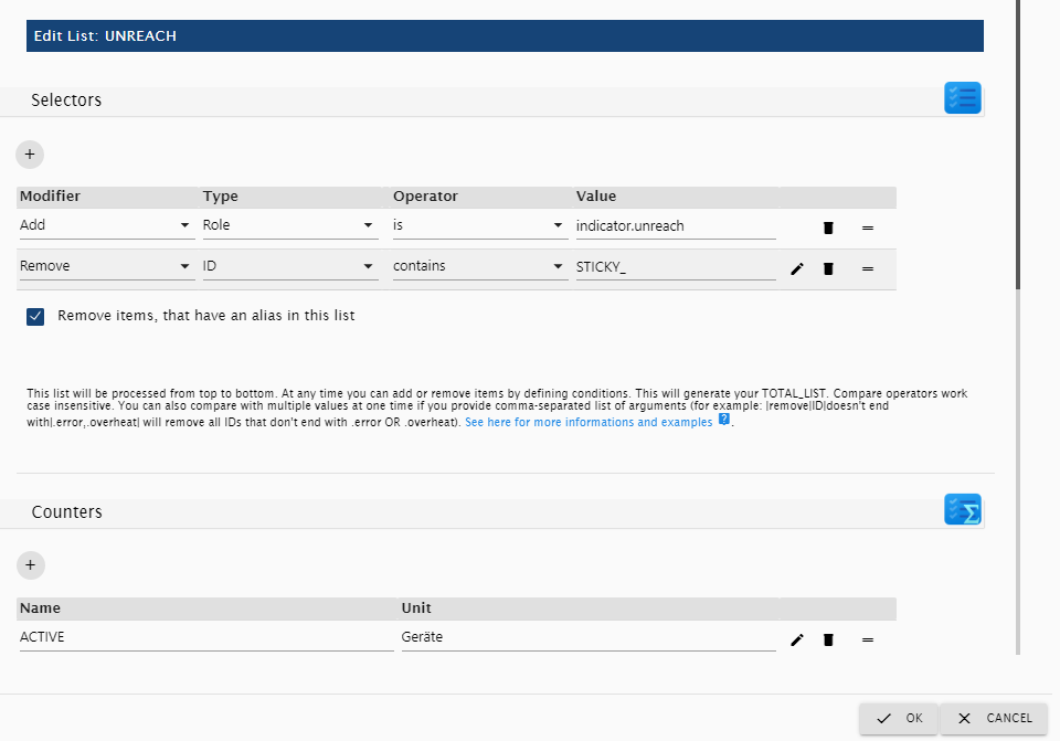
- The selectors first add all Data points with the common role
indicator.unreach - But it then removes all Data points with
STICKY_in its ID (homematicprovides theSTICKY_UNREACH-Indicator, which we don't want to count) - It filters duplicates by aliases out
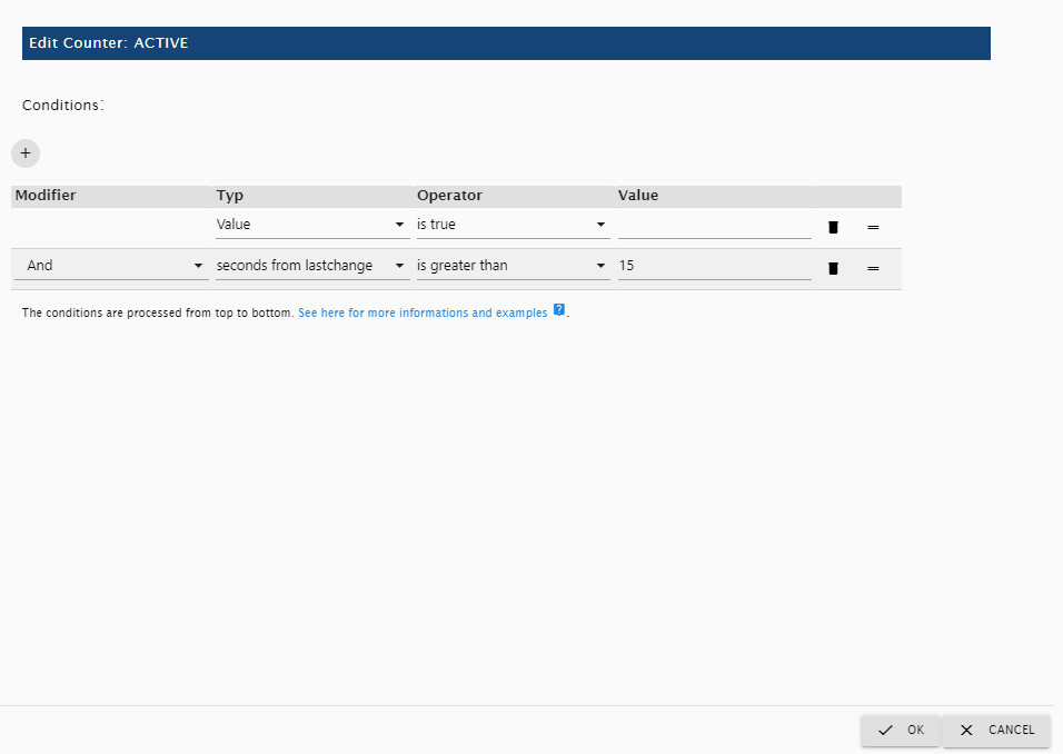
- And lastly, it counts all data points with the value
true, that have that state for at least 15 seconds
- The selectors first add all Data points with the common role
- There are some built in default lists you can add, for example complex Service-Messages and a Adapter-Monitor. Just hit the 'Add Default Lists' button and chose what to add. Feel free to examine the lists, to get a better understanding, how they work.


Wiki
- There is a very good Explanation with some good Enhancements by
dslraserin the wiki: wiki - Here you can find some tips for configuring the icon-replacements in the device-counter widget: wiki
Modifying Datapoint Configuration
You can modify the configuration of data points via the wrench-icon (or rather gear-icon in new react-ui) behind a datapoint in the device-configuration dialog or in objects-tab of iobroker.


Here you can:
- Set Readonly-Flag
- Set Invert-Flag
- Set Confirm-Flag (forces the user to confirm before a change is written to a datapoint)
- Set PIN-Code (forces the user to enter this PIN-Code before a change is written to a datapoint - but take care: this is only of low security, because the pin is checked in frontend! Use a number to display a fullscreen-pin-pad if asked for code)
- Modify unit of datapoint, separate for zero, singular and plural values
- Modify min and max of datapoint
- Set the steps that a level-slider takes when it is increased/decreased
- Modify type of datapoint
- Modify role of datapoint
- Set a target-value-id, which is a datapoint id, where target values are written to (if you have different data points for the actual and the target value)
- Set or modify a Value-List
- Add optionally an option to value list to enter free text
- Set a target-value-list:
- In addition to the target-value-id, you can define different datapoint-ids and target-values for different keys (keys are possible values of the original datapoint)
- You can also use the wildcard
*in the keys and in the target-values - Example:
- Key:
TuneIn-Playlist: *, Target-Datapoint ID:alexa2.0.Echo-Devices.XYZ.Music-Provider.TuneIn-Playlist, Target-Value:* - If the user enters
TuneIn-Playlist: Ambientthe valueAmbientwill be written toalexa2.0.Echo-Devices.XYZ.Music-Provider.TuneIn-Playlist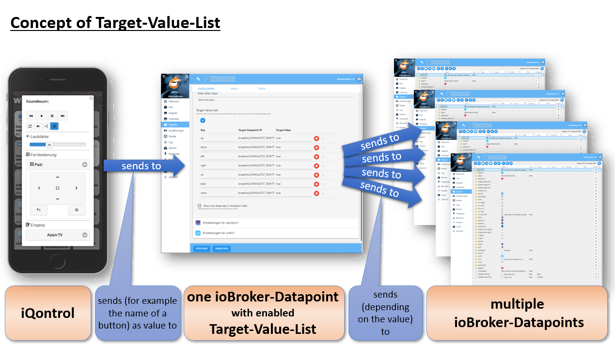
- Key:

Description of roles and associated states
Every device has a role, which defines the function of the device. Every role generates a set of states, which can be linked to a corresponding iobroker state. If you use the auto-create-function, you can choose an existing device from the iobroker-object tree. Auto-create tries to find out the role and to match as many states as possible. This will only work for known devices. For unknown devices, and to give devices advanced features, you can add them manually via the (+)-Button or edit the devices that were created by auto-create. To edit the role and the states of a device, click on the pencil behind the device. You will find a short description of the roles and the used states below:
General states:
STATE and LEVEL
Almost all roles have a STATE- and/or a LEVEL-state. In most cases this represents the main function of the device. You can assign iobroker-states of the following types to it:
-
boolean - if possible, it will be translated to a sensible text like
on/off,opened/closedor similar. If you click on the icon of a tile it tries to toggle the boolean (for example to turn a light on or off). If it is not read-only it will generate a flip-switch in the dialog - number - will be displayed with its corresponding unit and generate a slider in the dialog
- string - a text to be displayed
-
value-list - the selected value will be displayed. If it is not write-protected it will generate a drop-down-menu in dialog
- Technically a value-list is a value with a corresponding translation-list, defined in the
common.custom.iqontrol.<instance>.states,native.statesorcommon.statesobject of the datapoint:"native": { "states": {`true`: "Text for true", `false`: "Text for false"}, ... } - You can create your own value list by modifying the datapoint (wrench-icon, or rather gear-icon in new react-ui, behind the datapoint in the objects-tab of iobroker, see above)
- iQontrol will display a defined valueList as a drop-down field in the dialog under the following circumstances:
- if type is
numberand the valueList has exact as many entries, as steps between min- and max of the datapoint or - if type is
boolean, but role is notswitchor - if type is
stringor - if "Add option to enter free text" is activated
- if type is
- Technically a value-list is a value with a corresponding translation-list, defined in the
- If the device-tile will be displayed as active or inactive is also determined from the STATE or LEVEL-Datapoint. Furthermore, you can freely customize the behavior in the options section 'Conditions for an Active Tile'. You can even set another external datapoint that determines the state of the tile
However, not every type makes sense to every role. So the STATE of a switch for example will be a boolean in most cases, to be able to be toggled between on and off. A string may be displayed, but the switch will not be functional.
Further general states:
-
INFO_A and INFO_B: array - an array of data points and icons, that will be cyclical displayed in the upper right side of the tile
-
ADDITIONAL_CONTROLS: array - an array of data points, that define additional control elements that will be displayed inside info-dialog. You can use variables inside names and captions (use the same syntax as for normal device-names)
-
ADDITIONAL_INFO: array - an array of data points, that will be displayed at the bottom of the info-dialog
-
URL: CONSTANT or DATAPOINT string - this URL will be opened as iframe inside the dialog
-
HTML: CONSTANT or DATAPOINT string - this markup will be displayed inside the iframe, if no URL-Datapoint is specified
-
BACKGROUND_URL: CONSTANT or DATAPOINT string - this URL will be shown as background of the device-tile. It is placed above the background-images, but you can configure it to be hidden, if the tile is active or inactive. Please have a further look at the widget-section of this manual
-
BACKGROUND_HTML: CONSTANT or DATAPOINT string - this markup will be displayed as background of the device-tile, if no BACKGROUND_URL is specified
-
BATTERY: boolean - when true or number - when less than 10%, a little battery-empty-icon will be displayed
- You can further customize the behaviour of the battery-icon in the options section 'BATTERY Empty Icon'
-
ERROR: boolean - when true, a little exclamation-mark-icon will be displayed
-
UNREACH: boolean - when true, a little wireless-icon will be displayed
- Behaviour can be inverted in the 'General' section of options (use
connectedinstead ofunreach)
- Behaviour can be inverted in the 'General' section of options (use
-
ENLARGE_TILE: boolean - when true, the tile will be set as enlarged. You can overwrite that by clicking the enlarge/reduce button. But everytime the state of ENLARGE_TILE changes, it will take over control of the tiles' enlargement state again. If the role of
ENLARGE_TILEisbutton, then every state change will toggle the enlargement state -
BADGE: number or string - if a value other than zero/false is present, then a badge in the upper left corner is shown with this value. Can be configured to be also shown even if the value is zero or to ignore the unit
- BADGE_COLOR: string - any valid html-color-string (like 'green', '#00FF00', 'rgba(0,255,0,0.5)' and so on) that represents the color of the badge. If not present or invalid red with 20% transparency will be used.
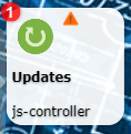
-
OVERLAY_INACTIVE_COLOR and OVERLAY_ACTIVE_COLOR: string - any valid html-color-string (like 'green', '#00FF00', 'rgba(0,255,0,0.5)' and so on) that represents the color of the overlay of the tile (depending on whether the tile is active of inactive). If no valid color-string is given, the standard-overlay-color (which can be configured in iQontrol-Options) is used. Keep in mind, that there is an option to define the transparency of the overlay in the iQontrol options, which will affect the appearance of the set overlay color.
- For lights, you can also use the option "Use color of lamp as OVERLAY_ACTIVE_COLOR" which can be found in the device specific options.
-
GLOW_INACTIVE_COLOR and GLOW_ACTIVE_COLOR: string - any valid html-color-string (like
green,#00FF00,rgba(0,255,0,0.5)and so on) that represents the color of a glow-effect around the tile (depending on whether the tile is active of inactive). If no valid color-string is given, the glow-effect is disabled.- GLOW_HIDE: boolean - if true, the glow-effect is hidden (can be inverted in the 'General' section of options)
- For lights, you can also use the option "Use color of lamp as GLOW_ACTIVE_COLOR" which can be found in the device specific options.
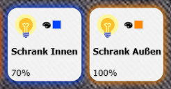


Link to other view:
- Has no further states
- The linked-view-property is opened directly
 Switch:
- STATE: boolean - display and set on/off-state
- POWER: number - power-consumption that will be displayed in small in the upper right corner
 Button:
- STATE: any - any desired type of state
- SET_VALUE: CONSTANT string - this is a constant (not a linked iobroker-state!) that will be assigned to the STATE if the button is pressed
- OFF_SET_VALUE: CONSTANT string - this is a constant (not a linked iobroker-state!). If defined, STATE will be reset to this value after the in options defined time or 100ms
 Light:
Every light may have one or both of the following states:
- STATE: boolean - show and set on/off-state
- LEVEL: number - show and set the level of the light
Optional you can define the following states:
- For colored LEDs (HSB-color-space):
- HUE: number - color of the light from 0-360° (hue format)
- SATURATION: number - saturation of the light (from white to pure color)
- COLOR_BRIGHTNESS: number - the brightness of the colored LEDs (if you have a LEVEL-State and no white LEDs, this is ignored, because brightness is controlled completely by LEVEL)
- For white LEDs:
- CT: number - color-temperature of the light, if it has two shades of white
- WHITE_BRIGHTNESS: number - the brightness of the white LEDs (if you have a LEVEL-State and no colored LEDs, this is ignored, because brightness is controlled completely by LEVEL)
- Alternative color spaces:
-
ALTERNATIVE_COLORSPACE_VALUE: string or number (depending on the chosen colorspace) - the value of the alternative colorspace
If your device does not support using HUE, SATURATION and COLOR_BRIGHTNESS (HSB/HSV-colorspace) you can use a variety of alternative color spaces. In the device-options you can choose one of the following color spaces:
- RGB / #RGB: instead of using HUE, SATURATION and COLOR_BRIGHTNESS you can use the RGB-Format (hex), optional with leading '#'
- RGBW / #RGBW: instead of using HUE, SATURATION, COLOR_BRIGHTNESS and WHITE_BRIGHTNESS you can use the RGBW-Format (hex), optional with leading '#'
- RGBWWCW / #RGBWWCW / RGBCWWW / #RGBCWWW: instead of HUE, SATURATION, COLOR_BRIGHTNESS, CT and WHITE_BRIGHTNESS you can use the RGBWWCW- or RGBCWWW-Format (hex, WW = warm white, CW = cold white), optional with leading '#'
- RGB (Hue only) / #RGB (Hue only): instead of using HUE you can use the RGB (Hue only)-Format (hex), optional with leading '#'. In this special case the RGB-Format will only accept pure saturated colors of the hue-color-circle. Mixed white is not allowed
-
Hue for Milight: This is the Hue-Value for Milight-Devices (v5), with use another starting-point in the hue color-circle:
MilightHue = modulo(66 - (hue / 3.60), 100) * 2.55; hue = modulo(-3.60 * (MilightHue/2.55 - 66), 360); function modulo(n, m){ return ((n % m) + m) %m; } - HHSSBB for Tuya: 12 digit long hex-string, representing hue (HH = 0000-016d [0-365]), saturation (SS = 0000-03e8 [0-1000]) and color-brightness (BB = 0000-03e8 [0-1000]) Keep in Mind: Conversion to alternative colorspace is done by frontend, so it is only active, if iQontrol is opened somewhere. Therefore, you can't use it as a converter for color spaces. To avoid conversation-loops it is recommended to either use the original colorspace-data-points (HUE, SATURATION, COLOR_BRIGHTNESS, CT, WHITE_BRIGHTNESS) or the alternative colorspace-datapoint to replace these data points.
-
ALTERNATIVE_COLORSPACE_VALUE: string or number (depending on the chosen colorspace) - the value of the alternative colorspace
If your device does not support using HUE, SATURATION and COLOR_BRIGHTNESS (HSB/HSV-colorspace) you can use a variety of alternative color spaces. In the device-options you can choose one of the following color spaces:
- Effect-Mode:
- EFFECT: value-list - the effect to play
- EFFECT_NEXT: boolean - if set to true, the next effect will play (as an alternative for devices that don't support EFFECT-value list)
- EFFECT_SPEED_UP / EFFECT_SPEED_DOWN: boolean - if set to true, the effect will speed up/down
- Miscellaneous:
- POWER: number - power-consumption that will be displayed in small in the upper right corner
 Fan:
Fan:
- STATE: boolean - display and set on/off-state
- LEVEL: number or value-list - the fan-speed
- POWER: number - power-consumption that will be displayed in small in the upper right corner
 Thermostat:
- SET_TEMPERATURE: number - goal-temperature
- TEMPERATURE: number - actual temperature to be displayed in small in the upper right corner
- HUMIDITY: number - actual humidity to be displayed in small in the upper right corner
- CONTROL_MODE: value-list - display and set the mode of the thermostat
- WINDOW_OPENING_REPORTING: boolean - if true, a little opened window is displayed
- VALVE_STATES: array of names and numbers - displays the opening of the valves that are associated with the thermostat
Homematic-Thermostat:
In addition to normal thermostat you can define:
- PARTY_TEMPERATURE: string - special-formatted string to define the party- or holiday-mode of Homematic-thermostats
- BOOST_STATE: number - displays the remaining boost-time of Homematic-thermostats
 Temperature-Sensor,
  Humidity-Sensor,
  Pressure-Sensor:
- STATE: number - temperature or humidity that will be displayed in the lower part of the device
- TEMPERATURE: number - temperature that will be displayed in small in the upper right corner
- HUMIDITY: number - humidity that will be displayed in small in the upper right corner
- The linked-view-property is opened directly
 Brightness-Sensor:
- STATE: number - brightness that will be displayed in the lower part of the device
- BRIGHTNESS: number - brightness that will be displayed in small in the upper right corner
- The linked-view-property is opened directly
 Motion-Sensor:
- STATE: boolean - display if motion is detected or not
- The linked-view-property is opened directly
 Door,
Door,  Window:
-
STATE: boolean - display if the door or window is opened or closed
- Alternatively you can assign a value-list, to display additional states like 'tilted' (in options of windows you can define which text stands for opened, closed a tilted to display the correct icon)
- You can also assign a string to display any text like "3 windows open" or "all closed" or a number
- The linked-view-property is opened directly
 Garage Door:
-
STATE: boolean - display if the door is opened or closed
- Alternatively you can assign a value-list, to display additional states like 'tilted'
- You can also assign a string to display any text like "3 doors open" or "all closed"
- TOGGLE: boolean - displays a 'Toggle'-Button and is set to true, if pressed
 Door with lock:
- STATE: boolean - display if the door is opened or closed (door/window-contact)
- LOCK_STATE: boolean - display and control if the door is locked or unlocked (control is disabled, if STATE is true - because you can't lock a door, that is opened)
- LOCK_STATE_UNCERTAIN: boolean - if true, the STATE will be displayed in italic-font to represent that the exact position of the lock is unknown
- LOCK_OPEN: boolean - if set to true, the door will open completely
 Blind:
- LEVEL: number - height of the blind in percentage
- DIRECTION: value-list - can be Stop, Up and Down. The values that represent Stop, Up, Down and Unknown can be configured
- STOP: boolean - is set to true, if the stop button is pressed. Additionally, you can define a value via the STOP_SET_VALUE Datapoint. If defined, this value will be sent instead of true, when the Stop button is pressed
- UP / DOWN: boolean - is set to true, if the up / down button is pressed (for devices, that use UP and DOWN data points instead of or in addition to LEVEL). Additionally, you can define a value via the UP_SET_VALUE / DOWN_SET_VALUE Datapoints. If defined, this value will be sent instead of true, when the Up / Down button is pressed
- FAVORITE_POSITION: boolean - can be used to recall a favorite position. If the Favourite button (button caption can be configured in the device settings) is pressed, true will be sent to this datapoint. Additionally, you can define a value via the FAVORITE_POSITION_SET_VALUE Datapoint. If defined, this value will be sent instead of true, when the favorite button is pressed
- SLATS_LEVEL: number - position of slats in percentage
 Fire-Sensor:
-
STATE: boolean - if true the sensor will be displayed as triggered
- Alternatively you can assign a value-list, to display additional states like 'tampered'
- You can also assign a string to display any text like "fire in upper floor"
- The linked-view-property is opened directly
 Flood-Sensor:
-
STATE: boolean - if true the sensor will be displayed as triggered
- Alternatively you can assign a value-list, to display additional states like 'tampered'
- You can also assign a string to display any text like "flood in upper floor"
- The linked-view-property is opened directly
 Alarm:
-
STATE: boolean - if true the sensor will be displayed as triggered
- Alternatively you can assign a value-list, to display additional states like 'tampered'
- You can also assign a string to display any text like "fire in upper floor"
-
CONTROL_MODE: value-list - select operation mode like "Armed" and "Disarmed"
- In device options you can define the value that represents disarmed, so the representing icon can be shown
 Battery:
- STATE: number - battery level in percentage
- CHARGING: boolean - if true, a charging-icon is displayed
- POWER: number - power-consumption that will be displayed in small in the upper right corner
- VOLTAGE: number - voltage that will be displayed in small in the upper right corner
 Date and Time:
- STATE: boolean - if true the tile will be showed as active
- SUBJECT: string - to set a description
-
RINGING: boolean - if true an alarm-bell is shown
- Keep in mind: you can configure a quit and a snooze-button via ADDITIONAL_CONTROLS
- TIME: string - String with date and or time or duration (you can specify the format in the device options) for first and second time
Show possible time formats: (klick to open)
- In the custom-section (wrench-icon or rather gear-icon in new react-ui) of any datapoint you can configure time-format and time-display-format. If the datapoint contains time information, these two parameters specify in which format the time is saved in the datapoint and how iQontrols displays the time to the user.
- For the 'Date and Time'-Device these two settings can also be made in the device options inside the device-specific section. These will overwrite the settings made in the custom-section of the datapoint.
- You can use the following tokens:
| Token | Description/Example | Datapoint | Display | Picker | ||
|---|---|---|---|---|---|---|
| Timestamp | Unix s Timestamp | X |
1410715640.579 |
X | --- | --- |
| Unix ms Timestamp | x |
1410715640579 |
X | --- | --- | |
| Date | Day of Week | d |
0 1...5 6
|
X | --- | --- |
dd |
Su Mo...Fr Sa
|
X | X (translated) | --- | ||
ddd |
Sun Mon...Fri Sat
|
X | X (translated) | --- | ||
dddd |
Sunday Monday...Friday Saturday
|
X | X (translated) | --- | ||
do |
0th 1st...5th 6th
|
X | --- | --- | ||
| Day of Month | D |
1 2...30 31
|
X | X | X | |
DD |
01 02...30 31
|
X | X | X | ||
Do |
1st 2nd...30th 31st
|
X | --- (converted to D) |
--- (converted to D) |
||
| Month | M |
1 2...11 12
|
X | X | X | |
MM |
01 02...11 12
|
X | X | X | ||
MMM |
Jan Feb...Nov Dec
|
X | X | X | ||
MMMM |
January February...November December
|
X | X | X | ||
Mo |
1st 2nd...11th 12th
|
X | --- (converted to M) |
--- (converted to M) |
||
| Year | Y |
1970 1971...9999 +10000 +10001
|
X | X | X | |
YY |
70 71...29 30
|
X | X | X | ||
YYYY |
1970 1971...2029 2030
|
X | X | X | ||
YYYYYY |
-001970 -001971...+001907 +001971
|
X | --- (converted to YYYY) |
--- (converted to YYYY) |
||
| Time | AM/PM | A |
AM PM
|
X | X | X |
a |
am pm
|
X | X | X | ||
| Hour | H |
0 1...22 23
|
X | X | X | |
HH |
00 01...22 23
|
X | X | X | ||
h |
1 2...11 12
|
X | X | X | ||
hh |
01 02...11 12
|
X | X | X | ||
k |
1 2...23 24
|
X | --- (converted to H) |
--- (converted to H) |
||
kk |
01 02...23 24
|
X | --- (converted to HH) |
--- (converted to HH) |
||
| Minute | m |
0 1...58 59
|
X | X | X | |
mm |
00 01...58 59
|
X | X | X | ||
| Second | s |
0 1...58 59
|
X | X | X | |
ss |
00 01...58 59
|
X | X | X | ||
| Fractional Second | S |
0 1...8 9
|
X | --- | --- | |
SS |
00 01...98 99
|
X | --- | --- | ||
SSS |
000 001...998 999
|
X | --- | --- | ||
SSSS...SSSSSSSSS
|
000[0..] 001[0..]...998[0..] 999[0..]
|
X | --- | --- | ||
| Time Zone |
z or zz
|
EST CST...MST PST
|
X | --- | --- | |
Z |
-07:00 -06:00...+06:00 +07:00
|
X | --- | --- | ||
ZZ |
-0700 -0600...+0600 +0700
|
X | --- | --- | ||
| Periods | Day of Year | DDD |
1 2...364 365
|
X | --- | --- |
DDDD |
001 002...364 365
|
X | --- | --- | ||
DDDo |
1st 2nd...364th 365th
|
X | --- | --- | ||
| Other | Day of Week (Locale) | e |
0 1...5 6
|
X | --- | --- |
| Day of Week (ISO) | E |
1 2...6 7
|
X | --- | --- | |
| Quarter | Q |
1 2 3 4
|
X | --- | --- | |
Qo |
1st 2nd 3rd 4th
|
X | --- | --- | ||
| Week of Year | w |
1 2...52 53
|
X | --- | --- | |
wo |
1st 2nd...52nd 53rd
|
X | --- | --- | ||
ww |
01 02...52 53
|
X | --- | --- | ||
| Week of Year (ISO) | W |
1 2...52 53
|
X | --- | --- | |
Wo |
1st 2nd...52nd 53rd
|
X | --- | --- | ||
WW |
01 02...52 53
|
X | --- | --- | ||
| Era Year | y |
1 2...2020... |
X | --- | --- | |
yo |
1st 2nd...2020th... |
X | --- | --- | ||
| Era |
N, NN, NNN
|
BC AD
|
X | --- | --- | |
NNNN |
Before Christ, Anno Domini
|
X | --- | --- | ||
NNNNN |
BC AD
|
X | --- | --- | ||
| Week Year | gg |
70 71...29 30
|
X | --- | --- | |
gggg |
1970 1971...2029 2030
|
X | --- | --- | ||
| Week Year (ISO) | GG |
70 71...29 30
|
X | --- | --- | |
GGGG |
1970 1971...2029 2030
|
X | --- | --- | ||
| Periods | Period | P |
Marks a period and not a specific time. Can be one of the following formats: | X | --- (converted to D [Day(s)], h:m:s) |
--- (converted to D, h:m:s) |
milliseconds (e.g. 279344) |
||||||
hours:minutes (e.g. 46:33) |
||||||
hours:minutes:seconds (e.g. 46:33:44 or 28:33:44.5) |
||||||
days hours:minutes.seconds (e.g. 1 22:33:44 or 1 22:33:44.5) |
||||||
days.hours:minutes.seconds (e.g. 1.22:33:44 or 1.22:33:44.5) |
||||||
ISO 8601 (e.g. P0Y0M1DT22H33M44S or P1DT22H33M44S) |
||||||
Py |
Period of years | X | --- | --- | ||
PM |
Period of months | X | --- | --- | ||
Pw |
Period of weeks | X | --- | --- | ||
Pd |
Period of days | X | --- | --- | ||
Ph |
Period of hours | X | --- | --- | ||
Pm |
Period of minutes | X | --- | --- | ||
Ps |
Period of seconds | X | --- | --- | ||
Pms |
Period of milliseconds | X | --- | --- | ||
| Flags | Set missing parts to beginning | tb |
E.g. set date to 1970-01-01, if only a time is given | X | --- | --- |
| Set missing parts to now | tn |
E.g. set date to now, if only a time is given | X | --- | --- | |
| Keep old missing parts | to |
E.g. leave date as before, if only a time is given | X | --- | --- | |
| Free text | Mark free text in brackets | [] |
[this is an example, all tokens are ignored] |
X | X | --- |
-
If you use different configurations for datapoint-timeformat and display-timeformat, the following conversion-rules are used.
-
You can use the flags
tb,tnandtoinside the datapoint-timeformat to influence the behavior.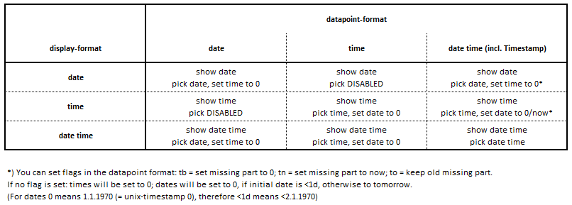

 Value:
- STATE: any - any valid state to be displayed (have a look at general states-section)
- LEVEL: number - will produce a slider in dialog
 Program:
- STATE: boolean - if set to true, the program will be started
 Scene:
- STATE: boolean - displays, if the scene is active. Depending on the configuration of the scene (virtual group, set values for false enabled or disabled), the toggle-command will send true, false, min, 0, max or 100. There is an option to always send true (disable toggleing).
 Media-Player / Remote Control:
-
STATE: string - "play", "pause" or "stop" or boolean - true for play, false for stop
- In device options you can define the value that represents play, pause and stop
- COVER_URL: string - URL to cover-image
- ARTIST, ALBUM, TITLE: string - self explaining
- TRACK_NUMBER: number - self explaining
- PREV, REWIND, PLAY, PAUSE, STOP, FORWARD, NEXT: boolean - will be set to true, if the corresponding button is pressed
- SHUFFLE, MUTE, PLAY_EVERYWHERE, EJECT, POWER_SWITCH: boolean - state for corresponding function
- REPEAT: boolean - state for repeat function or string - 3 states can be defined via the corresponding options: value for off, repeat-all and repeat-one
- DURATION, ELAPSED: number - duration and elapsed time of actual title - used to show a seek-bar
- VOLUME: number - for volume-slider
- SOURCE, PLAYLIST: value-list - show select-menu to choose a source or a title from playlist
To display a universal remote control you can define the following states:
- REMOTE_NUMBER: string - shows a num-pad a returns the corresponding number, if a number is clicked
- REMOTE_VOLUME_UP, REMOTE_VOLUME_UP, REMOTE_CH_UP, REMOTE_CH_DOWN: string - shows buttons for volume up/down and channel up/down and returns 'volumeUp', 'volumeDown', 'chUp' or 'chDown', if the corresponding button is pressed
-
REMOTE_PAD_DIRECTION, REMOTE_PAD_BACK, REMOTE_PAD_HOME, REMOTE_PAD_MENU: string - shows a trackpad for navigation and returns
- 'ok' if the middle of the pad is clicked,
- 'left', 'right', 'up' or 'down', if the edges of the pad are clicked or the pad is swiped in the corresponding direction or
- 'back', 'home' or 'menu*, if the corresponding buttons are clicked
- Keep in mind: You can use the Target-Value-List (accessible via the wrench-icon, or rather gear-icon in new react ui, of each datapoint) to link from one datapoint to multiple data points, depending on the returned value (see Modifying Datapoints section above)
- REMOTE_COLOR: string - shows colored buttons a returns the corresponding color ('red', 'green', 'yellow' or 'blue'), if a color is clicked
- REMOTE_CHANNELS: array - an array of buttons. The name of the button is sent to the corresponding state-id, if the button is clicked
- REMOTE_ADDITIONAL_BUTTONS: array - an array of buttons. The name of the button is sent to the corresponding state-id, if the button is clicked
- REMOTE_HIDE_REMOTE: boolean - if true, the complete remote control section will be hidden (for example to show it only, if a valid source is selected)
 Popup:
- STATE: any - can be used to display further information
 External Link:
- STATE: any - can be used to display further information
- URL: CONSTANT string - this URL will be opened
 Widget:
This device has some special predefined size- and display-settings to show a website, that can be defined by BACKGROUND_URL, as a widget. With default options, a small enlarge-button will be shown on the upper right side.
- STATE: any - SPECIAL: If empty, a virtual datapoint will be created, so you can click on the icon, to activate and therefore maximize the size of the widget
 Info-Text:
This device has some special predefined size- and display-settings to show a text over the full width of screen on a transparent background. With standard-settings the device is hidden, if the STATE is empty. The height of the device adapts to the size of the STATE.
- STATE: any - text shown on screen.
Troubleshooting
- Make sure you fulfilled the 'You need...' section at top of this page
- If something doesn't work like expected after update please try the following steps:
- Start upload of adapter:
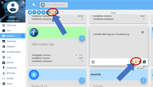
- Clear browser cache
- Restart ioBroker
- Start upload of adapter:

If you have further problems, please provide the log from the debugging-console of your browser and screenshots of the faulty line:
- Start iQontrol with opened debugging-console of your browser (mostly you need to press F12 to open it)
- Switch to the console-window and reproduce the bug
- Look for messages in the console-window
- When errors appear, the number of the line, which caused the error, is listed
- Please click on this line-number and make a screenshot of the faulty line:


Changelog
2.3.0 (2023-07-16)
- (sbormann) Fixes for new js-controller
2.2.0 (2023-03-23)
- (sbormann) You can now chose destination when copying devices.
- (sbormann) Added option Toggle POWER_SWITCH instead of STATE (for example when clicking on icon) for media.
- (sbormann) Added option to hide slider for LEVEL, if favorites are set.
- (sbormann) Added option to show BADGE, even if value is zero.
- (sbormann) Added option to set DURATION and ELAPSED in milliseconds respective percentage for media.
- (sbormann) Added ability to set links to other views with anchor to sub-headings.
- (sbormann) Corrected some fonts.
- (sbormann/Wal) Enabled right-click for wioBrowser.
- (sbormann) Added some new options for popup-messages and introduced persistent popups.
- (sbormann) Uploading of userfiles via ZIP-File is now possible.
- (sbormann/hetti72) Fixed CONTROL_MODE of HP-IP-Thermostat (hopefully finally...)
- (sbormann) Removed hidden links to other views from toolbar context-menu
2.1.0 (2023-01-24)
- (sbormann) Fixed marquee for INFO_A/B after resizing tile.
- (sbormann) Subheading with no visible tiles beneath are now hided.
- (sbormann) Added option to hide STATE and LEVEL in dialog.
- (sbormann) Fixed default icons for ERROR, UNREACH and BATTERY (if you have changed them in a previous version you might need to change them again).
- (sbormann) Fixed size of custom toolbar icons.
- (sbormann) Added DISCHARGE to Battery.
- (sbormann) Fixed Favorites not working in map-widget with instance-number.
- (sbormann) Enhanced JSON-Table to work with alexa-shoppinglist-adapter.
- (sbormann) Added badges to toolbar.
- (sbormann) Enhanced handling of images in BACKGROUND_HTML.
- (sbormann) Added option to protect instance by passphrase.
- (sbormann) Added option to set value of LOCK_OPEN for doors with lock.
- (sbormann) Linking color to GLOW or BACKGROUND_COLOR now works when using ALTERNATIVE_COLORSPACE.
- (sbormann) Added URL-Parameter &language=xx.
- (sbormann) Added option to center headers and subheaders.
- (sbormann) Enhanced FLOT-Chart-Widget to display more Datapoints.
- (sbormann) Fixed timestamp in JSON-Table-Widget.
- (dirkhe) Fixed and enhanced step attribute.
- (sbormann) Moved options caption for STATE and caption for LEVEL into section STATE, LEVEL and TIMESTAMP.
- (sbormann) Added option to set favorite values for LEVEL.
- (sbormann) You can now click on linked devices.
- (sbormann) Prevented back-swiping for safari.
- (sbormann) Updated some dependencies.
2.0.1 (2022-03-09)
- (sbormann) Fixed json-table sorting order.
- (sbormann) Added placeholder-option for empty tables to json-table-widget.
- (sbormann) Fixed 'switch to this widget button' for widgets with replace-URL.
- (sbormann) Added more timestamp options to datapoint-detection of json-table-widget.
- (sbormann) Enhanced sorting of lists.
2.0.0 (2022-02-25)
- (sbormann) Minor fixes.
2.0.0-rc4.0 (2022-02-22)
- (sbormann) Added option to allow widgets to adjust height of device tile and enhanced JSON-Table-Widget and Device-Counter-Widget to do so.
2.0.0-rc3.0 (2022-02-19)
- (sbormann) Added seconds from alive and seconds from connection to counter conditions of lists.
- (sbormann) Removed start_url from manifest.json to allow multiple instances as home-screen app.
2.0.0-rc2.2 (2022-02-15)
- (sbormann) Minor enhancements and bugfixes.
2.0.0-rc2.1 (2022-02-14)
- (sbormann) Abort button now works in preview mode.
2.0.0-rc2.0 (2022-02-12)
- (sbormann) Fixed counting of logs.
- (sbormann) Lists are now saved as readonly and with ack=true.
- (sbormann) Fixed glow.
- (sbormann) Enhanced sorting of JSON-Table-Widget.
- (sbormann) Added option to define, how the parent name of lists is determined.
- (dirkhe, sbormann) Added save-button to dialogs.
- (dirkhe) Added preview mode.
- (sbormann) Added option to define toolbar selected icon background color.
2.0.0-rc1.1 (2022-02-08)
- (sbormann) Compatibility to new ioBroker websocket established.
- (sbormann) Enhanced datapoint-recognition in json-table-widget.
- (sbormann) Fixed INFO A/B icon brightness-setting for dark mode.
2.0.0-rc1.0 (2022-02-04)
- (sbormann) Introducing a powerful new feature: Lists and Counters.
- (sbormann) The JSON-Table-Widget accepts now simple lists (for example an array of data points).
- (sbormann) Added configurable font to JSON-table widget.
- (sbormann) Added column-sorting to JSON-Table-Widget.
- (sbormann) Added heading and border-color-option to JSON-table widget.
- (sbormann) Added Device-Counter-Widget.
- (sbormann) Added option to show POWER as state.
- (sbormann) Added preview of tile appearance when setting tile colors.
- (sbormann) Added scrollbar-settings for firefox.
- (sbormann) Added option to adjust height of tile to the size of BACKGROUND_VIEW.
- (sbormann) Added option to change and invert INFO_A/B-Symbols.
- (sbormann) Added option to invert color of INFO_A/B icons for dark-mode.
- (sbormann) Added option to hide indicator icons if inactive, active or enlarged.
- (sbormann) Added import and export function to device options.
- (sbormann) Added widget-replaceurl to widgets, which allows creation of simplified widget-presets, as preparation for further development.
- (sbormann) Added option to media-player to disable forced reload of cover-image on TITLE-change.
- (sbormann) Adjustmets for ALTERNATIVE_COLORSPACE.
- (sbormann) Added widget-replaceurl as a widget configuration parameter.
- (sbormann) Changed behaviour of min/max/ignore-min-max-settings of FLOT-Chart-Widget.
- (sbormann) Added export and import function to devices.
- (sbormann) Fixed border-radius for big mode.
- (sbormann) Added configurable values for 'closed' and 'locked' for 'Door with Lock'
- (sbormann) Fixed targetValues for Admin 5.
1.11.0 (2021-12-18)
- (sbormann) Added the ability to globally change the default icons.
- (sbormann) Introducing icon sets and fluent icons.
- (sbormann) Added option to change badge font and color.
- (sbormann) Fixed setting of font family.
- (sbormann) Fixed LayoutViewDeviceInactiveHoverOpacity.
1.10.0 (2021-12-03)
- (sbormann) Fixed ALTERNATIVE_COLORSPACE.
- (sbormann) Added option to change the icons for BATTERY, UNREACH and ERROR.
1.9.16 (2021-11-23)
- (sbormann) Enhanced viewport height scaling for collapsibles.
1.9.15 (2021-11-23)
- (sbormann) Updated dependencies.
- (sbormann) Updated type-detector.
- (sbormann) Some minor code adjustments.
1.9.14 (2021-11-21)
- (sbormann) Added option to set colors for JSON-Table-Widget.
- (sbormann) Fix for periods with role value.time.
- (sbormann) Enhanced reconnection process when reopening the web app.
- (sbormann) Prevent endless loop for Party-Mode if objects do not exist.
1.9.13 (2021-10-02)
- (sbormann) Minor design adjustments for dark-mode.
1.9.12 (2021-09-28)
- (sbormann) Fix for ADDITIONAL_CONTROLS rendering only once.
1.9.11 (2021-09-27)
- (sbormann) Added release-script by AlCalzone.
- (sbormann) Set setState for postMessage to forced send.
1.9.10 (2021-09-26)
- (sbormann) Enhanced handling of states set by widgets.
1.9.9 (2021-09-09)
- (sbormann) Fixed collapsible not opening if initial closed.
- (muuulle, sbormann) Enhanced Analog-Clock-Widget to be able to display the time of a datapoint.
- (sbormann) Enhanced json-table-Widget to recognize parentNames of data points, transpose and convert json-data and some styling-options.
- (sbormann) Enhanced styling of ADDITIONAL_INFO.
1.9.8 (2021-09-03)
- (sbormann) Fixed variables with special chars not working.
- (sbormann) Enhanced json-table-widget with datapoint recognition, which allows to see values and toggle data points in the list.
- (sbormann) Fixed view rendering problems with thermostats without CONTROL_MODE.
- (sbormann) Added the ability to widgets, to create widgetStates that contain a variable (for example to create distinct instances of a widget with own data points).
- (sbormann) The map widget has been extended with a instance-option to create multiple maps with own data points.
1.9.7 (2021-08-31)
- (sbormann) Added option to close collapsible subheaders, if others open.
- (sbormann) Fixed missing subheaders if new line option was activated.
- (sbormann) Added option to define new section spacing.
- (sbormann) Minor design enhancements to dark mode, ADDITIONAL_INFO and JSON-Table-Widget.
- (sbormann) Added more options to configure cols of JSON-Table-Widget.
- (sbormann) Redesigned CONTROL_MODE of Thermostats to be a fieldset instead of a dropdown.
- (sbormann) Overwrite step for HomematicIP-Temperature sensors with wrong min and max values.
- (sbormann) Added option to send state-values when clicking on play, pause and stop to media.
- (sbormann) Updated dependencies.
- (sbormann) Added sections to widget options.
- (sbormann) Added option to show state and level divided for device type value.
1.9.6 (2021-08-21)
- (sbormann) Removed some unnecessary horizontal lines in dialog.
- (sbormann) Added option to edit caption of STATE or LEVEL.
- (sbormann) Enhanced ADDITIONAL_INFO list (you can go back to old style via option) and added optional columns.
- (sbormann) Added some polyfills for older browsers.
- (sbormann) Fixed a bug that prevented certain options from being applied correctly.
1.9.5 (2021-08-20)
- (sbormann) Removed prevention of injection for iframes.
1.9.4 (2021-08-20)
- (sbormann, sandro_gera) Preventing injection of code into states.
- (sbormann) Sub-Headers can now contain variables.
- (sbormann) Added option to make sub-headers collapsible.
- (sbormann) BACKGROUND_VIEWs are now lightened up in dark-mode.
1.9.3 (2021-08-18)
- (sbormann) Fixes for ADDITIONAL_CONTROLS.
- (sbormann) Some minor enhancements for handling of Date and Time.
- (sbormann) Added option to custom to hide period of date and time values.
- (sbormann) Some design adjustments for dark-mode.
- (sbormann) You can now freely configure all colours for dark-mode.
- (sbormann) Added previous and next buttons to views-tab.
1.9.2 (2021-08-17)
- (sbormann) Fixed conversion error #199.
- (sbormann) Added option to set ADDITIONAL_CONTROLS to half width.
- (sbormann) Enhanced uploading of font files.
- (sbormann) Added getOptions to postMessage-Communication for widgets.
- (sbormann) Added Dark-Mode to JSON-Table-Widget.
1.9.1 (2021-08-15)
- (sbormann) You can now upload own font files.
- (sbormann) Admin tab is now linked to the iqontrol-administration page instead of frontend.
- (sbormann) Fixed mkDir for redis.
- (sbormann) Enhanced enlarge button for large screens.
1.9.0 (2021-08-13)
- (sbormann) Added Dark-Mode.
- (sbormann) Added new configuration options for click on tile/icon behaviours - WARNING: Old configuration is automatically converted to the new settings. It is recommended to create a backup of your config BEFORE doing the update, as the new settings are not backwards-compatible and in case of conversion errors.
- (sbormann) Added option to link color of lamp to OVERLAY_ACTIVE_COLOR.
- (sbormann) Added option to define caption of button for external URLs.
1.8.2 (2021-08-06)
- (sbormann) Added JSON-Table Widget (Displays JSON-Data as table).
- (sbormann) Enhanced device copy dialog with option to set new name and to replace data points.
- (sbormann) You can now copy devices directly from the device list.
- (sbormann) Entries with empty values in Arrays of INFO_A/B are now hidden.
- (sbormann) Added option to hide UNREACH if device is inactive.
- (sbormann) Fixed missing general options for device link to other view.
- (sbormann) Fixed admin page not working in safari.
- (sbormann) Added option to hide name for buttons in ADDITIONAL_CONTROLS.
1.8.1 (2021-07-28)
- (sbormann) Some design-adjustments for react-ui.
- (sbormann) Keep track of ioBroker object changes in admin.
- (sbormann) Fixed crash if active view has no devices.
- (sbormann) Removed old conn.js from admin.
- (Einstein2002, sbormann) Added HomematicIP-Thermostat.
- (sbormann) Enhanced max-height of dialog.
- (sbormann) Fixed up, down and stop button for blinds.
- (sbormann) Changed some log messages.
- (sbormann) Enhanced FLOT-Chart-Widget to set axis options.
1.8.0 (2021-04-29)
- (sbormann) Some design-adjustments for react-ui.
1.7.3 (2021-04-27)
- (sbormann) Fixed admin-tab for react.
1.7.2 (2021-04-27)
- (sbormann) Added compatibility to new react-ui of admin-adapter.
- (sbormann) Fixed uploading of larger files.
- (sbormann) Changed background-images in auto-create views function.
- (sbormann) Internal definition and handling of device options changed.
- (sbormann) The directories
/usericons,/usersymbolsand/userwidgetsare now automatically created, if not existant. - (sbormann) Some design-adjustments for react-ui.
1.7.1 (2021-04-18)
- (sbormann) Fix to work with Admin v5.0.3 (renaming files and folders will only work with the upcoming next admin-update).
- (sbormann) Updated dependencies.
- (sbormann) Added option to show name of INFO_A/B.
1.7.0 (2021-04-13)
- (sbormann) Added combobox as possible option type.
- (sbormann) Added Date and Time as new device for dates, times and periods (durations).
- (sbormann) Added time-format and time-display-format to custom settings of data points.
- (sbormann) Added time-picker for every STATE datapoint and ADDITIONAL_CONTROLS - of role
value.time,value.date,value.datetime,level.timerandlevel.timer.sleep. - (sbormann) Enhanced blind to better show opening and closing, even if level is 0 or 100.
- (sbormann) Added STOP_SET_VALUE for blinds.
- (sbormann) You can now use variables in device-names, button-captions and headings of ADDITIONAL_CONTROLS.
1.6.6 (2021-03-21)
- (sbormann) Fix for double admin page.
1.6.5 (2021-03-20)
- (sbormann) If you change the device-specific option 'Return to OFF_SET_VALUE after [ms]' of buttons to 0, the button toggles now.
- (sbormann) Fixed noZoomOnHover for device icon on large screens.
- (sbormann) The options of the change device-options-function are now sorted alphabetically.
- (sbormann) Added option to configure appearance of VALVE_STATES for thermostats.
- (sbormann) Fixed recognition of blank icon for device-filling states and added padding, if badge is present.
- (sbormann) Added option to INFO_A/B to define the number of digits to be rounded to.
- (sbormann) Added option to customs-dialog to define the number of digits to be rounded to.
- (sbormann) Now also numerical values are treated as strings, if
common.roleis string (before it was converted to level). - (sbormann) Now empty values on a value-list are no longer ignored.
- (sbormann) Some fine adjustments to panel.
- (sbormann) Updated type-detector.
- (sbormann) Added edit button to views.
- (sbormann) INFO_A/B will be hidden if value is empty.
1.6.4 (2021-03-06)
- (sbormann) Added select id dialog to change-device-states function.
1.6.3 (2021-03-03)
- (sbormann) Added match-list to change device-options-function.
- (sbormann) Added change device-states-function to options.
- (sbormann) Fixed comparing to 0 for tile active conditions.
- (sbormann) Enhanced speed of admin ui.
1.6.2 (2021-02-28)
- (sbormann) Enhanced rendering of badge to avoid color flickering.
- (sbormann) Added option clickOnIconToggles and clickOnIconOpensDialog to all devices. The logic is now:
- If clickOnIconToggles is true => toggle
- else if clickOnIconOpensDialog is true => open dialog
- else if linked view is given => open link to view
- else do nothing
- (sbormann) Fixed slider sometimes not working after swiping.
- (sbormann) Prevent scrolling and flickering of background when dialog is opened.
- (sbormann) Lights without hue but with active option linkGlowActiveColorToHue now glow in a slightly yellow.
1.6.1 (2021-02-21)
- (sbormann) Fixed sentry error in main.js.
- (sbormann) Reworked shuffle-process.
- (sbormann) Fixed can't scroll to bottom issue.
- (sbormann) Added possibility to change many icons and options at once (under options, change device-options).
1.6.0 (2021-02-19)
- (sbormann) Changed standard badge-color to red, 20% transparency.
- (sbormann) Added optional glow-effect for tiles.
- (sbormann) Fixed edit-dialog of device not opening under some circumstances.
- (sbormann) Added type icon and type datapoint to widget-URL-parameters.
- (sbormann) Added OVERLAY_INACTIVE_COLOR and OVERLAY_ACTIVE_COLOR.
- (sbormann) Added option to show badge value without unit.
- (sbormann) Badge has now a maximum-width and uses marquee-effect.
- (sbormann) Added toggle by icon for garage door (after optional confirmation).
- (sbormann) Fixed not to open Dialog if clickOnTileOpensDialog is set to false.
- (sbormann) Added new device: Info-Text, which can be used to display plain Text on views, therefore some new options were created (stateHeightAdaptsContent, stateFillsDevice, stateBigFont).
- (sbormann) Text on transparent tiles is now white (can be configured).
- (sbormann) When converting to bool, "off" is interpreted as false now.
- (sbormann) Added option to center device name and/or state.
- (sbormann) Fixed option font-size for sub-header.
- (sbormann) Moved option, to show toolbar in one single line, into the options-tab.
- (sbormann) Added option, to invert Error Icon.
- (sbormann) Rearranged device options for a better overview.
- (sbormann) Added option noZoomOnHover for Icon (in device-options, section tile-behaviour (general) and, for all devices, in settings, section tile).
- (sbormann) Added delay to visibility of badge to allow color-change happen before it appears.
- (sbormann) Fixed min/max/step for number of URL-parameters of widgets (which fixed range for FLOT-Chart).
- (sbormann) Added PANEL_HIDE and the corresponding option Invert PANEL_HIDE to panel.
- (sbormann) Added manifest.json.
- (sbormann) Fixed saving values of color-picker.
1.5.7 (2021-01-24)
- (sbormann) Fixed missing
info.connectionobject. - (sbormann) Fixed INFO_B position for short tiles.
- (siedi) Added option clickOnTileOpensDialog to all devices. The logic is now:
- If clickOnTileToggles is true => toggle
- else if clickOnTileOpensDialog is true => open dialog
- else if linked view is given => open link to view
- else do nothing
- (sbormann) Fixed FLOT for short tiles.
1.5.6 (2021-01-21)
- (sbormann) Fixed toolbar hiding issue if popup with additional controls is closed early.
- (sbormann) Fixed ALTERNATIVE_COLORSPACE only working after opening the view a second time.
- (sbormann) Added badge.
- (sbormann) Added predefined wallpapers to dropdown for devices background images.
- (sbormann) Redesigned dropdown for toolbar-icons to show thumbnails and added ability to add custom icons.
- (sbormann) Added option to show toolbar in one singe line.
- (sbormann) Added HHSSBB for Tuya to ALTERNATIVE_COLORSPACEs.
- (sbormann) Added historyInstance to options of FLOT-Chart-Widget.
- (sbormann) Fixed changing commonRole breaks symbolic links.
1.5.5 (2021-01-07)
- (sbormann) Added optional headings to ADDITIONAL_CONTROLS, the appearance can be controlled by an option.
- (sbormann) Added "No caption" to the option that controls the appearance of ADDITIONAL_CONTROLS-Section.
- (sbormann) The ADDITIONAL_CONTROLS-Section has been reordered to appear higher up.
- (sbormann) Virtual enlarge-switch from widgets was renamed from switch to enlarge.
- (siedi) Fix for remote control not appearing if REMOTE_CHANNELS was the only used datapoint.
- (sbormann) Reposition popup, if ADDITIONAL_CONTROLS are present.
1.5.4 (2020-12-20)
- (sbormann) Added info if demo-view is loaded.
- (sbormann) Enhanced widget FLOT_CHART to be able to use an external datapoint.
- (sbormann) Added homeButton for BACKGROUND_VIEWs, if view has changed to return to home view.
- (sbormann) You can now edit widget-settings by clicking the pencil icon.
1.5.3 (2020-12-18)
- (sbormann) Fix for black-colour-options-bug for new instances.
- (sbormann) Added pressure sensor.
1.5.2 (2020-12-06)
- (sbormann) Design-Adjustments for iPhones without home button and devices with notch and rounded corners.
- (sbormann) Prevent opening of context menu when closing app.
1.5.1 (2020-12-01)
- (sbormann) Added URL-parameter noPanel.
- (sbormann) Changed fetching-method of ioBroker Objects.
Older Changelog: (klick to open)
1.5.0 (2020-11-24)
- (sbormann) Added Flot-Chart widget.
- (sbormann) Enhanced adding of widgets with a new settings dialog.
- (sbormann) Added some new options for widget-developers (the meta-tag URL-data points was enhanced for example to ask for a color with a color-picker, postMessage-answeres now contain the id of the original datapoint).
- (sbormann) Removed space when using new-line-option.
- (sbormann) Added role "button" in custom dialog.
- (sbormann) Enhanced timing of repositioning dialogs after loading.
- (sbormann) Added noToolbar to URL-parameters.
- (sbormann) Added BACKGROUND_VIEW, to define a view which will be displayed as background of a tile.
- (sbormann) Added the option 'Open linked view in parent instance, if this view is used as a BACKGROUND_VIEW' and the option 'close panel after opening link' for links to other views.
- (sbormann) Added a panel which can be placed on left side of the screen and display a BACKGROUND_VIEW/URL/HTML and is widely configurable.
- (sbormann) Added showing of swipe goals (can be hidden via option in options/miscellaneous/swiping).
- (sbormann) Fixed crash when enlarging a hidden tile.
- (sbormann) Reworked some borders and scrolling parameters.
- (sbormann) Fixed comboboxes (selecbox with progressbars in admin).
- (sbormann) Padding bottom is only applied when minimizing a tile to give enough room for scrolling to tile`s top.
- (sbormann) Fixed setState to false for postMessage-Communication.
- (sbormann) Added option to define border-radius (rounded corners) of tiles.
- (sbormann) Added option to define text-shadow-color of toolbar.
- (sbormann) Added fallback to loading iframe content for non-fitting mime types.
1.4.1 (2020-11-01)
- (sbormann) Fixed drag-sorting or tables and usage of combo-boxes on mobile (touch) devices.
- (sbormann) Enhanced demo for new instances.
- (sbormann) Enhanced auto-create views function.
1.4.0 (2020-10-30)
- (sbormann) Added Autocreate views, which will help you create entire configurations out of ioBroker lists (for example rooms or functions).
- (sbormann) Added state ENLARGE_TILE, which can be used to trigger enlargement of tile via external datapoint.
- (sbormann) Enhanced dynamic zoom for BACKGROUND_VIEW/URL/HTML to be more accurate when resizing the tile.
- (sbormann) Drag-Sort of lists should now work on touch devices too.
1.3.6 (2020-10-29)
- (sbormann) Added option for transparent background.
- (sbormann) Enhanced handling of temporary states for color lights.
- (sbormann) Added option for dynamic zoom for BACKGROUND_VIEW/URL/HTML.
- (sbormann) Fixed creating of widget-data points.
1.3.5 (2020-10-27)
- (sbormann) Fix for line 6034 (capitalize).
1.3.4 (2020-10-27)
- (sbormann) Added clock widget.
- (sbormann) Added ability to create symbolic links instead of real copies of devices.
- (sbormann) Added options to hide INFO_A and INFO_B if device is inactive/active/enlarged.
- (sbormann) Added optional delay of cover reload for media.
- (sbormann) Added new size option for tiles (full width with aspect ratio but limited to screen height).
- (sbormann) Added option to center tiles (options / tiles / general / tiles centered).
- (sbormann) Changed scrollbar layout.
- (sbormann) Fixed scrolling to top when clicking on a large dialog.
- (sbormann) Fixed colour lights if using
alterntive_color_space. - (sbormann) Added blank symbol.
- (sbormann) Removed up/down arrows from lists (because of sort-by-dragging not necessary anymore, and they broke symbolic links).
- (sbormann) Added option to apply padding to BACKGROUND_VIEW/URL/HTML.
- (sbormann) Enhanced recognition of tilted state for windows.
- (sbormann) Added backup and restore of settings and user files (under options / backup and restore).
1.3.3 (2020-10-17)
- (sbormann) Fixed applying of widget-options for newly devices that haven't been saved before.
- (sbormann) Enhanced postMessage-Communication to deliver the complete stateObject if a state is requested.
- (sbormann) Added postMessage-Communication commands getWidgetDeviceState, getWidgetDeviceStateSubscribed and setWidgetDeviceState.
- (sbormann) Drop-Down-Menus in admin-page are now bigger.
- (sbormann) Added Auto-create Widget to devices tab.
- (sbormann) Added more meta-tags for widgets.
1.3.2 (2020-10-12)
- (sbormann) Added icons to REMOTE_ADDITIONAL_BUTTONS of remote control.
- (sbormann) Added REMOTE_CHANNELS to display channel buttons inside remote control.
- (sbormann) Enhanced positioning of dialog if URL/HTML is set.
- (sbormann) When writing data to an iframe replace encoded cr chars.
- (sbormann) Added option to remove overlay of tile, if device is enlarged.
- (sbormann) Added possibility to add and edit
html/css/jsfiles to folder/userwidgets. - (sbormann) Withdrawn changes to blank icons (now they catch mouse events again) - but for that added an option to optionally ignore mouse events for icons.
- (sbormann) Added option which sections of remote are opened at start.
- (sbormann) Added new postMessage-communication options for widgets and allow widgets to create data points unter iqontrol.x.Widgets by using a meta-tag inside html-code.
1.3.1 (2020-10-04)
- (sbormann) Breaking change: completely removed presssure detection and replaced it by long clicks to open context menu.
- (sbormann) Blank icons don't catch mouse and touch-events anymore.
- (sbormann) Added option to disable virtual datapoint (switch) for widgets.
- (sbormann) Fixed URL-parameter home.
- (sbormann) Added collapsible sections to device options.
- (sbormann) Enhanced channel detector for auto-create devices function.
- (sbormann) Enhanced dropdown-menus on admin-page to work better on mobile devices.
1.2.7 (2020-09-30)
- (sbormann) Added ADDITIONAL_CONTROLS as universal datapoint to define an array of additional control items that will be displayed inside dialog.
- (sbormann) Added possibility to renderViews and openDialogs via popup-buttons and postMessage-commands for iframes.
- (sbormann) Changed behaviour of URL-parameter home (this will now also change the link of the first toolbar entry) and added new URL-parameter renderView.
1.2.6 (2020-09-27)
- (sbormann) Scroll to element when deactivating fullScreen.
- (sbormann) Enhanced picture selection drop-down and rearranged some images - maybe you need to clear cache to get this working.
- (sbormann) Added INFO_A and INFO_B to display additional information in the tile.
- (sbormann) Added possibility to hide views name.
- (sbormann) Added possibility to upload html, css and js files and added drop down menu for these files for URL- and BACKGROUND_URL-State.
- (sbormann) Added option to hide icon, if device is enlarged.
- (sbormann) Added option set visibility of BACKGROUND_VIEW/URL/HTML, if device is enlarged.
1.2.5 (2020-09-19)
- (sbormann) Fix for iOS 14 touch callout.
- (sbormann) Added option to show big icons if device is inactive, active or enlarged.
- (sbormann) Added forced reload to cover images.
- (sbormann) Added more tile sizes.
- (sbormann) Added options to hide device, name or state if inactive, active or enlarged.
- (sbormann) Added option direct mouse events to the tile instead to the content of BACKGROUND_VIEW/URL/HTML.
- (sbormann) Added postMessage-Communication to allow widget-websites to send commands to iQontrol and receive messages from iQontrol.
- (sbormann) Added option to disable swiping.
1.2.4 (2020-09-14)
- (sbormann) Ignore readonly for enlarge.
- (sbormann) Always show enlarge button, if tile is enlarged.
- (sbormann) Enhanced some styles and marquee detection.
- (sbormann) Added URL-parameter to open a specified dialog on loading the page.
- (sbormann) Changed the way cover images are loaded.
- (sbormann) Added option to start with new line for devices.
- (sbormann) Tiles with no link to other view now open dialog by default.
- (sbormann) Added mouse cursor styles depending on tile actions (open dialog, toggle, link to view, external link, ...).
- (sbormann) You can now choose caption and appearance (always visible, collapsible closed, collapsible opened) of ADDITIONAL_INFO.
1.2.3 (2020-09-07)
- (sbormann) Now it will be automatically scrolled to tile that is switched to Screen Size.
- (sbormann) New options to set tile size for an enlarged state, which can be toggled via a new enlarge-button and via the pressure menu (both needs to be turned on in options).
- (sbormann) Modified the widget-device to use the new enlarge-button and use a blank icon by default.
1.2.2 (2020-09-05)
- (sbormann) Enhanced TileActiveConditions to even work, if STATE is not defined.
- (sbormann) Added option to rename section 'Additional Buttons' for remote.
- (sbormann) Arrays like REMOTE_ADDITIONAL_BUTTONS are now sortable.
- (sbormann) Enhanced handling of BACKGROUND_VIEW/URL/HTML.
- (sbormann) Added options to change caption of UP, STOP and DOWN for blinds.
- (sbormann) Disabled scrolling to top by reconnection.
- (sbormann) Added more tile size options (full width with different aspects and full screen).
- (sbormann) Fixed a bug where frontend could crash in endless loop.
- (sbormann) Added Widget to devices.
1.2.1 (2020-28-30)
- (sbormann) If STATE in Dialog contains (valid) HTML-Code, it is now rendered as HTML and - if state is not readonly - a HTML-Editor is shown.
- (sbormann) Added option to disable zoom-effect on mouse-over (for HTML-Widgets the zoom-effect may be disturbing).
- (sbormann) Remote is only shown, if one of the remote data points are defined.
- (sbormann) Added polyfill for older browsers for Array.from in shuffle.js.
1.2.0 (2020-28-29)
- (sbormann) Introducing different tile sizes, they can be configured in options for active and inactive state.
- (sbormann) Added BACKGROUND_URL and BACKGROUND_HTML as universal states to all devices, to display webpages as background of tiles (for FLOT, weather, security-cameras,...).
- (sbormann) Again better animations for shuffle.js.
- (sbormann) Reordered remote control sections.
1.1.15 (2020-08-27)
- (sbormann) Bug-fixing shuffle.js (better animations, fixed hideIfInactive-Option).
1.1.14 (2020-08-24)
- (sbormann) Made HTML/URL-iFrame resizable (can be turned off by option).
- (sbormann) Bug-fixing remote control.
- (sbormann) Added option to configure conditions for active battery-empty-icon.
- (sbormann) Dialog is now repositioned and bigger when phone is rotated to horizontal view.
- (sbormann) Breaking Change: Using now shuffle.js to reposition the tiles after resizing or orientation change. For now it is only a nice effect, but this opens possibilities for future development with different tile-sizes.
1.1.13 (2020-08-23)
- (sbormann) Added option to remote to show vol and ch +/- inside pad.
- (sbormann) Fixed calculation of blind level.
- (sbormann) Fixed opening of external links.
1.1.12 (2020-08-21)
- (sbormann) Prevented selection of elements on long click for actual iOS version.
- (sbormann) Bug-fixing tile active conditions for media.
- (sbormann) Renamed Media-Player to Media-Player / Remote-Control.
- (bluefox) The compatibility to socket.io 3.0.13 provided
- (sbormann) Prevented accidentally sorting of tables when clicking buttons.
1.1.11 (2020-08-21)
- (sbormann) Added option to define explicit conditions for a tile to be active.
- (sbormann) Added wrench icon to edit array dialog.
1.1.10 (2020-08-20)
- (sbormann) Added universal remote control including a track-pad to media-device.
- (sbormann) Device-Options are now sorted in categories.
- (sbormann) Collapses like additional information are animated now.
- (sbormann) Added option for the device button to change the caption of the button in the dialog.
- (sbormann) Added option to open URL in new window instead of box inside dialog.
- (sbormann) Made toggling of a state more fault-tolerant if the type is not set correctly (iQontrol presumes now, it is a switch).
1.1.9 (2020-08-14)
- (sbormann) Enhanced popup with the ability to add buttons and confirmation messages.
- (sbormann) Fixed crash on some toolbar specifications.
1.1.8 (2020-08-02)
- (sbormann) Enhanced rendering of color-lights with alternative colorspace.
- (sbormann) Added rounded corners to iframe.
- (sbormann) Added sans-serif as standard font-family to iframe (may overwrite your settings - you can overwrite this by marking your own font-family css with
!important). - (sbormann) Added sentry plugin.
1.1.7 (2020-07-28)
- (sbormann) Improved long press and forced touch handling.
- (sbormann) Added URL-Parameters
returnAfterTimeDestinationViewandreturnAfterTimeThreshold.
1.1.6 (2020-07-24)
- (sbormann) Added some roles to recognize water and fire sensors more reliable.
- (sbormann) Added a block to blockly to send popup messages to iQontrol.
- (sbormann) Set option "Always use time instead of pressure" as standard - if you want to use ForcedTouch, disable this option.
- (sbormann) Updated some dependencies.
1.1.5 (2020-07-05)
- (sbormann) Made dialog movable by dragging title.
- (sbormann) Added LEVEL to fan.
- (sbormann) Fixed flickering of SVG-Background change on some devices.
1.1.4 (2020-07-03)
- (sbormann) Changed the way popup-iframes are created to allow execution of code inside them.
- (sbormann) Added the possibility to chose progressbar as icons and background-images for devices.
- (sbormann) Added progress-circle of remaining display-time to popup.
1.1.3 (2020-06-28)
- (sbormann) Added popup message (toast-message).
- (sbormann) Enhanced scenes to be able to toggle (added option to always send true, if you need the old behaviour).
1.1.2 (2020-06-21)
- (sbormann) Compatibility enhancements for repeat function of Media-Player.
- (sbormann) Made value-list and target-value-list sortable.
- (sbormann) Made sortable lists only draggable in y-axis.
- (sbormann) Added option to enter own value for value-lists.
- (sbormann) Added PLAY_EVERYWHERE to Media-Player.
1.1.1 (2020-06-16)
- (sbormann) Some fixes, styling and enhancements for Media-Player.
- (sbormann) Added option to hide play, pause and stop icon for Media-Player.
- (sbormann) Added function repeat one to Media-Player.
- (sbormann) Made restarting, if the value of a state has really changed.
- (sbormann) Fixed crash when some ids of linked views were missing.
- (sbormann) Added targetValues to custom configuration, which allows to send changes of a state to different target-data points.
1.1.0 (2020-06-13)
- (sbormann) Added Media-Player.
1.0.1 (2020-06-10)
- (sbormann) Fixed month for timestamps.
- (sbormann) You can now choose if values are linked states or constants.
- (sbormann) Added the ability to use variables in device-names.
1.0.0 (2020-06-01)
- (sbormann) Added a few captions to admin.
- (sbormann) Prevent pressure menu when scrolling and after opening menu.
- (sbormann) Corrected a few translations.
0.4.1 (2020-05-15)
- (sbormann) Added icons for top-light and tilted to window and enhanced window to recognize tilted position.
- (sbormann) Fixed crash when using some thermostats.
- (sbormann) New gulpfile and fixed translations.
- (sbormann) Further improvement of connection speed.
- (sbormann) Disabled context-menu on long/right-click.
- (sbormann) Revised pressure/forced touch and added option to always use time instead of pressure.
0.4.0 (2020-05-13)
- (sbormann) Major change using socket.io without conn.js which leads to a much faster initial connection.
- (sbormann) Improved loading and scrolling for popups.
0.3.7 (2020-05-06)
- (sbormann) Added more options to timestamp.
0.3.6 (2020-05-05)
- (sbormann) Added fallback to variables
- (sbormann) Added option to add timestamp to state
0.3.5 (2020-04-26)
- (sbormann) Added variables to icons and background images (see readme)
- (sbormann) It is now possible to remove toolbar (the first view is then the home view)
0.3.3 (2020-04-19)
- (sbormann) Fixed device readonly for toggle state.
- (Sebastian Bormann) Fixed devices with same name.
- (sbormann) Removed some old code from version <0.3.0.
0.3.2 (2020-04-19)
- (sbormann) Fixed loading toolbar with no entries on linked view.
- (sbormann) Fixed views with quotes in name.
- (sbormann) Fixed Flood-Sensor.
0.3.1 (2020-04-16)
- (sbormann) Breaking change: The complete configuration is no longer stored in ioBroker channels and states, but is fetched as one complete object, thus saving the configuration is much faster than before.
- (sbormann) Views, devices and toolbar entries are now sortable via drag- and drop in the configuration dialog.
- (sbormann) After saving the configuration the instance ist now yellow until the configuration is completely written.
- (sbormann) Added invert UNREACH to device options.
- (sbormann) Added Flood-Sensor.
- (sbormann) Enhanced auto-creation-feature by using ioBroker-Type-Detector by bluefox.
- (sbormann) Enhanced hue-lights when using alternative colorspace without white-values and changing ct.
- (sbormann) Enhanced hue-lights when using alternative colorspace to keep uppercase if needed.
0.2.20 (2020-04-08)
- (sbormann) If value for POWER is greater than 100, it is rounded without decimal places.
- (sbormann) Bug fixed invert-function with custom min and max.
- (sbormann) Added reload-link to loading page.
- (sbormann) Updated dependencies.
0.2.19 (2020-02-29)
- (sbormann) Updated dependencies.
0.2.18 (2020-02-29)
- (sbormann) Updated dependencies.
0.2.17 (2020-02-29)
- (sbormann) Added option to open dialog by clicking on tile for View, Window, Door, Fire, Temperatur, Humidity, Brightness and Motion.
- (sbormann) Added option to hide device, if it is inactive (handle with care, as you may not be able to switch it on again).
0.2.16 (2020-01-14)
- (sbormann) Fixed custom step for heating control.
- (sbormann) Fixed universal popup which was displayed, even when empty.
0.2.15 (2020-01-07)
- (sbormann) Added svg as possible image to upload.
- (sbormann) Made URL and HTML universal for nearly all devices, to display custom html code or content of an url inside the dialog (this could be used e.g. to display FLOT-graphs related to the device inside the dialog).
- (sbormann) Fixed disabled custom values with admin 3.7.6+ and js-controller <2.2.
0.2.14 (2019-11-12)
- (sbormann) Fixed icon-switching for thermostats.
0.2.13 (2019-10-23)
- (sbormann) Improved the return after time method.
- (Bluefox) Fixed translations in custom-dialog.
0.2.12 (2019-10-12)
- (sbormann) Improvement of homematic-thermostat for controler 2.0 compatiility.
0.2.11 (2019-10-07)
- (sbormann) Rewritten pincode-section to work with older browsers.
- (sbormann) Pincode now works for buttons as well.
- (sbormann) Modified the return after time function to work with older browsers.
- (sbormann) Fixed missing entrys in long pressure menus in iOS 13.
0.2.10 (2019-10-05)
- (Sebatian Bormann) Enhanced PIN-Code to view a num-pad when using an alphanumeric PIN.
0.2.9 (2019-10-02)
- (sbormann) Added optional PIN-Code to custom datapoint-configuration dialog (wrench icon).
- (sbormann) Added option to return to a view after a settable time of inactivity to settings.
0.2.8 (2019-09-27)
- (sbormann) Further improvement of index.js for controller 2.0 compatibility.
0.2.7 (2019-09-27)
- (sbormann) Fixed popup_width and popup_height.
- (sbormann) Further improvement of main.js and index.js for controller 2.0 compatibility.
- (sbormann) Added option showState for Button and Program.
0.2.6 (2019-09-24)
- (sbormann) Processing the plain text of values is now done after rounding a number value.
- (sbormann) Removed Icon_on for Button.
- (sbormann) Modified main.js for controller 2.0 compatibility.
0.2.5 (2019-09-22)
- (sbormann) Adjusted handling of pressure menu for iOS 13.
- (sbormann) Added Buffer for rendering a view while pressureMenue is being created.
- (sbormann) Added POWER and VOLTAGE to battery.
0.2.4 (2019-09-15)
- (sbormann) Further enhancement of control-mode handling for Homematic-thermostat.
- (sbormann) Minor bugfixes.
0.2.3 (2019-09-15)
- (sbormann) Further enhancement of control-mode handling for Homematic-thermostat.
- (sbormann) Added handling of alternative states-property-syntax.
0.2.2 (2019-09-14)
- (sbormann) Enhanced handling of control-mode for Homematic-thermostat for more compatibility.
- (sbormann) Reduced rate of sending when moving slider for blinds and thermostats.
0.2.1 (2019-09-07)
- (sbormann) Fixed crash of Backend (interchanged index_m.html and custom_m.html).
0.2.0 (2019-09-06)
- (sbormann) Added slats level to blind.
0.1.15 (2019-09-05)
- (sbormann) Added step to custom dialog, which allows to define the resolution of value-sliders.
- (sbormann) Values with unit % and a range from min to max of 0-1 are now scaled to 0-100.
- (sbormann) Fixed conversion to alternative colorspace for hue lights.
0.1.14 (2019-09-01)
- (sbormann) Fixed missing dropdown-menus for images after sorting or adding items to tables.
- (sbormann) Level-Sliders will have a higher resolution for data points with small value ranges.
0.1.13 (2019-08-28)
- (sbormann) Fixed crash of frontend.
- (sbormann) Security updates.
0.1.12 (2019-08-28)
- (sbormann) Added width and height to options for popup.
- (sbormann) Added option to define free CSS-code to modify frontend.
- (sbormann) Infotext-values are now displayed as plain text or rounded if numbers.
- (sbormann) Added 'Close dialog after execution' to device options for scenes, programs and buttons.
0.1.11 (2019-08-26)
- (sbormann) Bugfix for chrome opacity transition bug.
- (sbormann) Added placeholder for default values for text inputs on options page.
- (sbormann) Added placeholder for default icon and blank icon to device options.
- (sbormann) Extended thermostat CONTROL_MODE by type switch.
- (sbormann) Fixed crash when using thermostat with set-point a non Homematic-devices.
- (sbormann) Added min and max to custom dialog.
- (sbormann) Now you can set none as a devices background image for active devices (formerly this was copied from inactive devices for backward-compatibility-reasons).
0.1.10 (2019-08-20)
- (sbormann) You can now define different units if value is zero or if value is one in custom dialog.
- (sbormann) When changing an image via the new drop-down, save button will be activated now.
- (Sebastian Bormann) Added option, to remove overlay of tile, if device is active or inactive.
- (sbormann) Enhanced conversion function when converting boolean to number.
- (sbormann) Fixed renaming of image files (links to used images are now also correctly renamed).
- (sbormann) Fixed handling of spaces in image filenames.
0.1.9 (2019-08-18)
- (sbormann) Modified cache manifest to remove EISDIR-errors from log.
- (sbormann) Fixed toggle-entry in pressure menu.
- (sbormann) Added multiple file upload to images tab.
- (sbormann) Added check for dead links to other views when saving settings.
- (sbormann) You can now assign external urls to background images and icons (for example to add a weather-live-map).
- (sbormann) Removed options clickOnIconOpensDialog and clickOnTileToggles for Values and Programs as they are not switchable.
- (sbormann) Added OFF_SET_VALUE and the option 'Return to OFF_SET_VALUE after [ms]' to button.
0.1.8 (2019-08-11)
- (sbormann) Further improvements on connecting over iobroker.pro.
- (sbormann) COLOR_BRIGHTNESS and WHITE_BRIGHTNESS are now displayed, if LEVEL is not defined on hue lights.
- (sbormann) Added thumbnail-previews of fonts.
- (sbormann) Added clickOnIconOpensDialog and clickOnTileToggles to device options.
0.1.7 (2019-08-11)
- (sbormann) Added font-family, -size, -weight and -style to options for toolbar, headers, device-name, device-state and device-info-text.
- (sbormann) Added icon-size, icon-background-size and icon-background-corner-size to options for toolbar.
0.1.6 (2019-08-08)
- (sbormann) Next try to connect via iobroker.pro
0.1.5 (2019-08-06)
- (sbormann) Added validation to options.
- (sbormann) Extended alarm with CONTROL_MODE-datapoint and icons for disarmed, armed and triggered.
- (sbormann) To save memory, only used states are saved in local memory (before all used AND all updated states were saved).
- (sbormann) Optimized socket-connectionLink to try to connect via iobroker.pro.
0.1.4 (2019-08-04)
- (sbormann) Optimized fading of tiles.
- (sbormann) Added toggle-button to blind, if no up/down button is defined.
- (sbormann) Added detection of protocol for socket in admin.
- (sbormann) Added confirm-flag inside custom datapoint configuration dialog to enable asking user to confirm before changing values.
- (sbormann) Added toggle-button to garage door.
0.1.3 (2019-08-01)
- (sbormann) Added separate background image for active devices.
- (sbormann) Fixed background-options (color and opacity) for active and inactive device tiles.
- (sbormann) Added more space to views bottom.
- (sbormann) Fixed invert level for blinds.
- (sbormann) Organized options in collapsible layout.
0.1.2 (2019-07-29)
- (sbormann) Added FAVORITE_POSITION (with configurable button caption) and SET_VALUE for UP, DOWN and FAVORITE_POSITION to Blinds.
- (sbormann) Added 'No Icon' as option to icon configuration.
- (sbormann) Added icon to 'Link to other view'.
- (sbormann) Added a bunch of new standard-icons.
0.1.1 (2019-07-28)
- (sbormann) Added user icons.
0.1.0 stable (2019-07-27)
- (sbormann) First stable release.
- (sbormann) Added show timestamp to device options to chose default behaviour and a small timestamp-icon in the dialog to show and hide timestamps.
- (sbormann) Fixed readonly handling of control mode for Homematic Thermostats.
0.0.49 (2019-07-27)
- (sbormann) Added common type and common role to custom dialog.
- (sbormann) Added pressure menu for toolbar.
0.0.48 (2019-07-25)
- (sbormann) Datapoint BATTERY can now be a level - the battery-empty-icon will be shown if value is less than 10%.
- (sbormann) Added additional color spaces for hue lights (RGB, RGBW, RGBWWCW, RGBCWWW, Milight-Hue, RGB Hue Only).
- (sbormann) Added Garage Door.
0.0.47 (2019-07-22)
- (sbormann) Added targetValueId inside custom datapoint configuration dialog which allows to have different data points vor actual value and for target value.
- (sbormann) Added invert-flag inside custom datapoint configuration dialog.
0.0.46 (2019-07-20)
- (sbormann) Added options to device configuration dialog.
- (sbormann) Added readonly-flag to device options.
- (sbormann) Added invert color temperature flag to device options for lights.
- (sbormann) Added invert flag to device options for blinds.
0.0.45 (2019-07-15)
- (sbormann) Devices are now zoomed to fit screen (configurable under options).
0.0.44
- (sbormann) Fixed incomplete loading of admin page with some settings.
- (sbormann) Added datapoint-configuration via custom-dialog.
0.0.43
- (sbormann) Changed initialization of socket.io to an asynchronous process to wait for connection before trying to use file-operations.
- (sbormann) Added general datapoint ADDITIONAL_INFO to display additional data points at the bottom of the info-dialog.
- (sbormann) Fixed value list type conflict.
0.0.42
- (sbormann) Adjusted paths of demo-files.
0.0.41
- (sbormann) Major Change: The location of the uploaded user images has changed, so the images can be accessed by backup-function of iobroker - the images will be moved to the new location automatically - please open admin-page for ALL instances and save the settings to adjust the filenames of used images automatically.
- (sbormann) Inverted color-temperature-scale for hue-lights (now it uses the mired-scale = micro reciprocal degree-scale instead of kelvin).
- (Ansgar Schulte) Added Up and Down Buttons to Blinds.
- (sbormann) When creating a directory it will be entered.
- (sbormann) Added Effect-Section to Light
- (sbormann) If a state is not set yet, a standard value will be used
0.0.40
- (sbormann) Appended missing conn.js in admin-folder.
0.0.39
- (sbormann) Now file-operations in admin should work (file and directory renaming and deleting).
- (sbormann) Added Image-Popup in admin.
- (sbormann) Renamed demo-images.
0.0.38
- (sbormann) Again changes to forced touch for gained compatibility.
0.0.37
- (sbormann) Some more little changes to forced touch.
- (sbormann) Added option to open a view via url by adding 'home=' to url-parameters.
0.0.36
- (sbormann) Added compatibility for some android devices to forced touch.
- (sbormann) Changed the way hue and ct is displayed for better compatibility to some devices.
0.0.35
- (sbormann) Fixed crash of frontend, if a device has no role and added info to admin to choose a role.
- (sbormann) Removed filtering of states in select-id-dialog for auto-create.
- (sbormann) Further improvements of forced touch with force-indicator and hopefully a better compatibility with more devices.
0.0.34
- (sbormann) Added forced touch menu (press hard or press long on unsupported devices), which will give more room for extended features in the future.
- (sbormann) Linked Views can now be set for all roles and are available in the dialog and by a forced touch.
- (sbormann) Added timestamp for Window, Door, Fire, Temperature, Humidity, Brightness and Motion.
- (sbormann) Fixed issue 49 (state for role switch if type is number).
0.0.33
- (sbormann) Added WINDOW_OPENING_REPORTING to thermostat and Homematic-thermostat.
- (sbormann) Fixed marquee not always starting correctly.
0.0.32
- (sbormann) Added Battery.
- (sbormann) Heaters are displayed as inactive, if set-value is at its minimum.
- (sbormann) Added
meta.userobject to allow backup of user uploaded files via iobroker backup. - (sbormann) Added check for existence of
common.rolebefore rendering view.
0.0.31
- (sbormann) Fixed some typos.
- (sbormann) Enhanced color-mixing of light with separate brightness-data points for color and white.
- (sbormann) Rewritten rendering of view as preparation for further enhancements.
- (sbormann) Rewritten rendering of dialog as preparation for further enhancements.
- (sbormann) Added option to colorize Device-Texts.
0.0.30
- (sbormann) Fixed io-package.json
0.0.29
- (sbormann) changed parts of the code to be backward-compatible to older browsers like ie 11.
- (sbormann) Now it is possible to define a value list for a data point under .native.states which will have a greater priority than a value list under
.common.states. - (sbormann) Updated dependency for axios to 0.0.19 to fix a security issue.
0.0.28
- (sbormann) Added datapoint POWER to switch, fan and light.
- (sbormann) Fixed marquee for small info texts in the upper right corner at big screen sizes.
- (sbormann) Added more options for configuring header-colors and device-colors (experimental state). Text-color ist not configurable yet.
0.0.27
- (sbormann) Added marquee (scrolling text) for long states and device names (can be configured in options).
- (sbormann) Added more toolbar-options.
- (sbormann) Enhanced handling of value lists.
- (sbormann) Disabled swiping when dialog is opened.
0.0.26
- (sbormann) Added brightness to motion-sensor.
- (sbormann) Added options tab. You can now configure colors of toolbar.
- (sbormann) Fixed rendering of constants.
- (sbormann) Resized the demo-wallpapers for faster loading.
0.0.25
- (sbormann) Added motion-sensor.
- (sbormann) Added description, how the frontend works: Operating Principle of Frontend.
- (sbormann) Added dialog for editing constants like SET_VALUE, URL or HTML.
- (sbormann) Changed the way arrays are stored.
- (sbormann) Added submit-button for values of type string.
- (sbormann) Added saturation to hue-lights.
- (sbormann) Better icons for color-temperature and brightness-sensor.
0.0.24
- (sbormann) Fixed jittering on Safari while scrolling (was related to Pull2Refresh).
- (sbormann) System language of iobroker will be loaded and used.
0.0.23
- (sbormann) Rewrote how constant values (instead of linkedStates) are handled - this is a requirement for further development.
- (sbormann) Fixed Pull2Refresh on android devices / chrome.
- (sbormann) Added external links
- (sbormann) Added popups with iframes
0.0.22
- (watcherkb) Improved german translation.
- (BramTown) Improved german translation.
- (sbormann) Short after another coming reconnect-events (<5s) are ignored now.
0.0.21
- (sbormann) Added Pull2Refresh on mobile devices - reloads whole page when pulling down on homepage, otherwise only the actual view is reloaded.
- (sbormann) Improved reloading on reconnect (hopefully to get it finally good working on iOS 12.2).
0.0.20
- (sbormann) New trial to get it working in iOS 12.2.
0.0.19
- (sbormann) Improved reloading of page in new PWA-Mode of iOS 12.2.
0.0.18
- (sbormann) Improved fetching of VALVE_STATES.
- (sbormann) Changed Button Icon.
- (sbormann) Added Loading-Spinner if disconnected.
- (sbormann) Due to new iOS 12.2 PWA-Mode added visibility-check and connectivity-check.
- (sbormann) Added role-icons to role-selectbox in edit device dialog.
- (sbormann) Fixed missing value-list for states of the type string.
0.0.17
- (sbormann) Changed description of slider (level/dimmer/value/height).
0.0.16
- (sbormann) Role of device is displayed in devices-table.
- (sbormann) VALVE_STATES is now editable via GUI (show opening of valves associated with a thermostat in percentage).
- (sbormann) Added Role 'Button': You can define a constant SET_VALUE which will be written to the ID that is linked with STATE if the button is pressed.
- (sbormann) Rewritten parts of front-end to guarantee better compatibility. Boost-Mode for Homematic-Thermostat should work now.
- (sbormann) Added state BOOST_STATE for Homematic-Thermostat - ability to display remaining boost-time if in boost-mode.
- (sbormann) Added description of roles and corresponding states.
- (sbormann) Temperature und Humidity-Sensors can now display a STATE at bottom of device, and both, TEMPERATURE and HUMIDITY, in small in the upper right corner.
- (sbormann) Better handling of Auto-Create of Temperature- und Humidity-Sensors.
- (sbormann) German translation: 'geöffnet' lower case.
- (sbormann) Zigbee humidity and temperature added to auto-creation.
- (sbormann) Fixed not scrollable selectbox at devices tab.
0.0.15
- (sbormann) Improved check for value type of states.
- (sbormann) Improved slider-tooltip to lower font-size at large numbers.
0.0.13
- (sbormann) Doors and Windows now force true/false to be translated to opened/closed.
- (sbormann) Double Entries on WelcomeScreen/Overview removed.
- (sbormann) States are now set with the correct value type.
- (sbormann) Changed recognition of state types. I hope there are no new bugs now!
0.0.12
- (sbormann) Check for un-allowed chars in object names.
- (sbormann) Check for duplicates in view names.
- (sbormann) Level fires a slider in dialog - even when it has a state list (HUE again :)).
- (sbormann) Added Blinds (Homematic) - please test it, I don't have one to test.
0.0.11
- (sbormann) Added compatibility for edge and firefox.
- (sbormann) Again Hue bugfixes.
- (sbormann) Removed Tooltip from Toolbar.
0.0.10
- (sbormann) Added ColorTemperature. Hopefully HUE works now? Can't test ist, because i do not own any hue lamp :)
0.0.9
- (sbormann) Philips HUE added to auto-create (colortemp is not working yet!).
- (sbormann) LinkedView now also works on windows, doors and fire-sensor.
- (sbormann) Added translation (thanks
ldittmar!).
0.0.8
- (sbormann) Added icons to image selectboxes.
0.0.7
- (sbormann) Changed order of tabs
- (sbormann) Auto-create for shelly should work now (i hope so, can't test it here)
0.0.6
- (sbormann) Improved speed of select id and autocreate
- (sbormann) Set filter to channel on autocreate
0.0.5
- (sbormann) Bugfix: creation of many devices should work now
0.0.4
- (sbormann) Bugfix: copy device created just a reference to old object
- (sbormann) Added Toolbar-Icons
0.0.3
- (sbormann) various bugfixes
0.0.2
- (sbormann) first partly running version
0.0.1
- (sbormann) initial release
License
MIT License
Copyright (c) 2019-2023 Sebastian Bormann
Permission is hereby granted, free of charge, to any person obtaining a copy of this software and associated documentation files (the "Software"), to deal in the Software without restriction, including without limitation the rights to use, copy, modify, merge, publish, distribute, sublicense, and/or sell copies of the Software, and to permit persons to whom the Software is furnished to do so, subject to the following conditions:
The above copyright notice and this permission notice shall be included in all copies or substantial portions of the Software.
THE SOFTWARE IS PROVIDED "AS IS", WITHOUT WARRANTY OF ANY KIND, EXPRESS OR IMPLIED, INCLUDING BUT NOT LIMITED TO THE WARRANTIES OF MERCHANTABILITY, FITNESS FOR A PARTICULAR PURPOSE AND NONINFRINGEMENT. IN NO EVENT SHALL THE AUTHORS OR COPYRIGHT HOLDERS BE LIABLE FOR ANY CLAIM, DAMAGES OR OTHER LIABILITY, WHETHER IN AN ACTION OF CONTRACT, TORT OR OTHERWISE, ARISING FROM, OUT OF OR IN CONNECTION WITH THE SOFTWARE OR THE USE OR OTHER DEALINGS IN THE SOFTWARE.