


@types/intl-tel-input any more!
🗣️ NEWS: we now provide translation files for several common languages! See them in action.
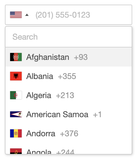
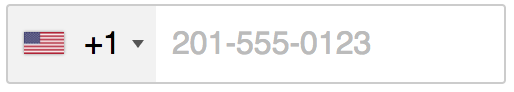
International Telephone Input is a JavaScript plugin for entering and validating international telephone numbers. It takes a regular input field, adds a searchable country dropdown, auto-detects the user's country, displays a relevant placeholder number, formats the number as you type, and provides comprehensive validation methods.
If you find the plugin helpful, please consider supporting the project.

- Demo and Examples
- Mobile
- Features
- Browser Compatibility
- Getting Started
- Recommended Usage
- Initialisation Options
- Public Methods
- Static Methods
- Events
- Utilities Script
- Troubleshooting
- Contributing
- Attributions
You can view a live demo and see some examples of how to use the various options. Alternatively, try it for yourself by downloading the project and opening demo.html in a browser.
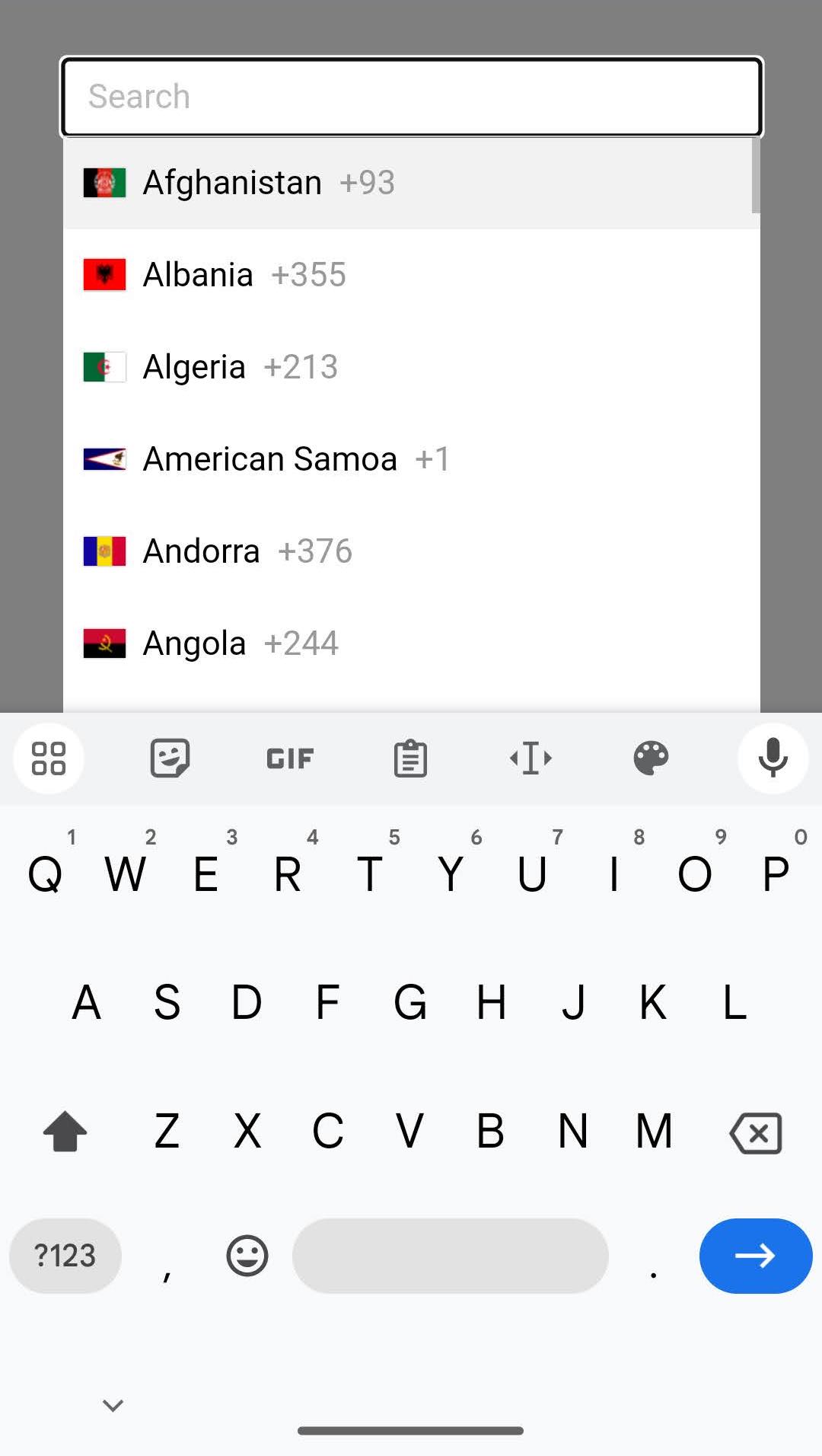
By default, on mobile devices we show a fullscreen popup instead of the inline dropdown, to make better use of the limited screen space. This is similar to how a native <select> element works. You can control this behaviour with the useFullscreenPopup option. The popup can be closed by either selecting a country from the list or by tapping on the grey area at the sides. See example (using the React component).
- Automatically select the user's current country using an IP lookup
- Automatically set the input placeholder to an example number for the selected country
- Navigate the country dropdown by typing a country's name, or using up/down keys
- Automatically format the number as the user types
- Optionally only allow numeric characters and cap the number at the maximum valid length
- The user types their national number and the plugin gives you the full standardised international number
- Number validation, including specific error types
- High-resolution flag images
- Lots of initialisation options for customisation, as well as public methods/events for interaction
- Accessibility provided via ARIA tags
- Typescript type definitions provided
- Easily customise styles by overriding the provided CSS variables
- React component included
- Translations for all country names (etc) provided in many different languages
| Chrome | Firefox | Safari | Edge |
|---|---|---|---|
| ✓ | ✓ | ✓ | ✓ |
Note: We have now dropped support for all versions of Internet Explorer because it is no longer supported by any version of Windows.
- Add the CSS
<link rel="stylesheet" href="https://cdn.jsdelivr.net/npm/intl-tel-input@21.2.4/build/css/intlTelInput.css">- Add the plugin script and initialise it on your input element
<script src="https://cdn.jsdelivr.net/npm/intl-tel-input@21.2.4/build/js/intlTelInput.min.js"></script>
<script>
  const input = document.querySelector("#phone");
  window.intlTelInput(input, {
    utilsScript: "https://cdn.jsdelivr.net/npm/intl-tel-input@21.2.4/build/js/utils.js",
  });
</script>-
Install with npm:
npm install intl-tel-input --saveor yarn:yarn add intl-tel-input -
Import the CSS:
import 'intl-tel-input/build/css/intlTelInput.css'; -
Set the path to flags.png and globe.png in your CSS, by overriding the CSS variables
.iti {
  --iti-path-flags-1x: url('path/to/flags.png');
  --iti-path-flags-2x: url('path/to/flags@2x.png');
  --iti-path-globe-1x: url('path/to/globe.png');
  --iti-path-globe-2x: url('path/to/globe@2x.png');
}- Import the JS and initialise the plugin on your input element
import intlTelInput from 'intl-tel-input';

const input = document.querySelector("#phone");
intlTelInput(input, {
    utilsScript: "path/to/utils.js"
});-
Download the latest release, or better yet install it with npm
-
Add the stylesheet
<link rel="stylesheet" href="path/to/intlTelInput.css">- Set the path to flags.png and globe.png in your CSS, by overriding the CSS variables
.iti {
  --iti-path-flags-1x: url('path/to/flags.png');
  --iti-path-flags-2x: url('path/to/flags@2x.png');
  --iti-path-globe-1x: url('path/to/globe.png');
  --iti-path-globe-2x: url('path/to/globe@2x.png');
}- Add the plugin script and initialise it on your input element
<script src="path/to/intlTelInput.js"></script>
<script>
  const input = document.querySelector("#phone");
  window.intlTelInput(input, {
    utilsScript: "path/to/utils.js"
  });
</script>We highly recommend you (lazy) load the included utils.js using the utilsScript option, which enables formatting and validation etc. Then the plugin is built to always deal with numbers in the full international format (e.g. "+17024181234") and convert them accordingly - even when nationalMode or showSelectedDialCode is enabled. We recommend you get, store, and set numbers exclusively in this format for simplicity - then you don't have to deal with handling the country code separately, as full international numbers include the country code information.
You can always get the full international number (including country code) using getNumber, then you only have to store that one string in your database (you don't have to store the country separately), and then the next time you initialise the plugin with that number in the input, it will automatically set the country and format it according to the options you specify (e.g. when using nationalMode it will automatically display the number in national format, removing the international dial code).
If you know the user's country, you can set it with initialCountry (e.g. "us" for the United States), and if you don't, we recommend setting initialCountry to "auto" (along with the geoIpLookup option) to determine the user's country based on their IP address.
If you know the user's language, you can utilise the included translations to localise the country names (etc) - see example.
When you initialise the plugin, the first argument is the input element, and the second is an object containing any initialisation options you want, which are detailed below. Note: any options that take country codes should be ISO 3166-1 alpha-2 codes.
allowDropdown
Type: Boolean Default: true
Whether or not to allow the dropdown. If disabled, there is no dropdown arrow, and the selected country is not clickable. Also, if showFlags is enabled and showSelectedDialCode is disabled, we display the selected flag on the right instead because it is just a marker of state. Play with this option on Storybook (using the React component).
autoPlaceholder
Type: String Default: "polite"
Set the input's placeholder to an example number for the selected country, and update it if the country changes. You can specify the number type using the placeholderNumberType option. By default it is set to "polite", which means it will only set the placeholder if the input doesn't already have one. You can also set it to "aggressive", which will replace any existing placeholder, or "off". Requires the utilsScript option.
containerClass
Type: String Default: ""
Additional classes to add to the (injected) wrapper <div>.
countrySearch
Type: Boolean Default: true
Add a search input to the top of the dropdown, so users can filter the displayed countries.
customPlaceholder
Type: Function Default: null
Change the placeholder generated by autoPlaceholder. Must return a string.
intlTelInput(input, {
  customPlaceholder: function(selectedCountryPlaceholder, selectedCountryData) {
    return "e.g. " + selectedCountryPlaceholder;
  },
});
dropdownContainer
Type: Node Default: null
Expects a node e.g. document.body. Instead of putting the country dropdown markup next to the input, append it to the specified node, and it will then be positioned next to the input using JavaScript (using position: fixed). This is useful when the input is inside a container with overflow: hidden. Note that the positioning is broken by scrolling, so the dropdown will automatically close on the window scroll event.
excludeCountries
Type: Array Default: []
In the dropdown, display all countries except the ones you specify here. Play with this option on Storybook (using the React component).
fixDropdownWidth
Type: Boolean Default: true
Fix the dropdown width to the input width (rather than being as wide as the longest country name). This is automatically enabled when countrySearch is enabled for design reasons. Play with this option on Storybook (using the React component).
formatAsYouType
Type: Boolean Default: true
Automatically format the number as the user types. This feature will be disabled if the user types their own formatting characters. Requires the utilsScript option.
formatOnDisplay
Type: Boolean Default: true
Format the input value (according to the nationalMode option) during initialisation, and on setNumber. Requires the utilsScript option.
geoIpLookup
Type: Function Default: null
When setting initialCountry to "auto", you must use this option to specify a custom function that calls an IP lookup service to get the user's location and then invokes the success callback with the relevant country code. Also note that when instantiating the plugin, a Promise object is returned under the promise instance property, so you can do something like iti.promise.then(...) to know when initialisation requests like this have completed.
Here is an example using the ipapi service:
intlTelInput(input, {
  initialCountry: "auto",
  geoIpLookup: function(success, failure) {
    fetch("https://ipapi.co/json")
      .then(function(res) { return res.json(); })
      .then(function(data) { success(data.country_code); })
      .catch(function() { failure(); });
  }
});
Note that the failure callback must be called in the event of an error, hence the use of catch() in this example. Tip: store the result in a cookie to avoid repeat lookups!
hiddenInput
Type: Function Default: null
Allows the creation of hidden input fields within a form to store the full international telephone number and the selected country code. It accepts a function that receives the name of the main telephone input as an argument. This function should return an object with phone and (optionally) country properties to specify the names of the hidden inputs for the phone number and country code, respectively. This is useful for non-Ajax form submissions to ensure the full international number and country code are captured, especially when nationalMode is enabled.
*Note: This feature requires the input to be inside a <form> element, as it listens for the submit event on the closest form element. Also note that since this uses getNumber internally, firstly it requires the utilsScript option, and secondly it expects a valid number and so will only work correctly if you have used isValidNumber to validate the number before allowing the form submit to go through.
intlTelInput(input, {
  hiddenInput: function(telInputName) {
    return {
      phone: "phone_full",
      country: "country_code"
    };
  }
});
Which will generate the following (hidden) elements, which will be automatically populated on submit:
<input type="hidden" name="phone_full">
<input type="hidden" name="country_code">
i18n
Type: Object Default: {}
Allow localisation/customisation of country names and other plugin text. There are two options: either import one of the provided translation modules (see option 1 below), or define your own custom translations (see option 2 below). If defining your own, you will need to specify all country names (over 200 at last count - see full list) using their 2-character iso2 name, as well as the 7 interface keys listed below. See example.
// OPTION 1: import one of the provided translation modules
import fr from "intl-tel-input/i18n/fr";

intlTelInput(input, { i18n: fr });


// OPTION 2: define your own custom translations
intlTelInput(input, {
  i18n: {
    // Country names (see full list here: https://github.com/jackocnr/intl-tel-input/blob/master/src/js/data.js)
    af: "Afghanistan",
    al: "Albania",
    dz: "Algeria",
    as: "American Samoa",
    ad: "Andorra",
    ...
    // Aria label for the selected country element
    selectedCountryAriaLabel: "Selected country",
    // Screen reader text for when no country is selected
    noCountrySelected: "No country selected",
    // Aria label for the country list element
    countryListAriaLabel: "List of countries",
    // Placeholder for the search input in the dropdown (when countrySearch enabled)
    searchPlaceholder: "Search",
    // Screen reader text for when the search produces no results
    zeroSearchResults: "No results found",
    // Screen reader text for when the search produces 1 result
    oneSearchResult: "1 result found",
    // Screen reader text for when the search produces multiple results, where ${count} will be replaced by the count
    multipleSearchResults: "${count} results found",
  }
});
initialCountry
Type: String Default: ""
Set the initial country selection by specifying its country code e.g. "us" for the United States. (Be careful not to do this unless you are sure of the user's country, as it can lead to tricky issues if set incorrectly and the user autofills their national number and submits the form without checking - in certain cases, this can pass validation and you can end up storing a number with the wrong dial code). You can also set initialCountry to "auto", which will look up the user's country based on their IP address (requires the geoIpLookup option - see example). Note that however you use initialCountry, it will not update the country selection if the input already contains a number with an international dial code.
nationalMode
Type: Boolean Default: true
Format numbers in the national format, rather than the international format. This applies to placeholder numbers, and when displaying user's existing numbers. Note that it's fine for user's to type their numbers in national format - as long as they have selected the right country, you can use getNumber to extract a full international number - see example. It is recommended to leave this option enabled, to encourage users to enter their numbers in national format as this is usually more familiar to them and so it creates a better user experience.
onlyCountries
Type: Array Default: []
In the dropdown, display only the countries you specify - see example.
placeholderNumberType
Type: String Default: "MOBILE"
Specify one of the keys from the global enum intlTelInputUtils.numberType e.g. "FIXED_LINE" to set the number type to use for the placeholder. Play with this option on Storybook (using the React component).
preferredCountries
Type: Array Default: []
Specify the countries to appear at the top of the list. Note that this option is not compatible with the countrySearch feature, and so that needs to be disabled for this to work. Play with this option on Storybook (using the React component).
showFlags
Type: Boolean Default: true
Set this to false to hide the flags e.g. for political reasons. Must be used in combination with showSelectedDialCode option, or with setting allowDropdown to false. Play with this option on Storybook (using the React component).
showSelectedDialCode
Type: Boolean Default: false
Display the country dial code next to the selected flag. Play with this option on Storybook (using the React component).
strictMode
Type: Boolean Default: false
As the user types in the input, ignore any irrelevant characters. Basically, the user can only enter numeric characters, and an optional plus at the beginning. Cap the length at the maximum valid number length. Requires the utilsScript option. See example.
useFullscreenPopup
Type: Boolean Default: true on mobile devices, false otherwise
Control when the country list appears as a fullscreen popup vs an inline dropdown. By default, it will appear as a fullscreen popup on mobile devices (based on user-agent and screen width), to make better use of the limited space (similar to how a native <select> works), and as an inline dropdown on larger devices/screens. Play with this option on Storybook (using the React component).
utilsScript
Type: String Default: "" Example: "build/js/utils.js"
Enable formatting/validation etc. by specifying the URL of the included utils.js script (or alternatively just point it to the file on cdnjs.com). The script is fetched only when the page has finished loading (on the window load event) to prevent blocking (the script is ~215KB). When instantiating the plugin, a Promise object is returned under the promise instance property, so you can do something like iti.promise.then(callback) to know when initialisation requests like this have finished. See Utilities Script for more information.
In these examples, iti refers to the plugin instance which gets returned when you initialise the plugin e.g.
const iti = intlTelInput(input);destroy
Remove the plugin from the input, and unbind any event listeners.
iti.destroy();getExtension
Get the extension from the current number. Requires the utilsScript option.
const extension = iti.getExtension();Returns a string e.g. if the input value was "(702) 555-5555 ext. 1234", this would return "1234"
getNumber
Get the current number in the given format (defaults to E.164 standard). The different formats are available in the enum intlTelInputUtils.numberFormat - which you can see here. Requires the utilsScript option. Note that even if nationalMode is enabled, this can still return a full international number. Also note that this method expects a valid number, and so should only be used after validation.
const number = iti.getNumber();
// or
const number = iti.getNumber(intlTelInputUtils.numberFormat.E164);
Returns a string e.g. "+17024181234"
getNumberType
Get the type (fixed-line/mobile/toll-free etc) of the current number. Requires the utilsScript option.
const numberType = iti.getNumberType();Returns an integer, which you can match against the various options in the global enum intlTelInputUtils.numberType e.g.
if (numberType === intlTelInputUtils.numberType.MOBILE) {
    // is a mobile number
}
Note that in the US there's no way to differentiate between fixed-line and mobile numbers, so instead it will return FIXED_LINE_OR_MOBILE.
getSelectedCountryData
Get the country data for the currently selected country.
const countryData = iti.getSelectedCountryData();Returns something like this:
{
  name: "Afghanistan",
  iso2: "af",
  dialCode: "93"
}
getValidationError
Get more information about a validation error. Requires the utilsScript option.
const error = iti.getValidationError();Returns an integer, which you can match against the various options in the global enum intlTelInputUtils.validationError e.g.
if (error === intlTelInputUtils.validationError.TOO_SHORT) {
    // the number is too short
}
isValidNumber
Check if the current number is valid based on its length - see example, which should be sufficient for most use cases. See isValidNumberPrecise for more precise validation, but the advantage of isValidNumber is that it is much more future-proof as while countries around the world regularly update their number rules, they very rarely change their number lengths. If it returns false, you can use getValidationError to get more information. Requires the utilsScript option. Note that in some countries there are several different types of numbers which can be valid at various lengths. For example, in the UK, mobile numbers are always 11 digits long (in national format, e.g. "07400123456"), while other kinds of numbers can be valid at lengths of 8, 9 and 10, and so when the UK is selected, by default isValidNumber will return true for any number between 8-11 digits. If you're only dealing with mobile numbers, you can pass true as the first argument to isValidNumber to only validate using mobile number rules, so for the UK, it will only return true for numbers with 11 digits.
const isValid = iti.isValidNumber();
// or for mobile only:
const isValidMobile = iti.isValidNumber(true);
Returns: true/false
isValidNumberPrecise
Check if the current number is valid using precise matching rules for each country/area code etc - see example. Note that these rules change each month for various countries around the world, so you need to be careful to keep the plugin up-to-date else you will start rejecting valid numbers. For a simpler and more future-proof form of validation, see isValidNumber above. If validation fails, you can use getValidationError to get more information. Requires the utilsScript option.
const isValid = iti.isValidNumberPrecise();Returns: true/false
setCountry
Change the country selection (e.g. when the user is entering their address).
iti.setCountry("gb");setNumber
Insert a number, and update the selected country accordingly. Note that if formatOnDisplay is enabled, this will attempt to format the number to either national or international format according to the nationalMode option.
iti.setNumber("+447733123456");setPlaceholderNumberType
Change the placeholderNumberType option.
iti.setPlaceholderNumberType("FIXED_LINE");getCountryData
Retrieve the plugin's country data - either to re-use elsewhere e.g. to generate your own country dropdown - see example, or alternatively, you could use it to modify the country data. Note that any modifications must be done before initialising the plugin.
const countryData = window.intlTelInputGlobals.getCountryData();Returns an array of country objects:
[{
  name: "Afghanistan",
  iso2: "af",
  dialCode: "93"
}, ...]
getInstance
After initialising the plugin, you can always access the instance again using this method, by just passing in the relevant input element.
const input = document.querySelector('#phone');
const iti = window.intlTelInputGlobals.getInstance(input);
iti.isValidNumber(); // etc
loadUtils
An alternative to the utilsScript option, this method lets you manually load the utils.js script on demand, to enable formatting/validation etc. See Utilities Script for more information. This method should only be called once per page. A Promise object is returned so you can use loadUtils().then(callback) to know when it's finished.
window.intlTelInputGlobals.loadUtils("build/js/utils.js");You can listen for the following events on the input.
countrychange
This is triggered when the selected country is updated e.g. if the user selects a country from the dropdown, or they type a different dial code into the input, or you call setCountry etc.
input.addEventListener("countrychange", function() {
  // do something with iti.getSelectedCountryData()
});
See an example here: Country sync
open:countrydropdown
This is triggered when the user opens the dropdown.
close:countrydropdown
This is triggered when the user closes the dropdown.
The utilities script (build/js/utils.js) is a custom build of Google's libphonenumber which enables the following features:
- Formatting upon initialisation, as well as with
getNumberandsetNumber - Validation with
isValidNumber,getNumberTypeandgetValidationErrormethods - Placeholder set to an example number for the selected country - even specify the type of number (e.g. mobile) using the
placeholderNumberTypeoption - Extract the standardised (E.164) international number with
getNumbereven when using thenationalModeoption
International number formatting/validation is hard (it varies by country/district, and we currently support ~230 countries). The only comprehensive solution I have found is libphonenumber, from which I have precompiled the relevant parts into a single JavaScript file and included in the build directory. Unfortunately even after minification it is still ~215KB, but if you use the utilsScript option then it will only fetch the script when the page has finished loading (to prevent blocking). If size is not a concern, then you can manually include the script yourself however you like, and as long as it has loaded before you initialise the plugin then it should work fine.
To recompile the utils script yourself (e.g. to update the version of libphonenumber it is built from), see the contributing guide.
Full width input
If you want your input to be full-width, you need to set the container to be the same i.e.
.iti { width: 100%; }dropdownContainer: dropdown not closing on scroll
If you have a scrolling container other than window which is causing problems by not closing the dropdown on scroll, simply listen for the scroll event on that element, and trigger a scroll event on window, which in turn will close the dropdown e.g.
scrollingElement.addEventListener("scroll", function() {
  const e = document.createEvent('Event');
  e.initEvent("scroll", true, true);
  window.dispatchEvent(e);
});
Input margin
For the sake of alignment, the default CSS forces the input's vertical margin to 0px. If you want vertical margin, you should add it to the container (with class iti).
Displaying error messages
If your error handling code inserts an error message before the <input> it will break the layout. Instead you must insert it before the container (with class iti).
Dropdown position
The dropdown should automatically appear above/below the input depending on the available space. For this to work properly, you must only initialise the plugin after the <input> has been added to the DOM.
Placeholders
In order to get the automatic country-specific placeholders, simply omit the placeholder attribute on the <input>, or set autoPlaceholder to "aggressive" to override any existing placeholder,
Bootstrap input groups
A couple of CSS fixes are required to get the plugin to play nice with Bootstrap input groups. You can see a Codepen here.
Note: there is currently a bug in Mobile Safari which causes a crash when you click the dropdown arrow (a CSS triangle) inside an input group. The simplest workaround is to remove the CSS triangle with this line:
.iti__arrow { border: none; }See the contributing guide for instructions on setting up the project and making changes, and also for how to update to a new version of libphonenumber, or how to update the flag images.
- Flag images from region-flags
- Original country data from mledoze's World countries in JSON, CSV and XML
- Formatting/validation/example number code from libphonenumber
- Feature contributions are listed in the wiki: Contributions
- List of integrations with intl-tel-input
Testing powered by BrowserStack Open-Source Program