input-switch


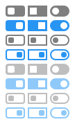
Simple CSS for display checkbox and radio inputs as switch buttons.
Example
Install
$ npm install input-switch$ yarn add input-switchFrom unpkg:
Notice
If you installed via package manager, don't forget to import CSS into your project.
Usage
Example text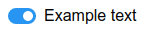
Modifiers
-
.has-switch.has-half-space-after- space after switch is half sized -
.has-switch.has-no-space-after- space after switch is omitted -
.switch.is-square- switch is square shaped -
.switch.is-round- switch is round shaped -
.switch.is-outline- switch is outlined, can be combined with.is-squareor.is-round
Customization
It's possible to customize some variables, for example colors:
; ;; ;Default values for all customizable variables:
/* sizes */; // default height of switch ; // default width of switch ; // default space after switch /* colors */; // default primary color of switch ; // default secondary color of switch ; // default pointer color of switch ; // default transparent color of switch /* transitions */; // default transition duration of switch ; // default transition timing function of switch