ink-select-input-horizontal 
Horizontal or Vertical select input component for Ink
This is a modified version of the original ink-select-input that returns the selectors horizontally or vertically and allows color customization.
note when requiring this package use:
const SelectInput = require('ink-select-input').default
Looking for a version compatible with Ink 2.x? Check out this release.
Install
$ npm install ink-select-input-horizontal
Usage
import React from 'react';import render from 'ink';import SelectInput from 'ink-select-input-horizontal'; const Demo = const handleSelect = { // `item` = { label: 'First', value: 'first' } }; const items = label: 'First' value: 'first' label: 'Second' value: 'second' label: 'Third' value: 'third' ; return <SelectInput = = />;; ;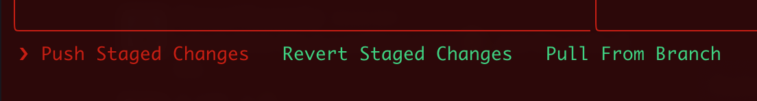
Props
items
Type: array
Default: []
Items to display in a list. Each item must be an object and have label and value props, it may also optionally have a key prop.
If no key prop is provided, value will be used as the item key.
isFocused
Type: boolean
Default: true
Listen to user's input. Useful in case there are multiple input components at the same time and input must be "routed" to a specific component.
initialIndex
Type: number
Default: 0
Index of initially-selected item in items array.
limit
Type: number
Number of items to display.
indicatorComponent
Type: Component
Custom component to override the default indicator component.
itemComponent
Type: Component
Custom component to override the default item component.
onSelect
Type: function
Function to call when user selects an item. Item object is passed to that function as an argument.
onHighlight
Type: function
Function to call when user highlights an item. Item object is passed to that function as an argument.