
Typescript material ui collection
Here you can see a Created by me and some hand picked collection of material components from various ui libraries. The goal is making ui development easy and seamless (Ui/ux itself with material design rules and Coding Experience) For now, components are in a limited number but i'm working on increasing their number to fulfill all ui/ux needed components
Table of contents
Installation
The library is installed and linked by default inside my boilerplate ignite-boilerplate-andross-typescript
If you have an ignite project you can add it by this command :
ignite add material-ui
You can also install it standalone by below commands :
npm install react-native-material-textfield react-native-vector-icons react-native-typescript-material-ui-collection react-native-material-ripple --save
react-native link
Recommended react-native version is >0.56
But if you using older versions and not configured typescript on it use below link
https://facebook.github.io/react-native/blog/2018/05/07/using-typescript-with-react-native
Components and Utils
Material Colors
I just converted www.materialui.co/colors colors to an object for easier use of these colors
Usage :
; MaterialColors.colorName.CcolorTone eg: MaterialColors.deepPurple.C400 //returns: #7E57C2 as stringMaterial Vertical Linear
this component is a view with default column direction it can be used for better readability of jsx ui code
Usage :
; MaterialHorizontalLinear /MaterialHorizontalLinear### Material Horizontal Linear
this component is a view with default row direction it can be used for better readability of jsx ui code
#### Usage :
; MaterialVerticalLinear /MaterialVerticalLinear### Material Card
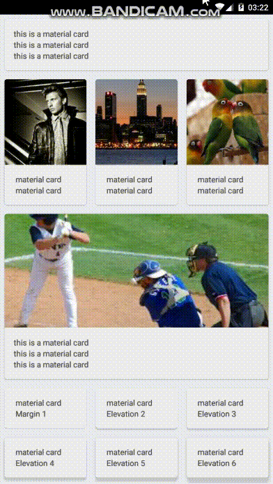
A card component created using material.io guidelines , Also CardContent Component is inside this is actually a view with 16dp padding
#### Usage :
Above gif's code (just important things)
//import ; //with image header MaterialCard style= header= MaterialCardContent Text material card</Text> Text material card</Text> /MaterialCardContent /MaterialCard //setting elevation MaterialCard style= elevation= MaterialCardContent Text material card</Text> Text Elevation 3</Text> /MaterialCardContent /MaterialCard //minimal usage MaterialCardContent Textthis is a material card</Text> Textthis is a material card</Text> Textthis is a material card</Text> /MaterialCardContent //with background image MaterialCard style= backgroundImageSource= MaterialCardContent Text style= material card</Text> Text style= Elevation 7</Text> /MaterialCardContent /MaterialCardProps
elevation?: number, margin?:number, header?Default Props
elevation:2, margin:8, backgroundColor:'#eeeeee'Material Toolbar
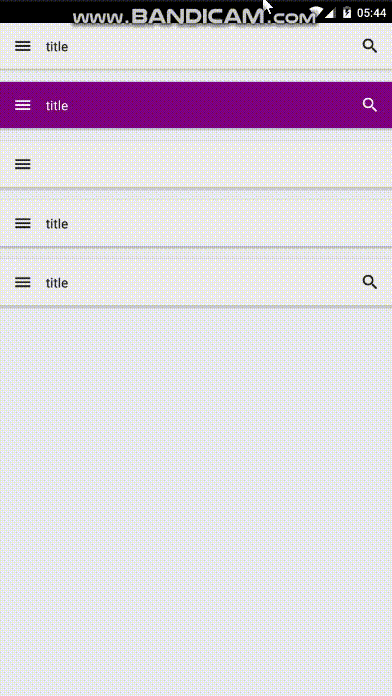
A toolbar designed based on material.io guidelines
And
MaterialToolbarContent you can use it for some content on your toolbar , you can also use your custom component
Can be used by Material Container
#### Usage
Import :
;Use:
MaterialToolbar leftIcon='menu' content= /MaterialToolbar leftIcon='menu' iconsColor='white' color='purple' content=/ // MinimalMaterialToolbar leftIcon='menu'/MaterialToolbar leftIcon='menu' content=/Props
MaterialToolbarProps Default Props
//Material Toolbar Content color: '#212121', typeModeIcon:'magnify', onTypeModePress:, onChangeText: //Material Toolbar color: '#eeeeee', onLeftIconPress:, onRightIconPress:, iconsColor:'#212121' Material Container
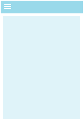
This component is a full width/height view for container view you can use it for more ui/ux code readability
#### Usage :
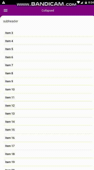
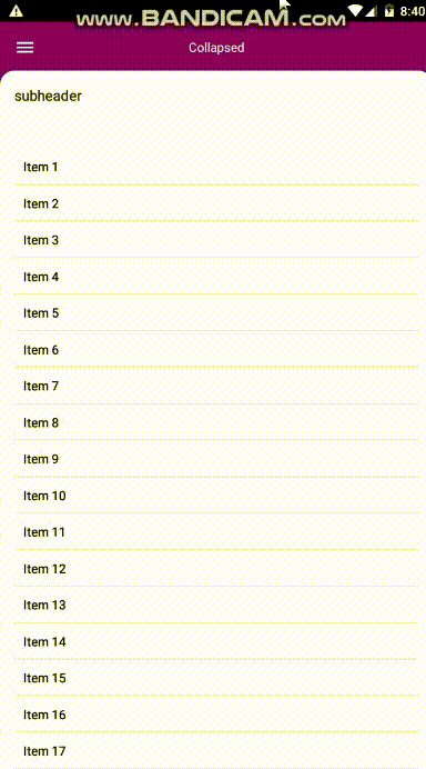
; MaterialContainer isRoot: boolean // if you set this prop true , your component will have no padding and you can render a toolbar view at top of it the default padding is 16 toolbar:React.ReactNode // this view will render at top of the view if you set isRoot true MaterialContainer // if you want to use this inside a root it is still a full width/height view with 16 dp padding /MaterialContainer /MaterialContainerMaterial Collapsible Toolbar Container
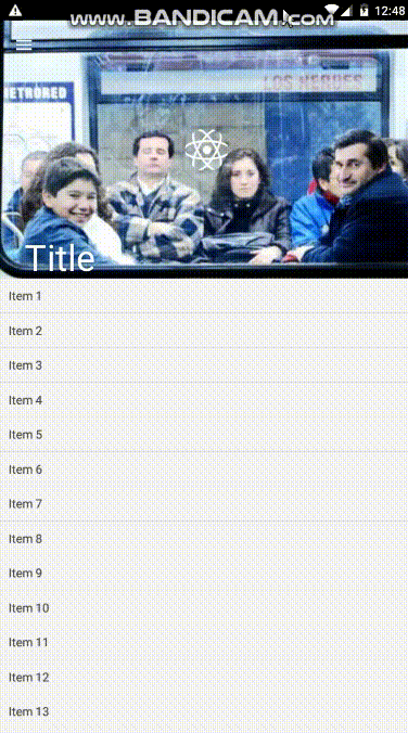
This is a pure js material collapsible toolbar container
Usage :
The exact code of above gif
; Props :
collapsedNavBarBackgroundColor?: string, imageSource?: string, onContentScroll?Material Backdrop
I tried to create this component using material.io guidelines in this link
Usage :
; ; ; source=} /> /View renderContent=View Props :
revealComponent?Material Text Input

Usage :
; MaterialTextInput isRtl= //just added this prop you can see other props from above link /Material Progress
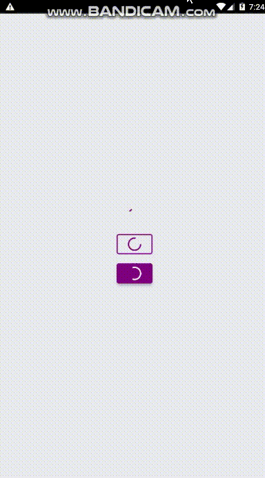
I used react-native-indicators code to do this with a few changes and turning the used code to typescript I have also used this component for progress inside below button components
#### Usage:
this is exactly the code of above gif
;; Props:
color:string,//just the color small?:boolean// using this will render small progress i'ts good for using inside buttons or etc.Material Buttons
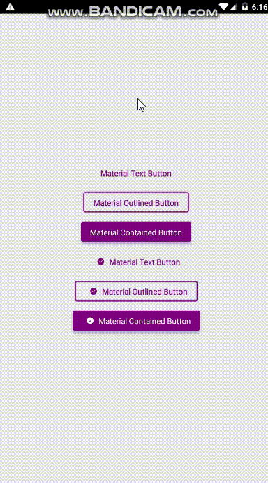
I Made these three buttons exactly based on material.io design guidelines
Usage:
this is exactly the code of above gif
;; Props:
MaterialTextButton:
text: string, icon?: React.ReactNode, // you can use your custom icon component , whatever, the button have react-native-vector-icons inside margin?:number, textColor?: string, textFont?: string, iconName?:string, // if you set the material icon name from https://materialdesignicons.com/ the icon will displayed onPress?MaterialOutlinedButton:
text: string, icon?: React.ReactNode, // you can use your custom icon component , whatever, the button have react-native-vector-icons inside margin?:number, textColor?: string, textFont?: string, onPress?MaterialContainedButton:
text: string, icon?: React.ReactNode, // you can use your custom icon component , whatever, the button have react-native-vector-icons inside margin?:number, color?:string, textColor?: string, textFont?: string, onPress?Material FAB
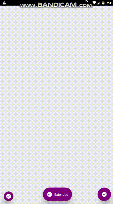
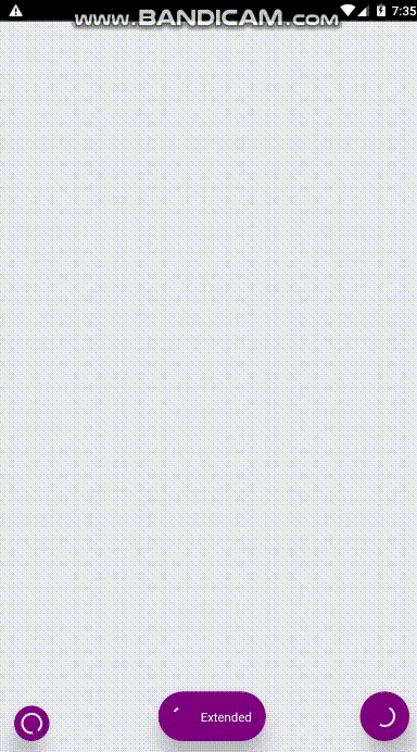
Usage :
this is exactly the code of above gif
; ; Props:
MaterialFab:
icon?: React.ReactNode, // you can use your custom icon component , whatever, the button have react-native-vector-icons inside color?:string, iconColor?: string, onPress?MaterialExtendedFab:
icon?: React.ReactNode, // you can use your custom icon component , whatever, the button have react-native-vector-icons inside color?:string, iconColor?: string, onPress?Material Checkbox
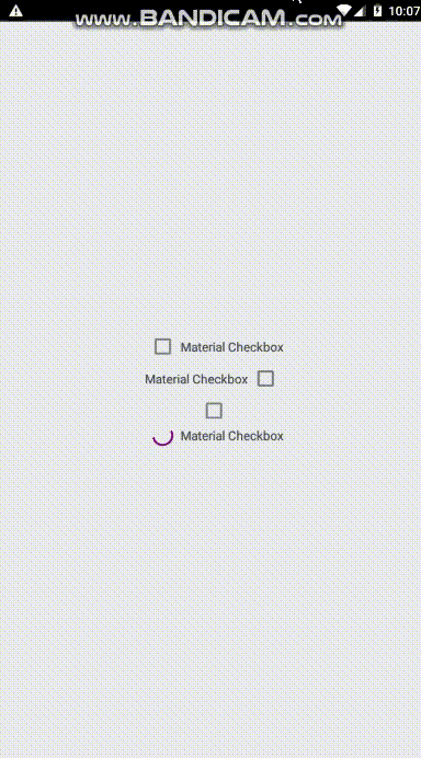
I Made this checkbox component exactly based on material.io design guidelines
Usage :
this is exactly the code of above gif
;; Props:
text?: string, isChecked?: boolean, textFont?: string, onCheckedChange?Material Switch
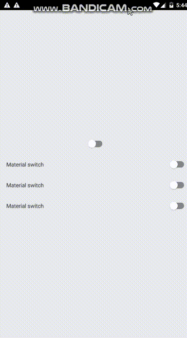
I Made this switch component exactly based on material.io design guidelines
Usage
this is exactly the code of above gif
; // Styles Props:
textFont?:string, textColor?:string, text?:string, color?:string onValueChanged?Material Radio Group
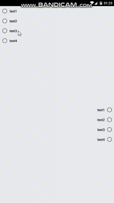
I Made this radio group component exactly based on material.io design guidelines
Usage
this is exactly the code of above gif
; // Styles Props:
data: any, // just be sure you have text:string field in datarows color: string, textFont?: string, textColor?: string, isRtl?:boolean, onItemPress?item, index: void