iElevator.js
this is a jQuery plugin for elevator, lightweight, easy to use and with some extra features
install
npm install ielevator or bower install ielevator
Features
- UMD support(AMD, CMD, Globals)
- Flexible HTML structure
- Provide several method of configuration
- Compatible with IE6+, Chrome, Firefox, Safari
- Extra functions
Dependencies
this is a jQuery plugin, So jQuery is required,
configuration
In order to ensure the plugin work normally, you provide at least one of “backtop” , "floors + btns" or "floors + btns + backtop"
Default Options
_defaults = floors: null btns: null backtop: null selected: '' sticky: -1 visible: isHide: 'no' numShow: 0 speed: 400 { meelement; } { meelement; }'floors' option
- (selector)select all elements with the given class, each represents a floor module. the default is null.
floors: ;'btns' option
- (selector)select all elements with the given class, each represents a focus button. the default is null.
btns: ;'backtop' option
- (selector)select all elements with the given class, each represents back-to-top button. the default is null.
backtop: ;'selected' option
- (css)selected refers to style of [btns option] selected or hover, or (selector) represents simulate selected object
selected: '' // selected: $('hightlight') ;'sticky' option
- (number)sticky emulates
'sticky position', is a Number type(the default is -1) and represents margin from top of elevator to top of viewport .
sticky: 100 ;'visible' option
- control elevator visibility, and contain isHide, numShow properties
- isHide:
yes|no. if yes, elevator is visible on initialization, and vice versa. ++NOTE: if no,however set any value to numShow, numShow doesn't make sense.++ - numShow:
Number. when scrollTop is greater than number, elevator will be visible. and vice versa
visible: isHide: 'no' numShow: 0 ;'speed' option
- control the speed of slider bar of window
speed: 400 ;'show' option
- override show function
{ meelement; }'hide' option
- override hide function
{ meelement;}Usage
it is easy to use, only you ovrride default options to meet your requirements what you want. the following four examples to illustrate the plugin how to use.
1. back to top【example】
HTML structure:
<div class="elevator elevator-backtop" id="backtop" > <a href="javascript:;" class="js-backtop">TOP</a> </div>Javascript:
;the example is very easy, only to get the "back to top" reference, and then [back to top] works
2. simulate elelvator【example】
HTML structure:
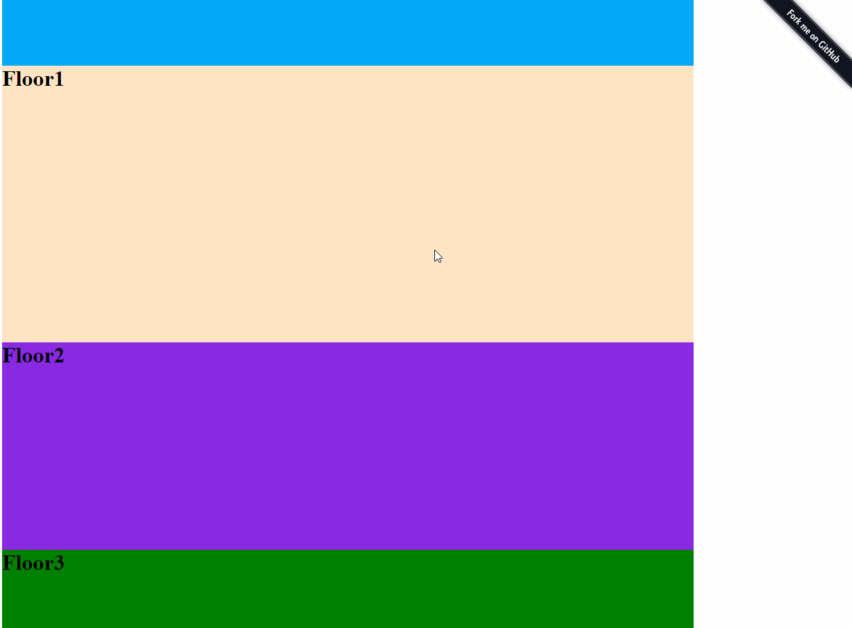
<div class="elevator" id="elevator" data-elevator-options='{"selected": "custome-selected"}'> <ul> <li><a href="javascript:;" class="custome-selected js-btn">floor1</a></li> <li><a href="javascript:;" class="js-btn">floor2</a></li> <li><a href="javascript:;" class="js-btn">floor3</a></li> <li><a href="javascript:;" class="js-btn">floor4</a></li> <li><a href="javascript:;" class="js-btn">floor5</a></li> <li><a href="javascript:;" class="js-btn">floor6</a></li> <li><a href="javascript:;" class="js-btn">floor7</a></li> </ul> </div>Javascript:
; NOTE: data-ielevator-options='{"selected": "custome-selected"}' is the highest priority. therefore, 'custome-selected' will overwrite 'selected' in configuration object
3. simulate elevator + back to top【example】
HTML structure:
<div class="elevator" id="elevator" data-elevator-options=''> <ul> <li><a href="javascript:;" class="custome-selected js-btn">floor1</a></li> <li><a href="javascript:;" class="js-btn">floor2</a></li> <li><a href="javascript:;" class="js-btn">floor3</a></li> <li><a href="javascript:;" class="js-btn">floor4</a></li> <li><a href="javascript:;" class="js-btn">floor5</a></li> <li><a href="javascript:;" class="js-btn">floor6</a></li> <li><a href="javascript:;" class="js-btn">floor7</a></li> <li><a href="javascript:;" class="js-backtop">TOP</a></li> </ul> </div>Javascript:
;4. require.js example【demoAMD】
5. 模拟segmentfault文章导航【example】
Javascript:
// 获取Markdown中的标题 var $demo = $titles = $nav = $demo $highlight = $demo STR = ''; // 填充标题 $titles; $nav; // 调用ielevator $demo;中文
iElevator.js是一个jquery小插件,使用简单,兼容IE6,支持UMD和3种配置方式,比锚点更灵活。
Default Options
_defaults = floors: null btns: null backtop: null selected: '' sticky: -1 visible: isHide: 'no' numShow: 0 speed: 400 { meelement; } { meelement; } floors:页面中floor模块的引用btns: 焦点图的引用backtop: 回到顶部按钮的引用selected: 焦点图在进行滚动或单击时的选中样式sticky: 模拟position: sticky定位,并可以指定elevator顶部距离窗口顶部的距离,默认为-1visible: 用于控制【电梯】的显示与隐藏,当srollTop值大于numShow时,显示【电梯】,反之则隐藏speed: 控制滑条的滚动速度show: 可以重写该函数,来定制elevator的显示方式hide: 可以重写该函数,来定制elevator的隐藏方式
安装
npm install ielevator or bower install ielevator
changelog
- 1.2.0: 增加throttle,对scroll事件进行节流优化,修复sticky|visible
License
iElevator.js is covered by the MIT License.