Hypertoxin


A themeable and declarative React Native component library for developing native mobile apps.


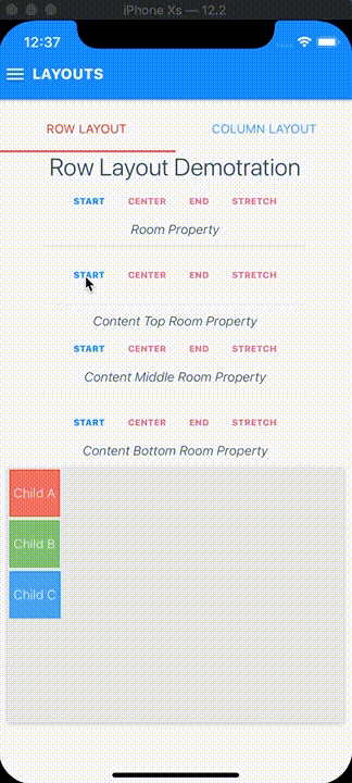
Screenshots with some example themes
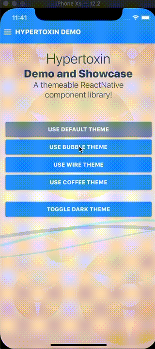
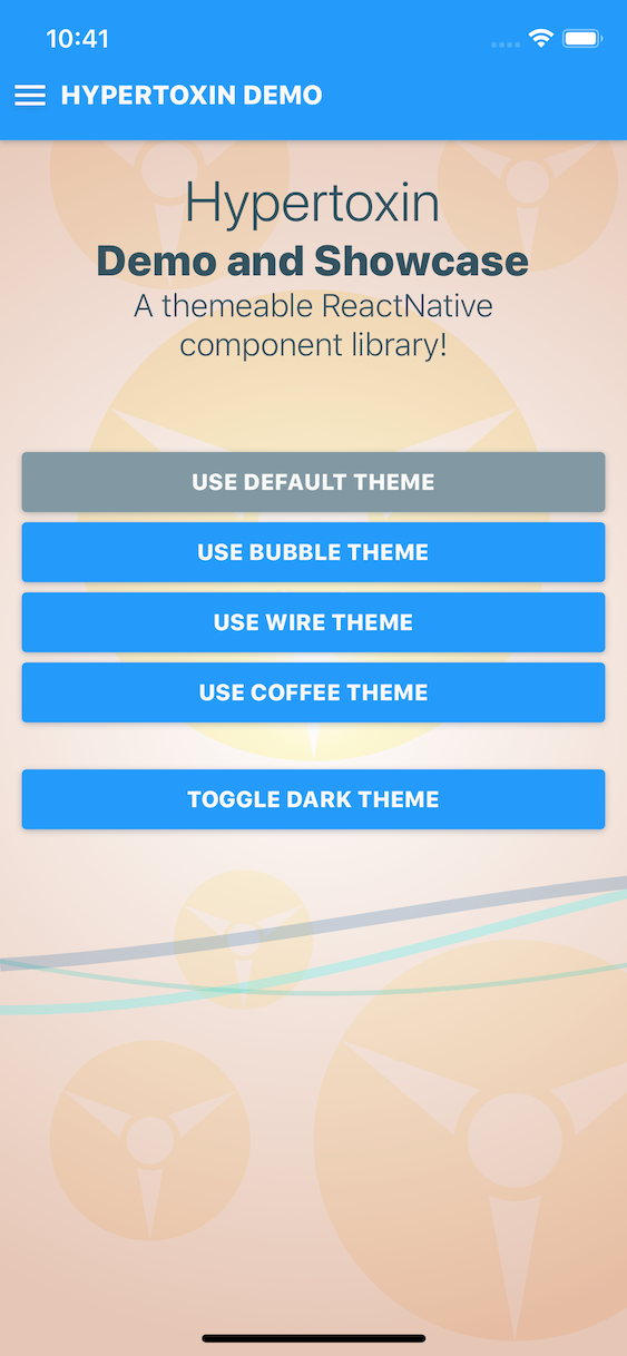
Dynamic theme switching
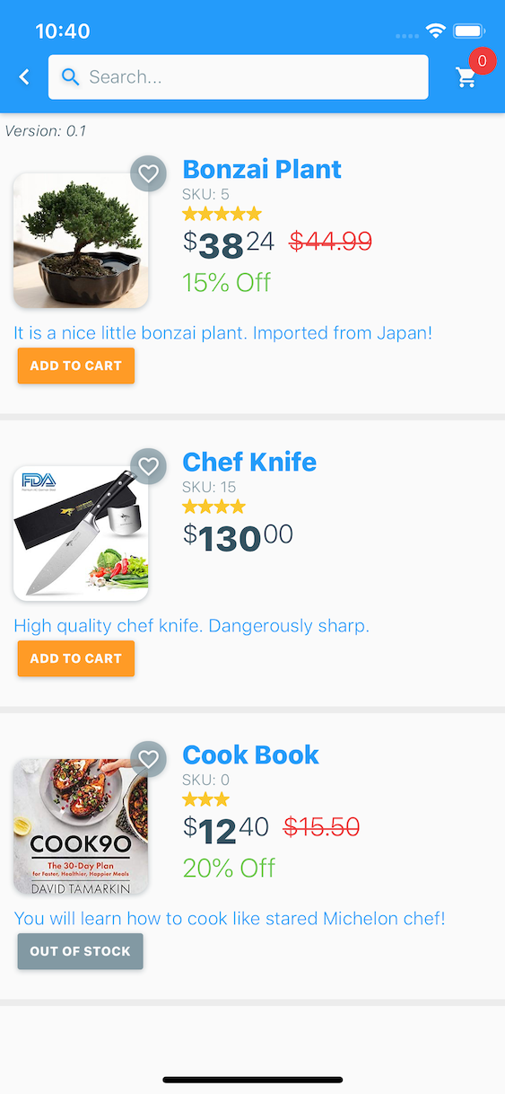


Mock up shopping app screenshots with default theme
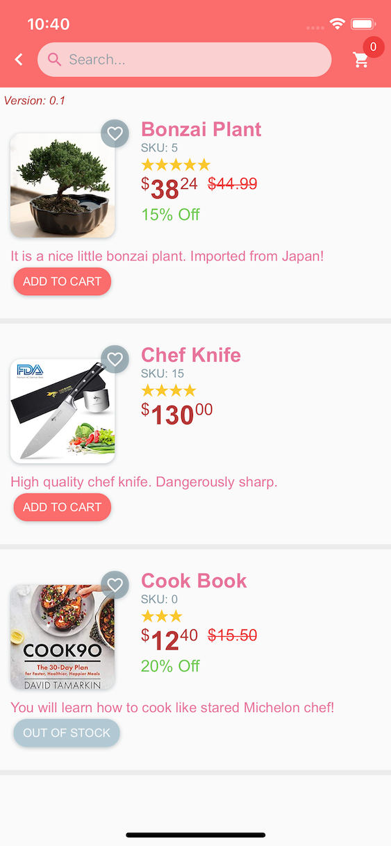


Mock up shopping app screenshots with bubble theme
Published Open-source App Virida built with Hypertoxin component library.


Checkout Virida on the app store!
Documeantations are still WIP.
Installation
$ npm install hypertoxin --saveDemo & Showcase
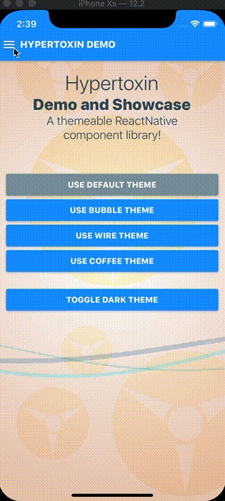
Hypertoxin comes with a full demo that you can build and run on your device or simulator. All of the code examples in this README are from the demo. To build the demo for iOS,
$ cd hypertoxin/demonpm installThis will install the required modules such as React Native, Hypertoxin, Hyperflow, and others. Then open hypertoxin/demo/ios with Xcode, select your ios simulator/device, and build. The default build scheme is release.
When use successfully, you will see the following on your device or simulator.
Usage
The imported hypertoxin object is consists of Ht, ThemeContext, and Theme. Ht is an object containing all available components. Theme is the default global theme object which is used as a reference for making custom themes. ThemeContext the a react context provider which is required for setting custom themes.
;; // All current available components with more to come. See todo list.const FlatButton RaisedButton AreaButton AvatarImage IconImage CoverImage TextField SearchField HorizontalDivider VeriticalDivider HeadlineText TitleText SubtitleText InfoText CaptionText BodyScreen HeaderScreen RowLayout ColumnLayout} = Ht; { return <ThemeContextProvider value = DefaultTheme // Modify this DefaultTheme object to make your own custom theme > // Top level app component goes here... </ThemeContextProvider> ; }Documentations
Button Components
Hypertoxin has three button components, FlatButton, RaisedButton, and AreaButton
Flat Button Properties
A standard button component that can be styled as an icon, a clear, or simply a flat opaque button.
| Prop | Type | Default | Description |
|---|---|---|---|
| exclusions | array of string | [] | Set which properties from parent component to exclude. See Using Exclusions Property section for details |
| room | string | none |
Set button's room with respect to parent component which can be one of none, content-left, content-middle, content-right, content-bottom, content-top, media. See Using Room Property section for details |
| action | string, object | none |
Set button's onPress callback action to be defined by the parent component. This property is used when a button is set as a child search button for parent components such as SearchField, TextField, or HeaderScreen. See Using Action Property section for details |
| shade | string, object | themed |
Set button's shade theme, can be themed, light, or dark |
| overlay | string | themed |
Set button's overlay style which can be one of themed, opaque, translucent, translucent-outline, transparent, transparent-outline |
| corner | string, number, object | themed |
Set button's corner styles. As a number, border radius = corner. Set corner as an object for more control. For example corner = { topLeft: 0.1, topRight: 0.1, bottomLeft: 0.1, bottomRight: 0.1} |
| size | string | themed |
Set button's size which can be one of themed, small, normal, large |
| margin | string, number, object | None | Set button's margin styles. As a number, the margin is equally set around the button. Set margin as an object for more control. For example margin = { top: 5, bottom: 5, left: 5, right: 5, horizontal: 5, vertical: 5} |
| disabled | boolean | false | Disable the button |
| busy | boolean | false | Enable button busy activity indicator |
| rippled | boolean, string | themed |
Enable button ripple animation |
| label | string | None | Button string label |
| color | string | themed |
Set button's color style. Can be hex string, default color name, or themed color name |
| debounced | boolean | false | Enable button debouncing at 250 ms |
| onPress | function | None | Calls when button is pressed |
| style | object | None | Flat button style is an object with the following properties: container: {...}, contentLeftRoom: {...}, contentMiddleRoom: {...}, contentRightRoom: {...}, badgeRoom: {...}, activityIndicatorRoom: {...}, label: {...}, ripple: {...}. Standard React Native style properties go inside these properties. Changes to these properties will override the global theme. See default style object |
Raised Button Properties
Raised button is similar to flat button with the exceptions that it has permanent drop shadow and opaque color.
| Prop | Type | Default | Description |
|---|---|---|---|
| exclusions | array of string | [] | Set which properties from parent component to exclude. See Using Exclusions Property section for details |
| room | string | none |
Set button's room with respect to parent component which can be one of none, content-left, content-middle, content-right, content-bottom, content-top, media. See Using Room Property section for details |
| action | string, object | none |
Set button's onPress callback action to be defined by the parent component. This property is used when a button is set as a child search button for parent components such as SearchField, TextField, or HeaderScreen. See Using Action Property section for details |
| shade | string, object | themed |
Set button's shade theme, can be themed, light, or dark |
| corner | string, number, object | themed |
Set button's corner styles. As a number, border radius = corner. Set corner as an object for more control. For example corner = { topLeft: 0.1, topRight: 0.1, bottomLeft: 0.1, bottomRight: 0.1} |
| size | string | themed |
Set button's size which can be one of themed, small, normal, large |
| margin | string, number, object | None | Set button's margin styles. As a number, the margin is equally set around the button. Set margin as an object for more control. For example margin = { top: 5, bottom: 5, left: 5, right: 5, horizontal: 5, vertical: 5} |
| disabled | boolean | false | Disable the button |
| busy | boolean | false | Enable button busy activity indicator |
| rippled | boolean, string | themed |
Enable button ripple animation |
| label | string | None | Button string label |
| color | string | themed |
Set button's color style. Can be hex string, default color name, or themed color name |
| debounced | boolean | false | Enable button debouncing at 250 ms |
| onPress | function | None | Calls when button is pressed |
| style | object | None | Raised button style is an object with the following properties: container: {...}, contentLeftRoom: {...}, contentMiddleRoom: {...}, contentRightRoom: {...}, badgeRoom: {...}, activityIndicatorRoom: {...}, label: {...}, ripple: {...}. Standard React Native style properties go inside these properties. Changes to these properties will override the global theme. See default style object |
Area Button Properties
Unlike flat or raised button, area button was intended mainly as a list item component. Therefore it works nicely as a selectable item in a typical list view.
| Prop | Type | Default | Description |
|---|---|---|---|
| exclusions | array of string | [] | Set which properties from parent component to exclude. See Using Exclusions Property section for details |
| room | string | none |
Set button's room with respect to parent component which can be one of none, content-left, content-middle, content-right, content-bottom, content-top, media. See Using Room Property section for details |
| action | string, object | none |
Set button's onPress callback action to be defined by the parent component. This property is used when a button is set as a child search button for parent components such as SearchField, TextField, or HeaderScreen. See Using Action Property section for details |
| shade | string, object | themed |
Set button's shade theme, can be themed, light, or dark |
| overlay | string | themed |
Set button's overlay style which can be one of themed, opaque, translucent, transparent |
| size | string | themed |
Set button's size which can be one of themed, small, normal, large |
| margin | string, number, object | None | Set button's margin styles. As a number, the margin is equally set around the button. Set margin as an object for more control. For example margin = { top: 5, bottom: 5, left: 5, right: 5, horizontal: 5, vertical: 5} |
| disabled | boolean | false | Disable the button |
| rippled | boolean, string | themed |
Enable button ripple animation |
| debounced | boolean | false | Enable button debouncing at 250 ms |
| onPress | function | None | Calls when button is pressed |
| style | object | None | Area button style is an object with the following properties: container: {...}, contentLeftRoom: {...}, contentRightRoom: {...}, ripple: {...}. Unlike flat and raised buttons, there is no middle room styling. Standard React Native style properties go inside these properties. Changes to these properties will override the global theme. See default style object |
Note: themed property indicates using values defined by the global theme provider.
By default, flat, raised, and area button components pass shade, size, color (flat & raised only), and disabled properties down to their child components and at the same time set margin = { 0 } and indentation = { 0 } properties onto its children. This behavior can be override by child components with the exclusions property. . See Using Exclusions Property section for details.
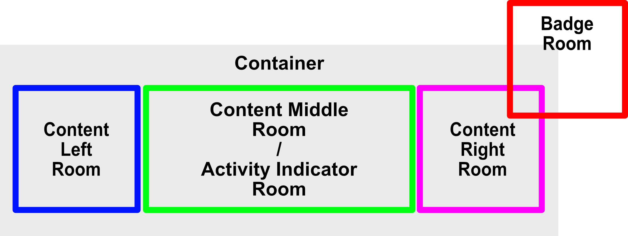
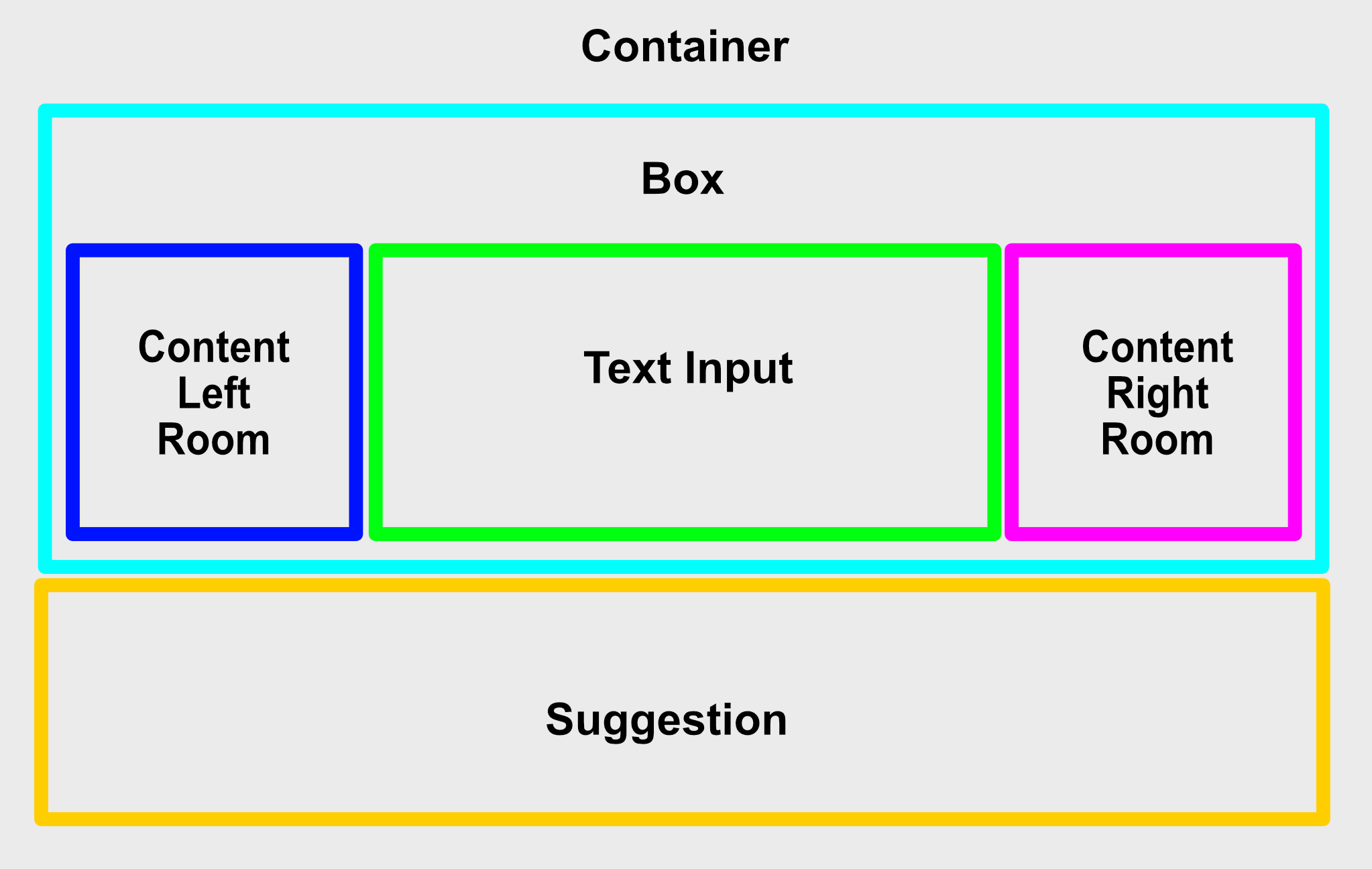
Flat & raised button internal view compositions diagram
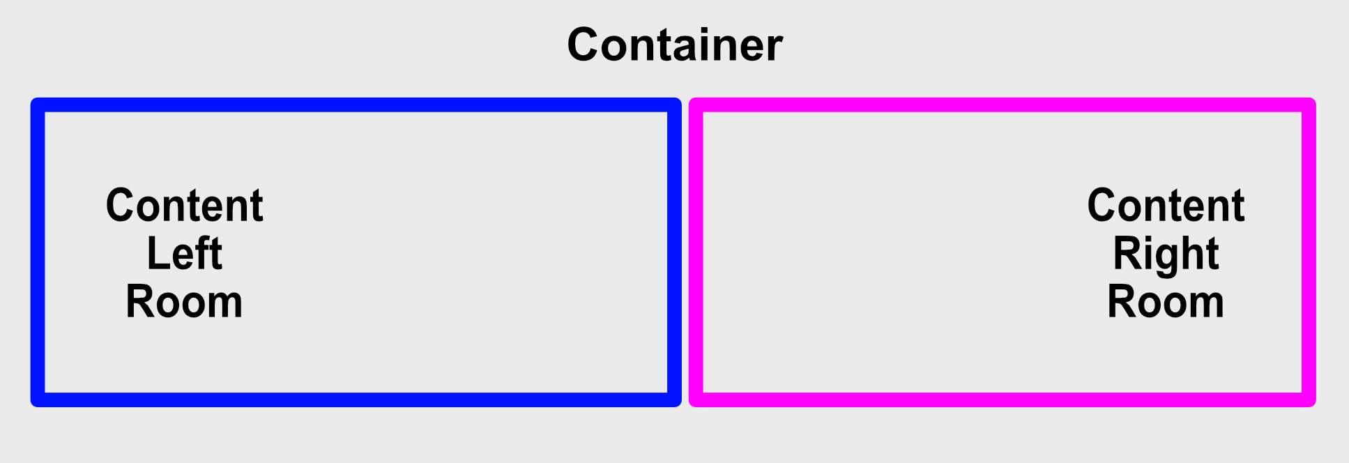
Area button internal view compositions diagram
Flat & raised button animated internal view composition reference names. See Animation API for details:
animated-container-viewanimated-content-left-room-viewanimated-content-middle-room-viewanimated-content-right-room-viewanimated-activity-indicator-room-viewanimated-badge-room-view
Area button animated internal view composition reference names. See Animation API for details:
animated-container-viewanimated-content-left-room-viewanimated-content-right-room-view
Flat, raised & area button methods & callbacks:
animate- See Animation API for detailsonPress- Button press callback- arguments:
event(object) - React Native event
- return: None
- arguments:
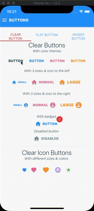
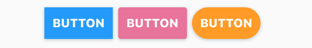
Flat Button Examples
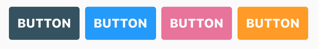
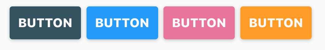
Standard flat buttons with colors defined by global theme
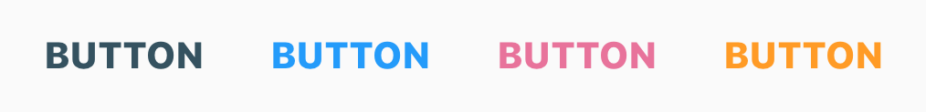
<FlatButton = 'opaque' = 'BUTTON' = 'default' /><FlatButton = 'opaque' = 'BUTTON' = 'primary' /><FlatButton = 'opaque' = 'BUTTON' = 'secondary' /><FlatButton = 'opaque' = 'BUTTON' = 'accent' />Clear buttons can be created when styling flat buttons with overlay = 'transparent' property. The component will auto-adjust the label text color accordingly.
Standard clear buttons with colors defined by global theme
<FlatButton = 'transparent' = 'BUTTON' = 'default' /><FlatButton = 'transparent' = 'BUTTON' = 'primary' /><FlatButton = 'transparent' = 'BUTTON' = 'secondary' /><FlatButton = 'transparent' = 'BUTTON' = 'accent' />
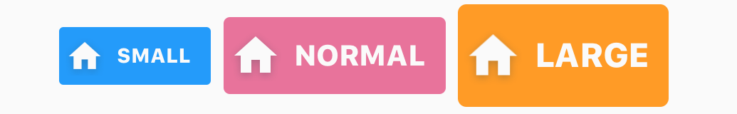
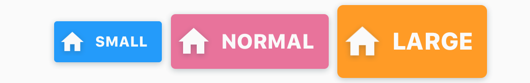
Flat buttons in 3 available sizes with icon images to the left
And icon images to the right
To add icon image to button, add a child icon image component (more details for IconImage component below) with a content room property. All button components have 4 child rooms, content-left, content-middle, content-right, and badge.
Internally, a room is just a convenient way for creating child Views, thus allowing the JSX code to be less clutter and much more declarative.
<FlatButton = 'opaque' = 'small' = 'SMALL' = 'primary' > <IconImage = 'content-left' = 'home' /></FlatButton><FlatButton = 'opaque' = 'normal' = 'NORMAL' = 'secondary' > <IconImage = 'content-left' = 'home' /></FlatButton><FlatButton = 'opaque' = 'large' = 'LARGE' = 'accent' > <IconImage = 'content-left' = 'home' /></FlatButton><FlatButton = 'opaque' = 'small' = 'SMALL' = 'primary' > <IconImage = 'content-right' = 'profile' /></FlatButton><FlatButton = 'opaque' = 'normal' = 'NORMAL' = 'secondary' > <IconImage = 'content-right' = 'profile' /></FlatButton><FlatButton = 'opaque' = 'large' = 'LARGE' = 'accent' > <IconImage = 'content-right' = 'profile' /></FlatButton>
Clear buttons in 3 available sizes with icon images to the left & right
<FlatButton = 'transparent' = 'small' = 'SMALL' = 'primary' > <IconImage = 'content-left' = 'home' /></FlatButton><FlatButton = 'transparent' = 'normal' = 'NORMAL' = 'secondary' > <IconImage = 'content-left' = 'home' /></FlatButton><FlatButton = 'transparent' = 'large' = 'LARGE' = 'accent' > <IconImage = 'content-left' = 'home' /></FlatButton><FlatButton = 'transparent' = 'small' = 'SMALL' = 'primary' > <IconImage = 'content-right' = 'profile' /></FlatButton><FlatButton = 'transparent' = 'normal' = 'NORMAL' = 'secondary' > <IconImage = 'content-right' = 'profile' /></FlatButton><FlatButton = 'transparent' = 'large' = 'LARGE' = 'accent' > <IconImage = 'content-right' = 'profile' /></FlatButton>
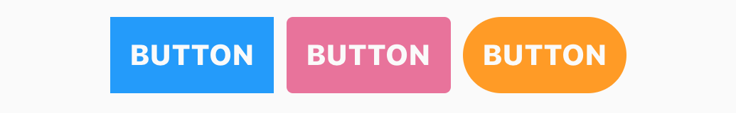
A few examples of corner styling
<FlatButton = 'opaque' = 'BUTTON' = 'primary' = 'sharp' /><FlatButton = 'opaque' = 'BUTTON' = 'secondary' = 'round' /><FlatButton = 'opaque' = 'BUTTON' = 'accent' = 'circular' />To create a button with a badge, add a child text component with a room = 'badge'.
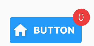
<FlatButton = 'opaque' = 'BUTTON' = 'primary' > <InfoText = 'badge' = 'white' > 0 </InfoText> <IconImage = 'content-left' = 'home' /></FlatButton>
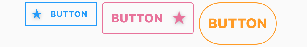
Flat outlined buttons when styled with `overlay = 'transparent-outline'` property
<FlatButton = 'transparent-outline' = 'small' = 'BUTTON' = 'primary' = 'sharp' > <IconImage = 'content-left' = 'star' /></FlatButton><FlatButton = 'transparent-outline' = 'normal' = 'BUTTON' = 'secondary' = 'round' > <IconImage = 'content-right' = 'star' /></FlatButton><FlatButton = 'transparent-outline' = 'large' = 'BUTTON' = 'accent' = 'circular' />
Flat buttons styled as icon buttons
<FlatButton = 'transparent' = 'small' = 'primary' = 'circular' > <IconImage = 'content-middle' = 'favorite' /></FlatButton><FlatButton = 'transparent' = 'normal' = 'secondary' = 'circular' > <IconImage = 'content-middle' = 'favorite' /></FlatButton><FlatButton = 'transparent' = 'large' = 'accent' = 'circular' > <IconImage = 'content-middle' = 'favorite' /></FlatButton><FlatButton = 'transparent' = = 'circular' > <IconImage = 'content-middle' = 'smiley-face' /></FlatButton><FlatButton = 'transparent' = = 'circular' > <IconImage = 'content-middle' = 'star' /></FlatButton>Raised Button Examples
Standard raised buttons with colors defined by global theme
<RaisedButton = 'BUTTON' = 'default' /><RaisedButton = 'BUTTON' = 'primary' /><RaisedButton = 'BUTTON' = 'secondary' /><RaisedButton = 'BUTTON' = 'accent' />
Raised buttons in 3 available sizes with icon images to the left & right
<RaisedButton = 'small' = 'SMALL' = 'primary' > <IconImage = 'content-left' = 'home' /></RaisedButton><RaisedButton = 'normal' = 'NORMAL' = 'secondary' > <IconImage = 'content-left' = 'home' /></RaisedButton><RaisedButton = 'large' = 'LARGE' = 'accent' > <IconImage = 'content-left' = 'home' /></RaisedButton><RaisedButton = 'small' = 'SMALL' = 'primary' > <IconImage = 'content-right' = 'profile' /></RaisedButton><RaisedButton = 'normal' = 'NORMAL' = 'secondary' > <IconImage = 'content-right' = 'profile' /></RaisedButton><RaisedButton = 'large' = 'LARGE' = 'accent' > <IconImage = 'content-right' = 'profile' /></RaisedButton>
A few examples of corner styling
<RaisedButton = 'BUTTON' = 'primary' = 'sharp' /><RaisedButton = 'BUTTON' = 'secondary' = 'round' /><RaisedButton = 'BUTTON' = 'accent' = 'circular' />
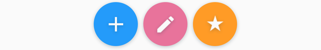
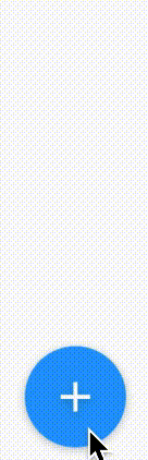
Raised buttons styled as floating action buttons
<RaisedButton = 'primary' = 'circular' = 'large' > <IconImage = 'content-middle' = 'add' /></RaisedButton><RaisedButton = 'secondary' = 'circular' = 'large' > <IconImage = 'content-middle' = 'edit' /></RaisedButton><RaisedButton = 'accent' = 'circular' = 'large' > <IconImage = 'content-middle' = 'star' /></RaisedButton>Area Button Examples
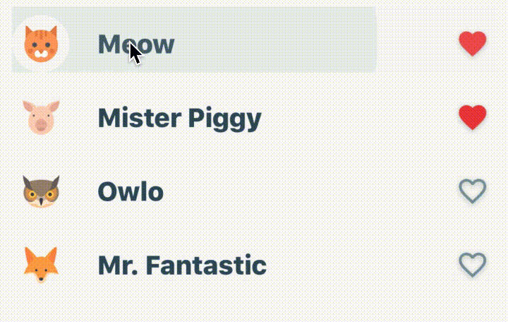
Using area button to create selectable list items
<FlatList = = />Field Components

Hypertoxin has two field components, TextField and SearchField
Search Field Properties
Use search field to create functional search bar. Notable feature is suggestion pull-up view.
| Prop | Type | Default | Description |
|---|---|---|---|
| exclusions | array of string | [] | Set which properties from parent component to exclude. See Using Exclusions Property section for details |
| room | string | none |
Set search field's room with respect to parent component which can be one of none, content-left, content-middle, content-right, content-bottom, content-top, media. See Using Room Property section for details |
| shade | string, object | themed |
Set search field's shade theme, can be themed, light, or dark |
| overlay | string | themed |
Set search field's overlay style which can be one of themed, opaque, translucent, translucent-outline, transparent, transparent-outline |
| corner | string, number, object | themed |
Set search field's corner styles. As a number, border radius = corner. Set corner as an object for more control. For example corner = { topLeft: 0.1, topRight: 0.1, bottomLeft: 0.1, bottomRight: 0.1} |
| size | string | themed |
Set search field's size which can be one of themed, small, normal, large |
| margin | string, number, object | None | Set search field's margin styles. As a number, the margin is equally set around search field container. Set margin as an object for more control. For example margin = { top: 5, bottom: 5, left: 5, right: 5, horizontal: 5, vertical: 5} |
| dropShadowed | boolean, string | themed |
Enable search field's container drop shadow |
| autoFocus | boolean | true | Enable search field's auto focus |
| autoCorrect | boolean | true | Enable search field's auto correct spelling |
| suggestive | boolean | true | Enable search field's suggestion pull-up view |
| pinnedSuggestionValues | array of string, number, or object | [] | A list of pinned suggestion values |
| hint | string | None | Set search field's hint |
| style | object | None | Search field style is an object with the following properties: container: {...}, box, {...}, contentLeftRoom: {...}, contentRightRoom: {...}, input: {...}, suggestion: {...}. Standard React Native style properties go inside these properties. Changes to these properties will override the global theme. See default style object |
| onSearch | function | None | Calls after search field's text input onSubmitEditing |
| onGetAutocompletionValues | async function | None | Async retrieve autocompletion string value array for suggestion pull-up view |
| onEditing | function | None | Calls when search field's text input onChangeText |
| onFocus | function | None | Calls after search field's text input is focused |
| onBlur | function | None | Calls after search field's text input is blurred |
| onCollapse | function | None | Calls after search field view collapsed |
| onExpand | function | None | Calls after search field view expanded |
| onHide | function | None | Calls when search field view becomes hidden |
| onShow | function | None | Calls when search field view becomes visible |
| onHideSuggestion | function | None | Calls when search field's suggestion view becomes hidden |
| onShowSuggestion | function | None | Calls when search field's suggestion view becomes visible |
| onClear | function | None | Calls after search field's text input is cleared |
| onClearSuggestion | function | None | Calls after search field's suggestion is clear |
| renderSuggestionItem | function | None | Takes an item from a list of suggestion items (pinned, autocompleted, & history) and renders them into the list in pull-up suggestion view |
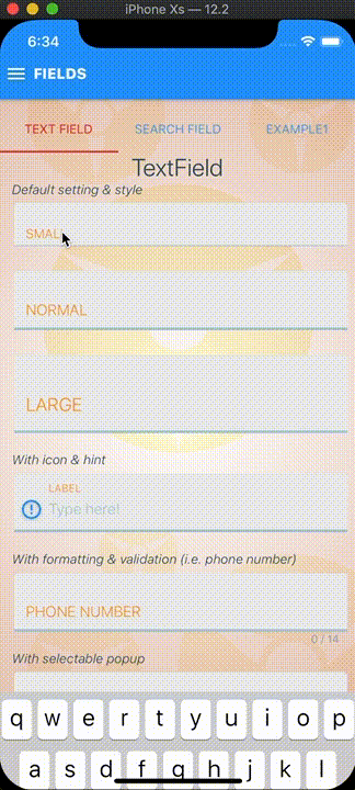
Text Field Properties
Use text fields to create beautiful input forms. Notable features are input reformatting & validation and selectable pull-up view.
| Prop | Type | Default | Description |
|---|---|---|---|
| exclusions | array of string | [] | Set which properties from parent component to exclude. See Using Exclusions Property section for details |
| room | string | none |
Set text field's room with respect to parent component which can be one of none, content-left, content-middle, content-right, content-bottom, content-top, media. See Using Room Property section for details |
| shade | string, object | themed |
Set text field's shade theme, can be themed, light, or dark |
| overlay | string | themed |
Set text field's overlay style which can be one of themed, opaque, translucent, translucent-outline, transparent, transparent-outline |
| corner | string, number, object | themed |
Set text field's corner styles. As a number, border radius = corner. Set corner as an object for more control. For example corner = { topLeft: 0.1, topRight: 0.1, bottomLeft: 0.1, bottomRight: 0.1} |
| size | string | themed |
Set text field's size which can be one of themed, small, normal, large |
| margin | string, number, object | None | Set text field's margin styles. As a number, the margin is equally set around text field container. Set margin as an object for more control. For example margin = { top: 5, bottom: 5, left: 5, right: 5, horizontal: 5, vertical: 5} |
| autoFocus | boolean | true | Enable text field's auto focus |
| autoCorrect | boolean | true | Enable text field's auto correct spelling |
| secured | boolean | false | Enable text field's secure mode |
| underlined | boolean, string | themed |
Enable text field's underlined animation |
| disabled | boolean | false | Disable text field's input |
| initialValue | string, number | None | Set text input's initial value |
| selectableValues | array of string, number, or object | [] | A list of selectable values |
| label | string | None | Set text field's label |
| hint | string | None | Set text field's hint |
| charLimit | number | -1 | Set text input's max characters count. Set charLimit > -1 for no character limit. When charLimit > 1, a little character counter will be visible in the bottom right |
| lineLimit | number | 1 | Set text input's max lines count. Set lineLimit > 1 for multi-lined text input |
| inputType | string | default |
Set text input's type which can be one of default, numeric, monetary, phone-pad, email-address, credit-card-visa, credit-card-master, credit-card-discover, credit-card-american-express |
| disableValidation | bool | false | Disable text input validation |
| disableFormatting | bool | false | Disable text input formatting |
| style | object | None | Text field style is an object with the following properties: container: {...}, box: {...}, contentLeftRoom: {...}, contentRightRoom: {...}, input: {...}, helper: {...}, status: {...}, label: {...}, underline: {...}, selection: {...}. Standard React Native style properties go inside these properties. Changes to these properties will override the global theme. See default style object |
| onValidate | function | None | Calls after text field's text input onChangeText or onEndEditing |
| onReformat | function | None | Calls after text field's text input onChangeText |
| onEditing | function | None | Calls when text field's text input onChangeText |
| onDoneEdit | function | None | Calls when a value in text field's selectable pull-up view is selected or after text field's text input onSubmitEditing |
| onSelect | function | None | Calls when a value in text field's selectable pull-up view is selected |
| onFocus | function | None | Calls after text field's text input is focused |
| onBlur | function | None | Calls after text field's text input is blurred |
| onHideSelection | function | None | Calls after text field's selectable pull-up view is hidden |
| onShowSelection | function | None | Calls after text field's selectable pull-up view is visible |
| onClear | function | None | Calls after text field's text input is cleared |
| renderSelectableItem | function | None | Takes an item from a list of selectable items and renders them into the list in pull-up selection view |
Note: themed property indicates using values defined by the global theme provider.
By default, text field component passes shade, size, and disabled properties down to it child components and at the same time set margin = { 0 } and indentation = { 0 } properties onto its children. By default, search field component passes shade property down to it child components and at the same time set margin = { 0 } and indentation = { 0 } properties onto its children. This behavior can be override by child components with the exclusions property. See Using Exclusions Property section for details.
Search field internal view compositions diagram
Search field animated internal view composition reference names. See Animation API for details:
animated-container-viewanimated-box-viewanimated-content-left-room-viewanimated-content-right-room-viewanimated-suggestion-view
Search field available actions:
searchclearblurfocusexpandcollapseshowshow-suggestionhidehide-suggestion
Search field methods & callbacks:
animate- See Animation API for detailsisCollapsed- arguments: None
- return: bool
isVisible- arguments: None
- return: bool
isSuggestionVisible- arguments: None
- return: bool
isFocused- arguments: None
- return: bool
collapse- arguments:
animation(object) - Collapse animation object. See Animation API for details.
- return: None
- arguments:
expand- arguments:
animation(object) - Expand animation object. See Animation API for details
- return: None
- arguments:
show- arguments:
animation(object) - Show animation object. See Animation API for details
- return: None
- arguments:
showSuggestion- arguments:
animation(object) - Show animation object. See Animation API for details
- return: None
- arguments:
hide- arguments:
animation(object) - Hide animation object. See Animation API for details
- return: None
- arguments:
hideSuggestion- arguments:
animation(object) - Hide animation object. See Animation API for details
- return: None
- arguments:
focus- arguments: None
- return: None
blur- arguments: None
- return: None
clear- arguments: None
- return: None
clearSuggestion- arguments: None
- return: None
onSearch- arguments:
value(string) - Submitted search text value
- return: None
- arguments:
onGetAutocompletionValues(async)- arguments:
value(string) - Submitted search text value
- return:
- results (array) - An array of autocompletion text values
- arguments:
onEditing- arguments:
value(string) - Current search text value
- return: None
- arguments:
onFocus- arguments: None
- return: None
onBlur- arguments: None
- return: None
onCollapse- arguments: None
- return: None
onExpand- arguments: None
- return: None
onHide- arguments: None
- return: None
onShow- arguments: None
- return: None
onHideSuggestion- arguments: None
- return: None
onShowSuggestion- arguments: None
- return: None
onClear- arguments: None
- return: None
onClearSuggestion- arguments: None
- return: None
renderSuggestionItem- Render the suggestion item component- arguments:
item(object) - Suggestion itemonPressSelectAndSubmit- Callback to indicate which item was selected and then submitted- arguments:
item- Selected item
- return: None
- arguments:
onPressSelect- Callback to indicate which item was selected- arguments:
item- Selected item
- return: None
- arguments:
- return - Component
- arguments:
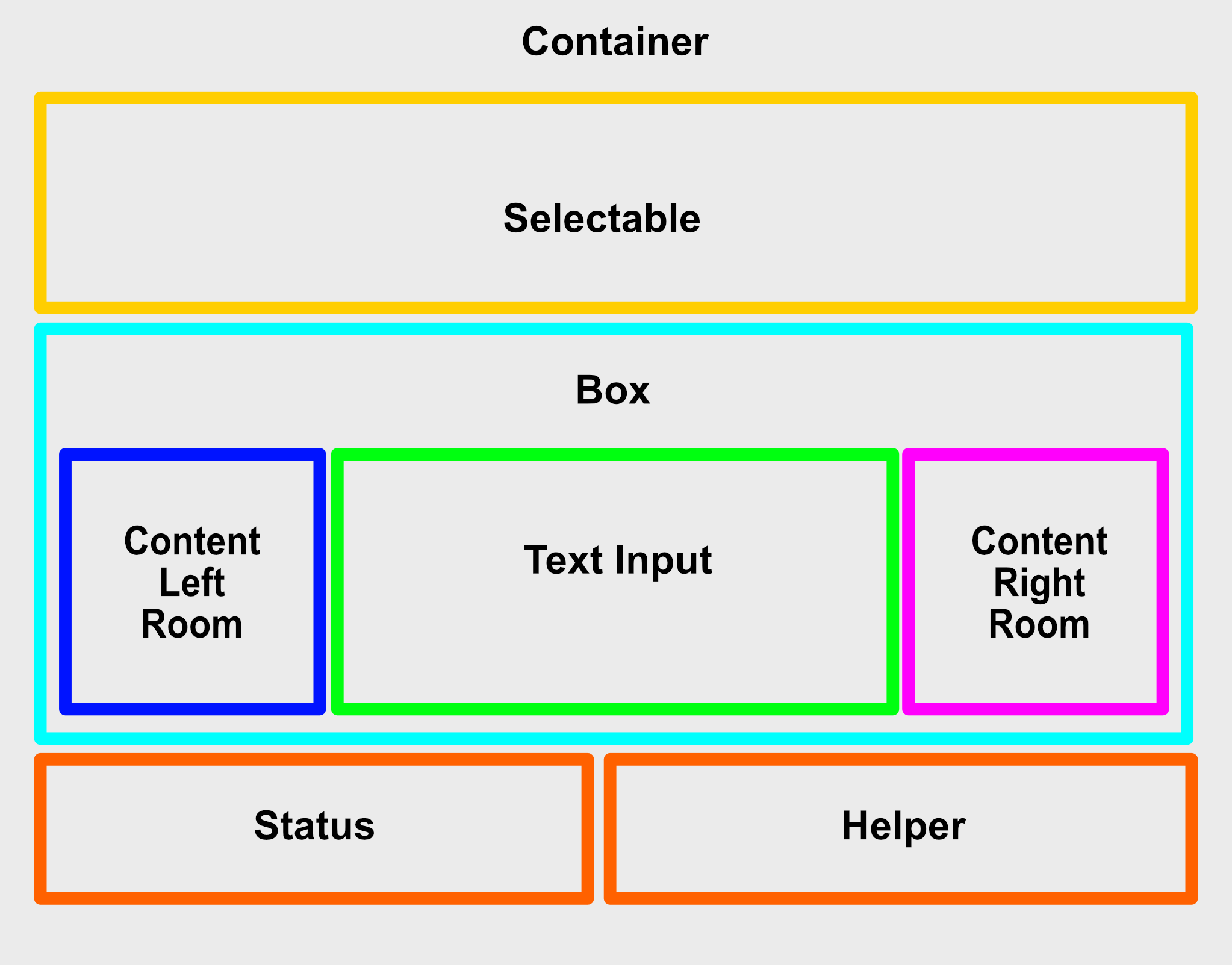
Text field internal view compositions diagram
Text field animated internal view composition reference names. See Animation API for details:
animated-container-viewanimated-box-viewanimated-label-textanimated-underline-focused-viewanimated-content-left-room-viewanimated-content-right-room-viewanimated-selection-view
Text field available actions:
clearblurfocusshow-selectionhide-selection
Text field methods & callbacks:
animate- See Animation API for detailsisValidated- Check if text input's value is validated- arguments: None
- return: bool
isSelectionVisible- Check if selectable pull-up view is visible- arguments: None
- return: bool
isFocused- Check if text input's value is focused- arguments: None
- return: bool
showSelection- Show selectable pull-up view ifselectableValuesis provided- arguments: None
- return: None
hideSelection- Hide selectable pull-up view ifselectableValuesis provided- arguments: None
- return: None
focus- Focus text input- arguments: None
- return: None
blur- Blur text input- arguments: None
- return: None
clear- Clear text input- arguments: None
- return: None
onValidate- Calls after text field's text input onChangeText or onEndEditing. See default onValidate- arguments:
value(string) - Current text valueinputType
- return: object - Expects return object with a
validateboolean property and astatusstring property
- arguments:
onReformat- Calls after text field's text input onChangeText. See default onReformat- arguments:
value(string) - Current text value
- return: string - Return reformatted value
- arguments:
onEditing- Calls when text field's text input onChangeText- arguments:
value(string) - Current text value
- return: None
- arguments:
onDoneEdit- Calls when a value in text field's selectable pull-up view is selected or after text field's text input onSubmitEditing- arguments:
value(string) - Current text value
- return: None
- arguments:
onSelect- Calls when a value in text field's selectable pull-up view is selected- arguments:
value(string) - Selected value
- return: None
- arguments:
onFocus- arguments: None
- return: None
onBlur- arguments: None
- return: None
onHideSelection- arguments: None
- return: None
onShowSelection- arguments: None
- return: None
onClear- arguments: None
- return: None
renderSelectableItem- Render an item from a list of selectable items and renders them into the list in pull-up selection view.See below for examples
Search Field Examples
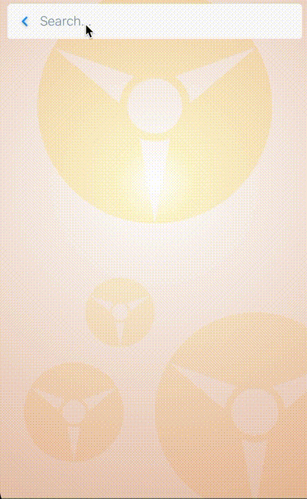
Search field with suggestion using Google's autocompletes
<SearchField = 'Search...' = = = = > <FlatButton = 'content-left' = 'expand' = 'transparent' = 'circular' > <IconImage = 'content-middle' = 'search' /> </FlatButton> <FlatButton = 'content-left' = 'collapse' = 'transparent' = 'circular' > <IconImage = 'content-middle' = 'go-back' /> </FlatButton> <FlatButton = 'content-right' = 'clear' = 'transparent' = 'circular' > <IconImage = 'content-middle' = 'cancel' /> </FlatButton></SearchField>Text Field Examples
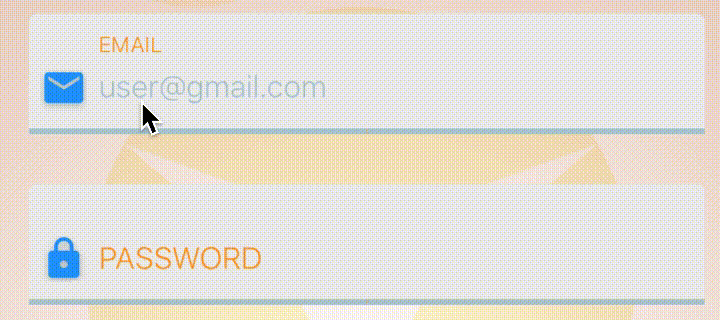
Using Text field to create simple logins
<TextField = 'EMAIL' = 'user@gmail.com' = 'email-address' > <IconImage = 'content-left' = 'email' /> <FlatButton = 'content-right' = 'transparent' = 'clear' = 'circular' > <IconImage = 'content-middle' = 'cancel' /> </FlatButton></TextField><TextField = = 'PASSWORD' > <IconImage = 'content-left' = 'lock' /> <FlatButton = 'content-right' = 'transparent' = 'clear' = 'circular' > <IconImage = 'content-middle' = 'cancel' /> </FlatButton></TextField>
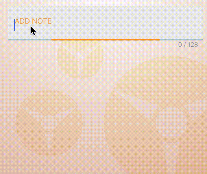
Using Text field to create a simple note
<TextField = 'ADD NOTE' = = > <FlatButton = 'transparent' = 'content-right' = 'clear' = 'circular' > <IconImage = 'content-middle' = 'cancel' /> </FlatButton></TextField>
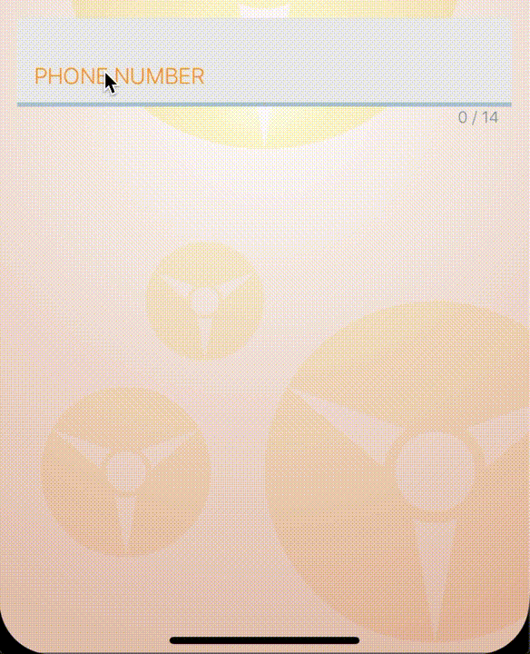
Text field with reformatting and validation
<TextField = 'PHONE NUMBER' = 'phone-pad' = = = > <FlatButton = 'content-right' = 'transparent' = 'clear' = 'circular' > <IconImage = 'content-middle' = 'cancel' /> </FlatButton></TextField>
Text field with selectable pull-up view
<TextField = 'LABEL' = = < = 'content-right' = 'transparent' = 'clear' = 'circular' > <IconImage = 'content-middle' = 'cancel' /> </FlatButton> <FlatButton = 'content-right' = 'transparent' = 'show-selection' = 'circular' > <IconImage = 'content-middle' = 'collapse' /> </FlatButton> <FlatButton = 'content-right' = 'transparent' = 'hide-selection' = 'circular' > <IconImage = 'content-middle' = 'expand' /> </FlatButton></TextField>Text Components
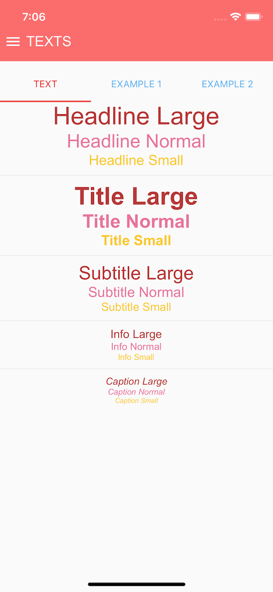
Text components with default theme and San-Francisco font
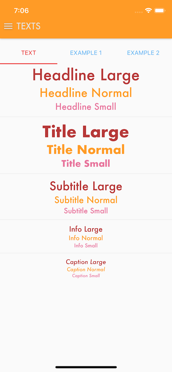
Text components with bubble theme and Arial font
Text components with coffee theme and Futura font
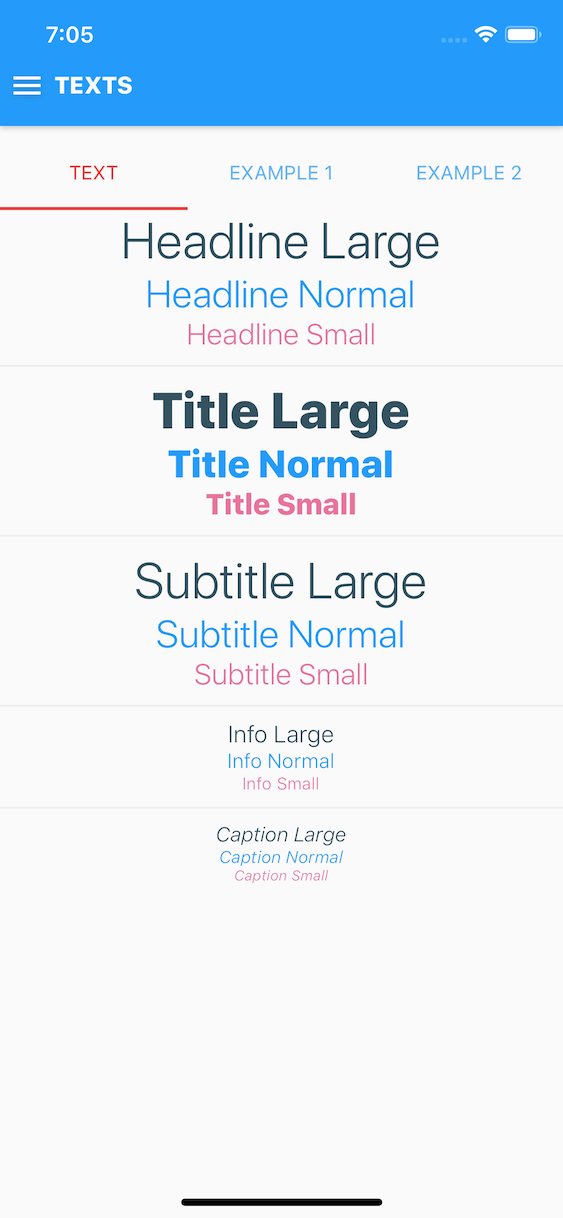
Hypertoxin has five text components, CaptionText, InfoText, SubtitleText, TitleText, HeadlineText
Text (Caption, Info, Subtitle, Title, & Headline) Properties
| Prop | Type | Default | Description |
|---|---|---|---|
| exclusions | array of string | [] | Set which properties from parent component to exclude. See Using Exclusions Property section for details |
| room | string | none |
Set text's room with respect to parent component which can be one of none, content-left, content-middle, content-right, content-bottom, content-top, media, activity-indicator. See Using Room Property section for details |
| shade | string, object | themed |
Set text shade theme, can be themed, light, or dark |
| size | string | themed |
Set text font's size which can be one of themed, small, normal, large |
| alignment | string | left |
Set text's alignment which can be one of left, center, right |
| decoration | string | none |
Set text's decoration which can be one of none, underline, line-through |
| font | string | themed |
Set text font's family which can be themed or font family name |
| uppercased | boolean | False | Force uppercased text |
| lowercased | boolean | False | Force lowercased text |
| indentation | number | 0 | Set text indentation |
| color | string | themed |
Set text's color style. Can be hex string, default color name, or themed color name |
| style | object | None | Standard React Native text style properties |
Note: themed property indicates using values defined by the global theme provider.
Text (caption, info, subtitle, title, & headline) animated internal view composition reference names. See Animation API for details:
animated-text
Text (caption, info, subtitle, title, & headline) methods & callbacks:
animate- See Animation API for details
Text (Caption, Info, Subtitle, Title, & Headline) Examples
<HeadlineText = 'large' = 'default' > Headline Large </HeadlineText><HeadlineText = 'normal' = 'primary' > Headline Normal </HeadlineText><HeadlineText = 'small' = 'secondary' > Headline Small </HeadlineText><TitleText = 'large' = 'default' > Headline Large </TitleText><TitleText = 'normal' = 'primary' > Headline Normal </TitleText><TitleText = 'small' = 'secondary' > Headline Small </TitleText><SubtitleText = 'large' = 'default' > Headline Large </SubtitleText><SubtitleText = 'normal' = 'primary' > Headline Normal </SubtitleText><SubtitleText = 'small' = 'secondary' > Headline Small </SubtitleText><InfoText = 'large' = 'default' > Headline Large </InfoText><InfoText = 'normal' = 'primary' > Headline Normal </InfoText><InfoText = 'small' = 'secondary' > Headline Small </InfoText><CaptionText = 'large' = 'default' > Headline Large </CaptionText><CaptionText = 'normal' = 'primary' > Headline Normal </CaptionText><CaptionText = 'small' = 'secondary' > Headline Small </CaptionText>Screen Components
Hypertoxin has two screen components, BodyScreen, HeaderScreen
Header Screen Properties
Use header screen to create navigation top bar.
| Prop | Type | Default | Description |
|---|---|---|---|
| shade | string, object | themed |
Set header screen's shade theme, can be themed, light, or dark |
| overlay | string | themed |
Set header screen's overlay style which can be one of themed, opaque, translucent, translucent-outline, transparent, transparent-outline |
| size | string | themed |
Set header screen's size which can be one of themed, small, normal, large |
| dropShadowed | boolean, string | themed |
Enable header screen's drop shadow |
| coverImageSource | React Native image source | None | Header screen's background cover image source |
| label | string | None | Set header screen's label |
| style | object | None | Header screen style is an object with the following properties: container: {...}, status: {...}, navigation: {...}, contentLeftRoom: {...}, contentMiddleRoom: {...}, contentRightRoom: {...}, mediaRoom: {...}, label: {...}. Standard React Native style properties go inside these properties. Changes to these properties will override the global theme. See default style object |
| onHideNavigation | function | None | Calls when header screen's navigator view becomes hidden |
| onShowNavigation | function | None | Calls when header screen's navigator view becomes visible |
| onHideMedia | function | None | Calls when header screen's media view becomes hidden |
| onShowMedia | function | None | Calls when header screen's media view becomes visible |
Body Screen Properties
| Prop | Type | Default | Description |
|---|---|---|---|
| shade | string, object | themed |
Set body screen's shade theme, can be themed, light, or dark |
| overlay | string | themed |
Set body screen's overlay style which can be one of themed, opaque, translucent, transparent |
| color | string | themed |
Set body screen's color style. Can be hex string, default color name, or themed color name |
| padding | string, number, object | None | Set body screen's padding styles. As a number, the padding is equally set around the screen. Set padding as an object for more control. For example padding = { top: 5, bottom: 5, left: 5, right: 5, horizontal: 5, vertical: 5} |
| coverImageSource | React Native image source | None | Body screen's background cover image source |
| contentTopRoomAlignment | string | none |
Child component top room property, which can be one of none, start, center, end, or stretch |
| contentMiddleRoomAlignment | string | none |
Child component middle room property, which can be one of none, start, center, end, or stretch |
| contentBottomRoomAlignment | string | none |
Child component bottom room property, which can be one of none, start, center, end, or stretch |
| scrollable | boolean | False | Enable to allow scrolling |
| keyboardAvoiding | boolean | False | Enable to allow keyboard avoiding. Works best with scrollable = true |
| style | object | None | Body screen style is an object with the following properties: container: {...}, contentTopRoom: {...}, contentMiddleRoom: {...}, contentBottomRoom: {...}. Standard React Native style properties go inside these properties. Changes to these properties will override the global theme. See default style object |
| onScroll | function | None | Calls when scrolling with scrollable = true |
Note: themed property indicates using values defined by the global theme provider.
By default, header screen component passes shade, size, and color properties down to it child components and at the same time set margin = { 0 } and indentation = { 0 } properties onto its children. By default, body screen component passes shade property down to it child components. This behavior can be override by child components with the exclusions property. See Using Exclusions Property section for details.
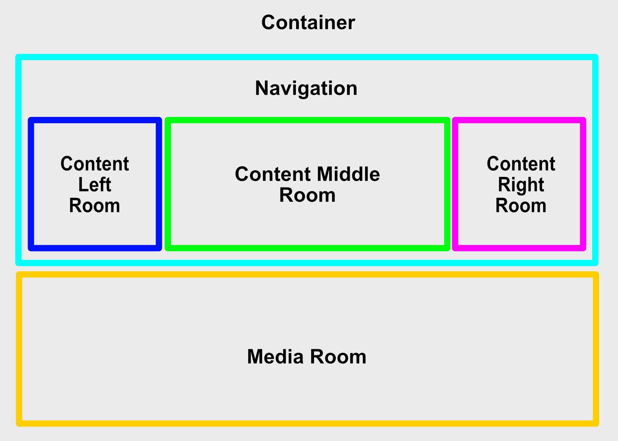
Header screen internal view compositions diagram
Header screen animated internal view composition reference names. See Animation API for details:
animated-container-viewanimated-navigation-viewanimated-content-left-room-viewanimated-content-middle-room-viewanimated-content-right-room-viewanimated-media-room-view
Header screen available actions:
show-mediahide-media
Header screen methods & callbacks:
animate- See Animation API for detailsisNavigationVisible- Check if header screen's navigation view is visible- arguments: None
- return: bool
isMediaVisible- Check if header screen's media view is visible- arguments: None
- return: bool
hideNavigation- arguments:
animation(object) - Hide animation object. See Animation API for details
- return: None
- arguments:
showNavigation- arguments:
animation(object) - Hide animation object. See Animation API for details
- return: None
- arguments:
showMedia- arguments:
animation(object) - Hide animation object. See Animation API for details
- return: None
- arguments:
hideMedia- arguments:
animation(object) - Hide animation object. See Animation API for details
- return: None
- arguments:
onHideNavigation- Calls when header screen's navigator view becomes hidden- arguments: None
- return: None
onShowNavigation- Calls when header screen's navigator view becomes visible- arguments: None
- return: None
onShowMedia- Calls when header screen's media view becomes hidden- arguments: None
- return: None
onHideMedia- Calls when header screen's media view becomes visible- arguments: None
- return: None

Body screen internal view compositions diagram
Body screen animated internal view composition reference names. See Animation API for details:
animated-content-top-room-viewanimated-content-middle-room-viewanimated-content-bottom-room-view
Body screen methods & callbacks:
animate- See Animation API for detailsonScroll- Calls when scrolling withscrollable = true- arguments:
scrollEvent(object): Scroll event object with the following schema:direction(number): 1 = scrolling up, 0 = no scrolling, -1 = scrolling down
- return: None
- arguments:
Header Screen Examples
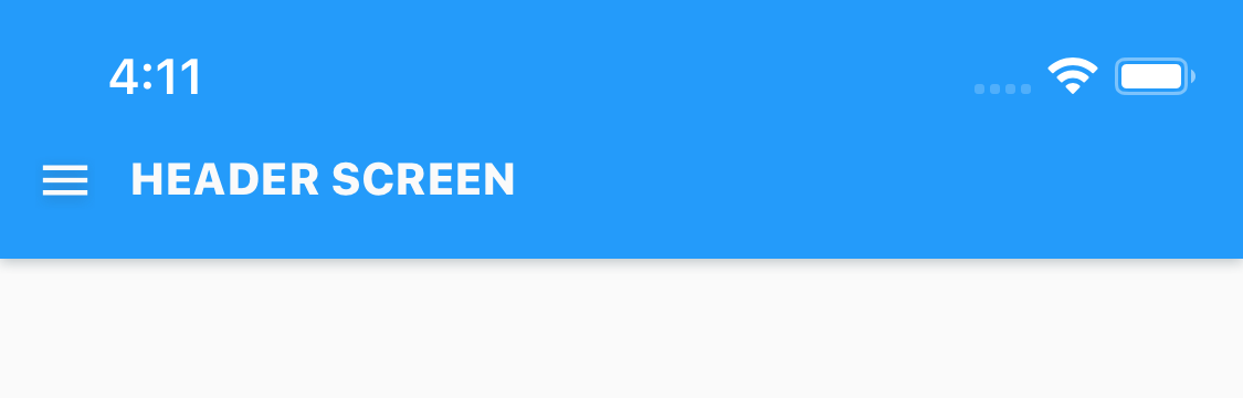


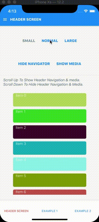
Header screen in 3 available sizes with default theme
<HeaderScreen // = `` = `` // = `` = 'HEADER SCREEN'> <FlatButton = 'content-left' = 'transparent' = 'circular' = > <IconImage = 'content-middle' = 'menu' /> </FlatButton></HeaderScreen>
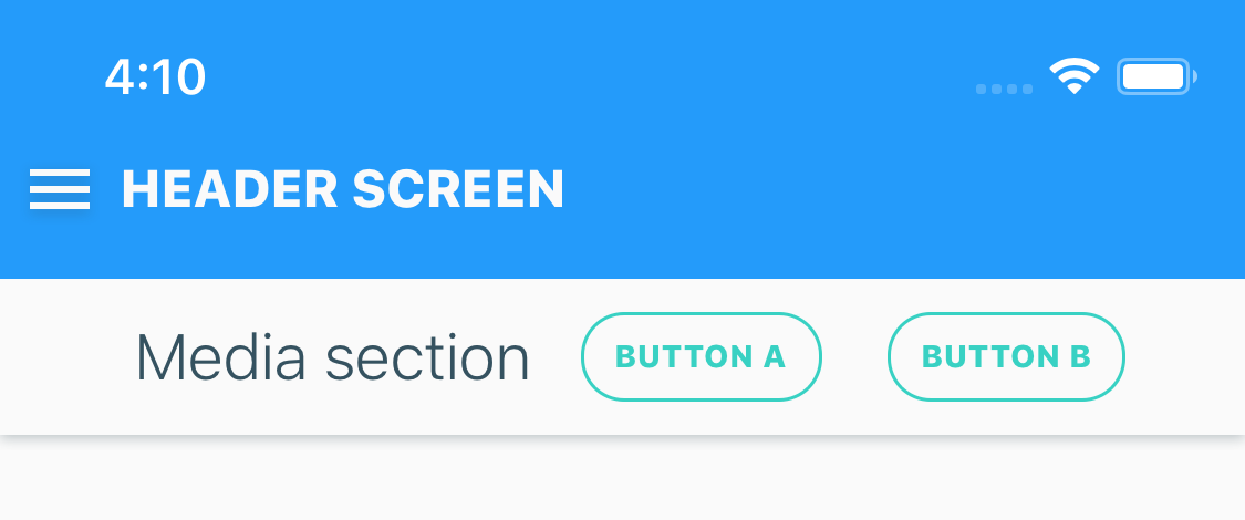
Header screen with media
<HeaderScreen = 'light' = 'HEADER SCREEN' > <FlatButton = 'content-left' = 'transparent' = 'circular' = > <IconImage = 'content-middle' = 'menu' /> </FlatButton> <ColumnLayout = 'media' = 'opaque' = 'center' = 'sharp' > <HeadlineText = 'content-left' = 'light' = 'small' = > Media section </HeadlineText> <FlatButton = 'content-right' = 'transparent-outline' = 'circular' = 'small' = 'BUTTON A' = = /> <FlatButton = 'content-right' = 'transparent-outline' = 'circular' = 'small' = 'BUTTON B' = = /> </ColumnLayout></HeaderScreen>
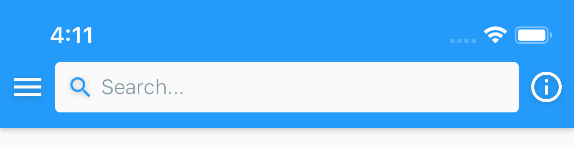
Header screen with icon button and search field
<HeaderScreen = 'light' > <FlatButton = 'content-left' = 'transparent' = 'circular' = > <IconImage = 'content-middle' = 'menu' /> </FlatButton> <SearchField = 'content-middle' = = 'small' = 'Search...' = = = > <FlatButton = 'content-left' = 'transparent' = 'circular' > <IconImage = 'content-middle' = 'search' /> </FlatButton> <FlatButton = 'content-right' = 'clear' = 'transparent' = 'circular' > <IconImage = 'content-middle' = 'cancel' /> </FlatButton> </SearchField> <FlatButton = 'content-right' = 'transparent' = 'circular' > <IconImage = 'content-middle' = 'large' = 'info' /> </FlatButton></HeaderScreen>
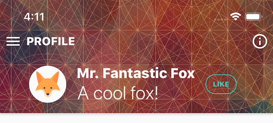
An example of user profile header screen
<HeaderScreen = 'light' = 'transparent' = = 'PROFILE' > <FlatButton = 'content-left' = 'transparent' = 'circular' = > <IconImage = 'content-middle' = 'menu' /> </FlatButton> <ColumnLayout = 'media' = 'transparent' = 'center' = 'sharp' > <AvatarImage = 'content-left' = = 'large' = = /> <RowLayout = 'content-left' = 'transparent' = > <TitleText = 'content-top' = 'light' = 'small' > Mr Fantastic Fox </TitleText> <SubtitleText = 'content-middle' > A cool fox! </SubtitleText> </RowLayout> <FlatButton = 'content-right' = 'transparent-outline' = 'circular' = 'small' = 'LIKE' = = /> </ColumnLayout> <FlatButton = 'content-right' = 'transparent' = 'circular' > <IconImage = 'content-middle' = 'large' = 'info' /> </FlatButton></HeaderScreen>Body Screen Examples
Below is an example of a basic app view that consists of a header and body screen where the render function returns an array of header and body screen component.
{ return <HeaderScreen = 'header-screen' = 'MY APP' /> <BodyScreen = 'body-screen'> <HeadlineText = 'content-top' = 'large'> Hello World! </HeadlineText> </BodyScreen> ;}Another example where you want the header screen to minimize (hide navigation view) when the body screen is scrolling down and maximize when scrolling up. This is achieved calling hideNavigation & showNavigation functions inside the onScroll callback of body screen component. onScroll provides scrolling direction that determines when to call hideNavigation or showNavigation function.
{ return <HeaderScreen = 'header-screen' = 'MY APP' = /> <BodyScreen = 'body-screen' = = > <HeadlineText = 'content-top' = 'large'> Hello World! </HeadlineText> </BodyScreen> ;}Layout Components

Hypertoxin has two layout components, RowLayout, ColumnLayout
Row Layout Properties
| Prop | Type | Default | Description |
|---|---|---|---|
| exclusions | array of string | [] | Set which properties from parent component to exclude. See Using Exclusions Property section for details |
| room | string | none |
Set row layout's room with respect to parent component which can be one of none, content-left, content-middle, content-right, content-bottom, content-top, media. See Using Room Property section for details |
| shade | string, object | themed |
Set row layout's shade theme, can be themed, light, or dark |
| overlay | string | themed |
Set row layout's overlay style which can be one of themed, opaque, translucent, translucent-outline, transparent, transparent-outline |
| corner | string, number, object | themed |
Set row layout's corner styles. As a number, border radius = corner. Set corner as an object for more control. For example corner = { topLeft: 0.1, topRight: 0.1, bottomLeft: 0.1, bottomRight: 0.1} |
| padding | string, number, object | None | Set row layout's padding styles. As a number, the padding is equally set around the layout. Set padding as an object for more control. For example padding = { top: 5, bottom: 5, left: 5, right: 5, horizontal: 5, vertical: 5} |
| margin | string, number, object | None | Set row layout's margin styles. As a number, the margin is equally set around the layout. Set margin as an object for more control. For example margin = { top: 5, bottom: 5, left: 5, right: 5, horizontal: 5, vertical: 5} |
| color | string | themed |
Set row layout's color style. Can be hex string, default color name, or themed color name |
| dropShadowed | boolean, string | themed |
Enable row layout's drop shadow |
| roomAlignment | string | none |
Component self's room property with respect to parent component's room, which can be one of none, start, center, end, or stretch |
| contentTopRoomAlignment | string | none |
Child component top room property, which can be one of none, start, center, end, or stretch |
| contentMiddleRoomAlignment | string | none |
Child component middle room property, which can be one of none, start, center, end, or stretch |
| contentBottomRoomAlignment | string | none |
Child component bottom room property, which can be one of none, start, center, end, or stretch |
| scrollable | boolean | False | Enable to allow scrolling |
| style | object | None | Row layout style is an object with the following properties: container: {...}, contentTopRoom: {...}, contentMiddleRoom: {...}, contentBottomRoom: {...}. Standard React Native style properties go inside these properties. Changes to these properties will override the global theme. See default style object |
| onScroll | function | None | Calls when scrolling with scrollable = true. Takes scroll direction object as argument |
Column Layout Properties
| Prop | Type | Default | Description |
|---|---|---|---|
| exclusions | array of string | [] | Set which properties from parent component to exclude. See Using Exclusions Property section for details |
| room | string | none |
Set column layout's room with respect to parent component which can be one of none, content-left, content-middle, content-right, content-bottom, content-top, media. See Using Room Property section for details |
| shade | string, object | themed |
Set column layout's shade theme, can be themed, light, or dark |
| overlay | string | themed |
Set column layout's overlay style which can be one of themed, opaque, translucent, translucent-outline, transparent, transparent-outline |
| corner | string, number, object | themed |
Set column layout's corner styles. As a number, border radius = corner. Set corner as an object for more control. For example corner = { topLeft: 0.1, topRight: 0.1, bottomLeft: 0.1, bottomRight: 0.1} |
| padding | string, number, object | None | Set column layout's padding styles. As a number, the padding is equally set around the layout. Set padding as an object for more control. For example padding = { top: 5, bottom: 5, left: 5, right: 5, horizontal: 5, vertical: 5} |
| margin | string, number, object | None | Set column layout's margin styles. As a number, the margin is equally set around the layout. Set margin as an object for more control. For example margin = { top: 5, bottom: 5, left: 5, right: 5, horizontal: 5, vertical: 5} |
| color | string | themed |
Set column layout's color style. Can be hex string, default color name, or themed color name |
| dropShadowed | boolean, string | themed |
Enable column layout's drop shadow |
| roomAlignment | string | none |
Component self's room property with respect to parent component's room, which can be one of none, start, center, end, or stretch |
| contentLeftRoomAlignment | string | none |
Child component left room property, which can be one of none, start, center, end, or stretch |
| contentMiddleRoomAlignment | string | none |
Child component middle room property, which can be one of none, start, center, end, or stretch |
| contentRightRoomAlignment | string | none |
Child component right room property, which can be one of none, start, center, end, or stretch |
| scrollable | boolean | False | Enable to allow scrolling |
| style | object | None | Column layout style is an object with the following properties: container: {...}, contentLeftRoom: {...}, contentMiddleRoom: {...}, contentRightRoom: {...}. Standard React Native style properties go inside these properties. Changes to these properties will override the global theme. See default style object |
| onScroll | function | None | Calls when scrolling with scrollable = true. Takes scroll direction object as argument |
Note: themed property indicates using values defined by the global theme provider.
By default, row and column layout components pass shade property down to their child components. This behavior can be override by child components with the exclusions property. See Using Exclusions Property section for details.
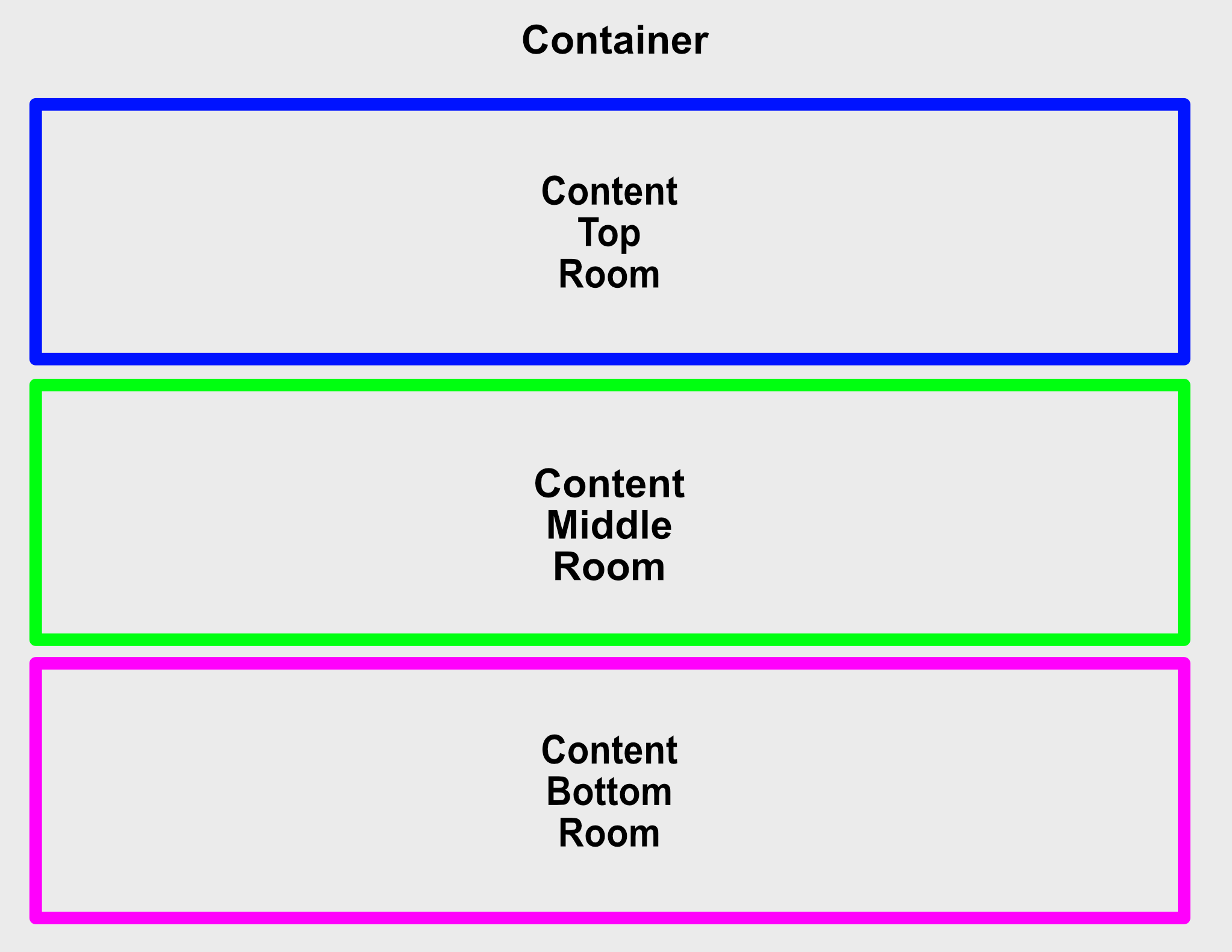
Row layout internal view compositions diagram
Row layout animated internal view composition reference names. See Animation API for details:
animated-container-viewanimated-content-top-room-viewanimated-content-middle-room-viewanimated-content-bottom-room-view
Row layout methods & callbacks:
animate- See Animation API for detailsonScroll- Calls when scrolling withscrollable = true- arguments:
scrollEvent(object): Scroll event object with the following schema:direction(number): 1 = scrolling up, 0 = no scrolling, -1 = scrolling down
- return: None
- arguments:
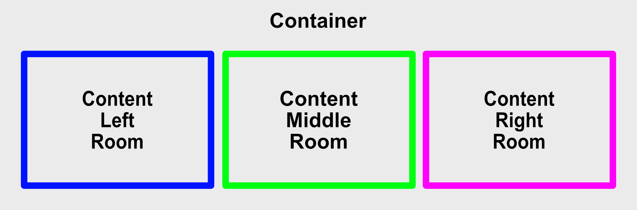
Column layout internal view compositions diagram
Column layout animated internal view composition reference names. See Animation API for details:
animated-container-viewanimated-content-left-room-viewanimated-content-middle-room-viewanimated-content-right-room-view
Column layout Methods & Callbacks:
animate- See Animation API for detailsonScroll- Calls when scrolling withscrollable = true- arguments:
scrollEvent(object): Scroll event object with the following schema:direction(number): 1 = scrolling up, 0 = no scrolling, -1 = scrolling down
- return: None
- arguments:
Image Components
Hypertoxin has three image components, AvatarImage, IconImage, and CoverImage
Avatar Image Properties
| Prop | Type | Default | Description |
|---|---|---|---|
| exclusions | array of string | [] | Set which properties from parent component to exclude. See Using Exclusions Property section for details |
| room | string | none |
Set avatar image's room with respect to parent component which can be one of none, content-left, content-middle, content-right, content-bottom, content-top, media, activity-indicator. See Using Room Property section for details |
| shade | string, object | themed |
Set avatar image's shade theme, can be themed, light, or dark |
| overlay | string | themed |
Set avatar image's overlay style which can be one of themed, opaque, translucent, translucent-outline, transparent, transparent-outline |
| size | string | themed |
Set avatar image's size which can be one of themed, small, normal, large |
| margin | string, number, object | None | Set avatar image's margin styles. As a number, the margin is equally set around avatar image container. Set margin as an object for more control. For example margin = { top: 5, bottom: 5, left: 5, right: 5, horizontal: 5, vertical: 5} |
| dropShadowed | boolean, string | themed |
Enable avatar image drop shadow |
| color | string | themed |
Set avatar's color style. Can be hex string, default color name, or themed color name |
| source | React Native image source | None | Image source |
| defaultSource | React Native image source | None | Image source |
| style | object | None | Standard React Native style properties. Changes to these properties will override the global theme. See default style object |
Icon Image Properties
| Prop | Type | Default | Description |
|---|---|---|---|
| exclusions | array of string | [] | Set which properties from parent component to exclude. See Using Exclusions Property section for details |
| room | string | none |
Set icon image's room with respect to parent component which can be one of none, content-left, content-middle, content-right, content-bottom, content-top, media, activity-indicator. See Using Room Property section for details |
| shade | string, object | themed |
Set icon image's shade theme, can be themed, light, or dark |
| size | string | themed |
Set icon image's size which can be one of themed, small, normal, large |
| margin | string, number, object | None | Set icon image's margin styles. As a number, the margin is equally set around icon image container. Set margin as an object for more control. For example margin = { top: 5, bottom: 5, left: 5, right: 5, horizontal: 5, vertical: 5} |
| dropShadowed | boolean, string | themed |
Enable icon image drop shadow |
| color | string | themed |
Set icon image's color style. Can be hex string, default color name, or themed color name |
| source | React Native image source | None | Image source or icon name in provided preset. See Theme Customization for details |
| defaultSource | React Native image source | None | Image source or icon name in provided preset. See Theme Customization for details |
| style | object | None | Standard React Native style properties. Changes to these properties will override the global theme. See default style object |
Cover Image Properties
| Prop | Type | Default | Description |
|---|---|---|---|
| exclusions | array of string | [] | Set which properties from parent component to exclude. See Using Exclusions Property section for details |
| room | string | none |
Set cover image's room with respect to parent component which can be one of none, content-left, content-middle, content-right, content-bottom, content-top, media, activity-indicator. See Using Room Property section for details |
| shade | string, object | themed |
Set cover image's shade theme, can be themed, light, or dark |
| margin | string, number, object | None | Set cover image's margin styles. As a number, the margin is equally set around icon image container. Set margin as an object for more control. For example margin = { top: 5, bottom: 5, left: 5, right: 5, horizontal: 5, vertical: 5} |
| width | number | None | Set cover image's width |
| height | number | None | Set cover image's height |
| corner | string, number, object | themed |
Set cover image's corner styles. As a number, border radius = corner. Set corner as an object for more control. For example corner = { topLeft: 0.1, topRight: 0.1, bottomLeft: 0.1, bottomRight: 0.1} |
| dropShadowed | boolean, string | themed |
Enable cover image drop shadow |
| resizeMode | string | contain |
React Native image resize property |
| source | React Native image source | None | Image source |
| defaultSource | React Native image source | None | Image source |
| style | object | None | Standard React Native style properties. Changes to these properties will override the global theme. See default style object |
Note: themed property indicates using values defined by the global theme provider.
Avatar Image Examples
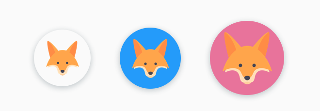
Avatar images in 3 available sizes with colors defined by global theme
<AvatarImage = = 'small' = 'default' = /><AvatarImage = = 'normal' = 'primary' = /><AvatarImage = = 'large' = 'secondary' = />
Same but with border outlines
<AvatarImage = = 'transparent-outline' = 'small' = 'default' /><AvatarImage = = 'transparent-outline' = 'normal' = 'primary' /><AvatarImage = = 'transparent-outline' = 'large' = 'secondary' />Icon Image Examples
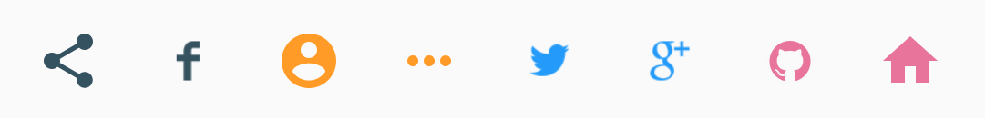
Some icon images with various colors
<IconImage = 'socialShare' = 'default' = = /><IconImage = 'facebook' = 'default' = = /><IconImage = 'twitter' = 'primary' = = /><IconImage = 'googlePlus' = 'primary' = = /><IconImage = 'github' = 'secondary' = = /><IconImage = 'home' = 'secondary' = = /><IconImage = 'profile' = 'accent' = = /><IconImage = 'ellipsis' = 'accent' = = />Divider Components
Hypertoxin has two divider components, HorizontalDivider, VeriticalDivider
Divider (Horizontal and Vertical) Properties
| Prop | Type | Default | Description |
|---|---|---|---|
| exclusions | array of string | [] | Set which properties from parent component to exclude. See Using Exclusions Property section for details |
| room | string | none |
Set divider's room with respect to parent component which can be one of none, content-left, content-middle, content-right, content-bottom, content-top, media. See Using Room Property section for details |
| shade | string, object | themed |
Set divider shade theme, can be themed, light, or dark |
| thickness | number, string | themed |
Set divider line thickness |
| edgeToEdge | boolean | false | Force divider line to the edges of screen |
| margin | string, number, object | None | Set text field's margin styles. As a number, the margin is equally set around text field container. Set margin as an object for more control. For example margin = { top: 5, bottom: 5, left: 5, right: 5, horizontal: 5, vertical: 5} |
| color | string | themed |
Set divider's color style. Can be hex string, default color name, or themed color name |
| style | object | None | Standard React Native view style properties |
Note: themed property indicates using values defined by the global theme provider.
Using Room Property
Rooms are predefined child views of the component and because Hypertoxin is a themed component library, all layouts of child views with any component are retricted. And room property helps enforce this restriction. Another reason for this is to keep JSX code short and concise while maintaining a consistent theme for all buttons globally.
For example, JSX code for a flat button with left and right icons using room property.
<FlatButton = 'opaque' = 'small' = 'SMALL' = 'primary' > <IconImage = 'content-left' = 'home' /> <IconImage = 'content-right' = 'profile' /></FlatButton>JSX code for a flat button with left and right icons without using room property.
<FlatButton = 'opaque' = 'small' = 'SMALL' = 'primary' > <View = > <IconImage = 'home' /> </View> <View = > <IconImage = 'profile' /> </View></FlatButton>Using Action Property
This property is design as a short cut for attaching a specifics callback to the component. It help keeping the code less clutter. For example, text field component has a clear method and we want to connect onPress callback of the button component to the clear method. Without using action property, you would need to use reference like below.
<TextField = = 'EMAIL' = 'user@gmail.com' = 'email-address'> <IconImage = 'content-left' = 'email' /> <FlatButton = 'content-right' = 'transparent' = 'circular' = > <IconImage = 'content-middle' = 'cancel' /> </FlatButton></TextField>But with action property, you only need to assign the action clear of the text field component to the child button component's action property. This make the JSX code a bit cleaner and shorter. See below.
<TextField = 'EMAIL' = 'user@gmail.com' = 'email-address' > <IconImage = 'content-left' = 'email' /> <FlatButton = 'content-right' = 'transparent' = 'clear' = 'circular' > <IconImage = 'content-middle' = 'cancel' /> </FlatButton></TextField>Using Exclusions Property
By default, parent component would pass down theme properties (size, color, etc) to child components. For example, if you want the icon image of the normal size button to be small, you must include exclusions = {[size]} so that the property size = 'small' of icon image component is not overwritten by the parent flat button component.
<FlatButton = 'opaque' = 'normal' = 'SMALL' = 'primary' > <IconImage = 'content-left' = = 'small' = 'home' /></FlatButton>Animation API
All components, except for HorizontalDivider, VeriticalDivider, and CoverImage, have an animate method. Internally, Hypertoxin uses react-native-animatable library for animation transition.
Method animate takes an object as argument with the following default property values.
- arguments:
animation(object) - Animation object that has the following schema:refName(string) - Animated reference name of cild component compositetransitions(array) - An array of transition object with the following schema:to(object) - Transition to objectfrom(object) - Transition from objectoption(object) - Transition option with the following schema:duration(number) - Transition duration (ms)delay(number) - Transition delay (ms)easing(string) - Transition easing. See react-native-animatable docs for all available easing types.
onTransitionBegin(function) - Callback when a transition begins. Takes transition index as argumentonTransitionEnd(function) - Callback when a transition ends. Takes transition index as argumentonAnimationBegin(function) - Callback when an animation begins (before the first transition in sequence started)onAnimationEnd(function) - Callback when an animation ends (after the last transition in sequence ended)
- return: Promise
For a more elaborate animation sequence transitions, use onTransitionBegin, onTransitionEnd, onAnimationBegin, and onAnimationEnd callbacks to chain multiple animations together. The method also returns a promise that resolve between the transitions and animations which can be use if callback is not preferred.
Now to see how use the animate method, let's do a simple send mail button animation shown here below.
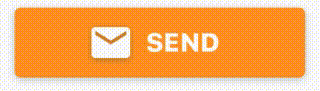
The animation sequences of this button are onPress -> fade out SEND label and email icon -> fade in activity indicator and button in busy mode -> fade out activity indicator -> fade in SENT label with different color and a check icon to the left.
First let's create a raised button inside some other parent component. The parent component with track the raised button ref with raisedButtonRef, and also have two states, mailSent and sendingMail.
Property color switches value that depends on the state mailSent. Property label
<RaisedButton ref = { componentraisedButtonRef = componentRef; } busy = sendingMail rippled = false room = 'content-right' color = mailSent ? `secondary` : `accent` label = mailSent ? `SENT` : sendingMail ? `` : `SEND` margin = 10 > <ActivityIndicator room = 'activity-indicator' size = 'small' color = Themecolorpalettepink /> <IconImage room = 'content-left' source = !mailSent ? `email` : `check` /></RaisedButton>Next, defines the onPress button that triggers the animation sequences.
onPress = { if !mailSent // Fade out the left email icon componentraisedButtonRef; // Fade out the center label componentraisedButtonRef; }Below are a few more examples of animations and code.
An example of animation sequences of payment submit button. Source
An example of animation sequences of an expanding FAB menu. Source
An example of animation sequences for popup menu. Source
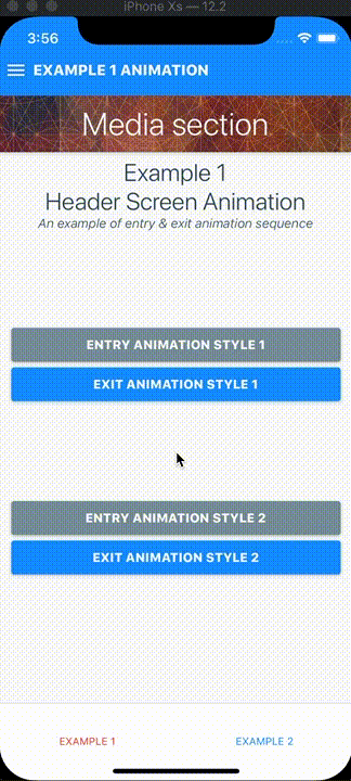
An example of animation sequences for header screen entry & exit. Source
Theme Customization
Hypertoxin global theme is highly customizable and one of the way to make your own customized theme is to modify the default theme.
Default global theme object schema:
name(string) - Theme nameicon(object) - Put your custom icon preset sources herecolor(object) - Default color theme objectfont(object) - Default font theme objectmisc(object) - Default misc theme objectfield(object) - Default field theme objectimage(object) - Default image theme objectbutton(object) - Default button theme objecttext(object) - Default text theme objectlayout(object) - Default layout theme object,screen(object) - Default screen theme object
For example, import the Theme object from hyperflow as DefaultTheme.
;Next modify the DefaultTheme object using standard object destructuring method. For example, adding a customized global button corner theme called semi-sharp
const MyTheme = ...DefaultTheme button: ...DefaultThemebutton flat: ...DefaultThemebuttonflat corner: `semi-round` raised: ...DefaultThemebuttonraised corner: `semi-round` corner: ...DefaultThemebuttoncorner flat: ...DefaultThemebuttoncornerflat semiRound: 01 raised: ...DefaultThemebuttoncornerraised semiRound: 01 ;Or using lodash library merge function.
const MyTheme = _;And to apply custom theme, simply set the top level ThemeContext provider value of your app.
<ThemeContextProvider value = MyTheme > <App/></ThemeContextProvider>To setup custom icon preset, simply import your icon images to icon property of your custom theme object like so below.
MyThemeicon = home: profile: And to use your custom icon, just set the source property of icon image component to the name of the icon. This behavior is only applied to icon image component.
<IconImage source = 'home' /><IconImage source = 'profile' />Hypertoxin demo has three custom theme examples that you can take a look for references. Bubble Theme, Coffee Theme, and Wire Theme
Todo:
- Use React Hooks
- Add Switcher (Button group) component
- Add expand/collapse actions to row and column layout components
- Add proper testings
- More mockup app examples
Change Log:
- Link to change log
License
Hyperflow is MIT licensed.