hyper-material-box 

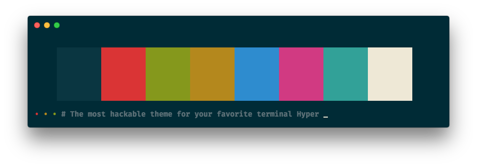
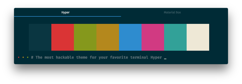
The most hackable theme for your favorite terminal Hyper
🏁 Let's jump right in
All you need is two simple steps !!
📥 Installation
Just add the following script to your .hyper.js:
moduleexports =plugins: 'hyper-material-box'
Restart your Hyper.app.
Done 🎉
🔧 Config
You can add the following scripts to your .hyper.js, if you like what you see.
🔧 Color Scheme
The default color scheme is
solarized-dark.
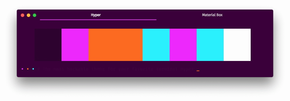
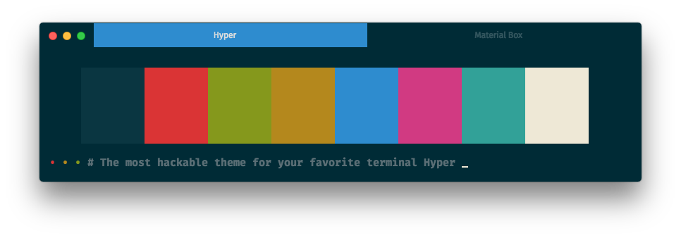
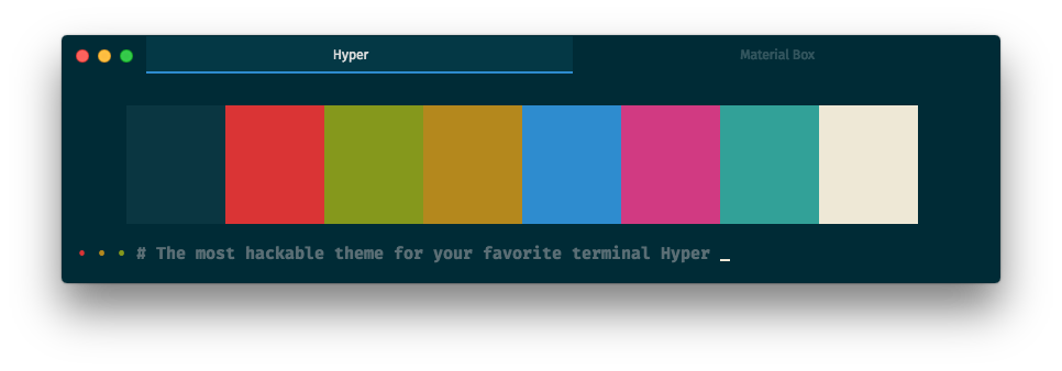
Currently, we provide our user over 30 beautiful color schemes (click the name to see the screenshot):
- 80rave
- apex
- base16-green-screen
- base16-ocean-dark
- base16-ocean-light
- dracula
- gruvbox-dark-hard
- gruvbox-dark-medium
- gruvbox-dark-soft
- gruvbox-light-hard
- gruvbox-light-medium
- gruvbox-light-soft
- material
- material-darker
- material-lighter
- material-palenight
- monokai
- nord
- one-dark
- one-light
- predawn
- seti
- snazzy
- solarized-dark
- solarized-light
- tomorrow
- tomorrow-night
- tomorrow-night-blue
- tomorrow-night-bright
- tomorrow-night-eighties
For example, if you like the material color scheme, you can add the following script:
moduleexports = config: materialBox: scheme: 'material' 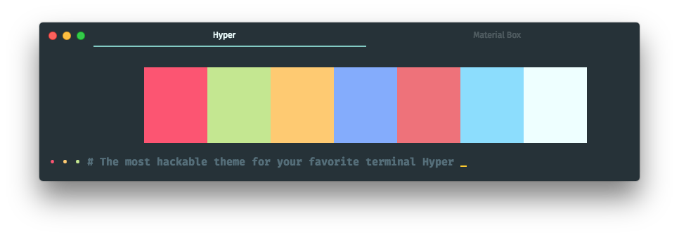
🔧 User
You can override the default color scheme with the
usersection.
If your favorite color scheme isn't in the list, you can create a new scheme by yourself,
for example you can add the following script instead adding scheme: 'material':
moduleexports =config:materialBox:user:colors:black: '#263238'red: '#FF5370'green: '#C3E88D'yellow: '#FFCB6B'blue: '#82AAFF'magenta: '#F07178'cyan: '#89DDFF'white: '#EEFFFF'lightBlack: '#546E7A'lightRed: '#FF5370'lightGreen: '#C3E88D'lightYellow: '#FFCB6B'lightBlue: '#82AAFF'lightMagenta: '#F07178'lightCyan: '#89DDFF'lightWhite: '#EEFFFF'// DefaultbackgroundColor: '#263238'foregroundColor: '#CCCCCC'cursorColor: '#EEFFFF'borderColor: 'transparent'// Accent coloraccentColor: '#80CBC4'// Other (optional, it will be override by foregroundColor)tabTitleColor: 'rgba(255, 255, 255, 0.2)'selectedTabTitleColor: '#EEFFFF'// css (optional)css: ''termCSS: ''
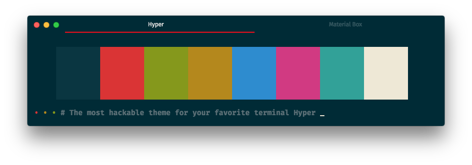
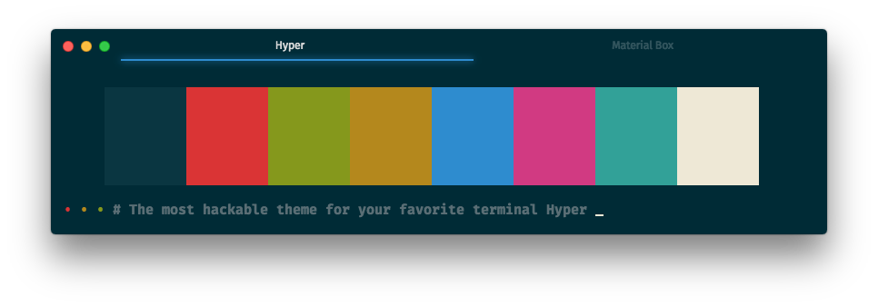
🔧 Selected Tab Flavor
The default selected tab flavor is
underline.
You can change the selected tab flavor by set the selectedTabFlavor to preline, overline, filled or none:
moduleexports =config:materialBox:selectedTabFlavor: 'preline'

moduleexports =config:materialBox:selectedTabFlavor: 'overline'

moduleexports =config:materialBox:selectedTabFlavor: 'filled'
moduleexports =config:materialBox:selectedTabFlavor: 'none'

🔧 Highlight Selected Tab
highlight selected tab is disable by default
You can highlight the selected tab by set highlightSelectedTab to true:
moduleexports =config:materialBox:highlightSelectedTab: true
🔧 Display Border
The
borderis hide by default.
You can enable the border by set the displayBorder to true:
moduleexports =config:materialBox:displayBorder: true

🔧 Accent Color
You can change the accent color by set the user: { accentColor } to another color:
moduleexports =config:materialBox:user:accentColor: 'red'
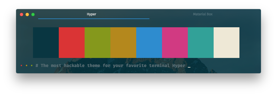
🔧 Light Effect
The
overlineselected tab flavors doesn't support light effect.
You can enable the light effect by set the lightEffect to true:
moduleexports =config:materialBox:lightEffect: true
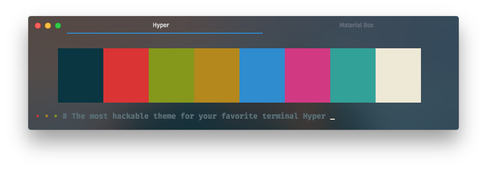
🔧 Background Opacity
The default background opacity is
1.0.
You can change the background opacity by set the backgroundOpacity to 0.1 ~ 0.9:
moduleexports =config:materialBox:backgroundOpacity: 05
🔧 Background Vibrancy
Background vibrancy only available when background opacity value is between 0.1 ~ 0.9
You can enable the background vibrancy by set the backgroundVibrancy to true:
moduleexports =config:materialBox:backgroundVibrancy: true
🔧 Auto Hide Title
auto hide title is disable by default
You can set the autoHideTitle to true, it will hide the title when the window only has one tab:
moduleexports =config:materialBox:autoHideTitle: true
🔧 Hide Traffic-Lights
hide traffic light is disable by default
If you want to hide the traffic-lights, you can set the hideTrafficLights to true:
moduleexports =config:materialBox:hideTrafficLights: true
🔧 Other
🔧 Left Close Button
left close button is disable by default
If you like the left close button, you can set the closeOnTheLeft to true:
moduleexports = config: materialBox: closeOnTheLeft: true ❤️ Contributing to hyper-material-box
You can contribute your own color scheme to this project, see the CONTRIBUTING.md for more details.
⚡️ Credit
⚡️ The 80rave color scheme contributed by @PetrBarborka
⚡️ The apex color scheme inspired by apex/apex-syntax
⚡️ The auto hide title inspired by sindresorhus/hyper-hide-title
⚡️ The base16 color scheme family inspired by Base16
⚡️ The dracula color scheme inspired by Dracula — A dark theme for Atom, Alfred, Brackets, Emacs, iTerm ...
⚡️ The gruvbox color scheme family inspired by Briles/gruvbox-atom
⚡️ The hide traffic-lights inspired by albinekb/hyperclean
⚡️ The left close button inspired by jhen0409/hyperterm-close-on-left
⚡️ The light effect inspired by simeydotme/hyperterm-gooey
⚡️ The material color scheme family inspired by equinusocio/material-theme
⚡️ The material UI inspired by equinusocio/hyper-material-theme
⚡️ The matrix color scheme inspired by giuseppeg/hyperterm-green
⚡️ The monokai color scheme inspired by the most popular color scheme for Sublime Text
⚡️ The nord color scheme inspired by arcticicestudio/nord-hyper
⚡️ The one-dark color scheme inspired by atom/one-dark-syntax
⚡️ The one-light color scheme inspired by atom/one-light-syntax
⚡️ The overline selected tab flavor inspired by pauldariye/hyper-midnight
⚡️ The predawn color scheme inspired by jamiewilson/predawn-hyperterm
⚡️ The preline selected tab flavor inspired by Kikobeats/hyper-flat
⚡️ The seti color scheme inspired by jesseweed/seti-syntax
⚡️ The snazzy color scheme contributed by @stoe
⚡️ The solarized color scheme faimly inspired by Solarized - Ethan Schoonover
⚡️ The tomorrow color scheme family inspired by chriskempson/tomorrow-theme
❤️ Thank you guys, you guys are all amazing !!! ❤️
📄 License
This project is licensed under the MIT License, please see the 📄LICENSE.md for more details 👍