Table of Contents
HorizGauge

Draw a horizontal svg gauge.
Play with the settings of the horiz-gauge by visiting the horiz-gauge playground.
Install in your Node project with
npm i horiz-gauge
and use it inside your code via
const gauge = require('horiz-gauge');
or, alternatively
import gauge from 'horize-gauge';
Create the new gauge objects via
let diagram = gauge(settings);
Parameters
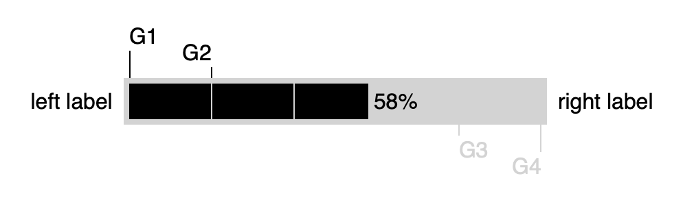
settingsObject The configuration object for the gauge. All data for the gauge is provided with this object.settings.svgObject The DOM tree element, wich must be an svg tag. The gauge will be attached to this DOM tree element. Example:settings.svg = document.getElementById('gauge');'gauge'is the id of a svg tag.settings.idString? The id of a domtree svg element, to which the gauge will be bound to. The id will only be used in case settings.svg is not provided.settings.fractionNumber? Progress indication for the gauge. A value of 0 is indicating no progress, 1.0 is indicating completion. Default is0.0settings.fractionLabelString? A label to show for the progress fraction. Default is''.settings.fractionColorString? The color for the fraction indication. Default is'#222'settings.fractionExceedColorString? The color to use in case fraction > 1.0.settings.emptyColorString? Color for the non-progress area of the gauge. Default isborderColorsettings.emptyPatternBoolean? When true, the empty area will be a pattern made offractionColorandemptyColorsettings.progressWidthNumber? Width in pixels for the progress gauge without borders and margins. Default is200.settings.progressHeightNumber? Height in pixels for the progress gauge without borders and margins. Default isfontSize + 2.settings.borderColorString? Color of the border of the progress gauge. Default is'#ccc'settings.borderWidthNumber? Width in pixels for the border of the progress gauge. Default is0settings.fontSizeNumber? Size in pixels for all labels. Default is16settings.fontFamilyString? The font to use for all labels. Default issans-serif.settings.margin{top: Number, right: Number, bottom: Number, left: Number}? The margin for the gauge. Markers and labels are drawn inside of the margin. Default values are:settings.margin = { top: 0, right: 0, bottom: 0, left: 0 }settings.leftLabel{label: String, color: String, textAnchor: String}? A label to put to the left of the progress gauge. Must fit into the left margin. Allowed values fortextAnchorare'start', 'middle', 'end'. Default values are:settings.leftLabel = { label: '', color: '#222', textAnchor: 'start' }settings.rightLabel{label: String, color: String, textAnchor: String}? A label to put to the right of the progress gauge. Must fit into the right margin. Allowed values fortextAnchorare'start', 'middle', 'end'. Default values are:settings.rightLabel = { label: '', color: '#222', textAnchor: 'start' }settings.markersArray<{fraction: Number, label: String, color: String, position: String, distance: Number, textAnchor: String}>? Highlight fractions outside of the gauge. Each marker is an object with a fraction for the marker and some optional settings. A marker must fit into the margins of the gauge. Allowed values forpositionare'top', 'bottom'Allowed values fortextAnchorare'start', 'middle', 'end'Example:settings.markers = [ { fraction: 0.0, label: 'G1', distance: 20 }, { fraction: 0.2, label: 'G2' }, { fraction: 0.8, label: 'G3', color: 'lightgray', position: 'bottom', textAnchor: 'start'}];settings.dividersArray<{fraction: Number, color: String}>? Highlight fractions inside of the gauge. Each divider is an object with a fraction and an optional color. The default forcolorisemptyColor. Example:settings.markers = [ { fraction: 0.1 }, { fraction: 0.2, color: 'green' }, { fraction: 0.8, color: 'red'}];
draw
Draw the gauge.
Parameters
settingsObject? The configuration object for the gauge. Optional. If provided, will overwrite the settings object already given to the constructor.
remove
Clear the gauge.
imageSource
Draw the gauge and return the result as a string which can be assigned to the SRC attribute of an HTML IMG tag.
Returns string
svgSource
Draw the gauge and return the result as a SVG tag string.
Returns string