Create beautiful React-Native forms within minutes with validator, progress-bar, custom error handling by passing just JSON
If you find this repo useful, please give it a star on github
| Status | |
|---|---|
| Build |  |
| Dependencies |
  
|
| Package |
 
|
| License |  |
⭐ Features
- 10+ fully customisable component ready to be used by passing a json (including support for loading data asynchronously)
- Can easily manage Safe Area for devices with notch
- Ingerated with optional progress bar to show user their progress while filling up a form
- Allows throwing custom error and data validation
- Includes loading component
- Instant support for feature and issue using git issue tracker
Screenshots


Installation
RN-Formly use following as peerDependency
- react-native-device-info
- react-native-image-crop-picker
npm i react-native-image-crop-picker react-native-device-info rn-formly --save
For iOS, If you are using React Native => 0.60 then simple do
pod install
else follow this guide
Setting up image crop picker
IOS setup
Image Crop picker requires you to have relevant permission to access camera and storage for both iOS and Android
- Go to info.plist and add this
<plist version="1.0">
  <dict>
    ...
    <key>NSPhotoLibraryUsageDescription</key>
    <string>$(PRODUCT_NAME) would like access to your photo gallery</string>
    <key>NSCameraUsageDescription</key>
    <string>$(PRODUCT_NAME) would like to use your camera</string>
    <key>NSPhotoLibraryAddUsageDescription</key>
    <string>$(PRODUCT_NAME) would like to save photos to your photo gallery</string>
    <key>NSMicrophoneUsageDescription</key>
    <string>$(PRODUCT_NAME) would like to use your microphone (for videos)</string>
  </dict>
</plist>
You refer to following documentation for more information (and probably for integration in complex project)
or look into this commit
Android Setup
Add following lines in your android/app/src/main/AndroidManifest.xml
 <uses-permission android:name="android.permission.INTERNET" />
 <uses-permission android:name="android.permission.CAMERA" />
 <uses-permission android:name="android.permission.WRITE_EXTERNAL_STORAGE"/>
look at this commit
If this does not work, refer to following instructions.
Usage
To get started/or a try it out, you can clone or check out the following repo
Minimilistic Setup Example
import SignupFormComponent from 'rn-formly';


const inputFields = [
  {
    key: 'name',
    type: 'text',
    label: `Your Full Name`,
    required: true,
    helper: 'Using your real name would make it more likely for you to get a match',
    templateOptions: {
      componentProps: {
        placeholder: 'Frank Murphy'
      }
    }
  },
  {
    key: 'otp',
    type: 'otp',
    label: 'Enter OTP',
    helper: '(optional) but try to enter incorrect date',
    templateOptions: {
      noOfTextInput: 5,
    }
  }]

  const App: () => React$Node = () => {

  const justLogDataFromForms = (index, key, currentValue,  payload) => {
     console.log('Logging from Parent log')
    console.log(index, key, currentValue, payload)
  }

  return (
    <>
      <SignupFormComponent
      inputFields={inputFields}
      globalButtonText={'Next'}
      onButtonClick={justLogDataFromForms}
      defaultColor={'green'}
      progressBarProps={{
        blink: false
      }}
      />
    </>
  );
};
Example usage of all the component can be seen using this file
Required Props
| SNO | Prop | Type | Default | Required | description |
|---|---|---|---|---|---|
| 1. | inputFields | Array | Nope | Yes | Click here |
| 2. | onButtonClick | Async function | Nope | Yes | Passed function receives index of the element in array, key associated with it and the complete payload, This is triggered after user have clicked on the Next button, and before the iteration happens, you can throw errors here to prevent from incrementing to the text state |
This is how error handling is done behind the scene: if (error.message) setErrorData({status: true, message: error.message})
Optional Props
Important Props are highlighted.
General Optional Props
| SNO | Prop | Type | Default | Required | description |
|---|---|---|---|---|---|
| 1. | textStyle | stylesheet object | none | No | Heading text style (style for your label key in inputFields props) |
| 2. | progressBar | object | blink: false | No | click here to know more about ProgressBar Component |
| 3. | helperTextStyle | stylesheet object | none | No | Helper text style (style for your helper key in inputFields ) |
| 4. | backgroundViewColor | string | 'white' | No | background for the view of your form |
| 5. | defaultColor | string | 'black' | no | Formats button color, text color and sub component color accordingly (can be override by passing styles for individual component) |
| 6. | onFinish | function | none | No | Function which is triggered after user have itterated over all the elements in the passed inputFields |
| 7. | backIconStyle | stylesheet object | none | No | Styling for the back button <
|
Button Optional props
Validation and Error throwing are done in inputFields array. See inputFields section to know more
| SNO | Prop | Type | Default | Required | description |
|---|---|---|---|---|---|
| 1. | buttonSelectedStyle | stylesheet object | none | No | Styling of the button when a user is allowed to move to the next field |
| 2. | buttonNotSelectedStyle | stylesheet object | none | No | styling of the button when a user is not allowed to move to the next field |
| 3. | buttonSelectedTextStyle | stylesheet object | none | No | styling of the text inside the button when a user is allowed to move to the next field |
| 4. | buttonNotSelectedTextStyle | stylesheet object | none | no | styling of the text inside the button when a user is not allowed to move to the next field |
Error Props
Validation and Error throwing is done in the inputFields array. See inputFeilds section to know more.
| SNO | Prop | Type | Default | Required | description |
|---|---|---|---|---|---|
| 1. | defaultErrorMessage | string | 'Sorry Something went wrong' | No | Error message for user when error occurs but the error does not contain a message for failure |
| 2. | errorStyle | stylesheet object | none | No | Text Styling for error message |
Note
- for
stylesheet objecttype props. you need to pass props like this
const styles = StyleSheet.create({
  someStyle: {
    ....
    ....
  },
})
and then pass styles.someStyle in props
- For
stylesheet object,DefaultNonedoes not mean that element won't have any styles; the props provided by the user would override the default styling.
inputFields Props
inputFields Props supports most of the popular components you would need in a form. If we are missing any component, create an issue, and we should be able to add within 2-4 days.
Currently Supported Component
- Text
- dataTyper
- checkboxes
- picker
- image,
- images
- AutoComplete
- otp
Structuring your Array Object
  {
    key: 'name',
    type: 'text',
    label: 'Your Full Name',
    helper: 'Using your real name would make it more likely for you to get a match',
    templateOptions: {
      componentProps: {
        placeholder: 'Frank Murphy'
      },
      templateStyle: styles.textStyle // refer to the style component
    }
  }
Global Properties for each object
| S.NO | key | type | description | Required |
|---|---|---|---|---|
| 1. | key | string | Unique key to identify the object | Yes |
| 2. | type | string | type of component you want to use (should be one of the above) | Yes |
| 3. | label | string | Heading for the field | Yes |
| 4. | helper | string | Helper for the field | No |
| 5. | templateOptions | object | props for specific components | No |
| 6. | Validator | function | sometimes you want to do validation in the real-time and not after the next button is clicked, in this case, pass the validator function. A validator function would receive the following data in its argument index, key, currentData, payload
|
No |
| 7. | required | Boolean | if required: true the field cannot be empty i.e. button to iterate to the next component will be disabled |
no |
Text Component
{
    key: 'name',
    type: 'text',
    label: 'Your Full Name',
    helper: 'Using your real name would make it more likely for you to get a match',
    templateOptions: {
      componentProps: {
        placeholder: 'Frank Murphy'
      },
      templateStyle: styles.textStyle // refer to the style component
    }
  }
Component level Props are mostly passed in templateOptions
TemplateOptions keys with value
| S.NO | key | type | description | Required |
|---|---|---|---|---|
| 1. | componentProps | object | Can pass all the props for TextInput
|
no |
| 2. | templateStyle | style object | stying for text input | no |
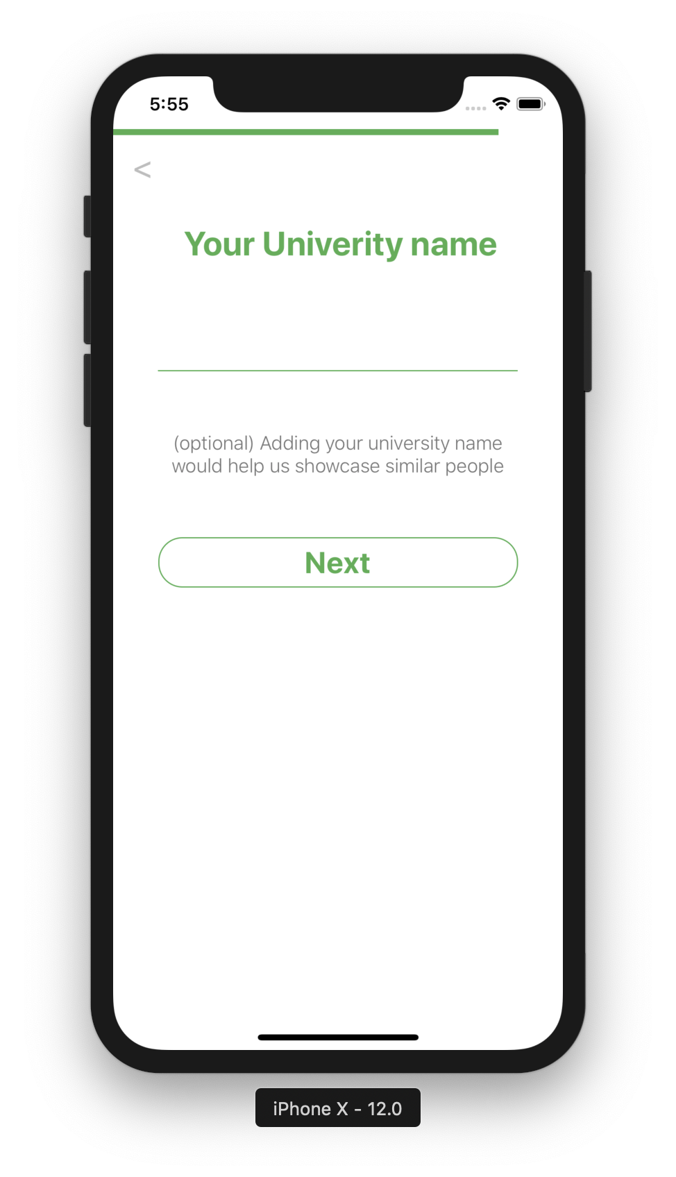
dateTyper
  {
    key: 'dob',
    type: 'dateTyper', //change this to Dob component
    label: 'Your Date of birth',
    helper: 'Your Birthdate will help us in connecting you with people of similar age',
    required: true
  },
TemplateOptions key/value
| S.NO | key | type | description | Required | Default |
|---|---|---|---|---|---|
| 1. | dateFormat | string | should be either DDMMYYYY, or MMDDYYYY or YYYYMMDD
|
No |
checkboxes
  {
    key: "gender",
    type: 'checkboxes',
    label: 'Select your Gender',
    helper: '(Optional), Please select a gender',
    templateOptions: {
      options: [
  {
  key: 'male',
  label: 'Male',
  value: false
  },
  {
    key: 'female',
    label: 'Female',
    value: false
  },
  {
    key: 'others',
    label: 'Others',
    value: false
  }
]
    }
  },
TemplateOptions key/value
| S.NO | key | type | description | Required | Default |
|---|---|---|---|---|---|
| 1. | options | Array | should contain key, label and value
|
Yes | None |
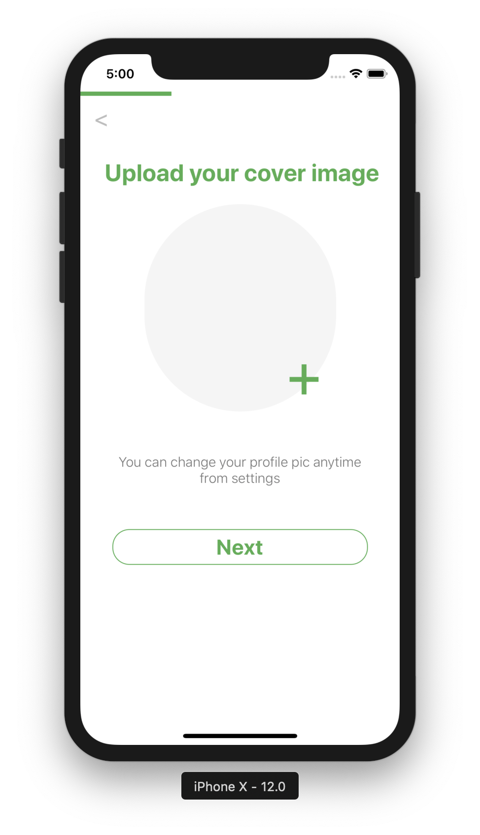
image (single image)
  {
    key: 'image',
    type:'image',
    label: "Upload your cover image",
    helper: 'You can change your profile pic anytime from settings',
    templateOptions: {
     cropHeight: 200,
     cropWidth: 300
    }
  },
TemplateOptions key/value
| S.NO | key | type | description | Required | Default |
|---|---|---|---|---|---|
| 1. | cropWidth | number | width of the image user is allowed to crop/select | no | none |
| 2. | cropHeight | number | heoght of the image user is allowed to crop/select | no | none |
images
  {
    key: 'image',
    type:'images',
    label: "Upload your cover image",
    helper: 'You can change your profile pic anytime from settings',
    templateOptions: {
     cropHeight: 200,
     cropWidth: 300
    }
  },
TemplateOptions key/value
| S.NO | key | type | description | Required | Default |
|---|---|---|---|---|---|
| 1. | cropWidth | number | width of the images user is allowed to crop/select | no | none |
| 2. | cropHeight | number | heoght of the images user is allowed to crop/select | no | none |
OTP
   {
    key: 'otp',
    type: 'otp',
    label: 'Enter OTP',
    helper: '(optional) but try to enter incorrect date',
    templateOptions: {
      noOfTextInput: 5,
    }
  },
TemplateOptions key/value
| S.NO | key | type | description | Required | Default |
|---|---|---|---|---|---|
| 1. | noOfTextInput | number | number of character in your otp | yes | none |
AutoComplete
{
    key: 'autoComplete',
    type: 'autoComplete',
    label: 'Type Programming language',
    helper: "This is an example of Auto Complete Component, Don't try to make sense out of the returned data",
    templateOptions: {
      asyncFunction: async function (text) {
        return async data
      }
    }
  }
Where data should be object Array containg id, value, title
 [{
    {
      id: 1,
      title: "Javascript",
      value: "javascript"
    },
    {
      id: 2,
      title: "Java",
      value: "java"
  },
}]
Click here to see the example da
TemplateOptions key/value
| S.NO | key | type | description | Required | Default |
|---|---|---|---|---|---|
| 1. | componentProps | object | Can pass all the props for TextInput
|
no | |
| 2. | asyncFunction | async function | this function will recive the input text and should return suggestions accordingly (via making some api call etc) | yes | none |
| 3. | loaderRequired | Boolean | shows loader until user recieves the data from async function | no | false |
| 4. | listViewStyle | styling object | styling for the list list view | no | nope |
| 5. | listTextStyle | styling object | styling for the text in the list view | no | nope |
Picker
  {
    key: "gender",
    type: 'picker',
    label: 'Select your Gender',
    helper: '(Optional), Please select a gender',
    templateOptions: {
      options: [
  {
  key: 'male',
  label: 'Male',
  value: false
  },
  {
    key: 'female',
    label: 'Female',
    value: false
  },
  {
    key: 'others',
    label: 'Others',
    value: false
  }
]
    }
  },
TemplateOptions key/value
| S.NO | key | type | description | Required | Default |
|---|---|---|---|---|---|
| 1. | options | Array | should contain key, label and value
|
Yes | None |