Modular, easy to upgrade and high performance CSS framework
- You need Node > v12
- Our tool basecore-cli
All the components live in node_modules/getbasecore/src/components/
Every component follows this logic, lets use the Button Component as an example:
JS is stored in node_modules/getbasecore/src/components/atoms/BtnSimple/BtnSimple.js SCSS is stored in node_modules/getbasecore/src/components/atoms/BtnSimple/core_btn-simple.scss
The JS Component imports the SCSS core and the SCSS core imports the custom SCSS.
BtnSimple.js import "./core_btn-simple.scss";
core_btn-simple.scss
@import "/src/global.scss"; @import "/src/components/atoms/BtnSimple/btn-simple.scss";
By doing this the components are easy to update using npm without breaking anything in your current project.
SCSS is stored in /src/components/atoms/BtnSimple/btn-simple.scss
## Customizing components
Basecore works with the premise that you never need to change anything but CSS variables, this are located in your src/component/ folder.
If you need to alter a component to change its behavior then it's best to just create a new component, every component has a onClick, onChange prop so you can pass any function to them and keep the component as just a shell that receives props.
Some default components may have state but its only used to make it appear active / inactive and things like that.
## Importing components
You can import the built in components just by importing them like this:
import {
  BtnSimple,
  BtnSwitch,
  Icon,
  LinkSimple,
  List,
  FormInputRangeSimple,
} from "getbasecore/Atoms";


import {
  Accordion,
  Alert,
} from "getbasecore/Molecules";
- A project created using Create React App ( Vue support coming soon)
- For React: React Router, node-sass ( Our CLI will install them for you )
First, install Parcel:
npm i -g parcel-bundler
We recommend this two plugins for parcel posthtml-modules and posthtml-expressions
npm i --save posthtml-modules

npm i --save posthtml-expressions
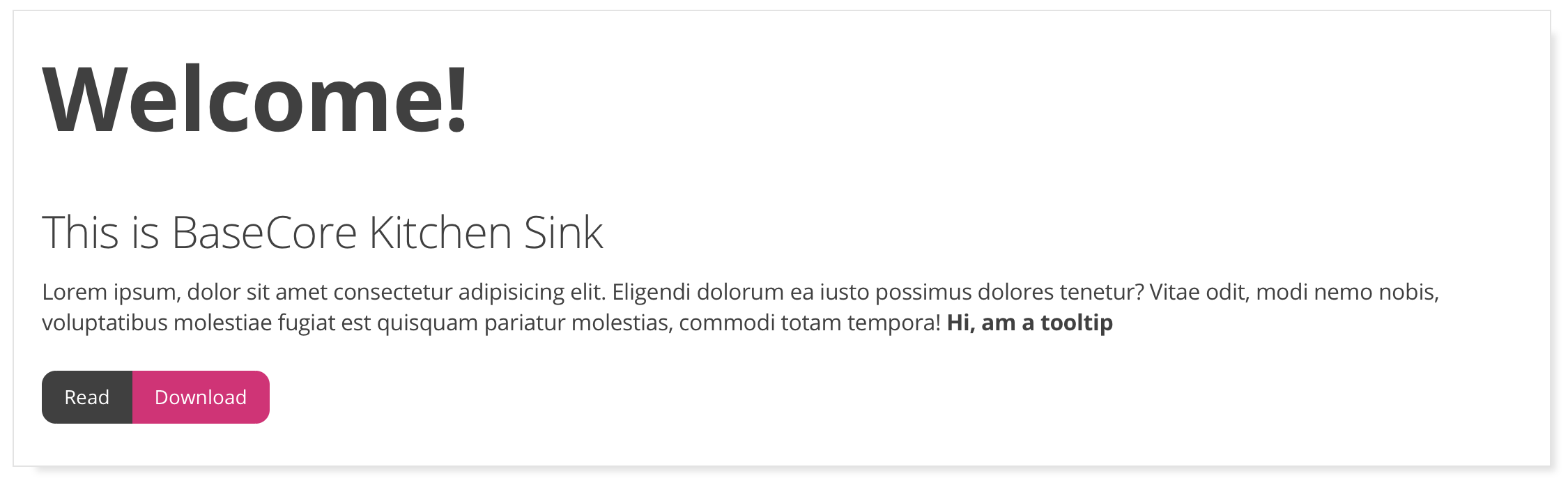
You'll need them to open the Kitchen Sink were you can preview all baseCore components, you can use them to build static html.
For Parcel to work nice with baseCore you need to create this two files in your project
.sassrc
{
    "includePaths": ["node_modules"]
}
.posthtmlrc
{
  "plugins": {
    "posthtml-modules": {
      "root": "./src"
    }
  }
}
Start Parcel and have fun :)
parcel ./src/pages/index.html --open
Just follow basecore-cli instructions
baseCore is a framework created using the knowledge of both UI designers and Frontend Developers, targeting reusability, accesibility and a low Kb weight size and a extremely easy way to customize components.
Our mission is to create an easy to use framework that allows everybody in the Team to create a project ASAP, for this we've inspired our framework in the Atomic Design methodology
tldr; Atomic Design separates components in:
| Type | Description |
|---|---|
| Atoms | A simple element like a Button |
| Molecules | More than one Atom together |
| Cells | This doesn't exist in the regular Atomic Design. We'll talk about it later |
| Organisms | More than one Molecule / Cell together |
| Templates | A whole page with Organisms, Molecules, etc but with dummy content, like a prototype. |
| Pages | A final Template but with final content |
A single button:

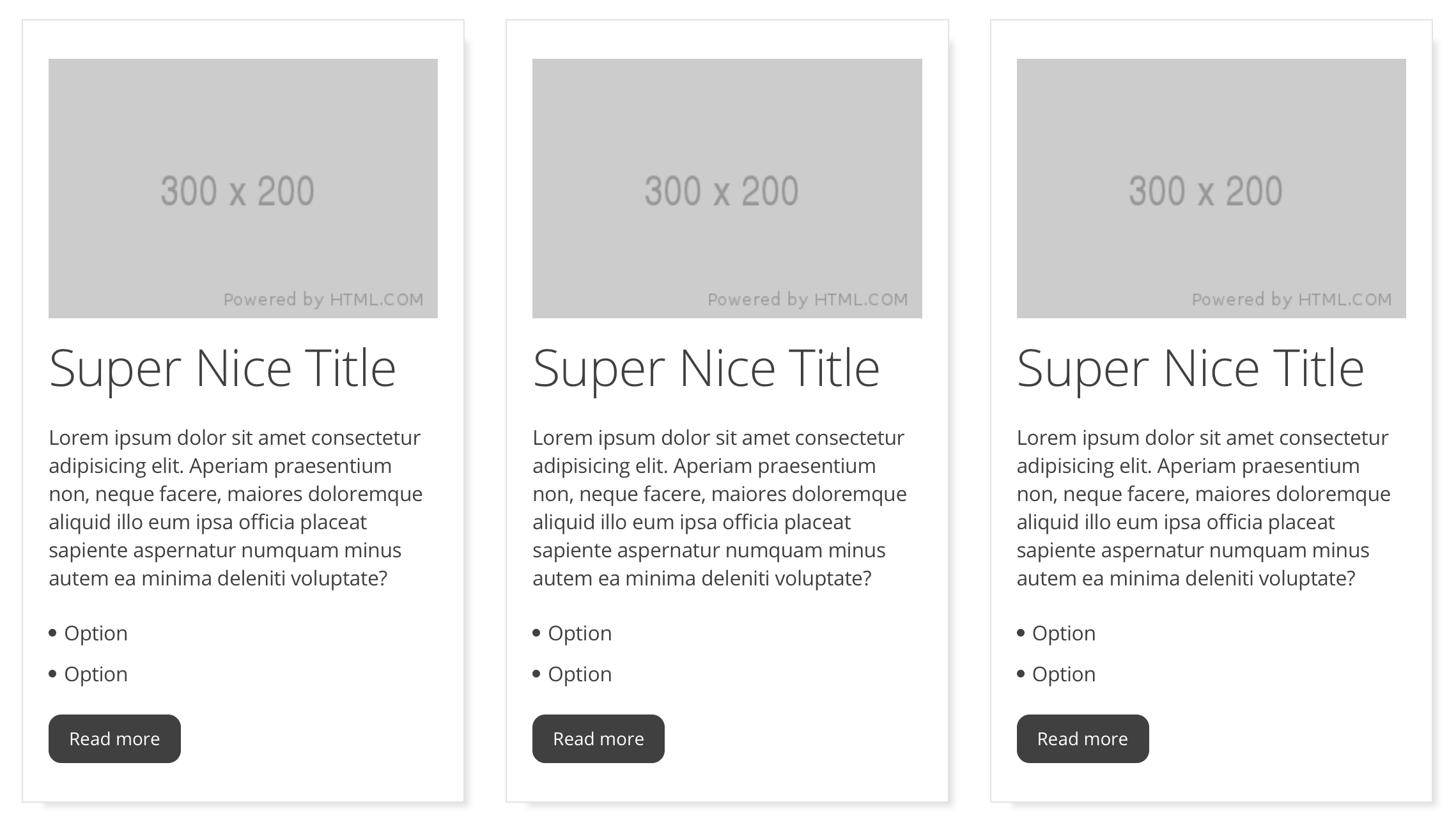
Two Atoms (buttons) together:

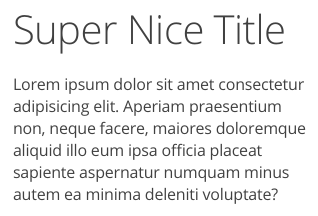
Another two Atoms together: a title and a paragraph tag:
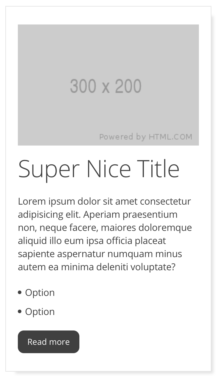
Three atoms Image + Title + Paragraph + List ( Molecule ) + button, all of them inside a Cell
This case is a special one because Atomic Design dictates that component should be an Organism, but we're calling it also a Molecule ( or a Mega Molecule for use of different name ) . We only define a Component as an Organism if that Component has Javascript logic. More on this later.
A Cell is the container of others Atoms + Molecules, think of it as the typical card component, a Component container with CSS for only its own padding, background color, margin, etc. But with no content insideas the content style and functionality aren't define by the Cell as every Atom and Molecule has its own CSS and Javascript, more on this later on.
Every component has its own SCSS and React Component files, all of them starting with an underscore in its file name so we know it's a partial element of the component.
| Name | Description |
|---|---|
| \name.scss | Component visuals |
| \Name.js | Component logic |
Every line of code should only affect the component itself, never its parents or his children, for example if a Molecule interacts with another Molecule then the two of them should be organized inside a Organism.
In UI Design the complexity of the component defines if it's an Atom, a Molecule or an Organism, in code we have to twist that a litte, we use the scope of interaction to separate the components:
| Component | Description |
|---|---|
| Atom | Only has State or logic its used to interact within itself. Functions are passed using props |
| Molecule | Only has State or logic its used to interact within itself. Functions are passed using props |
| Organism | Has Javascript Logic that affects the children within. Functions can be defined here |
| Cell | Has no Javascript Logic as it's only "a shell" |
Components are designed as "empty shells", you pass them everything by using props. This way they are extremely reusable, you can have components that look the same but their functionality different whenever you need them to.
Imagine a search page, you have the Search Input, the Search Button and the Results, all in the same page.
When you click on the Search Button, the Buttons changes and shows a loading animation, 1 second after, the Results starts to show your favourite products.
Search Input => Atom 1
Search Button => Atom 2
Search Input + Search Button => Molecule 1
Result Product => Molecule 2
A grid of 9 Result Products => Mega Molecule 1
Molecule 1 + Mega Molecule 1 => Organism 1
Lets review the logic of every element:
Atom 1: Has no Javascript Logic
Atom 2: Has no Javascript Logic
Molecule 1: Has Javascript logic so it can change the Search button, but only affects itself
Organism 1: Has Javascript Logic, when we press the Search Button we call a web service that once we've parsed it we create the grid of 9 products
By doing this, we can make multiple and different Result pages using the same Molecules in just seconds because they have all we need except the web service logic.
So Atoms, Molecules and Cells are highly reusable, and since every one of them will just be imported / referenced in the whole project if we need to make a change, we only have to do it in one component and everything will propagate with no effort. As you can already see, Organisms aren't meant to be reused but you can if you want to, though. In the previous example you could integrate the Organism 1 in any other page, as it already has everything needed in itself to just work.
src/
    app/
    components/
        atoms/
        molecules/
        organisms/
    fonts/
    hooks/
    pages/
    routers/
    utils/
      animate/
      grid-layout/
      mixins/
      reset/
      vars/
public
  svg/
    icons/
    sprite.svg
| Name | Description |
|---|---|
| components/\atoms/ | Atoms, put yours here too |
| components/\molecules/ | Molecules, put yours here too |
| components/\organisms/ | Organisms, put yours here too |
| components/\cell/ | Cells, put yours here too |
| fonts/ | Put all your custom Fonts here |
| hooks/ | Create all your custom hooks here |
| pages/ | Create different .html files here for static projects |
| routers/ | Create all your custom routers here |
| utils/ | Folder with various SCSS tools |
| utils/animate/ | animate.css animations converted as mixins |
| utils/grid-layout/ | Grid custom SCSS properties |
| utils/mixins/ | Mixins |
| utils/reset/ | Some SCSS Reset |
| utils/vars/ | SCSS Vars |
| public/svg/icons | You can store your icons here for reference |
| public/svg/sprite.svg | You need to store your SVG icons inside this file |
You just need to import the desired component like this:
import {
  ComponenteName,
  AnotherComponentName
} from "getbasecore/Atoms";
This is the list of all the default Atoms available in baseCore:
Btn
BtnSimple
BtnSwitch
FormCheckboxSimple
FormInputRangeSimple
FormInputSimple
FormRadioSimple
Icon
Iframe
Img
Link
LinkSimple
List
LoaderCircle
ProgressBar
Typography
This is the list of all the default Atoms available in baseCore:
Accordion
Alert
Breadcrumb
Dropdown
Form
Modal
Pagination
Table
Tabs
Tooltip
Basecore uses SVG Sprites in order to have a powerfull icon system you can modify using only SCSS.
To create a new icon you need to copy the svg source code in the public/svg/sprite.svg changing the svg tags with symbol tags and adding it an ID:
Original SVG
<svg viewBox="0 0 24 24"><path d="M15.41 7.41L14 6l-6 6 6 6 1.41-1.41L10.83 12z"/>
</svg>
Modified inside sprite.svg
<symbol id="arrow-left" viewBox="0 0 24 24"><path d="M15.41 7.41L14 6l-6 6 6 6 1.41-1.41L10.83 12z"/>
</symbol>
Now if you want to insert an icon just use the Icon component by just using the svg ID in the "icon" prop:
import { Icon } from "getbasecore/Atoms";
export const Component = ({ props }) => {
  return <Icon icon="arrow-left" />
}
baseCore gets its name from this concept: Split the code in Core code and Custom Core.
This is the code you shouldn't have to touch ( we should maintain it for you! ) because it contains logic that should change, for instance, a modal always has the same logic: You push a button and you get a modal window. This logic is within the node_modules and can't be extracted automatically, but nothing keeps you to just copy and paste the files in the project but we greatly advise against it as it will complicate your project maintenance.
Another example are buttons, how many times have you reset the buttons? Remove the borders, apply webkit fixes? All this code belongs to the Core portion of baseCore so this annoyances are taken care for you even before starting the project.
Here is some of the core code of the Modal Molecule Component:
\core_modal.scss
.modal {
  margin-left: auto;
  margin-right: auto;
  z-index: -1;
  position: fixed;
  left: 0;
  right: 0;
  margin: auto;
  opacity: 0;
}
These are properties a modal is always going to have, and if for some reason it doesn't you can easily overwrite them using CSS cascade, but we've put a lot of work separating core and custom code so you don't have to worry about this.
All the Javascript Code that ships with baseCore is part of Core Code , so all imports targets are in the node_modules folder.
This is the code you should and will touch.
Every component that comes with baseCore is defined almost in it's entirety with CSS variables so you can change the component visual aspects really fast.
Getting back to our modal, the scss in the project relates to the custom part of the code, in there you can see all the variables you can use to customize it
--modal-backdrop-bg: rgba(0, 0, 0, 0.5);
--modal-dialog-bg: white;
--modal-dialog-padding: 40px;
--modal-close-size: 20px;
--modal-close-color: var(--color-text-1);
--modal-close-top: 10px;
--modal-close-right: 10px;
--modal-anim-top: 10%;
In the complete baseCore Docs you can read about every single variable and what part of the component affects.
| Name | Description |
|---|---|
| --modal-backdrop-bg | Backdrop background color |
| --modal-dialog-bg | Modal dialog background color |
| --modal-dialog-padding | Modal dialog background color |
| --modal-close-size | Close button size |
| --modal-close-color | Close button color |
| --modal-close-top | Close button top position |
| --modal-close-right | Close button right position |
| --modal-anim-top | Modal top position animation |
You could also say that Core Code contains Funcionality code, and Custom Code contains the Visual customizable code.
In order for baseCore to work you need to know that:
- If you want to use SCSS vars you should import globals.scss
- You need to import this SCSS files in your main index.js React file: import "getbasecore/src/utils/reset/core_reset.scss"; import "getbasecore/src/utils/grid-layout/core_grid-layout.scss"; import "getbasecore/src/components/atoms/Typography/core_typography.scss";