

<gdg-group>
A web component that displays a GDG name (and optionally the next scheduled event and/or other text) and links to the group's Meetup page (and event page, if the next event is displayed).
Install
Polyfill tags if you need them. This will include ShadowDOM and Custom Elements support.
<script src="https://unpkg.com/@webcomponents/webcomponentsjs@latest/webcomponents-sd-ce.js"></script>
Loading this component. It would be a good idea to use a specific version instead of latest.
<script src="https://unpkg.com/gdg-group@latest/dist/gdg-group.min.js"></script>
Usage
Properties:
url-name: string
- required
- the name that appears in the Meetup url
show-next-event: boolean
- optional
- include this property if you would like to display the next scheduled event
group-name: string
- optional
- set this value if you would like to display something other than the GDG group's official Meetup name
image-url: string
- optional
- set this value if you would like to override the default image
image-width: string
- optional
- set this value if you would like to override the default image width
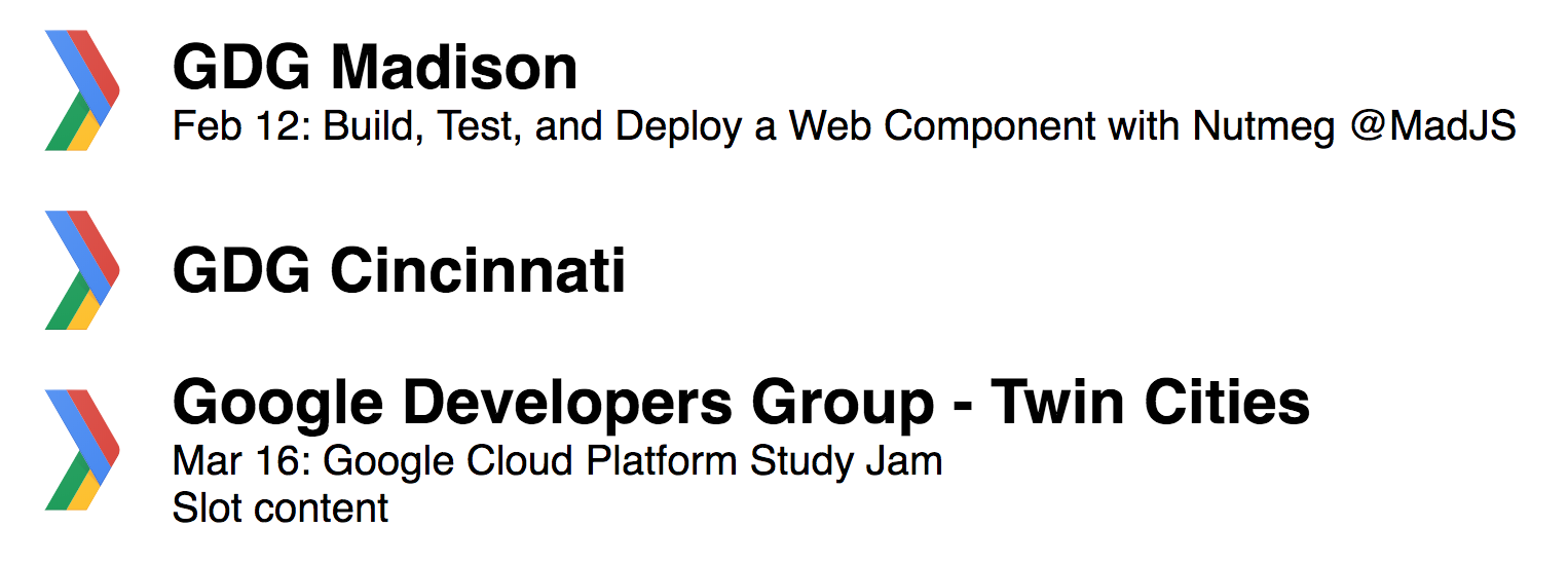
  <gdg-group url-name="gdgmadison" show-next-event></gdg-group>

  <gdg-group url-name="cincy-android" group-name="GDG Cincinnati"></gdg-group>

  <gdg-group url-name="gdg-tc" image-width="90">Slot content</gdg-group>
Live demo on codepen.
License
GdgGroup is released under an MIT license.
Built, tested, and published with Nutmeg.