react-slider


A fully featured slider component made in React.
Installation
npm install --save fc-react-slider
Basic Usage
; Component { <Slider name='vertical' orientation='vertical' showSteps onDragStart= onDragEnd= /> }Props
| prop name | defaultValue | type |
|---|---|---|
| attributes | {} |
Sometimes you may need to add some custom attributes to the root tag of the component. attributes will accept an object where the key and values will be those attributes and their value respectively. Eg : If you pass attributes = {'data-attr1' : 'val1','data-attr2' : 'val2'}the root tag will have the attributes data-attr1 and data-attr2 with the corresponding values as val1 and val2 respectively |
| className | '' | Optional className to be added to the root tag of the component |
| max | 20 | maximum limit of the slider |
| min | 0 | minimum limit of the slider |
| disabled | false |
To disable or not to disable |
| name | '' | name of the component |
| onChange | ({name, value}) |
function triggered when the value changes |
| onDragStart | ({name, value}) |
function triggered when the sliding starts |
| onDragEnd | ({name, value}) |
function triggered when the sliding stops |
| orientation | 'horizontal' |
'horizontal' or 'vertical' |
| rangeTemplate | [function](#rangeTemplate) |
Returns an element that shows the slider range. |
| readOnly | false |
Boolean |
| showSteps | false |
whether or not to show steps. |
| step | 1 | The difference between two sliding positions. |
| tooltipTemplate | [function](#tooltipTemplate) |
Returns the tooltip element. |
| type | 'range' |
'value' or 'range' |
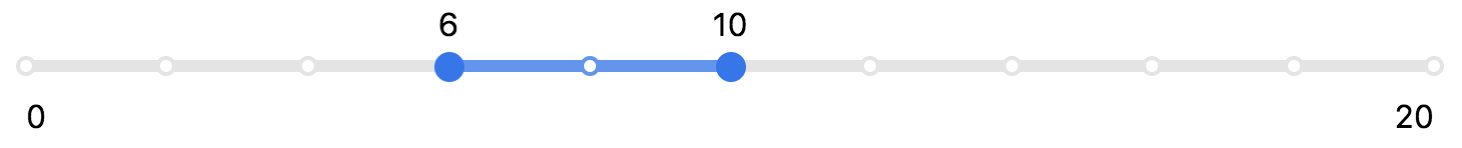
| value | [5, 10] ️ |
Can be a number or an array based on whether the type is 'value' or 'range |
respectively.
rangeTemplate
defaultValue:
{ return <div className='slider-range' > <div className='slider-range-min' >min</div> <div className='slider-range-max' >max</div> </div> ; }tooltipTemplate
defaultValue:
{ return value; }Development
- Clone the repo
- Create a new branch.
- Run
npm install && npm run storybook - You can find the server running at localhost:9002
- Add feature or fix bug. Add tests if required.
- if commit fails make sure that there's no linting error or failed test by running
npm run test && npm run lint
License
MIT @ Ritesh Kumar