ember-showcase 
A set of primitives to showcase interactive code examples
Compatibility
- Ember.js v3.16 or above
- Ember CLI v2.13 or above
- Node.js v10 or above
Installation
ember install ember-showcase
Usage
ember-showcase is an addon that provides you with component abstractions
that you can build upon to showcase interactive code-samples in your
applications.
This can be useful for documenting an addon, a styleguide or when writing a blog.
ember-showcase comes with no styling. As it is meant as a base for your own
abstraction on top of it you can style it as you see fit. The follwing guide
walks you through the existing components in ember-showcase and how you could
create your own component abstraction on top of it.
Components
Showcase
The Showcase-component is a provider component that yields out everything you
need to build your own interactive code sample component.
Showcase yields a nested hash that holds the following properties:
-
ui- a set of declarative components-
useSnippet- a component that you use to register snippets to theShowcase -
snippet- a component that renders a code snippet
-
-
state- state of theShowcaseyou can use to build your own code sample abstraction-
activeSnippet- the currently active code snippet of all all the registered snippets. By default this will be the first registered snippet -
snippets- all the registered snippets on theShowcase
-
-
actions- a set of actions you can trigger on theShowcase-
registerSnippet- an action to register a code snippet on theShowcase -
activateSnippet- an action to switch out the currently active snippet
-
Example
In this example we will walk you through creating your own Demo-component
that is based on ember-showcase. Demo will be able to show an interactive
code sample - i.e. an ui that shows the code to demo in action. You will also
be able to attach an optional set of code-snippets (based on
ember-code-snippet) that you can
toggle between to show other developers how the component you are demoing will
be used in code.
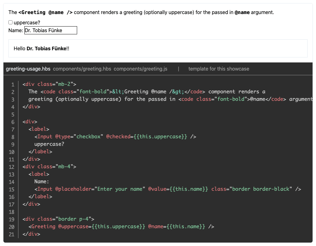
Here's how you will be able to use it:
And here's how you would use ember-showcase to implement Demo:
Bundled addons
ember-showcase bundles some addons to provide its functionality.
- ember-code-snippet - for providing code snippet functionality
- ember-prism - for highlighting code snippets
If you need to customize code-snippet or code-highlighting functionality please have a look at the documentation of both addons.
Contributing
See the Contributing guide for details.
License
This project is developed by effective-ember and contributors. It is licensed under the MIT License.