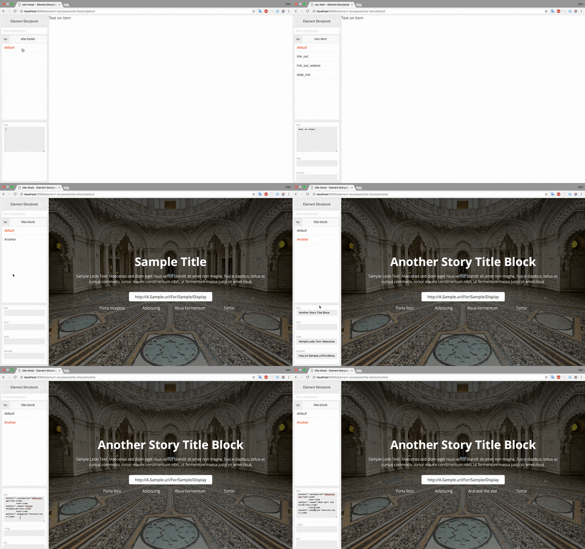
element-storybook
This is a development and testing environment for native components. This is in beta and may have extensiv changes, all efforts will be provided to create non breaking changes, but there is no guarentee, and if a feature is needed that will benefit the product but cause a breaking change, it will be implamented.

In a future release JS modules will be the default type and the UI will be moved over to that. I just want to give you a heads up.
How to use:
Element-storybook is build on express and allows you to create an instance and configure it's deployment. It is a development tool, as well as a display tool as in using React-Storybook I have found it has been needed to showcase elements.
To create an instance in your node server:
const storybook = new Storybook({
    stories: `client/elements/**/*.story.js`,
    storybookRoot: '/element-storybook/',
    pathToElements: '/elements/',
    pathToPolyfills: `/polyfills/`,
    moduleType: 'html'
    app,
    dir: path.join(__dirname,`../`),
    stylesheet: '/path/to/stylesheet',
    inject: '<script>//something to be injected before the close body tag.</script>'
});
You can now use JS import style instead of HTML imports. The property moduleType can be set to JS to allow this.
Parts
- stories: Path, using glob, to your stories.
- storybookRoot: URL Path you want storybook served. For example
/element-storybook/would serve athttp://yourServer/element-storybook. - pathToElements: URL Path to the element directory in your local project.
- pathToPolyfills: Element-storybook doesn't load the polyfills itself. We are assuming, since you are developing custom elements, you have your own support taken care of. So you can specify the path to your polyfills. If you need more information about the polyfills goto the Web Components Project on GitHub
- app: the express app.
- dir: The root of your project, this may not be the same as
__dirnameas that is the root of the node process and some projects are organized to have a server directory and a client directory. This would be the root of the project. - stylesheet: This is a stylesheet that will be injected into the iframe to see how your project styles might effect the element.
- inject: this is a block that allows you to inject anything right before the closing body tag.
Creating a story
At this time storybook is assuming a little about your elements.
- That they are in one directory
- That that directory is organized with:
- a folder that matches the name of the element
- in that folder is an HTML file with the name of your element.
- a story in that same folder.
directory structure
For example assume I have an elements folder for my elements.
- elements
    - my-element
        - my-element.html
        - my-element.story.js
    - another-element
        - another-element.html
        - another-element.story.js
If you are using JS module types instead of an .html file you would have a .js file.
To make a story:
const {Story, Props} = require('element-storybook');

let story = new Story('my-element');

story.addProp('prop1')
    .addProp('prop2','bool')
    .addProp('--cssProp')
    .addProp('prop3',['option 1','options 2','options 3','option 4']);

story.addSlotElement('another-element');

story.add(`default`, `
    <my-element></my-element>
`)
.add(`with child`, `
    <my-element prop1="prop 1 value" prop3="option 1">
        <another-element another-prop="another value"></another-element>
    </my-element>
`);

module.exports = story;
Story provides a few functions to create the story:
- constructor:
element: the name of the element this is a story for.
- add: This adds a story and accepts to params:
story name: defines the name of the storymarkup: defines the markup for the story, including the element.
- addProp: this adds a property to your element that can be modified via the interface.
prop name: Name of the prop. This can include custom properties from CSS by adding--to the front, or if you want to change the slot useslotas the prop name and it will allow you to freeform change the contents of the element.options- optional: this has a few options - if the value is:- not present: it is assumed any value can be accepted and will be interpritade as a free form field.
bool: it will be rendered as a true false property and will be based on the presence of the property and rendered as a checkbox.- An array: it will be taken as the list of viable options and will be renedered as a select box.
- addSlotElement: allows you to add an element to the slot that is also a custom element. It takes a string or an array and is the name of the element you are using.
All functions return the story so can be chained.